Early last summer, Jeff Manning, executive director of the California Milk Processor Board and one of the architects of the celebrated “Got Milk?” campaign, dreamed up yet another winning idea. The milk lobby would team up with famous cookie-makers — Entemann’s, Keebler, Nabisco — to produce spots that extolled the glories of milk and cookies together. From the point of view of the cookie-makers, Manning’s offer was a no-brainer. “Basically, it was us approaching the Oreo people and saying, ‘Hey, we’ve got $22 million to spend. Can we help you sell more Oreos?’ Manning recalls. “How do you say no to that? We got cooperation from everybody.” Until, Manning says, “we thought up a very clever idea for an ad that involved Pillsbury.”
Manning had asked his San Francisco ad agency, Goodby, Silverstein, to draw up storyboards featuring that squeezably soft gob of goo, the Pillsbury Doughboy. The Goodby creatives came back with a concept that was “a little bit of a spoof,” Manning concedes. The ad opened with a shot of an all-American family sitting around the kitchen table, “super clean-scrubbed, looking as perfect as can be,” Manning says. “The wife comes to the table and asks her husband and son if they’d like some freshly baked chocolate chip cookies from Pillsbury. The husband says, ‘Oh, thank you, darling.’ The Doughboy says, ‘There’s nothing like something fresh from the oven.’ Everyone’s looking joyous. The Doughboy is looking as happy as can be. All is going well.”
Then, Manning says, “The husband takes a bite of the cookie. He says, ‘We got some milk?’ The teenage son goes to the fridge, picks up the empty carton, and says, ‘We’re out of milk, man.’ And the husband goes crazy. ‘We’re out of milk? Who drank the last of the milk?’ The whole family turns and looks at the Doughboy. And he’s got chocolate on his face, as if he had some of his own cookies. Clearly, he drank the last of the milk. And he turns around and dashes off camera.”
Manning chuckles at the recollection of the ad. “It was a fabulous spot,” he says. “Really interesting and contemporary. Unfortunately, the Doughboy couldn’t do it.”
What do you mean, the Doughboy couldn’t do it? I say. The Pillsbury Doughboy, after all, is not a conscious actor, but a pixelated arrangement of circles, cylinders and rectangles, presumably devoid of any rational mental functioning. Manning sighs. “We ran up against the guidelines,” he explains.
The ad, Manning elaborates, had failed to conform to a series of authoritarian, though kindly, rules that all Doughboy-related work must abide by. “The Pillsbury guidelines stipulate that the Doughboy must always be a helper, a teacher or a friend,” he says. “Our spot showed the Doughboy drinking the last of the milk. Therefore he wasn’t being a helper. He wasn’t being a teacher. And he certainly wasn’t being a friend.”
The Doughboy superego was plumbed in several lengthy conference calls, in which the milk lobbyists tried to persuade the Pillsbury executives that the ad was all in good fun. “It’s not as if we showed the Doughboy doing something terrible,” Manning reflects. “I mean, he didn’t steal money from Mom’s purse. He just drank the last of the milk. Because, you know, you’ve got to have milk with Pillsbury cookies.” The Doughboy’s handlers were not convinced. “They kept saying it was not in character for the Doughboy to take the last of the milk,” Manning recalls. “Because, when he took the milk, that meant the family wouldn’t have any milk. And that creates animosity between the family and the icon.”
But didn’t Pillsbury grasp that the scenario was make-believe? “They just kept going back to the guidelines,” Manning says. “They reminded us that the word ‘mischievous’ is not in the guidelines. ‘Playful’ is there, but ‘mischievous’ is not … Which is unfortunate. Because, as I said, we thought this would have been a neat spot for both of us.” So confident were the Pillsbury executives in their defense of the Doughboy’s unshakeable goodness that they remained unmoved by the agency’s ace in the hole — focus-group videos that showed consumers cheering at the spot. “Our respondents kept saying, ‘It’s so cool that the Doughboy would do that!’ Manning says. “They said, ‘He’s always such a goody-goody. It’s kind of cool that he would drink the last of the milk.’ They didn’t see him as being a bad guy. They saw him as a teacher, a helper, a friend, who was so overwhelmed by his desire for milk and cookies that he just had to do this.”
All the same, Manning believes it’s not his place to question Pillsbury’s judgment. “I personally believe it said good things about their brand; good things about refrigerated cookie dough,” he says carefully. “Then again, I don’t have a $10 billion investment in the Doughboy.”
In an attempt to confirm Manning’s account, I called Liz Hanlin, director of communications at Pillsbury. Hanlin is a gracious, friendly woman, a consummate professional, but when the conversation turned to the Doughboy, she turned tense and evasive. “I couldn’t really speak to that,” she told me. “I don’t speak for the Doughboy. There’s someone else here who does that.”
After two weeks of toing and froing, I was finally put in touch with Dennis Ready, the company’s director of brand development. Ready, a very serious and soft-spoken man of about 40, assured me that Pillsbury “made absolutely the right decision” in pulling the Doughboy from the milk spot.
“For some other character, taking the milk might be fine,” Ready said pensively. “It might be a real funny thing for him to do. But not the Doughboy. He doesn’t trick people. He doesn’t take advantage. It’s not in his character to do that.”
I asked Ready if he wasn’t concerned that the Doughboy’s act might be growing a little stale; if Jeff Manning’s focus group transcripts didn’t show that consumers were hungering for a darker, more defiant Doughboy.
Ready sighed deeply. “With an icon like the Doughboy, you have to take the long view,” he said. “In the course of running a spot, consumers might really like it. But then, the question is, where does this work take us 10 years from now? If we keep putting him in situations like that, it could start to change how people perceive his character.”
But we’re not talking about a long-term shift in direction, I persisted. The Doughboy could still dance on counters and promote his line of buttery baked treats. This would be a one-time lark, a spoof, a temporary detour from his contribution to the betterment of humanity.
Ready grew exasperated. “Look,” he said. “If you asked the Doughboy if he wanted to do that commercial, he’d say no. He’d say, ‘I just want to talk about my cookies.'”
A few weeks ago, I might have surmised that Ready was crazy, that too many days and nights spent in the constant company of his jolly, jaunty baby-man had thoroughly toasted his strudel. But there are many, many other people who are just as tenderly devoted to the cats, bears, ducks, giants, insects, legumes, mythical beings and crustaceans who incarnate their brand in the popular imagination. Call up the marketing directors at Kellogg’s, General Mills, Nabisco or any other giant packaged-goods conglomerate, and you’ll get the same rapt paean.
“He’s really more of a person than a bug,” explains Anh Nguyen of General Mills. Nguyen is speaking of the Honey Nut Cheerios Bee. “He’s not just this insect buzzing around,” she says eagerly. “He wears fresh, normal everyday clothes … If you look at him, you see that his face is friendly.”
“He’s very classy and upscale,” raves Planters Vice President David Yale of his brand’s icon, Mr. Peanut. “He’s someone you might meet at a celebrity party, or at a new club, or lounge or bar. And — to your surprise — he talks to you! He engages you in conversation! So yes, he’s got his top hat and monocle. But paradoxically, he’s also quite approachable and down to earth.”
Is there a Mrs. Peanut?
“I don’t know,” Yale says. “John, is he single?”
“He is single,” confirms John Barrows, senior manager of marketing communications. “There is no Mrs. Peanut. There will never be a Mrs. Peanut.”
Why not?
“He’s a cosmopolitan guy,” Barrows says. “He’s busy.”
“He’s a man about town, representing Planters and nuts wherever he goes,” Yale says cheerfully. “He’s not the settling-down kind.”
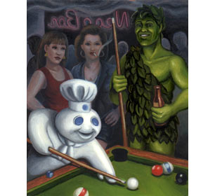
The Jolly Green Giant, however, is in a different league. “I would compare him to some kind of harvest god,” says Gerry Miller, executive vice president of the Leo Burnett Agency. “He signifies something that we can’t even express. Something that goes way back in the history of the species.”
Miller confesses he doesn’t yet understand the Green Giant in all of his mysterious, contradictory complexities. “The best characters are the ones who are flawed or internally conflicted,” he says. “As far as I can tell, the Green Giant is pretty perfect. And so, maybe as we think about how to drive him into the future, there will turn out to be some issue or conflict that he could have. Now, that doesn’t mean that we dress him up and put him in a mosh pit … But it does mean that we’ve got to keep working him, pushing him in new directions.” Miller reflects a moment. “I mean, we haven’t scratched the surface of this guy,” he says.
There is a story to be told about the dark side of postmodern commodity capitalism. This is not that story. This is a happy story, a story about a psychedelic, pink-and-white cloudcuckooland that burbles beneath the surface of American corporate life. In this sun-dappled, honey-nut Arcadia, everyone is buoyant, ebullient, joyful. Fawns prance. Butterflies flit by. Cartoon rainbows streak across the sky. Pop-eyed little characters float and fly, tumble and dance, perching on stars and lollygagging on crescent moons. And sober-suited corporate executives spend their days pondering such ontological questions as: Does the Pillsbury Doughboy actually make the cookies, and if so, are they made from parts of himself? (The answer, if you’re curious, is that while the Doughboy is clearly related to the product in an “ownership” way, in that he refers to the product as “my cookies,” it is never explained exactly how he creates them. “We don’t want people to really think about that part,” says Ready.)
Lately, however, a shadow has been darkening this magical, rainbow-filled cloudland. Some onlookers are muttering that the guardians of the brand icons have become so enraptured by these happy little beings that they’ve lost their grip on reality. “There are whole documents on what these characters will and won’t do,” complains Court Crandall, creative director at Ground Zero, a Santa Monica, Calif., advertising agency. “The documents go into the thousands of pages … Meanwhile, no one ever stops to consider whether the character even feels worth a damn in the first place. There’s a fine line between being a good brand custodian and being certifiably insane.”
It’s a bit of a puzzle how these frothy little toons came to acquire such ponderous personalities. According to Margaret F. Callcott and Patricia A. Alvey, authors of “Toons Sell, and Sometimes They Don’t: An Advertising Spokescharacter Typology and Exploratory Study,” advertising spokescharacters made their debut during the first years of the 20th century, as a way of bringing scary large companies down to human scale.
In “a period of migration, uprootedness, role changes and separations,” Callcott and Alvey write, these tiny, gesturing creatures served as a reassuring presence, “a comforting substitute for the familiar face of local merchants.” Far from being endowed with Flaubertian complexity, these proto-spokescritters simply served as literal embodiments of the product’s “unique selling proposition.” The umbrella-toting Morton Salt Girl, for instance, reinforced the message that the salt wouldn’t become sticky in humidity. (“When it rains, it pours.”)
Nowadays, of course, the decision to invest in a fictitious spokescharacter is a much weightier proposition. As Kevin Keller, professor of marketing at Dartmouth College’s Tuck School of Management, points out, many companies have good reason to eschew a celebrity spokesperson in favor of a corporate-minted creation. “Companies are turning to fictitious spokespeople because the real ones are getting thrown in jail,” Keller told me. “Even good people, people who really want to help the brand out, may end up doing things that harm the franchise.” So, whereas actors Cybill Shephard and James Garner lost a tad of credibility as spokespeople for the Beef Industry Council when she admitted to being a vegetarian and he underwent heart-bypass surgery, no one could ever call into question the Pillsbury Doughboy’s unimpeachable “expertise hook.” “After all,” Callcott and Alvey write, “who is better qualified to judge baking dough than a piece of dough himself?” No argument there.
The attraction of spokescharacters, says Dartmouth’s Keller, is that “I can craft their look, their words, their actions. And I can make sure, from a brand-building perspective, that with every move they make, they’re adding value to the brand franchise.” But somewhere along the line, as icon management became a legitimate professional specialty, this Henry Higgins-like impulse spun out of control. The operating principle went from benign anthropomorphism to a delusional break with reality.
“We talk about our characters as if they are real people,” says Ashley Postlewaite of Renegade Animation, an animation shop that specializes in personified animals operating in cartoon and live-action worlds. “We’ll ask questions like ‘Should Chester do this or that?’ or ‘What’s the pig going to be wearing?’ And it’s as if we’re sitting around a table saying, ‘Oh, Meryl Streep isn’t going to do that scene, she isn’t going to do nudity.’ It’s that level of seriousness. Sometimes I think: I went to Stanford to have this conversation about how the pig wouldn’t look like that, or the rabbit never does this, that or the other …? What’s the matter with me?”
As new cooks are brought in to stir the brand-broth, the three-ring binders swell to bursting. These days, it is not enough merely to specify that Mr. Peanut never speaks, but can make the occasional hand gestures. No, the five approved hand gestures — the wave, the thumbs-up sign, the shake of the hand, the tip of hat and the ability to hand out product samples — must be individually enumerated and communicated as a mandate to all vendors wishing to do business with Peanut. Likewise, the Green Giant company has let it be known that the Jolly Green Giant may only wear his red scarf when advertising frozen vegetables; and that there are certain things he can and can’t do in the valley. (He can never shake his fist, for instance.)
Meanwhile, the mills at General Mills are currently turning over the question of how, exactly, the beleaguered Trix rabbit should react when he is denied the Trix at the end of the commercial. “He really wants that product,” says Postlewaite. “He’ll sneak around in bushes, he’ll wear disguises, he’ll put on roller blades — he’ll do whatever it takes to get the product.” Frenzied rounds of research have failed to solve the problem of just how despondent the rabbit should be when he is reminded that Trix is for kids. “When he doesn’t get the product, he sighs a little sigh,” says Postlewaite. “You walk a line with that sigh, because you don’t want your lead character to seem super-sad. I mean, this isn’t Hamlet’s soliloquy.”
To revivify their fuzzy, nondescript icons, some companies are turning to brand therapists such as David Altschul, president of the advertising division at Portland’s Will Vinton Studios. As head of the studio’s Character Development Lab, a sort of rehab center for shopworn spokescharacters (the lab creates new characters as well), Altschul “interrogates” and “dimensionalizes” played-out spokescharacters until they throb with rich new life. Altchul’s specialized interventions are as complex as that of a real-life medical unit: Having resuscitated the M&M characters and the California Raisins, among others, he is now turning his sights to the Doughboy. “He’s one of the most effective icons out there,” Altschul tells me. “But he’s a generic icon, a generic icon made out of dough. His chief value is as a mnemonic device … What [Pillsbury] is leaving on the table is an opportunity for the Doughboy to have a more emotional connection with the consumer.”
When Altschul begins his signature brand of icon therapy, he begins by focusing on the negative. “We’re not in the business of developing virtues,” he says. “Virtues are all too easy to come by.” Not in humans, but in talking dogs, frogs, tigers and toucans. “When you look at these guidelines, they all read the same,” Altschul says. “They’re virtually interchangeable. The character is inevitably described as charming, friendly, helpful, optimistic and universally loved by all. Very occasionally, they’re described as a little bit mischievous. That’s the closest anyone comes to describing a flaw. Now, these types of guidelines are enormously engaging to the brand managers. They’re not terribly engaging to the consumer.”
A key part of his job, Altschul concedes, is managing the distress of the traumatized brand managers. Like frightened and overindulgent parents who have difficulty refusing their child anything, they are loathe to believe their tiny charges could ever be the least bit cocky, sardonic, piggish or mean-spirited. “They’ve put their brand icon on a pedestal,” Altschul complains. “They’re afraid to touch him.”
Altschul remains hopeful that someday he’ll have the chance to mold the Doughboy in his own image. “I’m not talking about a major makeover,” he says eagerly. “The Doughboy is not ripe to become mean-spirited, like the red M&M, or dopey, like the yellow M&M. But there are some subtle things you could do that would make him more of an individual character. Not just a generic icon made out of dough.” Altschul is growing excited. “The first thing I would do,” he says, “is say to the folks at Pillsbury: If you want us to deal with this character, we are going to take this character guidelines book and trash it.”
Informed of Altschul’s well-meaning offer, poor Dennis Ready of Pillsbury almost has a coronary. “Oh no,” he says. “No, no, no. We are not going to trash the guidelines. We take the property very seriously. His personality. His role in advertising. Things he can do. Things he can’t do. The physical Doughboy. It’s all described in excruciating detail. I’ve made presentations on him … We’ve got a bible that’s hundreds of pages. And so we pretty much have that codified.”
As for Altschul’s offer to help Pillsbury get in touch with the Doughboy’s dark side, Ready says thanks but no thanks. “There are certain other characters who come to mind,” he says, his voice hardening slightly around the edges. “One is the Trix rabbit. He’s always trying to pull tricks to get the Trix. My point to you is, the Doughboy does not engage in things like that. He could never be cast in a role where he was pulling tricks, or being mean or sarcastic to somebody. He’s always warm and sweet and enthusiastic and helpful. It’s in his personality. It’s in his character.” Ready pauses. “I could go on and on,” he says dreamily.
Ready is a model of garrulousness compared to his counterparts at McDonald’s, where the guidelines on Ronald are guarded as jealously as the code for a nuclear warhead. Weeks went by before I could convince anyone in the company’s Oak Brook, Ill., headquarters to speak on the record about the gestalt of their mysterious spokes-clown. When I asked a man in the press division about the possibility of talking to someone about this enormous, complicated and significant topic, he sighed and tried to dissuade me. “I’d like nothing better than to put you in touch with one of our caretakers on Ronald,” he said. “It’s just that the people who manage Ronald on the McDonald’s end are really, really serious about him. And it’s a difficult time, because Ronald is going through some evolutions right now … You’d be surprised how really passionate and sometimes sensitive people are about this character.”
I asked the spokesman if he could at least describe to me what he considered to be Ronald’s true nature. “We’re on background, right?” he said. “Because I’d be more comfortable doing this on a background basis.” When I assured him we were, there was a long pause. “OK,” the spokesman finally said, his voice dropping to a whisper. “He is kids’ fun magical friend.”
Like tiny children babbling happily to their dolls, the brand-builders have constructed entire worlds around their cherished characters. In this vast delusional matrix, no detail is overlooked. Spokescharacters have friends, enemies, weaponry, magic lozenges and other paraphernalia. And they inhabit specific ecological niches: Just as the Green Giant can never leave his valley, Froot Loops’ Toucan Sam can never leave his animated jungle. And as for Lucky the Leprechaun leaving the forest — forget about it. I’ve already asked Mark Delahanty, director of leprechaun equity at General Mills, and the answer is definitely no. “You won’t find him in a kid’s kitchen, sitting down eating breakfast,” he told me. “Look for Lucky to always be in a fairy-tale type setting.” Why? I wondered. “Because he’s a leprechaun,” Delahanty barked. “He lives in the forest. That’s where you’ll see him. That’s where you’ll find him.”
One can’t help but be impressed by the sheer level of thought that has gone into the construction of these characters’ inner worlds. The strategy, as we say in ad-land, goes very far down the funnel. It’s a little disconcerting to discover, after reading marketing documents from Kellogg’s, that Snap! Crackle! and Pop! — the Rice Krispies elves — have more richly developed inner lives than several of my own friends. From elf dossiers, we learn that Snap! is the oldest and the wisest, “the leader and problem solver” of the bunch. Pop! is the “irrepressible child … usually the one who pulls gags and gets the ‘last word in the form of a pun.'” Crackle! is that perennially misunderstood “middle child … [who’s] never quite sure of himself, but tries to keep order between the other two.'” (Crackle! won’t be appearing in commercials for a few months, while he sorts out some issues.)
The M&M characters, after months of therapy at Altschul’s spokescharacter infirmary, have also emerged as fully integrated characters, with their own proprietary bundles of qualms and neuroses. “Five years ago, when we started our process, the M&M characters were just a mnemonic device,” Altschul told me. “Recognition was a mile wide and half an inch deep. Everyone knew who they were. And nobody much cared.” Altschul, along with M&M/Mars’ advertising agency, BBDO New York, went immediately to work. “When we’re trying to tell stories, we look for sources of conflict,” a BBDO account director told me. “In the case of the M&Ms, there were three deep pools of potential conflict. One is that they’re a duo, with clashing personalities. So there’s a certain amount of conflict between them. No. 2, they’re small. They’re 2-and-a-half-feet tall, slightly clumsy, hard-shelled characters trying to maneuver in a world of humans. No. 3, they are candy-covered chocolates in constant danger of being eaten. Out of these sources of conflict, we have written and produced over 60 spots. And there isn’t a dud in the lot.”
When it came to the development of the M&Ms’ individual personalities, the parent company got a bit queasy. “You can imagine that M&M/Mars, being much like lots of other packaged goods companies, does not think of its flagship brand as dopey, or small-minded, or conniving,” Altschul chuckles. But Altschul, along with BBDO creative directors Susan Credle and Steve Rutter, were bent on changing that. They immediately set about transforming each M&M from a “generic icon” to a contingent, selfish individual. “The red M&M — he’s the calculating one,” Altschul explains. “A little bit small-minded, a little ambitious and a little full of himself. Yellow is goodhearted, but a bit slow on the uptake. Blue is a little closer to a Woody Allen in terms of attitude. A little more wry, a little more understated. Occasionally a bit sarcastic.”
Altschul stresses that selling this psychodrama to the parent company was no easy task. They had always envisioned the M&Ms as amiable, nonthreatening, helpless, happy, sunshine-spreading. Now, here they were, turning out to be hostile, provocative, spiteful, accusatory, unreasonable, willful. “We don’t focus on pleasing the brand managers,” Altschul shrugs. “It’s easy enough to create characters that would warm the heart of a brand manager. Just create a little shill in tennis shoes who spouts his brand strategy on the air, and doesn’t get paid residuals. That’s not what we’re focused on. We are focused on the emotional connection with the consumer.”
