 Celebrating 25 years as a musical performer, the Galaxie 500/Damon & Naomi founder discusses art, small press publishing, and design instead of bass chops and harmonies.
For the last quarter-century, Naomi Yang's graphic design palette has evolved serendipitously. This is in large part, she says, due to the fact that she could pick and choose her projects based on creative merit. It was never her breadwinning gig.

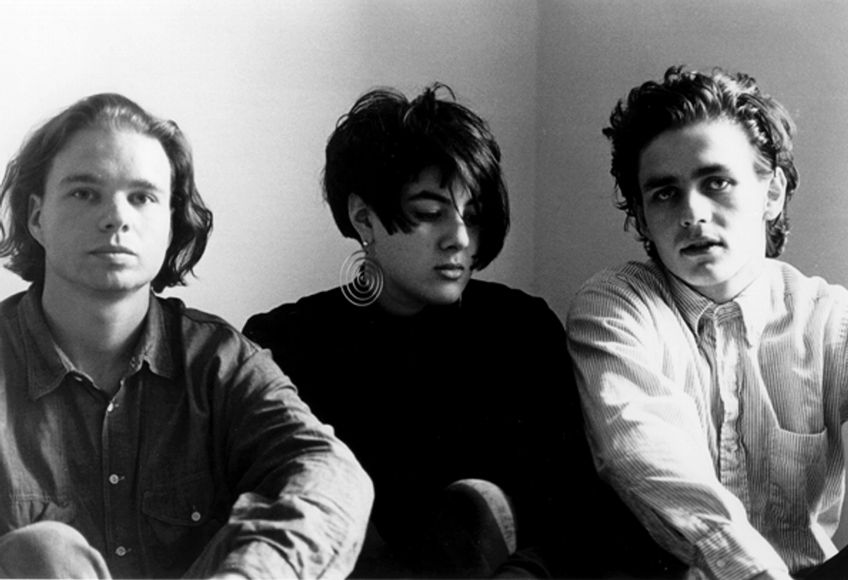
Naomi Yang and Damon Krukowski
Still, Yang is primarily known as a musician -- first as a founding member of Galaxie 500; more recently as a current member of the duo Damon & Naomi, born out of G-500's split -- more than a visual artist or graphic designer. But you can also add record label owner, art director/co-publisher, photographer and water colorist to her list of skill sets.
 Yang studied visual arts as an undergrad at Harvard, and for a brief time, enrolled in graduate school for architecture (also at Harvard), before rock stardom came calling. Enter: the space-age sounds of Galaxie 500, a Velvets-inspired "alternative rock band," when such a thing still existed. G-500 would go on to help define the burgeoning East Coast music of the late '80s; the trio quickly broke out of the college radio ranks and into the pre-Grunge mainstream -- especially overseas -- with fellow Commonwealth of Mass bands the Pixies and Throwing Muses.
Since day one, Yang has meticulously designed her band's materials herself, originally inspired, she says, by '60s Elektra Records album covers.
After G-500 called it quits in 1991, Yang and Damon Krukowski, her longtime companion and collaborator, formed D & N, and began to perform as a duo (they are supported by a backing band, like Ghost from Japan, when they perform live).
In 1989, D&N launched Exact Change, the small press -- which they still run today -- dedicated to "experimental literature with an emphasis on Surrealism, Dada, Pataphysics, and other nineteenth and twentieth century avant-garde art movements."

And in 2005, after years of recording for other record labels, they decided to start their own, 20/20/20. "The name comes from the game 'Careers,' that both Damon and I played when we were kids," she tells me. "In that game you chose a profession and any combination of points in three categories -- Fame, Money and Happiness -- that sum up to 60. The first to reach their chosen goals would be the winner.
"In the discussions about whether to start our own label -- what to do with our real careers -- Damon and I discovered that as children we both always chose the proportions 20-20-20 and would often win with this formula. We were thinking about how being in control of the financial side of our career was something we had never done, and maybe it was time to do it, time to give that more attention."
This spring D&N released their seventh studio album, "False Beats and True Hearts." To celebrate the visual splendor of Naomi Yang, I thought it appropriate to interview her about her design aesthetic, working habits, keen influences and the trials and tribulations of small business instead of the usual musicianship fodder. The following is a portion of that conversation.

Does working in multiple disciplines (music, graphic design, publishing, painting) help you fine-tune each respective medium? Furthermore: Do you have a favorite?
I enjoy doing all these things, which is why I think I never specialized in any one of them; I find each media expressive in its own way, each interests me, and they are all fun. But I do think my work in all these disciplines -- music and visual arts -- has been an interrelated aesthetic journey to create something beautiful, and something that has a certain ease: a feeling of inevitability and elegance of proportion.
I was studying architecture at the Harvard Graduate School of Design, until I realized I was never going to be happy being an architect and dropped out to go on tour with Galaxie 500, and I always remember one critique in particular. The project involved designing a small building on a plot of land, and at my critique one teacher complained that my building and landscape just looked like "it had always been there" -- there were no flashy design moves on my part. I took that as a compliment; I think I aspire to that kind of naturalness in my music, my photography, and my graphic design.


You've said that you came at design as a hobby. Do you think this has allowed you more creativity in that you've never had to design, say, products or advertising for projects outside of your own -- or at the very least, on your own terms?
I guess "hobby" is a kind of funny way to put it in that I have been preoccupied with graphic design since I was a kid -- graphic design is a strange hobby for a child. But it started when I was 10 and went away in the summer to an arts camp where they did a lot of theater productions; for each show they would design and silk-screen posters. I learned how to make and print silkscreens there, and by 7th grade I was doing all the posters for the shows in my middle school. I used to sit around and memorize the "Letraset" (rub-on type) catalog with all the sample typefaces -- there were a lot fewer typefaces then!
As an adult, I really have been lucky in that I have never done graphic design solely for a living so I have been able to choose the design jobs that I take. I enjoy collaborations in both music and design, but I know they are most successful when all sides have respect for each other's thoughts and work resulting in a productive give and take, rather than just "the customer is always right so I will make this headline 60 pt even though it looks stupid that way." In the past few years I have had a great design job for the John Cage Trust, working with the head of the Trust, Laura Kuhn, on a John Cage Calendar, which I designed from scratch. It has been a wonderful experience.
Tell me about working at Milton Glaser's office as a post-high school/pre-college student. What was one salient point you took away from working in his office?
It was a wonderful and very formative experience, it was called an apprenticeship, and it really was very old-fashioned training. All the layout was done by hand, with rubber cement and X-Acto knives. If you wanted to change the size of some type you had to make a whole new photostat of the typesetting that you had ordered from a typehouse. I think the best thing I learned was how to look at letterspacing for titles. The person I was working under at Milton Glaser had an eagle eye, and all the kerning was hand done. You took a photostat of the title, cut parallel lines above and below, and then cut lines between each letter. Then you painstakingly pulled each letter to the right or left to improve the letterspacing. I would do my best and then show it to my boss, and he would squint at it and send me back to redo it. And of course, once you had to redo one part of a word it affected the rest of a word ... but I still look at letterspacing that way!
Also, being around Milton Glaser himself made a very deep impression on me. I was a fan of his when I was in high school. His work was my inspiration in my poster design. I loved his illustrations so much; the beautiful line in his drawings, and the humor and drama in his work. It was like a dream to be in that office and see how things were actually made. I loved being behind the scenes -- it was like being backstage and seeing how everything is done.
During the course of the summer Milton Glaser would have a meeting with each intern, where you showed him your own portfolio and he would critique it. I remember him telling me my work reminded him of his own when he was my age (I was 17 at the time), which was so encouraging and kind of him. I still treasure that whole experience of that office; it really did give me a foundation in graphic design.

In an interview in an early issue of Yeti you mentioned that at one point you worked at the rare book library at Harvard in the manuscript department, and that you had a real love for medieval manuscripts and early printed books. You and Damon have run a publishing company almost as long as you've been playing as a duo. If books are to survive the age of e-books and the digital tablet, how important will good design be for the future of books?
A book has always been an object! That is what can be so wonderful about them and so different than a digital book -- or even a print-on-demand book. A book is an entire world: You see the cover, you pick it up, you feel the material of the cover, you turn it over, you read the back -- and then you open it! You get the progression of the half-title, the title page, the table of contents and then that first page of text, that first line. And there are so many small things, the page numbers, the running heads, the proportions of the margins -- the same elements in each book -- but how will you do it this time?
It is interesting to me to see the resurgence of the LP in the music world. As MP3s and digital downloads have taken over, the CD format, which was never satisfying, is now becoming extinct and the more sensuous LP format is making a real comeback. While people can enjoy the convenience of a digital download, for a lovely object they are turning to LPs. I think it will be the same for books -- I was in an airport bookstore on tour and I noticed all these hardcover versions of "classics." It was interesting to me that publishers are now making elaborate hardcovers of the very same books that people can download for free, and that an airport bookstore would bother carrying them -- who needs extra weight in their luggage? But it must be that people are buying them for the fact that they are "objects" and not just to read the text.

Both the Galaxie 500 and D&N covers have always had a timeless jazz record-sleeve aesthetic. In that same Yeti interview, you mentioned that you like to find one image to start out the creative process, and build around it. Has the process pretty much stayed the same throughout the last 25 years? Do you have a favorite album G500/D&N cover and why?
My father was a photographer, and so I grew up appreciating the power of the photographic image. I think I pretty much still do rely on the power of the photographs I choose to use. It kind of goes back to my Milton Glaser roots -- those iconic images. Of the Galaxie 500 covers, if I had to choose a favorite I think it would be "On Fire" -- I took that photo myself -- I made a crazy contraption with my camera so that I could press the shutter and be in the photo and I really wanted it to look like a '60s Elektra records cover (Love, the Stooges, Tim Buckley). It was a moment when Bruce Mau was doing all those beautiful Zone Book covers -- the colors of those covers were so amazing, unlike anything I had ever seen before, so I actually called him (I didn't know him) and asked how he did it. He very kindly explained how he was substituting or adding a PMS color in CMYK printing, and so that's the technique I used. I guess even at that point in my album design I was using things I had discovered via book design. The cover typography came from Solotype in San Francisco, which specialized in unusual wooden and hot metal display types from the '60s and you could order custom typesetting from them -- pre-computer all your type had to be ordered, and it was expensive, that's why only the display type was done that way. I think they charged by the letter.

Why did you decide to start a record label after so many years recording for other labels like Subpop?
There came a time when things weren't working out with Subpop anymore, and rather than looking for a new label our manager suggested we start our own. We work through a distributor but we can record and release at our own schedule and also, occasionally, put out other people's records, although the label is primarily for our work -- old and new.
What was the initial inspiration for the book publishing house Exact Change? Has there been one book that you've put out that you're most proud of?
Exact Change started out as a small magazine that Damon and I made together in college. We were inspired by the avant-garde magazines of the 1920s, such as 391, as well as my interest in the built environment of the U.S. (the highways, the road signs, the streetscape). We decided to make a little magazine, with essays and photography by ourselves and our friends; which was loosely gathered under the idea: "A Journal of the American Landscape." We typeset this entirely on a fabulous old IBM Executive typewriter: it had proportional spacing (really!) and the font was Futura. I loved it for its slightly unpredictable rendering of Futura -- also the typewriter tape was a film, not an inked ribbon, and so the type was super-black. I painstakingly did mechanicals for every page of this magazine.
We just gave this little magazine away to friends, but we gave a copy to poet Charles Simic, with whom Damon was studying. He liked it a lot and asked us if we wanted to do a chapbook with him. And so the first Exact Change book was born. Later, as we decided to continue to publish books we were noticing that a lot of classics of surrealist and avant-garde literature were out-of-print. We were able to license the rights for these books for very little and re-edited and retypeset them for our series.

Do you still find time to paint?
Sometimes I do small watercolors -- I like the intimate scale, and improvisatory nature of the medium. But mostly I have been taking photographs and working on my digital darkroom skills. Even though my father was a professional photographer -- or maybe because he was a very skilled traditional darkroom photographer -- it has taken me a while to really take my own work as a photographer seriously. But photography is very natural to me -- the perfect medium for capturing a moment, a certain light, a composition! Last year, I started a website for my photography.
*All images are courtesy of 20/20/20
Copyright F+W Media Inc. 2011.
Salon is proud to feature content from Imprint, the fastest-growing design community on the web. Brought to you by Print magazine, America's oldest and most trusted design voice, Imprint features some of the biggest names in the industry covering visual culture from every angle. Imprint advances and expands the design conversation, providing fresh daily content to the community (and now to salon.com!), sparking conversation, competition, criticism, and passion among its members.
Shares