 I spent the first weekend of July as the houseguest of Lucio Passerini, Milanese woodcut artist and letterpress printer. On the morning of July 2 we took a leisurely walk a mile or so to his studio, Il Buon Tempo on Via Longhi. The weather was sunny but cool, unusual for Milano in the summer, making the walk very pleasant. Lucio's studio is hidden at the back of an apartment building courtyard. The atmosphere is very quiet, an island of peace in the midst of a busy city.

Lucio Passerini in his studio. All photographs by Paul Shaw.

Lucio Passerini and Alta Price at the Albion handpress

Type, tools, and materials in Lucio Passerini's studio

A copy of The Triumphal Arch by Albrecht Dürer next to the Vandercook printing press.
The studio is composed of two high-ceilinged rooms. The front room, where the printing presses are, has a skylight at the top, helping to flood it with welcome light. Lucio has two presses, an Albion handpress (or torchio in Italian) and an American Vandercook proofing press, the workhorse of modern letterpress printing. The second room has his store of type, which includes a newly acquired bank of Art Nouveau wood type from a former Catholic printing school for orphans. The walls of both rooms are festooned with examples of Lucio's work as a woodcut artist. But on the wall next to the Vandercook he has pasted a reproduction of Albrecht Dürer's enormous "Triumphal Arch" of 1515, a tour de force composed of 192 separate blocks -- an homage to one of the greatest woodcut artists ever.
Lucio, the author of "Xilografia, i materiali, le tecniche, la storia della stampa a rilievo" (1991), stumbled into printing books by accident. In printing images cut into wood and linoleum he found that he sometimes would fold the paper in half, and then even in half again. And that meant that he had, unwittingly, created pages for a book. His first book was made in December 1982 as a small Christmas gift for his friends. It was "Poesia per una mosca" [Poetry for a Fly] by Leonardo Sinisgalli.
Lucio's books since are like that first one, booklets: "libretti" rather than "libri." They are small in size and page count, existing principally as vehicles for poetry and imagery. Sometimes the illustrations are his, but often they are the works of other artists, including on occasion calligraphers such as Anna Ronchi. The books of Il Buon Tempo exist outside the world of commercial publishing. Of them, Lucio says, "Questi libri non son strumenti per la divulgazione di un contenuto testuale o figurativo ma, piuttosto, l'espressione di una visione personale -- dell'arte, della poesia, della tipografia -- da condividere in una cerchia ridotta di 'complici'." [These books are not instruments for the dispersion of textual or figurative content, but, rather, are for the expression of a personal vision -- of art, of poetry, of typography -- to share with a small circle of accomplices.] Lucio focuses on doing all of the production work by hand, using quality materials, and collaborating with likeminded people, whether they are poets, artists, calligraphers or even other letterpress printers.
"L'atto di stampare e pubblicare un testo o una immagine conserva una ritualità ," Lucio writes, "un po' solenne che proietta sull'oggetto libro un'aura speciale. Avere la possibilità di controllare tutte le parti di questo processo, sia ideative sia pratiche, offre il privilegio di giocare con la forma del libro." [The act of printing and publishing a text or image preserves rituality, a little solemnity that projects onto the object a special aura. To have the possibility of controlling all of the parts of this process, whether creative or practical, offers the privilege of playing with the form of the book.] Among the poets that he has published are Ezra Pound, Emily Dickinson, William Carlos Williams, Marina Tsvetaeva and Torquato Tasso. But the books of his that most speak to me are those with his own abstract illustrations and typographic designs such as "Atlante Piccolo" (1996), "Typo" (2007) and "Talete" (2010). These, and other works, can be found in the catalogue published last year in conjuncton with a retrospective exhibition of Il Buon Tempo at the Biblioteca Vallcelliana in Rome. It is titled "Il Buon Tempo: Le edizioni del torchio privato di Lucio Passerini, qui per la prima volta raccolte in volume e illustrate."
Lucio has honed his typographic skills from working with Alessandro Zanella of Ampersand Press and others. His 2006 meeting with Silvio Antiga and Sandro Berra of the Tipoteca Italiana Fondazione led to his acquisition of an Albion handpress, one made c.1870 by Norberto Arbizzoni in Monza, and to a new passion for wood type. The Art Nouveau wood type he purchased from the orphanage school was first used, with illustrations by Fabrizio Parachini, in "Suono di nulla" by Kengiro Azuma (2010). The book only used the lowercase, though. During our morning visit Lucio and I became engrossed instead in the beauty of the capitals, figures and punctuation.

Lucio Passerini hand-inking Art Nouveau wood type
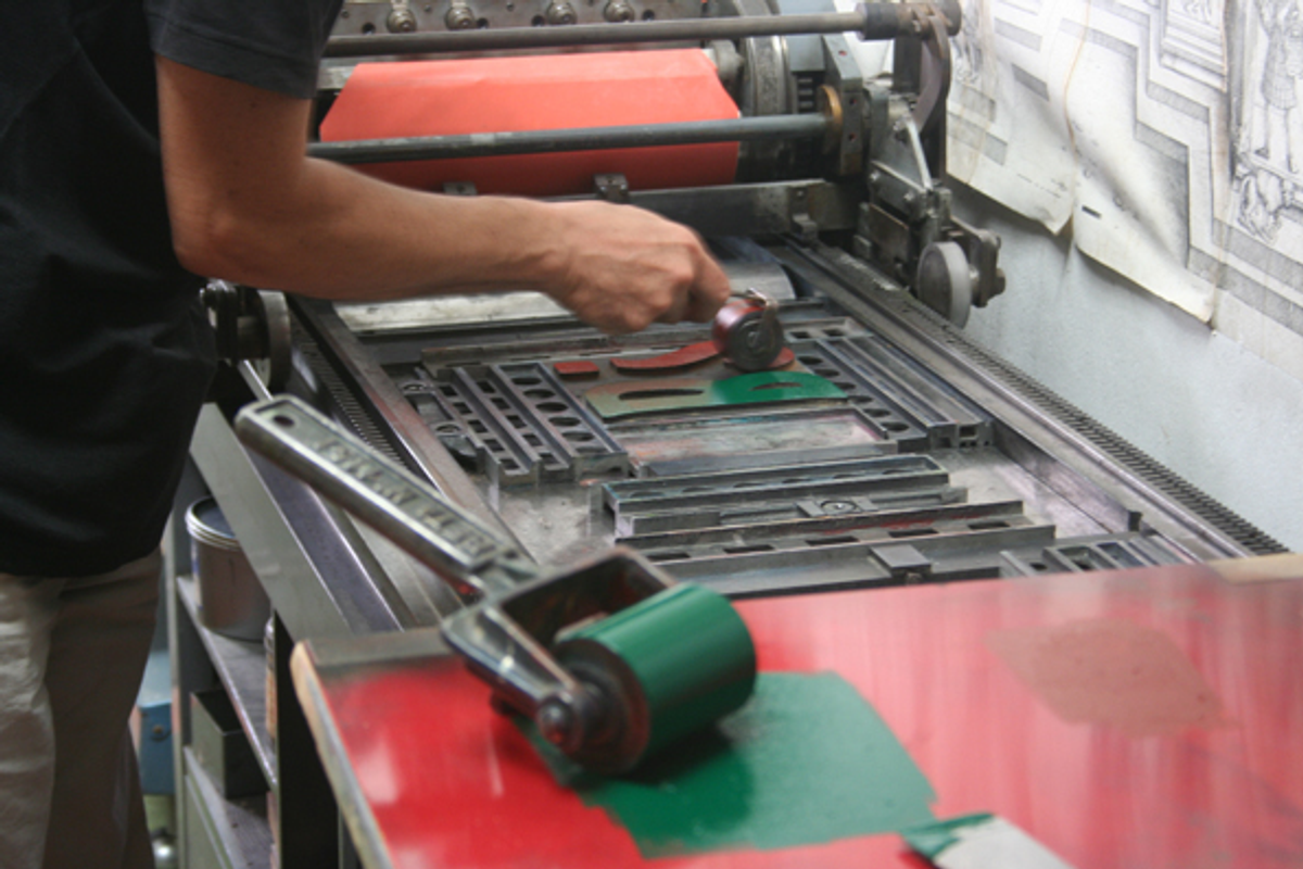
I pulled out a B -- the first letter of my wife's name -- and asked Lucio if we could print up a sample as a gift for her. He readily agreed and that started us down a path of printing that culminated in something for this blog. Rather than start up the inking mechanism on the Vandercook, Lucio preferred to use hand rollers to ink the single letter. We proofed it and then combined it with a sinuous question mark, not with any meaning in mind but simply because the two forms balanced each other beautifully. Then, pawing through the capitals, we decided to print the A in honor of Alta Price, my colleague in the Legacy of Letters tours, who had just called to say she was on her way over to visit the studio. We paired the A with a lovely, open-ended 4 as a nod to her activities as an artist/papermaker. She was delighted by it when she arrived.

Lucio Passerini printing with the Vandercook"
As toothsome as the Art Nouveau wood type was, the highlight of the visit to Il Buon Tempo was another wood type, a thick commercial script. As soon as Lucio brought it out I was captivated. It is an angled body script, meaning that the body of the type (the blocks) are cut diagonally. This allows the script to have a proper slope without being shoehorned into a vertical rectangular shape like most types. However, it also requires the typographer/printer to have triangular pieces to use at the beginning and end of words or lines so that lock-up can be easily accomplished. This particular script had blunt entry and exit strokes in order to minimize breakage. But most exciting of all, it had several specially kerned letters, most of them not standard.

Print set in wood type and locked-up for printing

Printing controls on a Vandercook Universal proof press
Since I have been working on a book about script typefaces for the past two years, this typeface immediately grabbed my attention. I have become especially fascinated by the various methods that foundries used to cast script types so that they would appear "natural" and here was a chance to see one such approach in action. I asked Lucio to print a word using a kern and he picked up a P combined with an r. With the magazine in the back of my mind, that quickly led me to suggest "Print" as the word. After we printed "Print," Lucio set "Trip." When I asked him why, he pointed to the side of the Vandercook where the two options were "Print" and "Trip"! I had thought of the two words as a description of my visit to Italy -- a "print trip." Once having printed "Print" we had to do "imprint" for the magazine's blog. And thus I had a great excuse to write about Il Buon Tempo and Lucio Passerini.

ImPrint set in script wood type and printed at Il Buon Tempo
Copyright F+W Media Inc. 2011.
Salon is proud to feature content from Imprint, the fastest-growing design community on the web. Brought to you by Print magazine, America's oldest and most trusted design voice, Imprint features some of the biggest names in the industry covering visual culture from every angle. Imprint advances and expands the design conversation, providing fresh daily content to the community (and now to salon.com!), sparking conversation, competition, criticism, and passion among its members.
Shares