So far the biggest story to come out of baseball's early off-season isn't some splashy free agent signing or the abrupt retirement of St. Louis Cardinals manager Tony LaRussa, but that of the logo and uniform redesign of the Florida Marlins. The new look was officially announced on Friday, and if you haven't seen them already, you might not believe your eyes. In fact, when some of the images of the new logo were leaked there was such shock and disbelief by the baseball world, most people assumed it was a farce, calling the look everything from "Hawaiian Shaved Ice" to "Push-up Pop" to "Rainbow Bright."

The rebrand was planned as part of the team's big move to their new stadium, New Marlins Ballpark (which also sports a logo with a rainbow motif), a baseball-only park with a retractable roof to keep the tropical rains away. With a name like New Marlins Ballpark, the powers-that-be decided the team needed a new identity as well. So not only are the uniform colors radically different, but the team will now be called the Miami Marlins.
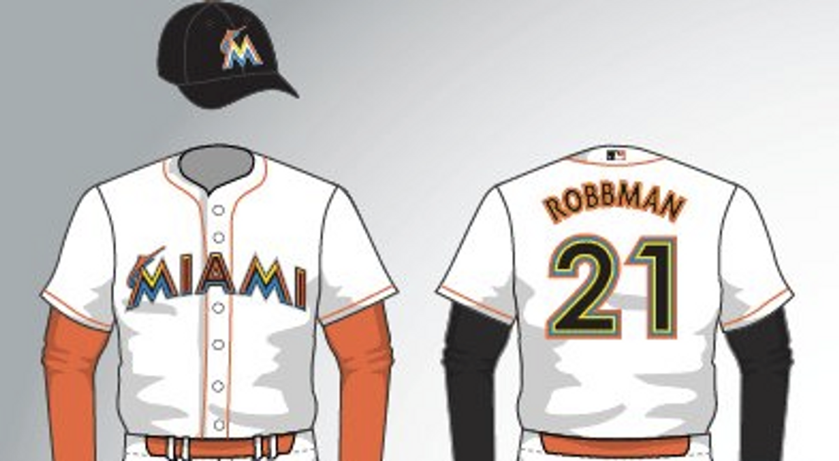
 Gone is the teal, silver and black color scheme the team has worn since its inception in 1993 (and in which it won two World Series), and in its place, as you can see, is a curious combination of oranges, yellows, blues and assorted other bright hues. Gone too is the detailed illustration of the eponymous fish, bursting around and through the logo with furious determination. Instead there is now a whimsical suggestion of a marlin swooshing from some unclear source out of the Aztec-influenced M letterform. Whatever its origin, one thing is sure: The overall effect is anything but intimidating.
In addition to the new logo and color scheme, new uniforms will also be revealed. Again, this look isn't certain to be the one unveiled on Thursday (and in light of all the backlash, it's entirely possible the Marlins' design team has gone back to the drawing board) but this is what has been floating around the ether and seems to make sense based on the logo. White home jerseys with black caps. Away grays with a radically out of place blue cap (that strangely echo the original Tampa Bay Devil Rays uniforms). And some assortment of combinations for Fridays and other games.


 Apparently the team's (and stadium's) colorful new look is meant to reflect the multicultural heritage of the many diverse ethnic groups living in the area. But you have to wonder if the Marlins' head honchos learned nothing from the atrocious Houston Astros uniforms of the mid-1970s (known as the "rainbow era") that made even Nolan Ryan and J.R. Richard, at left (two of the era's most dominating pitchers), look a tad sheepish.
Not to say orange is a bad choice for a sports team (the Giants, Orioles and Tigers pull it off pretty well), but it does require some tasteful design skill and a healthy grasp of workable color palettes.
Perhaps it's not the worst logo ever (for some ideas on that front click here); there are always the Chicago White Sox shorts and collared unis from the '80s to claim that distinction. But if this is indeed the look of the new Miami Marlins, my guess is it won't be around long.
Copyright F+W Media Inc. 2011.
Salon is proud to feature content from Imprint, the fastest-growing design community on the web. Brought to you by Print magazine, America's oldest and most trusted design voice, Imprint features some of the biggest names in the industry covering visual culture from every angle. Imprint advances and expands the design conversation, providing fresh daily content to the community (and now to salon.com!), sparking conversation, competition, criticism, and passion among its members.
Shares