Imprint

What I learned from a witch doctor

I thought I was drawn in by the dazzling product packaging, but I found I was looking for something more

  • more
    • All Share Services

What I learned from a witch doctor Justo Botánica on East 104th and Lexington, New York
This article originally appeared on Imprint.

ImprintThe only connection most people have to Santería is Ricky Ricardo pounding on the conga drum in old “I Love Lucy” reruns. “Babalú, Babalú Ayé,” chants Cuban icon Desi Arnaz, bow tie loosened. Four decades after my first “Lucy” episode, I have learned that Babalú Ayé is the name of the West African orisha, or intermediary between God and man, that translates to “Father, lord of the earth.” Ayé is renowned for the control he exercises over disease and healing, and he is among the most powerful deities in the African and Caribbean spiritual traditions. Babalú is not just a nostalgic TVLand reference. He is an essential figure in Santería.

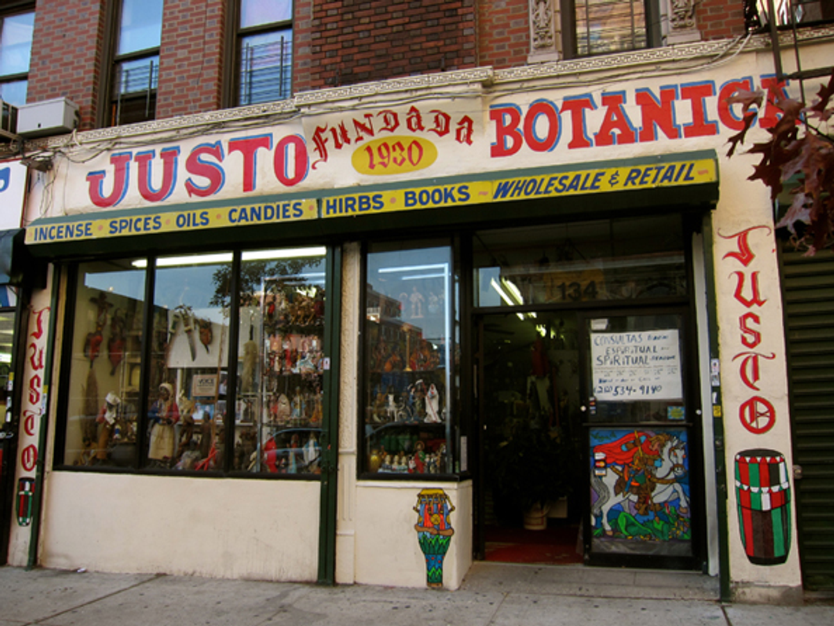
Santería is a belief system that blends the faiths of the African diaspora, Roman Catholicism and native Indian tradition. As African slaves were separated from their homelands and scattered through North America, they managed to retain aspects of their culture and traditions, and merged them with the belief systems of their new lands. The resulting faiths are still popular today, and widely practiced in Caribbean, African and Hispanic communities. The inexpensive fast luck candles found on the shelves of urban bodegas and grocery stores provide only a small glimpse into the world of contemporary folk and spiritual traditions. A visit to Justo Botánica on East 104th Street in New York City introduced me to a brand of faith based in part on spiritual products and their “alleged” mystical powers, as well as the wisdom and business savvy of their purveyors.

Justo Botánica

Justo Botánica on East 104th and Lexington, NYC

A botánica is a retail store that sells products often regarded as magical or alternative. Botánicas carry the scented oils, sprays, candles and incense that are used in rituals (or in my case, displayed like trophies on my shelves). My mother tells the story of her middle-class upbringing in Kingston, Jamaica, in the 1940s, when she dismissed the suggestion of using herbs to rid her older brother, Sydney, of rheumatic fever. Frustrated that the family doctor was unable to cure him, their maid, a poor woman from the Jamaican countryside, plunged Sydney into a concoction of roots pulled from the backyard. She instructed him to soak in the “bush bath” regularly for seven days. Sydney and my mother, just teenagers at the time, mocked the rural folk medicine the maid conjured. But a week later, Sydney was cured. When I mention Justo Botánica and its myriad of remedies, my now-elderly mother, a devout Catholic, cautions me not to scoff.

My man Jorge

Sixty-three-year-old Jorge Vargas is the owner of the cluttered Justo Botánica in Spanish Harlem, and he considers himself part pharmacist, part witch doctor. “I know my rituals,” Vargas says. “I can give an opinion. People come in for old-fashioned remedies.” Only minutes into my first visit to the shop, a customer asks for products to encourage hair growth. Vargas patiently pulls several items from the shelves behind the counter, and explains the sequence and number of days each product should be applied. But surprisingly, the majority of customers do not need instructions. “People come in and they know these things,” says Vargas. “They read and they buy.” While most arrive with shopping lists, they almost always look to Jorge Vargas for advice before final purchase.

“Tell the kids to pick five river rocks from the bottom of the water,” a young hospital worker in colorful scrubs instructs her husband by cellphone after a discussion with Vargas. “And can you get some water from the river and put it in a bottle?” The woman leaves with a small bag of carefully considered charms, and Vargas explains that customers create their own rituals. “People come in here in search of hope, as with any religion,” he says, and it’s his job to find or create the products that fit their specific needs. “People ask for things,” he continues, “and you remember the name and start making it.”

“You’ve got to be creative,” Vargas says. While suppliers from California to China provide materials to make some of Justo’s many ritual products, “It’s like the soaps you buy at the supermarket. The subtle differences make one product more desirable than another to a particular customer.” Varieties of soaps cover every need from the ubiquitous quest for romance to settling court cases. (Court-related products are particularly strong sellers.) “There are saints and rituals,” says Vargas, “incense, and of course, candles, which have always been popular. It’s called the Divine Light.” Black ritual candles are often used to subdue or destroy rivals and enemies, and are decorated with ominous skulls and blank spaces on which names of foes are to be inscribed. I purchase a black D.U.M.E. (“Death Unto My Enemies”) candle for fun, but am soon warned by my sister, a university professor, to dispose of it as quickly and as far from home as possible. I comply.

Candles manufactured by the Crusader Candle Co.

Candles manufactured by the Crusader Candle Co. in Brooklyn

While I was initially dazzled by the array of colorful candles that line the back walls of Justo Botánica, it’s the quirky homemade ritual products that have piqued my curiosity over time. “You take what you know from different sources and combine it to create a new product,” Vargas says, somewhat cryptically. I wonder if the community Justo serves can afford to spend money on herbal remedies and lottery books ― is this stuff legit? Over the course of the winter, and through the spring, I pay Vargas sometimes-weekly visits; ironically, after my hour of psychotherapy only a few blocks away. I realize that it doesn’t really matter if Justo’s spiritual merchandise is real or not. Vargas’ words stick with me: “People come in here in search of hope.” As it turns out, I am searching for hope, too, and am unwilling to discount the power of faith in anything that brings even a small measure of peace.

Bath products

I'll take two, please

Enter at your own risk

Floor washes, amulets and ritual baths are popular items at Justo, and the hand-crafted typography and line drawings on their packaging are both charming and true to the makeshift vibe of the shop. A recent computer-generated sign for spiritual readings is, thankfully, the only suggestion of digital technology to be found. And when Vargas proudly points it out to me, I ask for the old cardboard sign with its decorative yet earnest penmanship. I contact the new sign’s creator to make sure there are no future rebranding plans on the horizon. She is sweet and protective of Jorge Vargas, and while I don’t want to hurt her feelings, I find myself growing protective of him, too.

Some of Justo's homemade labels

Some of Justo's homemade labels

Vargas’ stepfather designed many of the original labels for items that are still produced by Justo, which first opened in the 1930s. Vargas continues to create packaging himself, using his own lettering, drawings, and photocopied engravings. He revels in the creative process and loses himself in designing Justo’s many bottle and jar labels. If a job is three colors, he redraws the art with the appropriate colored pens, and even has his own small press set up in the back of the shop to cut costs. Vargas still has original work created by his “daddy,” and pulls out a well-worn letter from 1945 requesting a copyright on a jinx removing alcohol. He becomes wistful as he recalls his father’s inability to secure the license. Vargas shows me tattered artwork for a poster of the seven orishas, a missed opportunity that he says his stepfather should have trademarked, along with many of the formulas and names of Justo’s ritual products.

Popular ritual baths

As I poke Vargas with more questions about the creation of the packaging I’ve now grown to love and collect, he brushes off my curiosity with a smile. He tells me that it’s not about the design; it’s about the beliefs. What am I looking for? What keeps drawing me back to the sweetly scented shop with its statues, beads and talismans? There is something about Jorge Vargas that inspires trust. Members of the community clearly see him as part of their extended families. I drag my sister and teenage niece up to Justo, and Vargas is endeared by my sibling’s fluent Spanish. She notices a small group of women waiting for spiritual readings; a service Vargas provides in a back room, and asks them in Spanish for the price. We are taken aback by the high cost of enlightenment.

“I do tarot card readings spiritually with all my guidance and all my spirits,” says Vargas. “It’s something that’s gifted.” I return a few weeks later on a quiet Monday morning determined to get my cards read. I am in the back room I’ve wondered about, and have paid $45 for what I’m calling my experiment. I leave an hour later, more than a little spooked. I feel Vargas has peered into the depths of my soul. “My cards are like seeing a story about you,” he tells me as he studies the colorful, oversize tarot cards. “You are trying to make a decision on the path that you have taken,” he says slowly. “There are thorns that you are trying to pull out of your heart. You are seeing new things that you can hold. There are good things that you will receive in your soul. You have come to see the spirit of lights to see what they see in the crystal ball.”

SCORPION S

My visits to Justo taper toward the end of the spring. Each time I stop by, Vargas asks how I am faring with the various issues we’d discussed during my reading, and says that we need to continue the conversation. I tell him that he’d actually freaked me out just a little, since he was talking about things that I knew I’d never mentioned before; topics that made my eyes well up with tears. He winks and tells me that’s his job.

Soap

Not developed by Jorge Vargas, but completely fascinating (soaps)

I stop in again after being unexpectedly laid up in the hospital in May, and tell Vargas that I am a bit unnerved by the experience. He gives me a hug. I disappear again and return in the summer, the proud instructor with her class of eager tourist typography designers. Vargas regales them with the stories he’d shared with me that past winter. He is a gracious host, allowing the class to take pictures, and answers the same questions he’s probably answered every time a group of curious strangers stop in to buy a funny candle. My group is courteous, respectful, and appreciative. They purchase souvenirs. I am thrilled to expose the class to a little snippet of New York City culture that they may never have witnessed otherwise. And then I disappear for a few more months, still uneasy about Vargas’ ability to read not just my mind, but what is in my heart.

I make my way back to Justo in late October, keenly aware of my long absence, and am greeted like an old friend. It’s Saturday morning this time, just after a rescheduled therapy appointment, and I’m figuring it’s now been a year since my first visit to 104th Street. Vargas tells me I look “juicy,” which is probably a polite way of telling me I’ve gained weight, though he says it’s the Puerto Rican version of looking healthy.

Roman Catholic Holy Water

Justo's version of Roman Catholic Holy Water

I ask Jorge Vargas for advice on how to proceed in the coming months, though I’m sure I’ll stop by again before it gets too cold. I’m feeling a little more confident than I did when we first met, and certainly less lost than when I had my tarot cards read. Things are beginning to fall into place since I left my job suddenly late last fall, though the pace often feels glacial. “Well, my lady, you are researching,” Vargas says. “There’s a lot of good energy in what you’re writing. It is an energy that you will create into a book. Why? Because people are always seeking. If you write something, you will be of service. That’s your job. You have a life, but that’s up to you. If you stay in one position, you’ll get stuck. You have to find something you feel good with, or else you’ll just be by yourself with all your pressure. You have to make sure that you have your moment. But it’s up to you to make the move. If it goes sour, it doesn’t matter because you still got something out of it. You have to have an open mind.” Vargas kisses my hand and I leave Justo Botánica with two small bottles of Happiness Oil.

My new favorite thing ever

Wash away evil

Go away, evil!!

Gotta love this...

Copyright F+W Media Inc. 2011.

Salon is proud to feature content from Imprint, the fastest-growing design community on the web. Brought to you by Print magazine, America’s oldest and most trusted design voice, Imprint features some of the biggest names in the industry covering visual culture from every angle. Imprint advances and expands the design conversation, providing fresh daily content to the community (and now to salon.com!), sparking conversation, competition, criticism, and passion among its members.

Our bodies, our products

A look back at the long tradition of creating memorable trade characters from the objects they sell

  • more
    • All Share Services

Our bodies, our products
This article originally appeared on Imprint.

ImprintI bet many of you don’t know what the Michelin Man, also known as the Bibendum, is made of. Take a wild guess! French cartoonist Marius Rossillon, also known as O’Galop, created the prototype for a Munich brewery (he was holding a glass of beer and quoting Horace’s phrase “Nunc est bibendum” — now’s the time to drink). It was rejected. But the Michelin brothers saw the image and suggested replacing O’Galop’s man with a figure made — yes indeed — from tires. Voila! The Bibendum is now one of the world’s most recognized and collected trademarks in the world.

Concocting trade characters from the products or the things they represent derives from a long tradition — dating back to medieval trade markings and up through the golden age in the early 20th century (and beyond).

French designers were indeed quite fond of playful mnemonic manipulation, as the examples here for steel wool cleaners, pots and pans, teas and coffees from the 1920s and ’30s attest. The characters are quite surreal yet none so abstract that the message is lost. Made from the packages or from the products themselves, these characters are not as cuddly as Speedy Alka Seltzer or the Mt. Olive Pickle man, but they do have an artful presence and charm.

Continue Reading Close

When nuclear terror reigned

Old handbooks about atomic annihilation allow a fascinating glimpse into some of our greatest fears

  • more
    • All Share Services

When nuclear terror reigned
This article originally appeared on Imprint.

ImprintEngland has a long tradition of dystopian prophecy in literature and cinema. The likes of H.G. Wells, George Orwell, J.G. Ballard, and Ridley Scott all seem to revel in presenting doomsday scenarios. Films such as 1961′s “The Day the Earth Caught Fire,” and the 1965 BBC docudrama “The War Game,” depicting a Soviet nuclear strike on England, as well as books like Raymond Briggs’ “When the Wind Blows,” a deceivingly innocent tale of untold horror, are among the works that underscore the British fascination with and fixation on nuclear devastation.

Fascination? More like well-earned trepidation. After all, during World War II, London was blitzed nightly by German bombs and rockets, its citizenry enduring what most civilized beings could barely imagine. If Hitler had developed the atomic bomb, England would have suffered the same fate as Hiroshima and Nagasaki.

England was forced to develop a sophisticated civil-defense apparatus, which included publishing cautionary guides like this handbook “Advising The Householder on Protection Against Nuclear Attack.” With the same kind of low-key narrative that a “householder” might read on how to survive a bug or rodent infestation, this “training publication for the civil defense, the police and fire services” addresses protective measures, needed equipment, what to do after an attack, and how to “manage” life “under fall-out conditions.” The text is reservedly quaint, underplaying the tragic impact of nuclear war, and the illustrations lack the slightest hint of horror. Indeed, by Jove, it is actually kind of comforting.

Similar handbooks in the United States were shrill by comparison. While they suggested that survival was possible, the magnitude of a nuclear attack was never minimized.

This handbook was republished by the V&A in 2008—for what purpose, other than nostalgia, is unclear. I reproduce it here as a curio from a time when our biggest enemy was the Soviet Union. With all the natural and man-made potential catastrophes at our doorstep, one almost longs for those days.

Continue Reading Close

Illustrating the ’60s music revolution

How one book captured the spirit and art of the cultural transformation -- as it was happening

  • more
    • All Share Services

Illustrating the '60s music revolution
This article originally appeared on Imprint.

Imprint“When did music become so important?” That’s Don Draper from last week’s “Mad Men,” set in 1966. Later in the episode he turns off “Tomorrow Never Knows,” from the Beatles album “Revolver,” and walks out of the room.

art: Rick Griffin

There’s something happening here, but you don’t know what it is — do you, Mr. Draper? One year later, Rolling Stone magazine will make its debut, followed soon by “Rock and Other Four Letter Words.”

“Rock,” a 250-plus-page Bantam paperback, was published in January 1968 and subtitled “Music of the Electric Generation.” It was one of the first books of its kind, chronicling a cultural revolution that was still in the midst of its own creation. Crammed with black-and-white portraits of bands and musicians, it’s part oral history, part visual LSD trip. One of its fold-out spreads has an intricate, circuitlike diagram that connects over a hundred names, from the Butterfield Blues Band, the Beach Boys, and the Byrds to Busby Berkeley, Brubeck and Bach.

The editor-designer was a writer named J Marks. The photographer for most of the images was Linda Eastman, who went on to work for Rolling Stone and — oh, yes — marry Paul McCartney.

By the sheer force of its graphic presentation, ”Rock and Other Four Letter Words” conveys the mid-1960s music scene’s spirit, vitality and relevance.


Continue Reading Close

How to resurrect a comic book

Should revived comics be made to look new or faded? Two releases explore both approaches

  • more
    • All Share Services

How to resurrect a comic book
This article originally appeared on Imprint.

ImprintMemory is evanescent. I can’t recall where I made the purchase; perhaps it was during an elementary-school or Cub Scout trip. Nor do I remember my exact age; it was anywhere between 8 and 10. What I do remember vividly is the visceral experience: the feel and smell of the paper as I unfurled it. The sense that I was both witnessing and experiencing history, which I then held tangibly in my hands. In the morning of that day, my mother had given me some small change for the day’s trip, and I spent it on a reproduction of the Declaration of Independence. It was printed on a rough-hewn, yellow paper stock with stains on both sides, and it had a rigidity that made it hard to open (it was folded in quarters). The reproduction possessed a distinct smell, and the texture was coarse, as if it was once damp and left to dry. “Onion paper,” my mother explained when I got home. It sounded exotic. Sadly, I’ve forgotten the whereabouts of that formative piece of paper, but the power of the experience has remained.

As I remember it. Every defect was a hidden treasure.

Around that same time my father came home with a present for me. It was a ream of blank newsprint paper. He was a transit worker, and he explained that someone had left it behind on the subway. For me it became a treasured gift, as the paper looked exactly like the paper of the comic books I so fervently read. With the paper as my narrative canvases, I began producing my own comics by the score: Dr. Sol, The Crusaders, The Saturator, Gas-Man! et al.

Page from The Saturator, created when I was 11. At long last, I could produce comic books that looked like comic books.

Cut forward to 2001 when I first began to go through the Woody Guthrie Archives, located in Manhattan, to explore whether it was possible to make a book of his artwork. (It was.) Peering through his drawings and journals, I had the same experience I had as a child, although this time the documents had authentically aged: The years had added a yellow patina to many of these pieces, despite the fact that they were stored in a climate-controlled environment. This was the first time I was confronted with the question of how best to reproduce this work. Does one attempt to imagine it as it was when originally created, with pristine white backgrounds and colors that have not yet faded? Or reveal it as it exists today, less vivid but with the stains of time present? Since the former was impossible to know, I came to the conclusion that only the latter made sense.

I experienced this again a few years later with Louis Armstrong’s collages, which he “laminated” with Scotch tape. With these collages there was no question about heading back in time—the dried tape was as much a part of the collages as every photo was.

Woody Guthrie’s journals gain gravitas with the patina of passing years.


In Armstrong’s collages, yellowing tape adds to the experience.

Which brings me back to comics. One of the first collections I ever purchased, in the 1980s, was Bill Blackbeard’s oversize “Smithsonian Collection of Newspaper Comics,” first published in 1977. Within the anthology, “Hogan’s Alley,” “Little Nemo in Slumberland,” “Gasoline Alley,” “Buster Brown,” and myriad others were lovingly and photographically reproduced with great detail on a paper stock closely akin to newsprint.

Imagine my surprise when I began to explore hardcover anthologies of comic books from DC and Marvel, released in the same era. “DC Archives” and “Marvel Masterworks” could not have been more different from Blackbeard’s groundbreaking accomplishment. They were garishly colored on high-gloss white stock; I had the sensation that I would need sunglasses to read them. I soon learned that since the original comics were unavailable—as were photostats—and the original artwork had been lost, destroyed, or scattered, the reproduction involved hiring present-day artists to trace and recolor the comics. The final effect was not so much of a black-and-white MGM classic colorized by Turner but rather like Gus Van Sant’s frame-by-frame remake of “Psycho,” starring Vince Vaughn as Norman Bates.

A page from Bill Blackbeard’s seminal work on newspaper comic strips, beautifully photographed in the pre-scanning days.


A side-by-side comparison of the original Fantastic Four #4 comic and a Marvel Masterworks “recreation.” Not only are the tracings inaccurate, the coloring does not adhere to the original.

The first time I became aware that change was in the air was when DC released “Jack Kirby’s Fourth World Omnibus, Vol. 1. “Here, an off-white paper replicated the look and feel (although happily not the fragility) of newsprint, and the line art was reproduced from the original stats. Fortunately, DC has employed this technique for other releases, although Marvel has opted for the strategy of tracing and reproducing on bright paper.

Smaller publishers like Fantagraphics followed Blackbeard’s lead, and since the advent of digital scanning, many others have chosen similar tacks: Abrams, IDW, Dark Horse, Titan, and Yoe Books all beautifully reproduce from the source. Still, two schools of thought have emerged about how best to achieve an optimum reading experience, both utilizing matte paper. One approach keeps the yellowing borders intact, while the other involves removing the borders and enhancing the colors, as if the comics had originally been printed on white, higher quality stock.

The DC release Jack Kirby’s Fourth World Omnibus, Vol. 1, successfully replicates the look and feel of the original comics.

In the next month, two books of comics reprints I’ve edited will be released, showcasing both techniques. “Golden Age Western Comics,” published by powerHouse Books, reproduces the original pages whole cloth, although the blacks and colors have been enhanced to replicate how they would have appeared before fading. In addition, we made minor touch-ups. Up until this point, this generally would have been my preference, as I prefer the viewing experience to be as close to reading a 60-year-old comic as possible; these comics were never printed on white paper to begin with. However, Fantagraphics has removed the borders and all signs of aging on our Mort Meskin book of reprint stories, “Out of the Shadows.” Comparing the two releases, I’ve come to appreciate the advantages of both approaches. As a genre, Westerns are mired in nostalgia, having long since been replaced by other action tropes in modern-day entertainment. With that in mind, a book as object set in a distant time and place seems appropriate. For the Mort Meskin collection, we hoped that a contemporary audience would rediscover him; Fantagraphic’s fresh, newly minted approach goes a long way toward achieving that.

A page from Golden Age Western Comics, published by powerHouse.

A page from Out of the Shadows, released by Fantagraphics.

Continue Reading Close

Steven Brower is a graphic designer, writer and educator and the former Creative Director/ Art Director of Print. He is the author/designer of books on Louis Armstrong, Mort Meskin, Woody Guthrie and the history of mass-market paperbacks. He is Director of the “Get Your Masters with the Masters” low residency MFA program for educators and working professionals at Marywood University in Scranton, Pa. @stevenianbrower

Donny Osmond: Design icon

In the1970s, teen magazines were my obsession -- and inspired my love of design

  • more
    • All Share Services

Donny Osmond: Design icon
This article originally appeared on Imprint.

Before there was a Justin Bieber — before there was even a Justin Timberlake — there was Donny Osmond. One summer night in the 1970s, my poor older brother, Mike, was forced to take his preteen sisters to see Donny and those other Osmonds, as well as the Jackson 5, at New York’s Madison Square Garden.

ImprintImagine the stress of worrying about two adolescent girls and their obligatory mutual friend dancing their way down from the cheap seats to the slightly better view one section below. Mike was in college, and my sister and I weren’t even in high school yet. I guess that’s why our brother sat ducked down in his seat, hiding behind a newspaper.

16 was my first magazine subscription, though I never got to send away for any of the groovy posters or luv kits. 16 and Spec were essentially the same publication, but the idea of reading a magazine called 16 made me feel older—you know, more mature.

Gloria Stavers was 16 magazine in the early 1970s. She met its owner, Jacques Chambrun, in 1958 and signed on as office staff for the nascent publication. She checked reader mail and fulfilled subscriptions, all the while studying young readers’ needs. She soon made a name for herself in the entertainment industry with her list of questions compiled from the typical queries the magazine received — “40 Intimate Questions.” By late 1958, Chambrun named Stavers editor in chief of 16. The writer Dave Marsh calls her the “first real pop journalist.”

Stavers published teen idols’ loves ’n’ hates, baby pix, and wonderfully whitewashed life stories. There was no sex to speak of, though there was an implied — and completely benign — sexiness in some of the feature titles (“What I Do After Dark!”). The stories were upbeat, and the stars didn’t have things like drug or alcohol problems. There were lots of exclamation marks and no sordid scandals. And ohhhh, the pinups that were carefully removed from the center of the book and taped to my bedroom walls …

The 16 mag (always mag, never magazine) of my childhood asked squealing preteens to choose between Donny, David, and Michael. Though I did like David Cassidy and his groovy hair, and enjoyed a little Donny from time to time, my heart ultimately belonged to Michael Jackson. He seemed like a shy guy, which was intriguing, and Michael didn’t get quite as much magazine real estate as Donny. I always rooted for the underdog, even back in 1973.

I was past my teen-mag expiration date by the time Andy and David Williams and Shaun Cassidy became fave raves. And I never quite understood the appeal of Randy Mantooth or Rick Springfield, though I always had a huge crush on Scott Jacoby.

1970s-era Spec and 16 inspired my love of publication design. Looking back, of course, they’re both pretty cheesy but also charming and unself-conscious with their rub-down type and Chartpak rules. The colors! The illustrations!

These are my teen mags, by the way, not eBay purchases—though admittedly, I’ve been seriously tempted…

Number one fan:


Continue Reading Close

Page 1 of 47 in Imprint