
 As pedestrians meander swiftly through urban grids, confronting billboards, scrolling through incoming texts and saturated Twitter feeds simultaneously, London-based designer Amandine Alessandra demands that they pause … with the use of typography.
Eager to step away from digital fonts and ubiquitous desktop publishing software, Alessandra frequently turns to the urban environment, found objects and the human body as a resource for typography. She calls herself a live-type maker. “I have nothing against computers. I use lots of programs and I'm not saying one shouldn’t use them,” she explains, “I just think it’s nice to question your tools.” Alessandra’s typographic work not only challenges her viewers to consider the tools they use to communicate, but to be open minded about what letters could look like. Distorted by low-tech and unrefined methods of construction, each letter designed by Alessandra depends on the reader’s imagination for interpretation. “It’s accepting that if it looks vaguely like an A, it can be an A,” Alessandra states. “I think it’s a very postmodern approach to typography.”


Inviting her audience to think and look more closely at the letterforms has been an ongoing goal in Alessandra’s work. Her latest project Dance With Me utilizes long exposure photography to capture letterforms created by micro-choreographed movements. Clothed entirely in black, each dancer uses quick short motions to draw a letter in the air with their hands. Each letter is a ghosted silhouette – the result of repetitive movement accumulated in a single static image. Coming from a background of photography, Alessandra prefers to use long exposure or stop motion over video to capture movement. “I find that video is quite difficult to share. Because you really take a lot of people’s time, even if it’s 10 seconds. People have very, very low attention these days.”

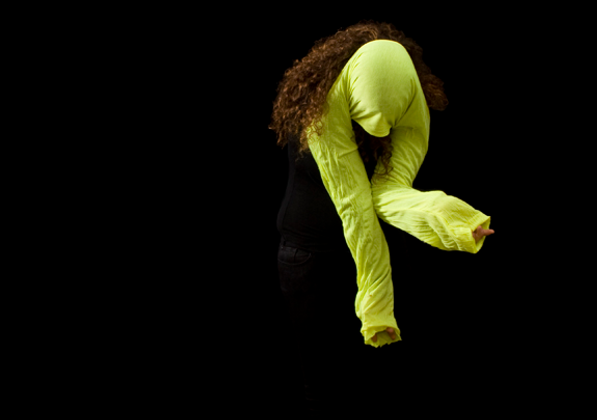
Sharing is an important aspect to Alessandra, therefore she often tries to organize performances in public spaces, stopping people in their tracks with her typographic installations. In 2010, as the final project for her master's at London College of Communication, Alessandra orchestrated an assembly of eight people to mimic a real-time digital clock in Liverpool Street Station. Dressed in black and a lime green bolero, performers bent their arms and torsos to act out the numbers. Even amid the rush hour crowds on a Friday evening, the group was able to attract curiosity from passersby. “Some people thought we were selling something, so they were trying to understand what the advertising was for,” Alessandra recalls.
In an earlier iteration of the same project, Alessandra had her performers occupy the crossing at Abbey Road, and spell out words such as "wait," "pause" and "hold" in front of oncoming cars. She compares the Letterform for the Ephemeral project to guerrilla advertising or an analog tweet, as it allows her to disperse short messages at a very large scale without it being illegal. “It’s a bit like graffiti,” she says, “but it doesn’t damage anything.”

Alessandra draws inspiration for her activist typographic performances from a photograph of a student protest in May 1968, documented in Massin’s Letter and Image. Wearing big paper boxes with a letter written on each, the students gathered to spell something together. “If one of them was to be missing, the work wouldn’t mean anything anymore,” says Alessandra, who sees great value in collaboration and tries to use her work to facilitate collective experiences. “The idea of this typography was to question things, to question the passing of time, and to question how we can need each other to spread a message.” Her work draws attention and interaction, serving as social commentary of the current culture of speed.

At the time of her experimentation, Alessandra’s peers at school were skeptical her work would find any commercial application despite its visual appeal. But Euro RSCG Lisbon quickly reused her wearable letterforms for the launch of the site Optimus Kanguru, appropriating the bolero with bright colors. Alessandra’s use of the human form has appeared in numerous publications and her low-tech yet engaging work has caught the attention of many designers. Despite the abundance of media messages and overwhelming information we receive every day, it seems Amandine Alessandra is a success in provoking us to pause for thought.
**All images courtesy of Amandine Alessandra
Copyright F+W Media Inc. 2011.
Salon is proud to feature content from Imprint, the fastest-growing design community on the web. Brought to you by Print magazine, America's oldest and most trusted design voice, Imprint features some of the biggest names in the industry covering visual culture from every angle. Imprint advances and expands the design conversation, providing fresh daily content to the community (and now to salon.com!), sparking conversation, competition, criticism, and passion among its members.
Shares