
 Directors Jason Cohn and Bill Jersey have recently produced another design documentary that easily deserves a spot on the shelf next to Gary Hustwit's trilogy, "Helvetica," "Objectified" and "Urbanized." Now screening at independent theaters around the country, "Charles & Ray Eames: The Architect and the Painter" provides fresh insight into the personal lives of the couple behind the iconic chairs. While best known for their modernist furniture, the Eames also dabbled in a variety of other creative mediums, including film and exhibition design. As Cohn argues in a recent interview I did with him, the Eames were ahead of their time in their almost contemporary approach to self-promotion and branding. “When you were buying a piece of Eames furniture, you were buying a little bit of that joie de vivre, the free and easy California lifestyle, that Charles and Ray represented to a generation of people,” he says.
The "Eames" film, which came out last month, recently debuted on PBS's American Masters series, and can currently be viewed online on the PBS website. The DVD, which features nine extra scenes, can also be purchased from First Run Features.

What made you decide to do a documentary on the Eames?
I had a personal affinity for them, but I didn't have a design background at all. I didn't have hip parents who had a lot of Eames furniture in the house or anything like that. Their films have a cachet among a certain subculture of film geeks. You know, the kinds of guys who work at video stores and either live with their parents for the rest of their lives or become Quentin Tarantino. You always see their videos under "Staff Picks." I think I was introduced to the films through a friend when I was in graduate school at Berkeley. I thought their films are very personal for how beautiful and different they are. They made me curious: What kind of people make films like this? These are not the kinds of films you'd make for commercial purposes, but they weren't art films either.
One of the things I noticed early in the film was that you were telling not just the story of their design but also the story of their lives as designers and their creative process. How did you strike the balance between telling the story of their romance, which wasn't always as rosy as it first might appear, and creating a truthful account?
If you're writing a script for a romantic comedy, you get to fit it into a happy arc. But this is real life. And it wasn't that happy in terms of their relationship at the end. I was a little bit self-conscious about that. There is so much success throughout the course of their career but towards the end of their lives you get the feeling there was a certain amount of disillusionment and disappointment in their relationship and that their marriage wasn't what it had been. And Charles' other relationships certainly took a toll on theirs. But on the other hand, there is also something uplifting in it. They weathered it. They loved each other very much until the very end. They came up with a very adult, mature way of living with a less than perfect relationship. Their family mattered to them and their work mattered to them and they continued to work with each until the very end. I think they made certain sacrifices for things that really mattered to them. In the end, it's not a romantic comedy. In the real world, that's still a pretty good ending.

Can you talk a little bit about how you put the film together?
We had this access to all of that material, which includes 100 completed films and hundreds of thousands of photographs. We could only realistically manage to get our grubby little hands on a small fraction of it. Almost everything at the Eames Office is at the Library of Congress, but sometimes we found it easier just to get it from the Eames Office. They knew where stuff was. At the Library of Congress, it's an important collection but it's one of a million important collections.
One story that I love to tell is the one about how Charles' grandson, Eames Dimitrios, goaded us into doing way more work than we had intended. He encouraged us to find the very best examples of prints of the Eames films. So we got the part where we were ready to finish the film, and we had acquired prints of films like "Powers of Ten" and "Tops." We had done transfers off of 16 mm prints that were held in various archives. For most documentaries done for PBS, these would have been fantastic prints. Typically for documentary film, you're just happy to be able to get your hands on something that is relatively clean. But Eames convinced us that it wasn't good enough to have something that was good enough. For a lot of people, this was going to be their introduction to these films and this was going to be the Eames film for at least a generation. In their essence are about beauty and you had to have the most beautiful prints of them. We shut down and put together a hit squad on the Library of Congress. We showed up there with three people and the LOC offered us three or four interns and we spent three days going through shelf after shelf of film canisters. We found what we believe are very likely the best examples of their 35 mm prints.
We also found some incredible photography from Wayne Miller whose images had been buried. We also came across some films that had been made about the Eames for public television, including the raw footage from a 1973 film so we were able to get ahold of never-been-seen interview footage of Charles and Ray.
We've added a lot of that stuff to the DVD extras because Charles and Ray didn't always have a very succinct way of talking. A lot of the stuff that we wanted to put in it would have taken them too long to get their thoughts out, but in a DVD extra you can just let them talk for two or three minutes. And that's when you really get a feeling for how they talked.

One of the things that struck me was the discussion in the film about how the Eames put together the film for the 1959 Kitchen Debate between Nixon and Khrushchev at the height of the Cold War. I didn't know they had been involved in that. Can you elaborate a little bit on what you found out about that?
What they were doing was pretty experimental. It wasn't the first multi-screen slide show, but they were still one of the first. It's not like they could outsource to some production company to figure out how to do it. They had to build that thing up from the ground up. It took them a long time to figure out how many screens to use and they settled on seven. They had to figure out the shape of the screen. Eventually they decided on this oval shape. For them, it was very much a design process, figuring out how to make the thing work and how to get the seven projectors to be all synced up at once with the music. So it was an experimental design process of trial and error.
In addition to introducing the Eames to people who may not be familiar with design, the film brought up another topic that is particularly relevant to those in the design industry and that was the issue of credit and the Eames office. That's an issue that modern designers and architects still face as you have the big names that become brands.
It was an issue in their time and it continues to be an issue. Unless we were just going to tell a completely hagiographic story with no blemishes whatsoever, we had to tell that. But my personal feeling is that it's just kind of the way that it is. If you have the guts to do what Charles and Ray did and start your own studio, then you can put your name on stuff.
There's a lot of he said/she said stories about what happened in the early years with Harry Bertoia and Herbert Matter. I think the source for a lot of the storytelling is Marilyn Neuhart, who wrote the two-volume book "The Story of Eames Furniture." She's been telling the story about how when the Eames plywood chair came out in 1946, a lot of people in the office believed they had a different relationship with Charles and role in the office than it turned out they actually did. They thought it was a co-op and they didn't think they were working for Charles Eames, but rather with Charles Eames. Bertoia thought he had made the most important breakthroughs in the chair, and there's documentation that goes both ways. In the end, it's way more detailed than we could get into in the film.
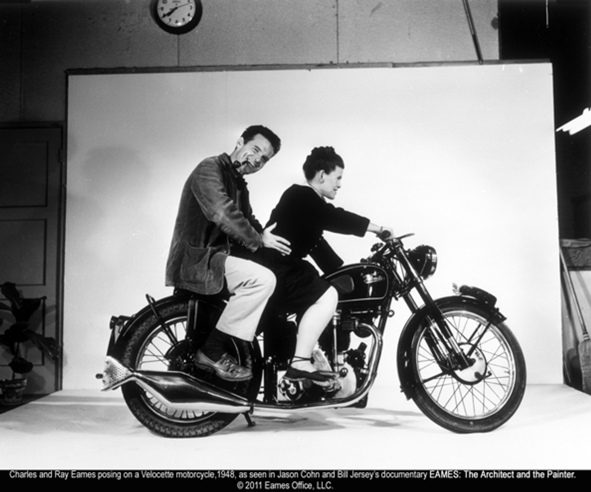
The point of talking about that story would be to say that Charles was extremely ambitious and maybe a little bit cutthroat in his career. I do think that it was important to him to build a strong brand. The way that he used the image of them as a couple to publicize and self-promote was far thinking. I think that he and Ray intuited that when you are selling a mass-produced item like a chair or an iPod, it's not quite enough to have something that is beautiful, works well and at the right price point. It helps when you can buy a tiny piece of the designer as well. Just like Steve Jobs did that with Apple, Ray and Charles did that with their furniture. When you were buying a piece of Eames furniture, you were buying a little bit of that joie de vivre, the free and easy California lifestyle, that Charles and Ray represented to a generation of people.

Do you have a favorite moment in the film?
It changes all the time but one scene that I've always loved is "Tops." I love that film and I love how (former Eames office designer) Jeannine Oppewall narrates that film. I love how it illustrates this idea of images serving as ideas, but I also like that we did the opposite and inserted words into it.
I think there's a kind of interesting duality in this idea of visual articulateness and verbal inarticulateness. I think that Ray and Charles were not always verbally articulate, but they were incredibly visually articulate. So I just love using that as an example of how they can express an idea so beautifully.
Are there any stories you wanted to include that you couldn't?
Holy crap man, it's unbelievable. There is so much stuff that the DVD has nine extra scenes that we cut from early versions of the film and there's easily another nine that we could have put in. Charles and Ray's early back story got cut so you don't know that Ray was from Sacramento and went to New York to go to a finishing school. You pick up on her when she's with painter Hans Hoffmann in the 1930s. You have no sense of Charles growing up in St. Louis or his first marriage. There is this really amazing story about Charles in St. Louis in the early 1930s at the height of the Depression. He had dropped out of architecture school so he wasn't very well equipped to make a living during the Depression. There wasn't a lot of work for architects anyway, so being an unlicensed architect in St. Louis at that time was kind of a drag. He basically deposited his wife and kids with her parents, and he took off on his own to Mexico in a beat-up old Model T. He traveled around Mexico for four or five months, just painting pictures, painting houses and doing odd jobs. It was during that period that he became interested in Mexican handcraft and folk art, which would have an impact on their later work and films like Day of the Dead. He also came back with a sense of himself and that he didn't need to make a lot of money. At least in the folklore of Charles Eames that's come down through the family, that's one of the most important stories.

In the film, you briefly touch upon how Ray emerged as the leader of the firm after Charles' death in 1978. Can you elaborate a little bit on that?
She maintained relationships with IBM and Herman Miller and work did continue at the office. I think she spent several years really grieving. Over time she sort of came out of that shell, and she started doing things that she had never done before, like speaking engagements. Whereas Charles had always been the one who was invited to go and give talks, Ray started to give the talks with slide shows. At first she was very tentative, but over time she became much more confident.
But she was in her 70s, and she considered her main job at that point in her life to secure the their legacy. They put together the book "The Story of Eames," which is an encyclopedia of everything they did together, with John and Marilyn Neuhart. I think that was a very combative relationship. I think Marilyn had a very different perspective on the Eames Office than Ray did, and an agenda that was the opposite of Ray's. They also had to try and organize and categorize all of that stuff for the Library of Congress. For an older woman who was grieving the death of her lifelong partner, I think that she had a lot on her plate.
What I think is significant and interesting, it's not so much what she did but what happened around her. Feminism eventually found its way to modernism and modernist scholarship, so people like design scholars Pat Kirkham and Joseph Giovannini started digging through Ray's trunk at the Library of Congress for evidence of what she brought to the partnership. It was a revision of history. There was a kind of revising upward of her status in the Eames Office. In the late 1970s through the '80s and '90s, she began to be seen as a co-equal of Charles whereas previously she hadn't been.

It made me think of the partnership between husband-and-wife architect team Alvar and Aino Aalto in Finland.
Pat Kirkham, a design scholar at Bard Graduate School in New York who wrote the first authorized biography of the Eames, just wrote a biography of Saul Bass and his wife, Elaine. She can probably tell you a list of 20 architects and designers where it's actually the same story: Elaine and Saul Bass; Robbin and Lucienne Day, who were Charles and Ray's contemporaries in England; and Le Corbusier and Charlotte Perriand, though I don't think they were ever involved romantically.
Have you become more interested in design since working on the documentary?
Yeah, within a limited range. I've become really interested in that period, in particular California design. I'm not a full-fledged design geek, but I'm enough of a furniture geek I can walk into a vintage shop and identify pieces from that era. I guess I'm on my way.
Do you want to do any more design documentaries?
I would love to. But I would only do design documentaries if I felt the designer had something to say. George Nelson, for instance. I feel like designers very often lead interesting lives and have a lot more to say than is immediately evident in looking at their products and designs, unless you really know how to read them as texts.
Do you own any Eames furniture?
I do. In fact, I'm sitting in an Eames chair right now.
See the trailer for the Eames movie and the video for Powers of Ten below:
Copyright F+W Media Inc. 2011.
Salon is proud to feature content from Imprint, the fastest-growing design community on the web. Brought to you by Print magazine, America's oldest and most trusted design voice, Imprint features some of the biggest names in the industry covering visual culture from every angle. Imprint advances and expands the design conversation, providing fresh daily content to the community (and now to salon.com!), sparking conversation, competition, criticism, and passion among its members.
Shares