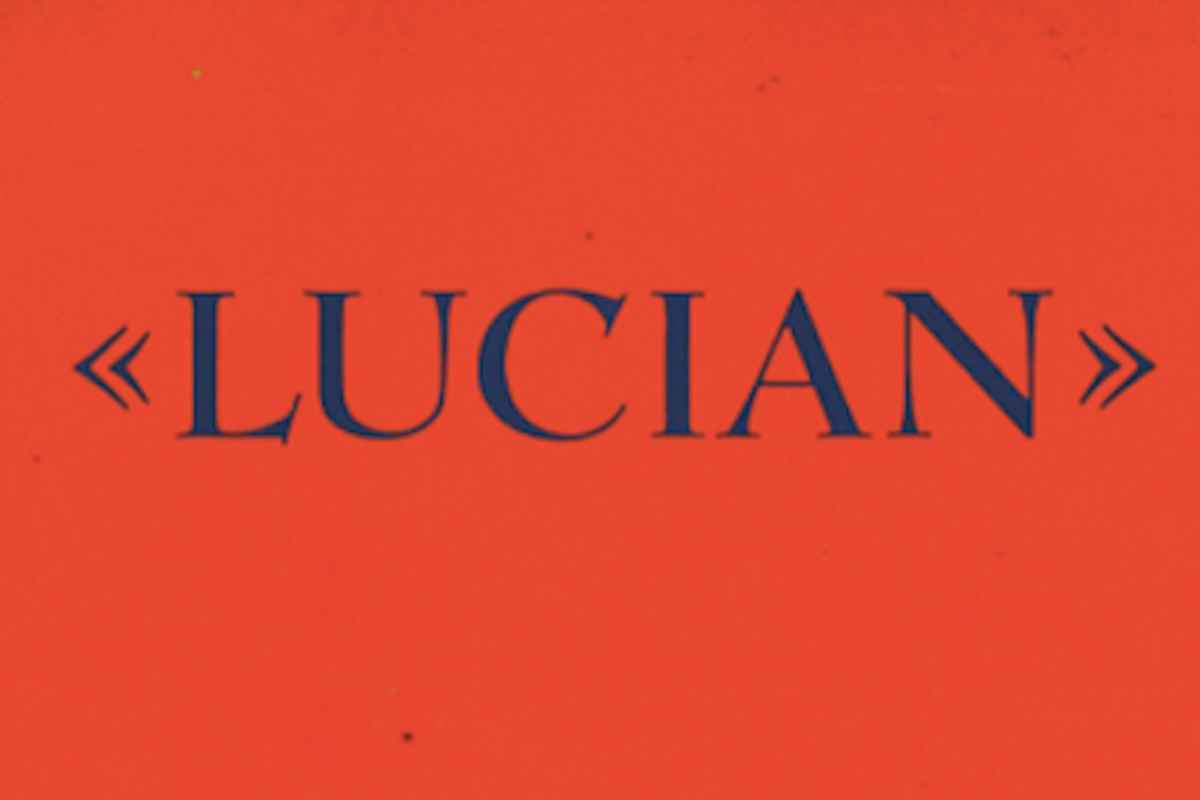

The Priester Match poster designed in 1906 by Lucian Bernhard is a watershed document of modern graphic design. Its composition is so stark and its colors so startling that it captures the viewer's eye in an instant. Before Preister, persuasive simplicity was a rare thing in most advertising: posters especially tended to be wordy and ornate. No one had yet heard of its young creator, who, thanks to this poster, was to influence the genre of advertising know as the Sachplakat, or object poster. Over the course of his career, which progressed from the turn of the century to the 1950s, Lucian Bernhard became a prolific designer not only of innovative posters but of trademarks, packaging, type, textiles, furniture and interior design. From his studio in New York City (he left Berlin in 1922), he developed some of the most recognizable American business advertising and trademarks, for such clients as Cat's Paw and ExLax, and Lucian Bernhard, the “inventor” of the sachplakat or object poster, designed more than 35 popular display typefaces, including many with his own name, like Bernhard Gothic and Lucian (the specimen sheet is above and below).
Bernhard's formative years (born in 1883) coincided with the explosion of Art Nouveau and Jugendstil. As a teenager, Bernhard visited Munich's Glaspalast, where he saw a major exhibition of European Art Nouveau applied arts, including the wildly colorful cabaret and theater posters of Jules Chéret, Toulouse-Lautrec and Alfonse Mucha. Also on view were maquettes for the economical advertising posters done by the famed Beggarstaffs, James Pryde and William Nicolson, which exerted a strong influence on the young Lucian's own poster making. Bernhard later said that he recalled “walking drunk with color” through this exhibit.
Though Munich was the center of the more “radical” German graphic arts, Bernhard decided to go to Berlin, where the wonders of industrial production and commercialism were manifest. Poster competitions were routinely sponsored by Berlin business establishments to identify new talent for the expanding advertising industry. One in particular, sponsored by the Priester Match Co., awarded 200 marks (then about $50) to the winner. Bernhard jumped at the opportunity, and with precious little time to produce his own entry, he made some instinctive design decisions, removing all but two matches and the brand name, Preister. The poster had major repercussions.
Bernhard capitalized on the Priester success. Although his subsequent designs were good, Bernhard never really surpassed Priester's serendipity in any of his other posters. He did, however, produce countless images for a range of different German (and later foreign) products. By the ripe old age of 23, he had become so sought after that he was compelled to open his own studio. Within 10 years his elegant new studio employed around 30 artists and their assistants. In 1920, he was made the first professor of poster art at the Berlin School of Arts and Crafts.
Bernhard also made inroads into German typography. When the formidable Berthold Type Foundry issued a “block” letter in 1910 that looked suspiciously like Bernhard's own poster lettering, he was force to seriously design his own alphabets to protect his inventions. In 1913 Bernhard's first typeface, Antiqua, was released by the Flinsch Foundry in Frankfurt; it was a good book face. He promised more but the Great War put a temporary halt to his output.
After the war, the avowedly apolitical Bernhard gladly accepted an invitation to come to the United States in 1922 for an unspecified time. Roy Latham, who ran a lithography firm near Albany, N.Y., proposed that Bernhard speak before various art directors' clubs in New York and elsewhere about advertising and logo design. Despite his poor mastery of English, Bernhard accepted. It was Latham's notion that Bernhard also be shuttled around the country to promote his own work and perhaps convince American art directors to consider modern design as an alternative to the overly rendered, often saccharine, painted illustration that represented American practice.
Bernhard had developed typefaces for Flisch and Bauer Type foundries in Germany, including a transitional bold brush script. He designed his first elegant script, Bernhard, in 1922 while traveling from Germany to New York on a steamship. In 1928 he joined forces with American Type Foundry, for whom he produced his family of gothics. He believed that sans serif type should not be used for text, once writing: “There is no doubt that the best type for continuous reading is the one in which schoolbooks, novels, and newspapers are printed: Garamond, Jenson, or Goudy Old Style.” Understanding that display faces were subject to the whims of fashion, however, he cluttered the market with new advertising faces.
Bernhard's life's work was made passé by changes in technology and style, but this extraordinarily prolific man left behind a significant body of work. If he were remembered only for creating the paradigm of 20th-century poster art, that alone would ensure his place in the history of graphic design.


Copyright F+W Media Inc. 2012.
Salon is proud to feature content from Imprint, the fastest-growing design community on the web. Brought to you by Print magazine, America's oldest and most trusted design voice, Imprint features some of the biggest names in the industry covering visual culture from every angle. Imprint advances and expands the design conversation, providing fresh daily content to the community (and now to salon.com!), sparking conversation, competition, criticism, and passion among its members.
Shares