Imprint

A passport to utopia

The satirical NSK State movement was founded in socialist Yugoslavia in 1984. It has now opened four embassies

This article originally appeared on Imprint.


ImprintA few years back (2003 to be exact) I wrote a story in Print on The NSK State, created in 1992 by the Slovene arts collective Neue Slowenische Kunst (NSK), which included the groups Laibach, IRWIN, Noordung, New Collectivism and the Department of Pure and Applied Philosophy. Their trope was needle-sharp parody of Communist and Fascist symbols and language.

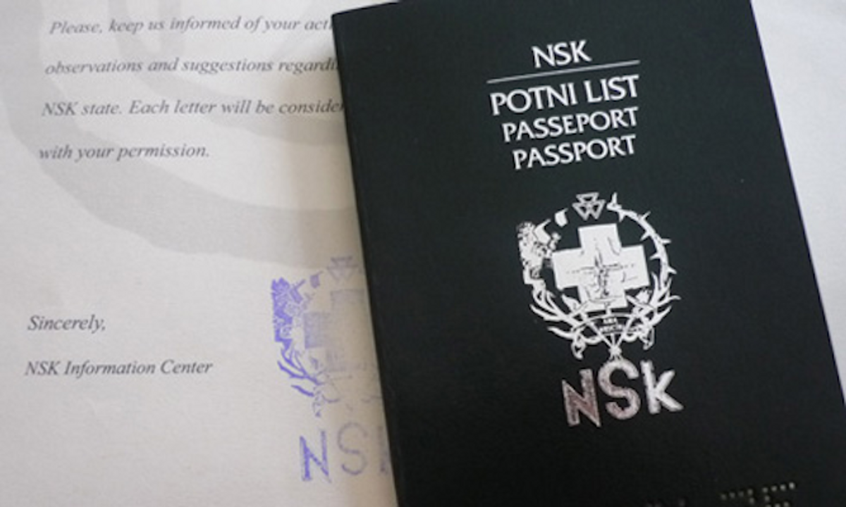
NSK was founded in Ljubljana in 1984 as socialist Yugoslavia began to return to prewar borders and age-old ethnic disputes. As an art and satire movement The NSK State is conceived as a utopia, which has no physical territory and is not identified with any existing national state. It is inherently transnational and describes itself as “the first global state of the universe.” It issues passports to anyone who is prepared to identify with its founding principles and citizenship is open to all regardless of national, sexual, religious or other status. It now has several thousand citizens across numerous countries and all continents.

The NSK State has opened temporary Embassy and Consulate events in  Moscow, Ghent, Berlin and Sarajevo. And earlier this month they issued passports at MoMA (Mezzanine, The Lewis B. and Dorothy Cullman Education and Research Building). MoMA states:

Organized in conjunction with the exhibition Print/Out, Print Studio is an interactive space that explores the evolution of artistic practices relating to the medium of print.

Originally founded by a collective of artists, musicians, and philosophers, the NSK State in Time (Neue Slowenische Kunst) came into being in 1992 shortly after Slovenia’s independence from the Yugoslavian federation. This declaration of existence was accompanied by the issuing of passports at various temporary embassies which operated alongside NSK exhibitions and events. Led by the Slovenian artists’ collective IRWIN, Print Studio will host IRWIN, NSK Passport Office, New York for three days and issue a limited number of passports. A concurrent series of presentations, discussions, screenings and a culminating NSK State Citizens’ Congress offers a forum to engage the public with ideas central to the NSK State and what it means to be a citizen of this state in time.

A limited number of passports will be printed during IRWIN’s NSK Passport Office, New York.

The “Time for a New State” billboard below is in Lagos where approximately 4000 citizens only have NSK passports (Thanks to Mirko Ilic).

Copyright F+W Media Inc. 2011.

Salon is proud to feature content from Imprint, the fastest-growing design community on the Web. Brought to you by Print magazine, America’s oldest and most trusted design voice, Imprint features some of the biggest names in the industry, covering visual culture from every angle. Imprint advances and expands the design conversation, providing fresh daily content to the community (and now to salon.com), sparking conversation, competition, criticism and passion among its members.

When text meets art

A new exhibition at the Museum of Modern Art highlights the meaning and mess of language

This article originally appeared on Imprint.

ImprintIn the exhibition “Ecstatic Alphabets/Heaps of Language,” which opened on Sunday at the Museum of Modern Art, words are treated as tools and as totems. Gathering text-based work by artists from Marcel Duchamp to Tauba Auerbach alongside contemporary designers like Paul Elliman and Dexter Sinister, the show offers varied takes on how to make meaning out of language, and also how to make a beautiful mess of it—sometimes at the same time.

A portion of Paul Elliman's Found Fount, at the Museum of Modern Art's "Ecstatic Alphabets/Heaps of Language"

The typographic theme runs through work by pillars of midcentury art (Lawrence Weiner, Robert Smithson) and contemporary design upstarts (like Experimental Jetset and Stuart Bailey and David Reinfurt, who collaborate as Dexter Sinister and produced the exhibition catalog—$5 in the MoMA gift shop and downloadable for free—as an issue of their magazine, Bulletins of the Serving Library). There’s also a bright thread of humor. Pick up one of three black telephones sitting on a shelf, and you’ll suddenly be on the line with Frank O’Hara or John Giorno or Robert Creeley, who generously recite a poem just for you (or in Allen Ginsberg’s case, chant incoherently in your ear).

Auerbach has some cheeky little ditties on display, including The Whole Alphabet (lowercase), a single piece of paper with all 26 letters typed one on top of the other in a formalist blur. Her other works are literal-minded jokes that use the expected physical form of the book as their punchlines: a 3,200-page RGB color test, for instance.

Cardboard scraps become letterforms in Elliman's Found Fount.

But the conceptual heart of the show, and the highlight, is Found Fount, by the London-based designer Paul Elliman. Elliman has long been experimenting with deconstructions of language and objects—creating alphabets from photobooth portraits, for example. Whereas some artists in the show disassemble language into its physical forms or turn it into sculptures drained of immediate linguistic meanings, Elliman conjures words from ordinary objects. “Dead Scissors,” for example, collects broken-off scissor handles that look like the letter P.

More of Found Fount's flotsam

Although Elliman has been gathering the pieces of Found Fount for 23 years, this is the first time the physical forms have been publicly on display. The show collects just a small sampling of the work, which still takes up a vast vitrine: cracked pieces of plastic, rusted metal U-rings, rhinestone-encrusted broaches, plastic beads, and cardboard cast-offs. The cardboard, mind you, has been not purposefully cut out into letterforms. Rather, they’re the random bits that are sometimes glued into folded boxes—the corners, wedges, and other pieces normally destined for the recycling bin. Here, however, they’re lovingly arranged and displayed on a black background under Plexiglas alongside Elliman’s other everyday wonders.

In Found Fount, silver hoop earrings become O's and lowercase g's

Tape dispensers and other plastic detritus in Found Fount

“Ecstatic Alphabets/Heaps of Language” runs through August 27. Paul Elliman will discuss his work on Wednesday, May 9, at 6 p.m.

Continue Reading Close

America’s road sign legends

Burma-Shave's rhyming ads turned highway billboards into poetry, and changed advertising -- and America

This article originally appeared on Imprint.

ImprintIn a simpler time, when automobiles went slower and the pre-Eisenhower highway system in the United States was less developed, there was a popular advertising campaign that ran from 1927 until 1963. It consisted of rhymed messages sequentially staked on the right side of the road, all ending with the advertiser’s name, “Burma-Shave.”

Examples of vintage Burma-Shave road signs, including a blue South Dakota version. (Ray Crockett photo)

These red ads (one state, South Dakota, insisted that they be dark blue to keep them from conflicting with the red reserved for warning notices) usually consisted of five signs. For example: “DON’T PASS CARS/ON CURVE OR HILL/IF THE COPS DON’T GET YOU/ MORTICIANS WILL/BURMA-SHAVE.”

Some slogans touted Burma-Shave as a pre-aerosol “brushless” shaving cream—a cream you could scoop out of a jar and lather onto your face without relying on an old-fashioned brush and moistened soap in a mug.


("Thoroly"? I guess if the word doesn't fit the composition, change the spelling. . .)

In 1925, Clinton Odell, a Minneapolis lawyer, took the liniment his father created and transformed it into a brushless shaving cream. He named his company Burma-Vita—Burma, because most of the essential oils in the liniment were from the Burmese portion of the Malay Peninsula, and Vita from the Latin for “life”: “Life from Burma.”

Some of Burma-Shave’s primary “brushless shaving cream” competitors were Barbasol and Noxema.

The company was sold to Philip Morris in 1963, and all the signs were removed soon thereafter. As a testament to the campaign’s cultural significance, a set of signs was donated to the Smithsonian, where it still resides. But the brand eventually petered out. After being sold yet again (this time to the American Safety Razor Company) and then reintroduced in 1997, it never regained a hold in the market.

A history of the Burma-Vita Company, written by Frank Rowsome Jr. and illustrated by Carl Rose, was published by the Stephen Greene Press in 1963.

By the early 1960's, the rising costs of road-sign maintenance (as well as new and more effective ways of advertising) sounded the death knell for the Burma-Shave signs.

The following pages from Frank Rowsome Jr.’s book list all the road-sign Burma-Shave phrases produced from 1927 to 1963.

Continue Reading Close

Secrets of the New Yorker cover

The venerable magazine's art editor talks about her choices -- and which cartoons were too provocative for print

This article originally appeared on Imprint.

ImprintFrançoise Mouly, the New Yorker’s art editor since 1993, doesn’t have normal relationships with the artists who draw the magazine’s covers. “Think of me as your priest,” she told one of them. Mouly, who co-founded the avant-garde comics anthology RAW with her husband, Art Spiegelman, asks the artists she works with—Barry Blitt, Christoph Niemann, Ana Juan, R. Crumb—not to hold back anything in their cover sketches. If that means the occasional pedophilia gag or Holocaust joke finds its way to her desk, she’s fine with that. Tasteless humor and failed setups are an essential part of the process. “Sometimes something is too provocative or too sexist or too racist,” Mouly says, “but it will inspire a line of thinking that will help develop an image that is publishable.”

Until recently, you would have had to visit Mouly’s office on the 20th floor of the Condé Nast building to see the rejected covers she keeps pinned to a wall. Now, some of those uninhibited outtakes have been collected in a new book, ”Blown Covers: New Yorker Covers You Were Never Meant to See” ($24.95, 128 pages), out now from Abrams. I talked to Mouly about the most incendiary sketches, the difficulty of publishing serious covers over Christmas, and why she heartily recommends listening to Rush Limbaugh.

Barry Blitt's illustration mocking terrorism fears was never used; the reference to Diet Coke and Mentos—a (very) low-level explosive combination—was deemed too obscure.

These early sketches of Blitt's idea, first with a pair of children and then with two businessmen (below), didn't work because they weren't specific enough.

What’s the process of deciding on a cover every week?

I’ve been the art editor for about 19 years, so I’ve been responsible for about 950 different published covers, and the process has been different for each one. But the general outline is that I set up a lineup every season of evergreen covers. So right now I’m talking to artists, soliciting ideas for Mother’s Day or spring or wedding or graduation.

And then there are timely political images or things that seem like the right idea at the right time—it can be a tsunami in Japan, but it can also simply be something that defines a time. Right now, one of the things I’m talking to artists about is the Republicans’ war on women. There’s not a specific moment for this, but it’s a subtext that’s in the air. Recently we did an image around the Republican primaries that involved a dog on top of a car, and that certainly was timely.

When we have something like that, then we are poised to upset the apple cart, and that can be turned around in as little as 24 hours. I’m in a constant conversation since I’m not commissioning or assigning any specific ideas. I’m not calling up artists and saying, “We need you to illustrate the war on women,” or whatever. We seldom have illustrations of cover stories on our covers. So we are dependent. What I’m really looking for are ideas that come from the artists on topics that will give us a sign of the era that we live in and, as a collection of images, will collect a picture of our time.

In the wake of the 1997 assault of Abner Louima, a Haitian immigrant, by white NYPD officers, Harry Bliss sketched then-Mayor Rudy Giuliani's paranoid psyche.

When I started, I didn’t know much about the New Yorker. I went to the library, and I looked at the storytelling images of the early days of the New Yorker—Peter Arno, Rea Irvin—and it did paint a portrait of the times, of what urban sophisticates chuckled at and attitudes, prejudices. That’s really not just the subtext but the text. That’s what we’re trying to capture—mannerisms as well as the way people dress and so on. I think you can get a very nuanced portrait of the society in images, because they talk about emotions beyond rationalization. So that’s what I try to orchestrate, but the artists have to come up with their own individual idea, like a little visual story, without being able to use words. And that’s a very specific task. There are not too many other venues for that. So I have to say, “Stop what you’re doing, and sit down at your drawing table, and come up with ideas.”

Christoph Niemann's 2003 sketch played on widespread anti-French sentiments in the U.S. in the run-up to the invasion of Iraq.

How many sketches do you receive from your regular contributors?

It depends. I don’t have any set way of doing it. Bob Mankoff, the cartoon editor, says that he wants to get a batch of 15 ideas. So he’s more systematic.

He also sets a specific day of the week for the cartoonists to come in person.

And he has minimum requirements. I search around, and I’m in a dialogue. Sometimes people send me one image. And what I say to the artists is, “Don’t edit for what you think will work.” If a sketch is on my wall, it’s not necessarily either accepted or rejected. It’s not like a line, and on the left is all the stuff that got rejected. It’s actually all the building blocks of having the right image at the right time. And many of the images that are published started out in sketches months and sometimes years before they were used—even the timely ones, because we are a weekly magazine, and we can only publish one cover a week. Sometimes something is too provocative or too sexist or too racist, but it will inspire a line of thinking that will help develop an image that is publishable.

In this rejected Barry Blitt sketch from 2002, Osama Bin Laden appraises proposed designs for the World Trade Center site.

What’s the most common reason why a piece may be great on its own but not work as the cover of the magazine?

Logistics. There have been some terrific images, and then we were out with a double issue that week and we couldn’t publish them. Or because the idea came in on a Friday and we had already published our cover. We are a weekly magazine, so the printing process finalizes something that is a constant flux. So I’d say logistics is usually the number one thing that narrows it down. And good taste would be the next one. Because everything needs to be approved by the editor of the magazine, David Remnick, who has final say on everything that gets published. But when I have the artists send stuff to me, I’m not necessarily going to show everything to David. I said to Anita Kunz, “Think of me as your priest. You can tell me all.”

Art Spiegelman reworked Norman Rockwell's painting "Freedom from Want" to highlight anti-Muslim violence in the fall of 2011.

What’s one thing that will never make it past David Remnick?

I don’t think that way. I encourage the artist to be uninhibited, because that is the sine qua non condition to try to make me laugh. And I mentioned in the book, Barry Blitt is really good at being uninhibited. He’s kind of a genius that way. My god, this guy thinks in doodling. There’s no editor in between the idea that he has and the idea that he commits to paper. But that’s a hard job to do—to not fear. It really is difficult to keep that spontaneity of thinking. But that’s because there’s no penalty. He’s not going to embarrass himself. He’s going to make me laugh, and it stays between us. This is similar to comedy writers who lock themselves up in a room. They’ll make a number of really bad-taste jokes, and the sexist and racist stuff is the least of it. They’ll really go off the deep end. And then that will actually unearth something that can be used.

An image like the terrorist fist bump, by Barry Blitt, which we published to such outcry, was talking about the unmentionables, the innuendos. There were a lot of allegations about candidate Obama being a Muslim, and that stuff was insidious because they were not saying it aloud, but they had no compunction. And all that the artist did here is visualize what people were insinuating, and sneaking in through the crack. Think of it as an inoculation, a way to actually use a drop of the poison in a controlled way. It’s very brave on the part of the artist to spend hours listening to Rush Limbaugh, for example—as Barry Blitt has done—because it’s a fascinating portrayal of America. It’s not useful to just say, “He’s a bad fat asshole,” and shield yourself from this, because you’ll only preach to the converted if you’re not listening to what’s being said.

Richard McGuire's waterboarding scene, painted after news came out of torture at Abu Ghraib, was inspired by Old Master paintings of Christ.

Is the fist-bump cover the one that has caused the greatest uproar?

We got a lot of flack in 1996 when we published a cover, also by Barry Blitt, of two sailors kissing in Times Square. And that was a parody of the Eisenstaedt photograph. This is pre-Internet, and people wrote letters to the editors. And in 1994 we broke a long tradition of Eustace Tilly by Rea Irvin being republished in February of every year, and we published an image by Robert Crumb. We got hundreds if not thousands of letters, but they were in the mail. What Barry said was, in 1996, if there had been the Internet, probably there would have been just as much of a reaction. The Internet amplifies the visceral reaction. And one of the ways we know that is, we are the New Yorker, but New York magazine got thousands of emails of people protesting the cover. Because New York, New Yorker—who knows? They just knew there was some cover they didn’t like. Some of them might not even have seen it. The Web allows for two things: for images to spread virally, and also for negative comments.

Anita Kunz’s drawing of Monica Lewinsky with a lollipop—why was that rejected?

We had already run an image on the topic, and we did not anticipate at the time how salacious the discourse was to become. It took us by surprise; we didn’t expect that the New York Times would have the word blow  job on the front page day after day after day after day. Often the artists know—because they actually are paying attention to stuff that’s in the air, they are so often ahead of their time.

Anita Kunz suggested that her sketch of Monica Lewinsky sucking a lollipop, made in 1998 during the White House sex scandal, "could be drawn in crayon, very child-like."

Your husband, Art Spiegelman, drew a picture of Santa Claus urinating in the shape of a Christmas tree. Why didn’t that pass editorial muster?

The editor at the time was Tina Brown, and she loved Art’s images. That’s really what started it all—the Hasidic man kissing a black woman, referencing Crown Heights. That’s the kind of image that she really liked. But Christmas is a difficult period for a magazine editor to do something provocative because somewhere in the back of people’s minds is “It’s a time to be jolly!” I know because around that time, I was actually preparing a cover story, one where we tied in the cover image to the article inside. This was a Mark Danner piece on the massacre in El Mozote, in El Salvador. And to do a cover image on the massacre—it’s like, “But not at Christmas time!” It still did run in December.

But to actually say to the whole wide world that Santa Claus doesn’t exist, that was getting a lot of editors unhappy—that we were willing to demystify Christmas. At the time, there were a lot of longtime New Yorker editors who were not necessarily that thrilled with the attention that the covers were getting. So in general there was a lot of opposition. And for that image, they were saying that it was provocation for the sake of provocation. Now, I actually don’t think so, and Art was very articulate about this and was explaining, “No, this is making a point. It’s not just a pee-pee joke for the sake of, like, ‘Ooh, ooh, isn’t pee-pee funny!’” It had to do with the obscenity of the merchandising around Christmas time. We’re talking about the early ’90s, when there are people homeless in the street—the inequality is contradicted by the over-merchandising Christmas. And then a suggestion was made to him: “Maybe it’s OK if it doesn’t mention the homeless.” And to him, that was really provocation for the sake of it. Later on we ended up publishing a crucified bunny rabbit, but that was Easter, not Christmas.

When The New Yorker passed on this Art Spiegelman sketch from 1993, he and Mouly used it as their Christmas card instead.

As you’ve been putting together the book over the last year or two, have you come across anything that you regretted rejecting?

There’s one of Sarah Palin brushing up on her books, preparing for her candidacy. I held that one for the last minute, because I was hoping and hoping and hoping that she would run. I really believed that we could publish it as a cover of the New Yorker. And when I realized that she prefers tweeting, I thought, well, I really would like to see that image in print. It’s wonderful, and it’s in the book.

Barry Blitt drew candidate Palin brushing up on her political reading.

Before the publication of the book, there was some back and forth with David Remnick about opening the door to that closed room and even discussing these things, because it’s not a very New Yorker-y thing to do. And there are issues with doing it. One could have to do with demystifying, making the process more predictable. But I actually think that it’s so rich and so interesting that it’s actually even more interesting if you have a sense of how the images are thought about, rather than less. It doesn’t explain anything because it still is genius when somebody gets the right idea.

And the other had to do with the fine line between what does get published and what doesn’t, because we publish so many provocative images. It seems to open itself up to second-guessing. But on that front, this will encourage more artists to take more chances, even the artists I’m already working with. I’m seeing it already. They are less afraid about wasting their effort on something that won’t get published. It’s encouraging more people to think more often about The New Yorker cover as a really vital form of communication to a great number of people, available to anybody who can handle a pen on a piece of paper. And that couldn’t make me happier.

Palin, drawn here by John Cuneo, has been a favorite subject of New Yorker artists.

Copyright F+W Media Inc. 2012.


Salon is proud to feature content from Imprint, the fastest-growing design community on the web. Brought to you by Print magazine, America’s oldest and most trusted design voice, Imprint features some of the biggest names in the industry covering visual culture from every angle. Imprint advances and expands the design conversation, providing fresh daily content to the community (and now to salon.com!), sparking conversation, competition, criticism, and passion among its members.

Continue Reading Close

7Up’s branding revolution

How "Bib-Label Lithiated Lemon-Lime Soda" became one of America's most popular soft drinks

This article originally appeared on Imprint.

ImprintI became interested in pop bottles (I grew up in the Chicago area where we all said “pop”) and related stuff when I was about 12 years old. I had gone inside an old garage that was attached to a neighborhood house that was being torn down and inside was a cache of un-returned pop bottles that must have dated from the 1940-’50s period. I took one of each type home (about 20 of ‘em) and yes, still have them to this day. I really got off on all the different labels and colors of glass and because I used to like to read old magazines I actually recognized most of the brands that were no longer around or had changed their design. I’ll go into this more in a future post, but wanted to lay some sort of a foundation for this piece, which is exclusively on 7Up, with a special focus on their branding efforts of the 1950s.

The soft drink that would be known as 7Up was created in 1929 by Charles Leiper Grigg in St.Louis as part of his “Howdy” line of sodas and was originally called “Bib-Label Lithiated (it contained the mood stabilizer lithium citrate until 1950) Lemon-Lime Soda.” It was almost immediately re-labeled “7 (7 natural flavors) Up Lithiated Lemon-Lime,” and then finally just “7Up”.

The first 7Up logo from 1929.

In terms of logos, an original winged trademark soon gave way to the red squared logo that lasted until the late 1960s that coincided with that period’s brilliant “Uncola” re-branding campaign. I always felt they had GOLD in that Uncola moniker. . .

A 1935 7Up label before the Howdy Company's name was changed to 7Up in 1936, followed by two Howdy beverage labels.

By the late 1940s 7Up was the third most popular soft drink in the United States. By the time the 1950s rolled around, the company had employed extensive branding techniques to keep the momentum going. The following three binders contain examples of what was offered to the bottlers and distributors to reinforce the product’s presence.

A catalog of 7Up sales/marketing items circa 1954.

This page includes tipped-in glossy paint chips.

These next three pages would NEVER fly with the HR Dept in 2012. . .

Before everyone had TV's in their home, it was common to go out to watch television.

7Up Sales & Promotion Merchandise Catalog circa 1954 - 59.

(would love to have those binders. . .)

Actual cloth swatches included.

More swatches.

1959 "Salesmakers" Catalogue

2 actual decals using the older logo with the woman reaching for bubbles- love the way the color is broken down into separate shapes and levels.

Actual booklet attached.

"Fresh Up Freddie" was the 7Up mascot created in 1957 by ad agency Leo Burnett and Walt Disney to help sponsor the Disney "Zorro" TV series.

Here’s a link to more info on “Freddie”: http://www.cartoonbrew.com/disney/fresh-up-freddy.html

Remember, it's from 1959. . .

Ditto. . .

2 mid-1930's 7Up bottles.

Left: 1940's bottle with 8 bubbles on label. Right: 1950's bottle 7 bubbles.

"Like" was introduced in 1963 as a diet version of 7Up. It contained Calcium Cyclamate which was determined to be a carcinogen in 1969. "Like" was discontinued in that same year and Diet 7Up was introduced in 1970 sans the Cyclamates. This bottle is dated 1964.

Late 1960's/early 1970's can.

"The Uncola".

As a final footnote, I was lucky enough to work on spots for 7Up International using the Susan Rose/Joanna Ferrone character “Fido Dido”! Here’s one of my favorites done while I was at the Ink Tank Studio in N.Y.: http://www.youtube.com/watch?v=8JpHjeGXyw8

Copyright F+W Media Inc. 2012.

Salon is proud to feature content from Imprint, the fastest-growing design community on the web. Brought to you by Print magazine, America’s oldest and most trusted design voice, Imprint features some of the biggest names in the industry covering visual culture from every angle. Imprint advances and expands the design conversation, providing fresh daily content to the community (and now to salon.com!), sparking conversation, competition, criticism, and passion among its members.

Continue Reading Close

Wet, revisited

In the late '70s, one magazine had an unparalleled artistic influence on L.A.'s bohemians

(Credit: Photo: Raul Vega. Design: April Greiman and Tom Ingalls. Art direction: Leonard Koren.)
This article originally appeared on Imprint.

ImprintIn the late 1970s, bohemian hipsters on L.A.’s west side were getting Wet. At the time, it was highly influential among local artists, designers and architects, despite its small circulation. And now, “Making Wet: The Magazine of Gourmet Bathing,” provides a sampling of its spirit.

Poster illustration and design: John Van Hamersveld.

Leonard Koren admits in his book that when he launched Wet in Venice Beach in 1976 he had “no skills in writing, editing, designing, art directing, advertising sales, publishing or business generally.” The first one, printed at Peace Press Graphics, “looked an awful lot like a newsletter.” After a few more issues he met Thomas Ingalls. “Tom had pale white skin, a long, straight nose, and limp blond hair parted rakishly on the side. He was exactly how I imagined a graphic designer might look.”

For the next six months or so, Tom tutored Leonard on layouts and paste-ups and connected him with photographers, illustrators, and designers who contributed to the magazine in exchange for freedom from commercial restraints. “In Wet they were able to express their bolder, brasher weirder visions – unfettered. April Greiman was one of those creators. She and Tom were romantically involved but on the verge of breaking up. In calmer times they had both agreed to assemble Wet issue number six. It was to be the first time someone other than me designed the magazine. When I brought in the text and visuals, April and Tom were screaming at each other. Nervously I sat around waiting, wondering if I had made the right decision.”

As it progressed, each issue became an innovative, off-the-grid visual experience. Graphic sensibilities varied from punk to pre-New Wave to proto-PostMod. Leonard recently told me, “I wouldn’t know where to begin about the various art directors who’ve worked for Wet.”

Leonard Koren signing books last month at L.A.'s La Luz de Jesus Gallery. Photo: M. Dooley.

The magazine lasted 34 issues before it went under in 1981. While afloat it covered the likes of David Hockney, David Byrne, David Lee Roth, David Lynch, Dick Dale, Debbie Harry, Chrissie Hynde, Sissy Spacek, Tim Leary, Merle Haggard, Mick Jagger, Henry Darger, Henry Miller, Helmut Newton, and on and on.

Those features, and a full survey of the magazine’s groundbreaking graphics, will have to wait for their own anthologies. Rather than an immersion, “Making Wet” is mostly a frothy, self-indulgent soak, with snapshots and drawings of men, women, and children in various stages of undress, cavorting and luxuriating in all manner of showers, spas, and tubs. There’s also a ten-page comic strip review of bath soaps by a pre-”Simpsons” Matt Groening, work by Gary Panter and Peter Shire, and some striking covers, including the ones below. So take a dip.


#7. Photo: Raul Vega. Design: April Greiman and Tom Ingalls. Art direction: Leonard Koren.

#9. Photo: Matthew Rolston. Design and art direction: Tom Ingalls.

#12. Illustration: Lynn Robb. Art direction: Leonard Koren.

#13. Photo: Jules Bates. Design and art direction: Elizabeth Freeman, Leonard Koren, and Margaret Wynn.

#14. Photo: Herb Ritts. Design and art direction: Leonard Koren.

#19. Photo: Larry Williams. Design and art direction: Roy Gyongy and Larry Williams.

#28. Photo illustration and design: Taki Ono and Lisa Powers. Art direction: Leonard Koren.

#30. Collage and design: Bob Zoell. Art direction: Leonard Koren.

#33. Illustration and design: Teruhiko Yumura. Art direction: Leonard Koren.

Copyright F+W Media Inc. 2012.

Salon is proud to feature content from Imprint, the fastest-growing design community on the web. Brought to you by Print magazine, America’s oldest and most trusted design voice, Imprint features some of the biggest names in the industry covering visual culture from every angle. Imprint advances and expands the design conversation, providing fresh daily content to the community (and now to salon.com!), sparking conversation, competition, criticism, and passion among its members.

Continue Reading Close

Page 1 of 46 in Imprint

www.salon.com/topic/imprint/