We all know this particular game of Printing Telephone: DeepPockets Company calls you up with a juicy assignment to redesign a beloved brand’s packages, printed collateral, signage -- the works. You labor (wo)manfully into the wee hours, turn around a brilliant concept, secure the client’s approval and then ship your designs into production. You’re printing in various locations globally, using multiple processes to churn out a bewildering variety of pieces.
![]()
Your team schools and schools the onsite printing manager at each location as to exactly how to color-match everything. Cut to the disastrous final reel: your woefully color-mismatched packages, brochures and all the rest, grouped like a guilty Exhibit A on a conference table, an angry client team arrayed all around it. How can you ever, ever relive such a scene?

Enter PantoneLIVE, just announced today. It’s a cloud-based color service providing brand managers, designers and everybody in a printing-production team with instant access to brand colors. In effect, PantoneLIVE aggregates and makes public all the rubber-meets-the-road experiences at printing presses worldwide, capturing the exact specifications that work perfectly for printing a given brand’s colors across multiple substrates and processes.
 Maybe you’re one of the lucky souls in the design-slash-branding game who’s never been burnt by such a scenario. In which case, you might be asking: “How hard can it be to print a color accurately? You’ve got the Pantone / PMS number already -- isn’t that all you need?”
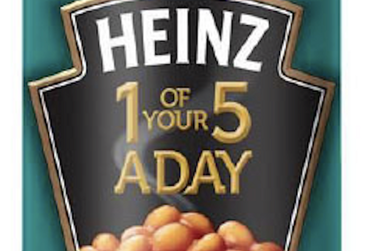
Explaining this calls for a concrete example. Take Heinz Beanz, a well-loved staple of any British kitchen. Instantly recognizable on the grocery shelf in an iconic turquoise can, Heinz Beanz branding has to be printed on paper (can wrappers), thin plastic (shrink-wrap around multi-can packs), thicker plastic (labels on “Fridge Packs” in glass jars), thickest plastic (“Snap Pots,” portable cups o’ beans similar to yogurt packaging) -- the list goes on. That turquoise is key for brand recognition, so much so that companies will defend their copyright turf if competitors try to infringe on an iconic color-to-product association. (See my post, Can You Own a Color?)
Green is a notoriously finicky color to match accurately (one of the reasons it's often considered an unlucky color -- see my post Irish Eyes Ain’t Always Smiling: The Contradictory Meanings of Green). Also, different printing processes are at play to print all these substrates -- the fancy word for the material to be printed on. Even with a universally recognized Pantone number, Heinz Beanz print jobs called for experienced folks to eyeball the color-match on-press, manual correcting their process to match the ideal shade in practice. If you’ve got a great eyeball on the job, marvelous -- but if you don’t, whole print runs may need to be chucked at ruinous expense because the colors don’t match the brand standards (or each other). However, when an especially good match on a tricky substrate-printing-process combo is achieved, those data specifications can be captured and shared via PantoneLIVE for others to use.
PantoneLIVE improved color-match accuracy for Heinz about 50 percent, which is no slouchy improvement. (See the full Heinz Beanz / PantoneLIVE case study here.) Other trial runs of LIVE allowed brands to reduce the proliferating numbers of inks in stock, all without reducing the variety of colors produced as the end result. A beans-loving American (this one) might say: “Hot diggity dog!”
 Beanz Meanz Heinz by Jon Hamilton-Fford, $22 and up.
PantoneLIVE is a joint project with best-of-breed partners in manufacturers’ inks, printing presses and packaging providers. It’s also the company’s first product of a new division, called Pantone Digital Business Unit. It’s a bold idea whose time seems overdue, with pricing that’s affordable enough for anyone who deals with large brands to ensure color accuracy.
Speaking for color fans everywhere, we’ll be curious to see what Pantone plucks out of the cloud next.
Copyright F+W Media Inc. 2012.
Salon is proud to feature content from Imprint, the fastest-growing design community on the web. Brought to you by Print magazine, America's oldest and most trusted design voice, Imprint features some of the biggest names in the industry covering visual culture from every angle. Imprint advances and expands the design conversation, providing fresh daily content to the community (and now to salon.com!), sparking conversation, competition, criticism, and passion among its members.
Shares