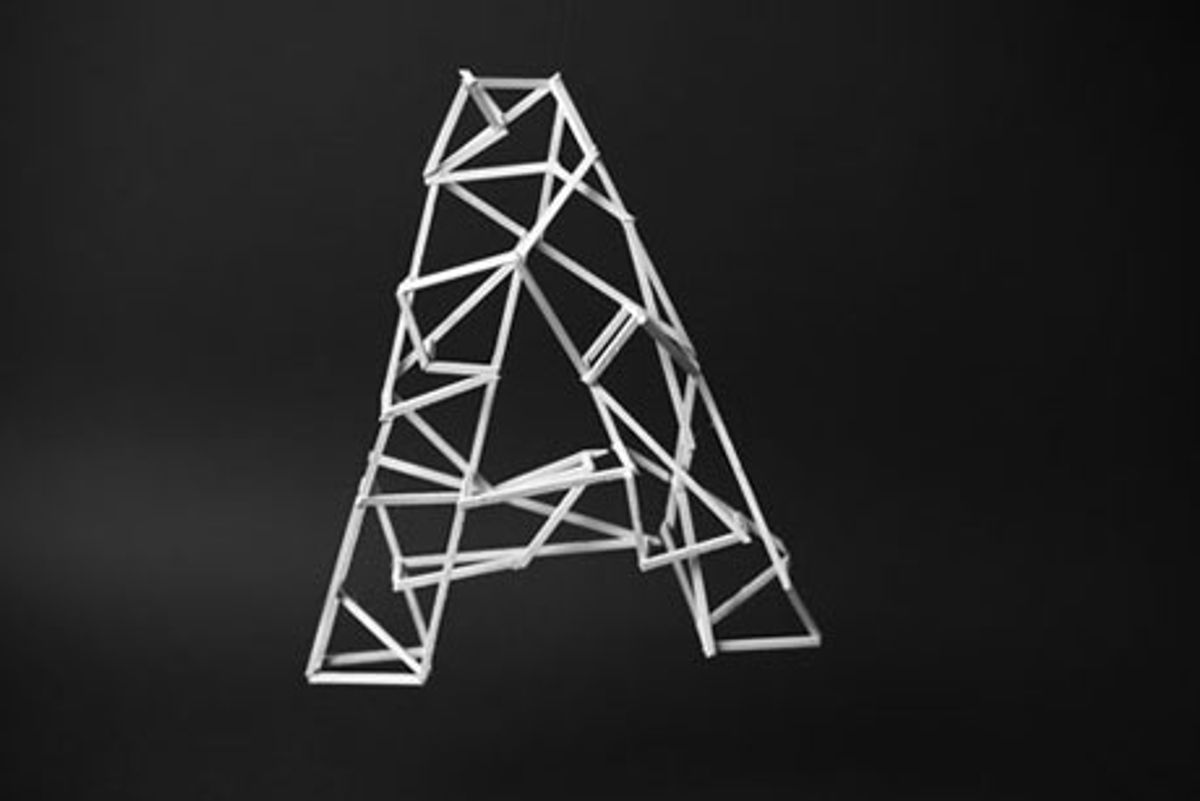
 The French designer Jerome Corgier, one of this year’s New Visual Artists, is a master of crafting two- and three-dimensional landscapes from type. For his newest project, called Skeletype, he has created an alphabet (minus one letter — can you find it?) from slats of wood held together with glue. Each letter seems to suggest a story, or an emotion, and the architectural construction lends the alphabet a sense of complexity, charm, and, at times, magnificence. The letters could be remnants from the set of a Brothers Quay film, sea creatures, illustrations for a sci-fi novel, a model of utopian architecture, or the scene of a seance. The alphabet is below — along with Corgier's answers to a few questions about its creation.

You've created 3-D type where the letters are both quirky and magnificent. How did you determine which letters would have which quality?
As the artist Soulages said: “That which I do I learn from what I search.” (The exact sentence in French is: "C'est ce que je fais qui m'apprend ce que je cherche.") In my case, I should say, “What I do helps me to know what I think.” All my projects are experimentations. I have an idea in the beginning, and this idea becomes more and more precise when I do the project itself.
For each letter, I create little sketches, and I try to make the forms correspond as best I can to each letter. For example, the T is a vertebral column: It was really the best letter to do that, and, as I made it, I saw that it became a cross, too. This T is really morbid, and I brought out that feeling with the candles that appear in the photograph.
For the C, I thought about a sea horse; so this letter should be very light and round. It seems to fly. The F is the more "natural" letter, so I decided to not be very precise in creating it: The angles are not very precise, the points are untidy. It is more natural, similar to the branches I put in the picture.
But sometimes there is an accident. For the X, I didn’t succeed in making what I wanted. I wanted to create an architectural letter, like a city. Instead, I created a dead city, like in the movie Inception. This is really a skeleton of type!


Which letters took you the longest to make? Which were the most frustrating?
The longest was probably the destroyed X, and it was probably the most frustrating, too. But as it is an experimental project, doing that opened many doors for future explorations. Now I have a further feeling of frustration because I want to do more and better with the letters I’m creating. I’m now able to manipulate the wood with much greater precision than I used to be able to, and I can make things much more precisely than I had been.

You said that your C was inspired by a sea horse. Were organic forms a conscious reference with other letters, like the S?
The T was inspired by the vertebral column, as were the C and the S, but these were much more personal. For the N: fish bones. And other inspirations: For the B, it was stained glass. And the L and D have more architectural influences, and also skeletons.

The G seems a bit angst-ridden. Is that an accurate observation?
Probably ... I don’t know, really. It was one of my first letters, and I would like that we could see it from all angles; then it would be clear that it is more tortured. I like it, but I don't know why, exactly.

Your L is a masterpiece — it seems a perfect fit for film noir. What was your inspiration for it, and why a staircase?
Thank you! Yes, it is a big and heavy piece. In fact, I just visited Rome one month ago, and the Ministry of Culture, with the big white staircase, impressed me — perhaps it inspired me. In any case, since the L is a very simple form, I wanted to make a very structural composition. (I did the Z just after the L.)

Why did you leave one piece off the N?
For me, the N is the skeleton of a fish. This explains the fragility of the piece. It was an accident — I broke it, and I said, "Okay, it’s like that, it’s very delicate, then I will keep the letter broken and show it like that.” When I do these projects, I’m not creating advertising, so it can be imperfect. In fact, it has to be imperfect, to be sensitive.

Corgier's complete Skeletype alphabet:


Shares