 Inside Paragraphs: Typographic Fundamentals
By Cyrus Highsmith
Font Bureau, 2012
Cyrus Highsmith, senior designer at the Boston-based Font Bureau, has written a short book on the basics of typography that, despite its odd approach—or maybe because of it—promises to become a standard text in introductory typography courses. The book, to be formally released next month during TypeCon 2012, in Milwaukee, is called Inside Paragraphs: Typographic Fundamentals, an accurate yet prosaic title that belies its charms. It is a simple book with a simple premise, which means that it is actually a very deep book.
[caption id="attachment_340541" align="aligncenter" width="600" caption="In a spread from "Inside Paragraphs," Highsmith shows the effect of justification on wordspacing. (Click on this image and others below for higher-resolution version.)"] [/caption]
In roughly 100 spreads, Highsmith explains the fundamentals of typography by focusing exclusively on one thing: white space. He does this on two concurrent levels. First, he illustrates each of his core concepts, and then he repeats the information in prose that is conversational and inviting. There is no jargon, no didactic attitude. Reading Inside Paragraphs is like having a conversation with a mentor rather than listening to a teacher lecture. It is the tone and visual look of the book that, as much as its contents, will surely endear it to typography students as much as it will to typography teachers.
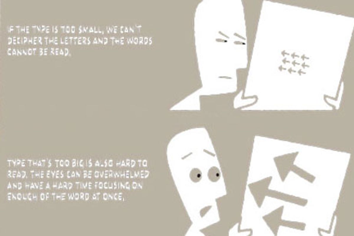
[caption id="attachment_340531" align="aligncenter" width="600" caption="Highsmith discusses the choice of the right point size for text."] [/caption]
Highsmith is almost as well-known for his illustrated sketchbooks as for the many outstanding typefaces he has designed for Font Bureau (among them Benton Sans, Quiosco, Prensa, and Zócalo). It is his quirky yet simple and strong style of illustration that is on display in Inside Paragraphs. The images, printed in taupe, are deliberately rough-edged without looking artsy-craftsy. Highsmith has actually drawn all of the “type” in the illustrations. Thus, this is a book about typography that, other than the text itself, has no type in it.
The typography of the text of Inside Paragraphs, closely-spaced in the time-honored way of Nicolas Jenson—a style that has fallen out of fashion today—fully embodies the principles of spacing (letter, word, line) that Highsmith is expounding. The book is set, naturally, in two of Highsmith’s own faces, Ibis Text for text and Scout for headings. The captions in the illustrations are all lettered by hand in a clear narrow sans serif with some thick/thin shading á la Tekton.
[caption id="attachment_340551" align="aligncenter" width="600" caption="Highsmith explains the use of hyphenation and justification settings in achieving justified text."] [/caption]
Inside Paragraphs reminds me of two (maybe three) other books on typography: How Typography Works (and Why It Is Important) by Fernand Baudin and Rhyme and Reason: A Typographic Novel by Erik Spiekermann. All of these books take a sidewise look at typography. They treat it in a friendly, metaphorical manner that relies for its effectiveness on unexpected illustrations and images. Whereas Spiekermann used a carton of eggs to explain letter spacing in Rhyme and Reason, Baudin and Highsmith employ drawings of type. These books are modest in their goals. They do not try to cover every conceivable aspect of typography, but restrict themselves to, as Highsmith’s subtitle puts it, the fundamentals. (This is where Rhyme and Reason parts company with its progeny, Stop Stealing Sheep & Find Out How Type Works.) In fact, Inside Paragraphs is the most ascetic of all three, so narrowly focused on its theme of spacing that it does not even discuss the marking of paragraphs (i.e., indenting and its alternatives).
[caption id="attachment_340421" align="aligncenter" width="492" caption="A spread from "Rhyme and Reason," by Erik Spiekermann, in which letterspacing is explained by an analogy to eggs"] [/caption]
[caption id="attachment_340381" align="aligncenter" width="492" caption=""How Typography Works," by Fernand Baudin. The text was handwritten by Baudin, who also drew the illustrations."] [/caption]
Inside Paragraphs is not the single source of typographic wisdom that some might be seeking, but it is a good companion to such stalwarts as Robert Bringhurst’s The Elements of Typographic Style and Willi Kunz’s duo Typography: Macro- and Microaesthetics and Typography: Formation and Transformation. (Students have to learn about indenting somewhere, after all.) It is a book about typography, not typographic style. Thus it sidesteps debates on serif vs. sans serif type, justified vs. flush left / rag right setting, symmetrical vs. asymmetrical layouts, and so on. Highsmith’s illustrations may date over time, but his content is timeless.
[caption id="attachment_340521" align="aligncenter" width="600" caption="Highsmith explains glyph space."] [/caption]
As with the Baudin and Spiekermann books, Inside Paragraphs is small in format (8.5"x5.5" landscape), making it comfortable to read and easy to carry.
I recently spoke with Highsmith via email to learn more about the genesis of Inside Paragraphs, the thinking behind its unusual format, and its relationship to other books on typography. The following is an edited version of our conversation.
How did the idea for Inside Paragraphs come about?
The book grew out of a lecture series I created about seven years ago at RISD [Rhode Island School of Design] for our beginning level typography course, Typography 1. That space was perfect for experimenting with different ways of explaining things, figuring out what I wanted to teach, and what's important for students at that level.
The book was my response to the gradual realization that the best way I could teach typography was to teach it from my point of view as a type designer, rather than from my own approach to type design. I am very focused on white space and spatial relationships. It’s a systems-thinking kind of approach. I realized if I taught typography with the same kind of approach, I could teach it in a very visual way.
Details and rules are important, especially in typography, but I can never learn that kind of thing without being able to see the big picture. I think that’s true for a lot of students in art school. They are visual thinkers, like me. And even if they aren’t, teaching this way doesn’t impede anyone’s education. However, the opposite approach, focusing too much on the small stuff without explaining why or how things relate to each other, will leave many students behind. In my experience, this is an easy trap for typography teachers to fall into.
What books did you read as a student studying typography? Which ones have you used as a teacher teaching typography?
As a student at RISD, we had some great books like The Elements of Typographic Style [by Robert Bringhurst], which is sort of a manual for excellent book typography. We had some others like Designing with Type [by James Craig], which is a fine book but I remember being perplexed at being assigned something so out of date. And we were assigned some books that focused on the historical stuff like [Alexander] Lawson’s Printing Types.
We use A Type Primer by John Kane, who teaches at RISD. It’s an excellent book with lots of clear definitions and examples. I believe Type 2 students are still encouraged to pick up The Elements of Typographic Style. My hope is that Inside Paragraphs can work alongside books like these.
One problem with many typography books is that they either address book typography only (e.g., The Elements of Typographic Style) or they focus on typography for posters and other graphic design ephemera (e.g., Typographic Design by Rob Carter, Philip B. Meggs, and Ben Day). What are your views on this?
I don’t think it’s a problem if books are focused on one kind of typography. I think it’s important to be clear about that, though, and to inform the reader how a specific kind of document will inform the typographer’s decisions.
As a student, I found the more generalist books about typography unsatisfying. I wanted details about how stuff worked and why. They didn’t go deep enough.
As a teacher, I have observed typography books often start out strong. The first chapters are aimed at students, with lots of clear explanations of basic terms. But the following chapters are often more like showcases of typography assignments, better suited to an audience of teachers looking for ideas of what to do in class.
I tend to agree with you about preferring books that tell me how things work and, most importantly, why. That’s why I enjoyed your book so much. And why it reminds me of both Rhyme and Reason and How Typography Works. Like Spiekermann, you rely on ordinary analogies to make your points (for instance, your comparison that glyph space is to shoeboxes as type is to shoes) and your writing has a colloquial tone. Why did you choose this approach?
For me, it’s the result of visual thinking, or at least the way I think—things always remind me of other things. When I first sat down at my desk, after I had made the decision to write this book, my first thought was I don’t want to write a book about typography, I want to make a comic book about typography. And then I thought, “Don’t be silly, you can’t make a comic book about typography.” Later, after a lot of work, I realized that if someone was going to make a comic book about typography, the book I have made is actually a pretty good start.
Inside Paragraphs is a very visual book. There is a diagram on almost every spread. The diagrams illustrate the text, and the text explains the diagrams. That might seem redundant, but as a teacher, I have found the greater variety of ways you can explain something, the better your audience will understand it. The result is that you can read the book in three ways: You can look at just the illustrations and diagrams on the left; you can just read the text on the right; or you can do both. Personally, I’d start by just looking at the pictures.
As for the tone of the book, I think it is a side effect of my writing process—figuring out how to explain simple things clearly.
There is no “type” in your illustrations. Did you really draw all the letters, including the blackletter texts?
Yes, I drew all the “type,” although I used some tricks. Illustrating typography is a funny design problem. I didn’t want to typeset the illustrations because I thought they needed to stand out more from the text. I tried something more like lettering, but it looked too much like lettering or calligraphy, which distracted from the message. So I drew the type in the illustrations with a bit of a rough edge, signaling that it’s part of the illustration, not the text. I think of them as diagrams. The goal is to explain the typographic concepts I’m writing about instead of just being examples of type set different ways, or instead of presenting a catalog of typography assignments.
And, yes, I drew the blackletter. I looked closely at Karlgeorg Hoefer’s Notre Dame from Linotype’s Type Before Gutenberg series as a model. When I draw a typeface for Font Bureau, I don’t rely as directly on an existing typeface. In this case, the intended use is limited to the illustrations for this book.
[caption id="attachment_340561" align="aligncenter" width="600" caption="This page from "Inside Paragraphs" shows Cyrus Highsmith's drawing of metal blackletter type."] [/caption]
One of the things I like about your book is that the typography practices what it preaches. The close spacing you use (and the dark color that results) is reminiscent of Nicolas Jenson’s work, which is not in vogue today. Is one of your goals to bring back such close setting?
That's interesting. No, I'm not on a mission, but I agree a lot of books are too light these days.
Speaking of close setting, have you read Geoffrey Dowding’s Finer Points in the Spacing & Arranging of Type? If so, did it have any influence on your view of the role of spacing in typography?
I have not read it. I’ll check it out.
[caption id="attachment_340401" align="aligncenter" width="492" caption="A spread from "Finer Points in the Spacing and Arrangement of Type," by Geoffrey Dowding, shows his unconventional use of the ampersand in text (see upper left page)."] [/caption]
Why, among all of your many typefaces, did you choose to set Inside Paragraphs in Ibis Text? It seems to be very recessive, a typeface that could have been used in a book from a half century ago.
Ha. Recessive? Okay, fair enough. Choosing a typeface is the typographer's most important decision, so that’s a good question. I chose Ibis, in part, because it is a bit recessive, although that’s not the word I would have used.
The book assumes the audience is setting type digitally, but, as much as I could, I tried to avoid specific references to software or technology that will soon be dated. I wasn’t going for timelessness, but I was hoping it could have a good long shelf life. I wanted the presentation to reflect that kind of presence. I picked Ibis to add some depth and background to my voice. The book is intended as a foundation, after all. Scout is a good companion for Ibis, structurally speaking. Also, Ibis and Scout are two of my more recent designs, so I’ll admit I’m inclined to favor them over my older stuff.
The format of Inside Paragraphs is easy to hold and easy to read, making it a friendly and comfortable book, unlike some of the heavy typography tomes that have been issued in recent years. Is this format the result of your own experiences as a student learning typography?
The horizontal format seemed best suited for this kind of presentation. Also, it could be an artifact of the lecture series where the images conformed to the horizontal screen.
Finally, is there a reason why you don’t discuss indents?
That’s a good question. I had some content about indents in an earlier draft. I cut it because I wanted to keep the focus on what goes on inside paragraphs. Indents have more to do with the relationships between paragraphs, at least in the way I think about them. Explaining when to use an indent, how to gauge its size, would be opening a whole new can of worms. Even though this is a fairly short book, I felt there was already enough in it to digest. Maybe indents are for the next book.
I look forward to the sequel.
Additional reading:
[caption id="attachment_340371" align="aligncenter" width="492" caption="Cover of "How Typography Works," by Fernand Baudin. Design by Baudin."] [/caption]
How Typography Works (and Why It Is Important)
By Fernand Baudin
(London: Lund Humphries Ltd., 1988)
originally published in French by Editions Retz 1984
The Elements of Typographic Style
By Robert Bringhurst
(Point Roberts, Washington and Vancouver: Hartley & Marks Publishers, 1999 2nd ed.)
first edition published 1992
Typographic Design: Form and Communication
By Rob Carter, Ben Day, and Philip Meggs
(New York: Van Nostrand Reinhold Company, Inc., 1985)
Designing with Type
By James Craig
(New York: Random House Digital, 2006; 5th ed.)
first published in 1971
Finer Points in the Spacing & Arrangement of Type
By Geoffrey Dowding
(London: Wace & Company Ltd., 1954)
1995 paperback reprint by Hartley & Marks Publishers Inc. with a foreword by Crispin Elsted
A Type Primer
By John Kane
(Upper Saddle River, New Jersey: Prentice Hall Inc., 2003)
Typography: Macro- + Micro-aesthetics
By Willi Kunz
(Sulgen, Switzerland: Verlag Niggli AG, 1998)
Typography: Formation + TransFormation
By Willi Kunz
(Sulgen, Switzerland: Verlag Niggli AG, 2003)
Rhyme and Reason: A Typographic Novel
By Erik Spiekermann
Trans. Paul Stiff
(Berlin: H. Berthold AG, 1987)
originally published 1982 in German as Ursache & Wirkung: ein typographische Roman
Shares