 Rolando G. Alcantara was born and raised in Torreón, an industrial city in north-central Mexico. He attended a technical high school there. Since childhood, he’d planned to become a doctor—a radiologist, like his mom.

A few weeks ago, he received his MFA from Maryland Institute College of Art (MICA) and brought a compelling presentation of typography to AIGA New York’s “My Dog and Pony: Fresh Blood III” event, which introduced the best of this year’s graduate student thesis projects from East Coast art schools and universities, including Pratt, Parsons, SVA, and Yale.
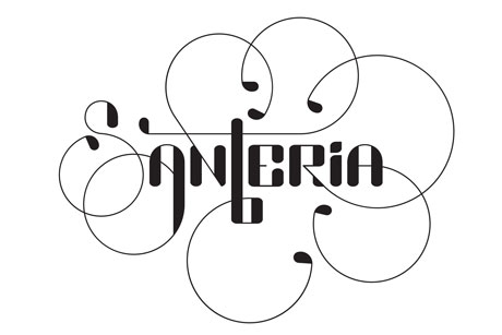
Onstage for 10 minutes, like all the graduates representing their schools, Alcantara presented the typefaces he’s designed, which are distinctive, original—and fluctuating, dynamic, on the move.
 (AP)
(AP)
His Mutable Typography website showcases his work, which also includes an exhibition and a zine. I had the pleasure of getting to know him a little better during a recent phone interview:
Tell me a little bit about your journey from Mexico to MICA and now to New York City.
My mom always loved her job as a doctor and med-school teacher, and I wanted to follow in her footsteps, become a doctor. I attended Instituto Tecnológico y de Estudios Superiores de Monterrey—a comprehensive, business-driven high school where students had to create something and sell it. I was pre-med. A cousin was at Abilene Christian University in Texas. I visited and just loved it. It seemed like just the ticket to get into a really good medical school, and more affordable for my parents than a university in Mexico. But in my junior year at ACU, I realized that medicine wasn’t my calling. After seeing a campus production that introduced me to photography and video, I wanted to be in the arts. I changed my major to electronic media. After a semester I changed it again, to graphic design. Electronic media wasn’t filling me up, and in graphic design everything in my life just lined up. Before graduation I got to direct the biggest student-run production of the year, Culture Show. I shot video, did all the posters, advertising.
And after graduation? Did you experience any immigration issues?
I moved to Dallas, where I got some good job offers. But there were visa limitations. After graduating from a U.S. college, nonresidents who came on a student visa have a year to do whatever they want, in something called OPT, or Optional Practical Training. I was a paid intern at Fossil, where they do beautiful work: catalogs, studio photography. It was a great experience, but after that it got tricky.
So what did you do?
Ultimately, I want to teach college. So I decided to apply to grad school at the institutions top-ranked by U.S. News and World Report: SVA, the School of the Art Institute of Chicago, Cranbrook, Yale, MICA.
MICA was just so amazing. The students, the faculty—especially Ellen Lupton and Jennifer Cole Phillips—the sense of community. Everybody there is just so talented. The emphasis is on writing and critical thinking. And in grad school there, you can take undergraduate classes to learn any graphic design skills that may be lacking. I got in, and got a little scholarship.
What inspired you to concentrate on typography?
A class with Ken Barber and Ben Kiel of House Industries in Baltimore. I love the shapes and forms of their work.
Who are your typographic heroes?
Besides Ken and Ben, the late Doyald Young, Peter Bil’ak, Underware Type Foundry, Hoefler & Frere-Jones, Matthew Carter, Post Typography, Jessica Hische. I love everything about typography: scripts and hand lettering and the interesting use of negative space. You can focus on the big picture, the overall look of a page or phrase that’s typeset, or on the minute detail, where the t crosses.
What about Neville Brody? I see some of him in your work.
I’m definitely inspired by the legacy of Neville Brody, the modularity of his type, his geometric approach.

Any influence from the folk art of Mexico, the textiles and tiles?
Yes, and from the vernacular typography on shops. I’m very interested in the use of blackletter in Mexican culture, by gangs and in handpainted signage on shops.
Tell me about AlphaBeta, your font set with 208 characters, the 26 letters each in 8 variations. There are some very cool letters in there. How did you come up with the concept?

First of all, I don’t draw very well. My style is geometric. I learned to draw using a ruler and protractor. With AlphaBeta I challenged myself to see how many different A’s and B’s and C’s I could design and have them all look different but also look good together. I set strict rules for myself. Wait, I’ll send you my official statement:
I took several steps in order to maintain a cohesive aesthetic throughout the typeface. I first decided to make a monospaced and unicase typeface with no contrast to its strok—no thins and thicks. I then designed each character based on a simple and geometric set of rules. I used only two types of curves and straight lines in a square grid [see animated GIF, above]. I distilled eight final alphabets from all my sketches—I tried to balance each alphabet so it would look good on its own first, and fit well with the rest of the typeface second. The result gives the designer freedom to choose between eight different drawings of each letter without making the typeset look like a ransom note.
I really like the A that appears to be waving, the E that looks like a little envelope flap, the L that’s like a satellite dish, the T that’s a martini glass, and the R that’s an umbrella bending in the wind. Here’s another challenge for you: set the word Era 8 different ways, and let’s see how the variations look.

Here it is. Each Era is in one of the 8 alphabets; they’re not mixed and matched. I could try that, too.
What do you envision doing in 10 years? What’s the next step after getting the MFA?
In ten years I’d love to be teaching. This summer I’m taking Type@Cooper, a program at the Cooper Union where I hope to get the skills to complete my typefaces—AlphaBeta doesn’t have any numerals or punctuation yet—and bring them to market.
What about versions for other languages? I can see it in Cyrillic.
Yes, and even in Spanish. How the accent marks work out will be very interesting.
Do you ever think about not becoming a doctor?
No. This is more satisfying. I’m way too excited about graphic design now. We get to live a really well-rounded life and always keep learning about everything.
.
For a primer on typography, check out Alex W. White’s Thinking in Type. For essays by major type masters, see Steven Heller’s Texts on Type. And for a range of playful, illustrative, and hand-made typography, take a look at Playful Type, now on sale at MyDesignShop.com.
