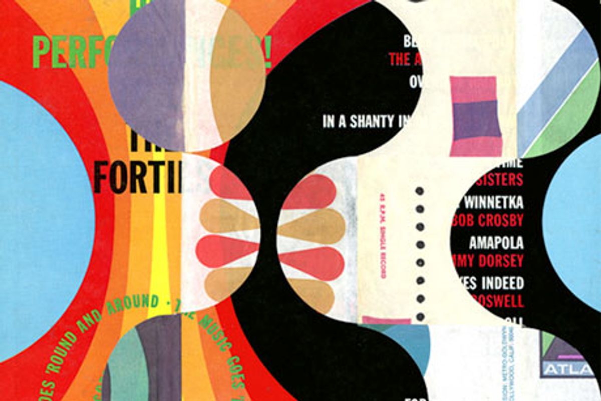
 Graham Moore creates fine-art pieces that put you in a dancing mood, just by looking into them. In fact, many of them began as vintage LP record album covers, several decades pre-mp3. Then, under his knife, texts lose their legibility, images lose their identity, and those often dull cardboard sleeves are reconfigured into visual bop rhythms and beats that delight the eye.

This art grew out of Moore's graphic design career. He worked at studios and ad agencies in London back in 1985. In 1991, he landed in Los Angeles, where he now freelances and earns awards such as Print's Certificate of Excellence. He also teaches at Art Center College of Design and other schools around town, where his students learn non-digital, handmade methods of operation.
I discovered Moore's collage work at a local gallery last month and was immediately attracted to his imaginative transformations of pop culture ephemera, both retro and contemporary. He’s currently preparing for a couple of local openings this summer. And his collage work is growing beyond his 12-by-12-inch format, as he experiments with big bits of billboards.
I recently connected with Moore to learn more about who and what inspires him.

Tell me about your formative years in England.
My use of shape and color comes from my foundation classes at Wimbledon School of Art, where for a year I did nothing but painting, drawing, and sculpture, far from the digital landscape of today’s design profession. Cut-and-paste was a big component of my design work then, and the photocopier and stat camera were king.
I was also heavily influenced by London’s fashion and music, especially the packaging of music.

How has West Coast living influenced your artistic sensibility?
Even back in London I was always a big fan of Americana: music, cars, art, and architecture, especially from the 1950s and 1960s. So living here, I was surrounded by it and soaked it up like a sponge. I think all this stuff has found its way into my artwork.

What attracts you to imagery from that era?
I love the clean, simple lines of midcentury modern and the cool sounds of west coast jazz and Blue Note album covers. And I’ve become a huge fan of the California Hard-Edge art movement: bold lines and organic shapes, color, and texture are all important ingredients that I employ in my own work.

How did you decide to collage with album covers?
I was doing a lot of collage in the classes I was teaching, always experimenting and exploring with different materials, textured papers and found imagery, etc. I had the idea to use record covers and the paper sleeves that protected 45 singles, specifically packaging from the 1960s. There’s so much of it, an endless supply of material. They already contain such strong use of shape, line, color, and texture: all the things, by the way, that I teach in my design classes. There’s something about the quality and feel of the printing from back then that cannot be rivaled.
It seems appropriate to me that it was the love of album cover art that made me want to pursue a career in graphic design in the first place, and here I am using it in a way I would never have dreamed of.

And how did you come to use billboard fragments in your newer pieces?
By accident! While working on the computer one day, from my window I was watching a worker strip down some billboards. I went down and asked him what he does with the remnants and he said, “I just trash it, so help yourself.” And I found that there was a lot of great color, typography, and texture to be had, and nice big areas of halftone dots.

What is your work process with these collages?
Lots of experimentation! For instance, with the billboard material, I break them down into manageable-size pieces, and then soak them in the bathtub until I can peel the layers apart. The fun is always in the reveal; because there are so many layers, you never know what you’re going to get. The record cover pieces are like jigsaw puzzles. I’m constantly moving them around until it feels right.
There have also been instances where I’ve found the frames first, and created the piece specifically for the frame. One important factor is that I always use a square format, which relates to back to the album covers.

What fine artists have influenced you?
Glad you asked. Jacques Villegle, Margaret Kilgallen, Bridget Riley, Louise Nevelson, Kurt Schwitters, and Hanna Höch, to name but a few. Dada, Fluxus, Russian Constructivism. Sister Mary Corita Kent—her use of popular culture imagery and typography are truly inspiring, and she was producing art with a meaning and a message.
I love the way Jane Maxwell uses layers of found and vintage papers that have been sanded, scraped, and resurfaced. Aged movie posters, labels on produce crates, advertising signs, and related materials surround and become the figures.
I've read all the works of William Burroughs and see similarities in the work of Cecil Touchon. Where Burroughs invented the cut-up method for his literature, Touchon’s visual language takes the form of the printed word and image and gives it a new twist. If you can get a copy, I highly recommend Reduced to Silence.

And how about designers?
A technique that I picked up from Bruno Munari was the way he showed how a square can be turned into an equilateral triangle, and when cut in a certain way, can be put back together in a multitude of options. The diagrams are shown in his book Design as Art. I've experimented with this technique a lot and have gotten some great results.
In Munari's design I found a sophistication of form, and after seeing some of Norman Ives's constructions and reconstructions, I started to experiment with cutting pieces into triangular forms, which led to the emergence of strong diagonals, giving the illusion of movement and rhythm, which was perfect for my music packaging.
When I was at design school, everyone wanted to go and work for The Face magazine when they graduated. Neville Brody's use of typography and page layout was truly exciting and groundbreaking at the time. I don't think that happened again until Raygun came along in the early nineties.
Terry Jones's Xerox manipulated imagery and textures are just a few of the many techniques he employed when he was producing the first issues of i-D. Lots of high contrast, gritty imagery, perfect for the indie landscape.
For years I've been cutting out shapes, textures, colors, and type from old magazines, but when I was introduced to the early works of Rex Ray I got truly inspired to just play with shapes. I think he is a good example of how experimenting by hand can yield awesome results when used in the digital realm.
Reid Miles, Jim Flora, Roman Cieslewicz, Alvin Lustig, Florence Knoll . . . so much inspiration!

How do you distinguish your fine art from your design work?
My personal art might not be the right look and feel and direction for some of my more corporate clients, for obvious reasons. But I’m hoping that one day I can incorporate my techniques into projects with a more flexible design brief.
At the moment I’m experimenting with putting my collage pieces into motion. Just like the computer is a tool, hand techniques are another set of tools to be added to one’s creative, visual repertoire.


.
For more midcentury college art, see Steven Brower's recent Imprint post "Jack Kirby's Collages in Context." And for even more handmade collages, check out the book Papercraft: Design with Art and Paper, now on sale at MyDesignShop.com.
Shares