 Maybe it's just because I'm based in London and so more aware, but this Olympics, more than any other, has been a target for spoof, protest, and conspiracy. Its staging has proved, so far, to be widely unpopular. Maybe this will change on July 27. It was unfortunate that just after London won the race to stage the Games, the global banking system collapsed, with its repercussions still painfully felt. An event that takes such an investment is always going to have to fight a battle of ideology with other worthy recipients of public finances. In a time of austerity, the idea (not necessarily true) that money directed to the Olympics was coming from welfare payments or hospitals was doubly problematic. The Olympics seemed a luxury London couldn't afford, and the Olympic movement became an idea people were mistrustful of.

To the onlooker, the Olympics and its attendant bureaucracy give every appearance of being a multinational corporation. Through its ownership and aggressive protection of Olympic branding, along with its cut of all sponsorship and broadcast income, the nonprofit IOC controls great wealth and influence, outside of but part of the political class.
The IOC makes political decisions when it chooses to allow an apartheid-supporting South Africa to take part in the Games, or when it permits China, with its poor record on human rights, to stage them. This seeming lack of moral focus, along with scandals of drugs, bribery, and black-market tickets, erode the moral superiority of the Olympics. As the IOC looks to secure use of its brand ever more aggressively, its rhetoric is that of a business corporation more than a celebration of sporting prowess. This has been in evidence with its myriad sponsorships and draconian rules on branding, its bullying of small businesses with similar names, and its banning of non-officially-branded food and drink from Olympic venues.
 On top of this, many Londoners feel disconnected and even excluded from the Olympics, an event on their doorstep but mostly inaccessible to them. Tickets are expensive and hard to obtain, and the sparkly new stadia are fenced off behind barbed wire, with anti-aircraft gun emplacements positioned on tower blocks. The legacy of these sporting facilities and the area’s predicted urban regeneration is, of course, unproved. All of this has contributed to the Olympics unpopularity, and people’s loss of interest.

 The sense of separation between the Olympics and local communities was crystallized in the identity of the Games. It is a logo and typeface not crafted in any traditional sense. An identity without the system or cultural signifiers associated with the Olympics (the familiar stacking of cultural symbol, rings, and wordmark). An “idea” identity, focused on a specific (young) audience. An identity based on lettering—and one so adaptable, deconstructable, and rearrangeable that it was all but inevitable people would use it to make their own messages.
In attempting this graphic identity—in line with the London Organising Committee's proposal to the IOC of focusing on youth—the design agency Wolff Olins was doing something different. They were also opening themselves up to criticism of pastiching youth graphics and neglecting “London” symbolism and the geographic or national iconography that is a standby of Olympic logos. 2012 was not an identity that would sit comfortably in middle England. Britain has a deserved reputation for its creative industries and an equally deserved reputation for its fondness for nostalgia.
 There was a huge reaction. News and entertainment media were outraged by the alleged cost and design of the logo. Designers discussed it at length in magazines and on blogs and message boards. The widely disseminated view that the logo—as a single object, alone—incurred a fee of £400,000 led to much opprobrium directed at Wolff Olins. Non-designers were aghast, and sent their “done for free in ten minutes but better than the official one” logos to the BBC, which amassed 84 designs.


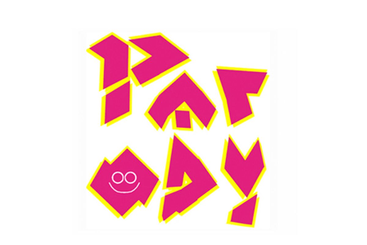
Deconstructed and rearranged versions of the logo started to appear. Ludicrous conspiracies alleging it to be a swastika or spelling ZION went viral. The logo's angular drawing was easy to mimic, and was quickly spoofed as RIP-OFF, PARODY, CRAP, or SHIT—or, more darkly, as NAZI or JEWS, with the 0 swapping handily between the letters H, O, R and A. Others lampooned its referencing of youth street-style graphics, even though this emphasis on youth supported the London Organising Committee’s presentation to the IOC. You may not like it, but Wolff Olins was on-brief.


It was rearranged, inevitably, as people having sex. The most popular of these showed Lisa and Bart Simpson engaged in—to use my favorite media euphemism—a “sex act.” This had myriad versions, some appropriately animated, some with helpful color-coding or additions to make their point.

 These viral anti-logos were for a while a phenomenon, they defined their moment, and demonstrated the immediacy with which ideas of spoof and protest could be disseminated. They were crude, rude, funny, weird. They made their point in the same way as the political or protest banners, T-shirts, badges, etc. you might see at marches or in picket lines, but infinitely more quickly.
.
Find branding and logo design books and downloads at MyDesignShop.com.
Shares