A new project from NASA Goddard Space Flight Center's Global Modeling and Assimilation Office has actually mapped out Earth's yearly carbon cycle into a beautiful, three-minute video.
NASA Goddard's website explains the visualization:
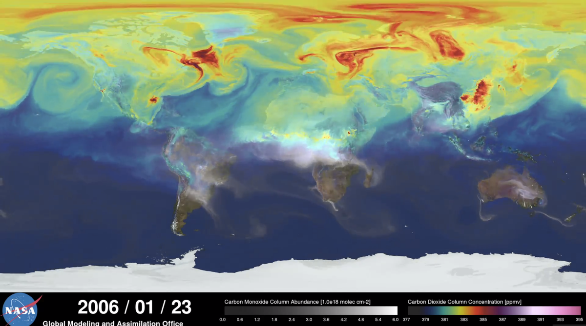
Plumes of carbon dioxide in the simulation swirl and shift as winds disperse the greenhouse gas away from its sources. The simulation also illustrates differences in carbon dioxide levels in the northern and southern hemispheres and distinct swings in global carbon dioxide concentrations as the growth cycle of plants and trees changes with the seasons...
The visualization is a product of a simulation called a "Nature Run." The Nature Run ingests real data on atmospheric conditions and the emission of greenhouse gases and both natural and man-made particulates. The model is then left to run on its own and simulate the natural behavior of the Earth's atmosphere.
The carbon cycle, for the uninitiated, is the repeated process of carbon being sucked in and spewed out by the planet's oceans, atmosphere, ecosystem and geosphere, over and over again.
While the video only runs from January to December of 2006, it would be interesting to see a change in CO2 levels as years pass in comparison to one another.
Shares