
"S" by Jon Sueda
 Can repetitive exposure to something -- no matter how good it is -- drive us crazy? How about listening to our favorite song over and over, eating our top dessert every single night, or even reading the good old ABC's every day of our lives? Will we eventually get sick of it all?
From the time we're born until the day we die, the twenty-six letters of the alphabet are completely and totally unavoidable. Thus, one has to wonder -- will there ever come a day when seeing our own language drives us all completely batty? Will people in the not-to-distant future be running and screaming down the streets from the frighteningly uninspired, overused curves of an "S" or the descender of a "p"?
Um -- probably not (although it's pretty hilarious to imagine). But to ensure that never occurs, from May 15th through September 4th a new show at the Pasadena Museum of California Art, Getting Upper, explores what happens when twenty-six graphic designers are charged with creating twenty-six brand spankin' newly designed letters of the alphabet.

"K" by Bob Aufuldish
Amos Klausner, curator of the Pasadena Museum of California Art explains, "We've been using these same Latin letterforms for thousands of years and they work just fine. But we repeat and reuse them on a massive scale. I guess I'm tired of the status quo."
Passionate about finding new ways to communicate and express ourselves, Klausner began studying the birth and evolution of the graffiti movement. He became fascinated with how these self-taught artists developed a new and uniquely personal language through the illegibility and deconstruction of letterforms -- a language that's understandable only to those within the graffiti subculture. (And which finally explains why graffiti usually looks like gibberish to the rest us).
Super excited about his findings, Klausner wanted to see what would happen when traditional graphic designers, who are so used to making text more readable, "were given the freedom to reconsider how and why we use these marks." Thus, he challenged twenty-six renowned California graphic designers/design firms including Jon Sueda, Bob Aufuldish, Volume Inc., Brett McFadden and Jason Schulte, among others to, "tear a letter apart and rebuild it based on their own influences and a nod to graffiti." The individual silk-screened letter posters, which are exhibited as a complete alphabet, are not meant to be a direct interpretation of graffiti typography (bubble letters, complicated scripts, cartoon characters, etc.), but rather the designers' personal interpretations of the art.

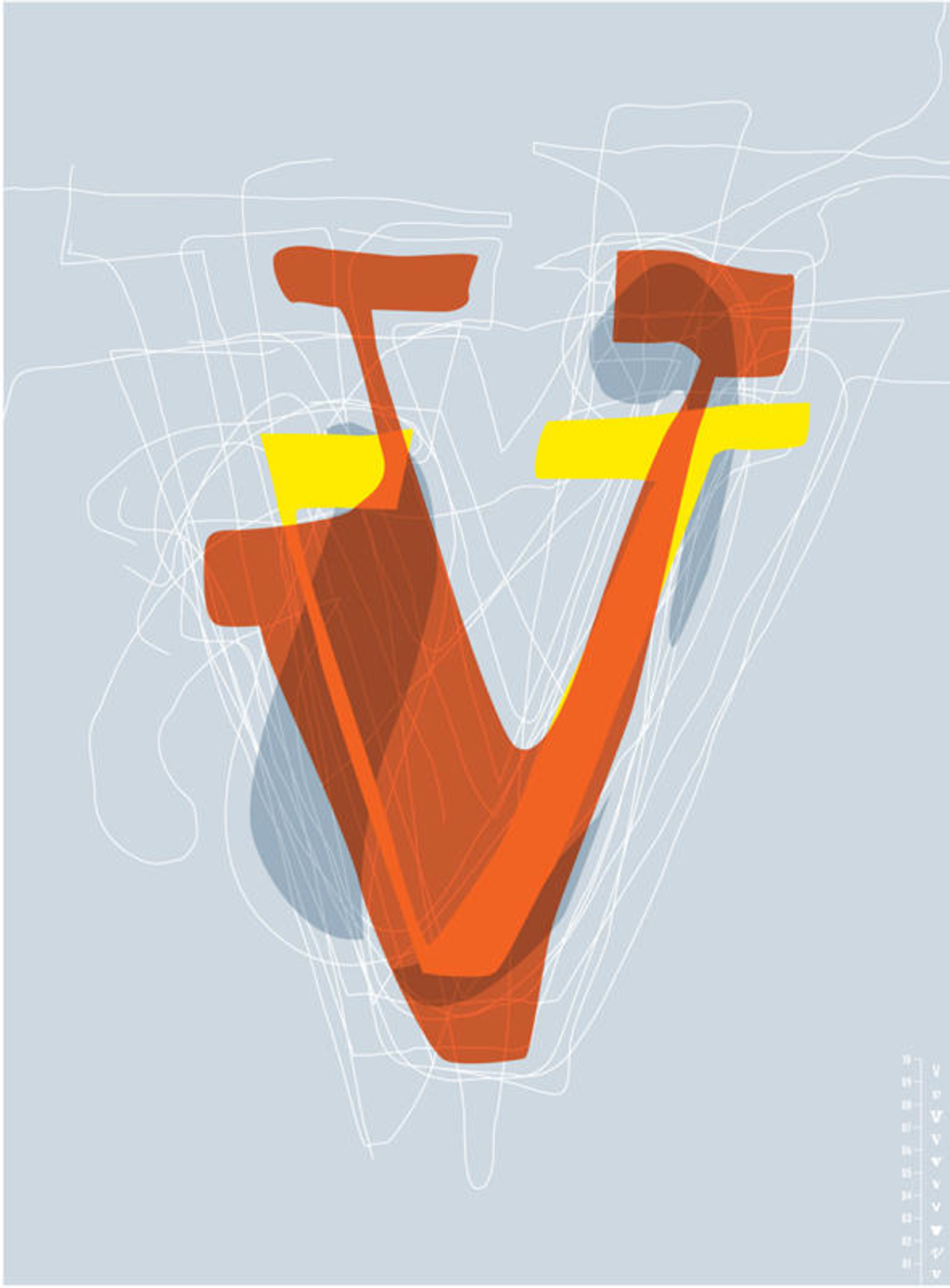
"V" by Volume Inc.
For example, Adam Brodsley and Eric Heiman of Volume Inc. "exploit the tension between the hand-constructed quality of graffiti typography and the more machined nature of the typefaces designers use every day."

"M" by Martin Venezky
Martin Venezky of Appetite Engineers creates a poster where, "... the letter M has overtaken its other twenty-five lettermates and crowned itself king. This is our future. Language is now composed entirely of three-letter words, acronyms, and abbreviations."

"J" by Jason Schulte
Jason Schulte of Office was inspired by "the contrast between organic/handmade and geometric/symmetry."

"L" by Scott MacFadden
Scott MacFadden of MacFadden & Thorpe was attracted, like many graffiti artists, to "the elements of typography that aren't strictly letterforms." He deconstructed and reassembled an "L" from "the rules, dashes, dingbats and borders that have provided structure and decoration since the dawn of moveable type."
With twenty of the top U.S. retailers including Safeway, Gap, and Wal-Mart all using Helvetica in their marketing materials, Klausner hopes the show will be a starting point to break free from uninspired global sameness and encourage "new ways of thinking, new ways of creating and hopefully, new moments of cultural identity."
To see more of these awesome graffiti-meets-design letter posters and read about the designers' thought processes, check out Getting Upper. Oh, and just to ensure the same old twenty-six don't drive you nuts in the future -- go nuts and buy a few of these eye-popping silk-screens pronto.
Copyright F+W Media Inc. 2011.
Salon is proud to feature content from Imprint, the fastest-growing design community on the Web. Brought to you by Print magazine, America's oldest and most trusted design voice, Imprint features some of the biggest names in the industry covering visual culture from every angle. Imprint advances and expands the design conversation, providing fresh daily content to the community (and now to salon.com!), sparking conversation, competition, criticism, and passion among its members.
Shares