 Designers, nutritionists, and food-policy experts were asked in the spring to reconsider how we get nutritional information about the food we buy. Initiated by the News21 program at UC Berkeley's School of Journalism and GOOD magazine, the aim of Rethink the Food Label (as its name suggests) was to make nutrition labels more informative and understandable, ditching the standard black-and-white model for one that improves nutrition literacy.

Renee Walker redesigns the nutrition label. Courtesy of GOOD Magazine.
The winners were announced two weeks ago, and Renee Walker, a visual designer and recent graduate of California College of the Arts Graduate Design Program who is currently freelancing for McSweeney's, took first place. Out of some 60 designs submitted, the judges (including the food writer Michael Pollan and Michael F. Jacobson, of the Center for Science in the Public Interest) chose her colorful, easy-to-read graphics.

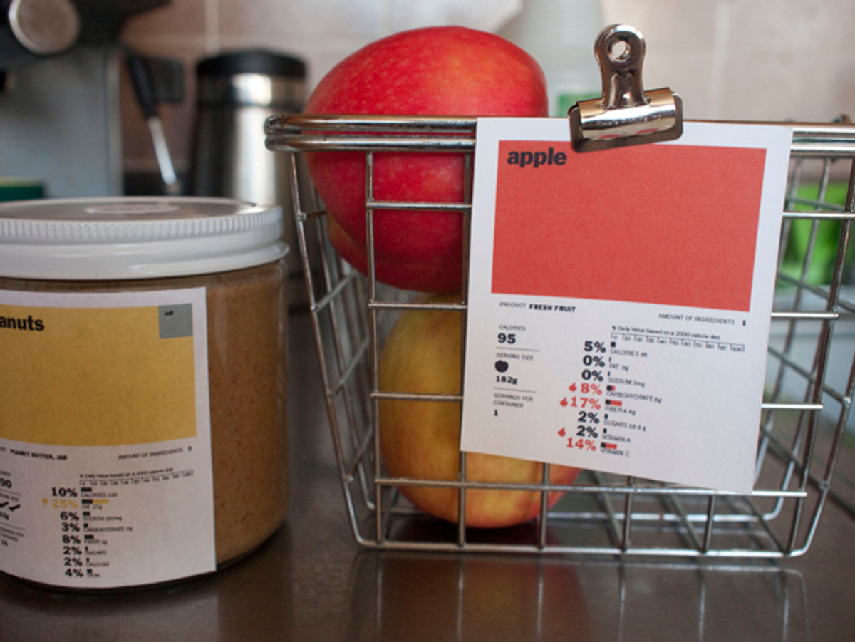
Walker's nutrition label design for an apple. Courtesy of Renee Walker.
"I didn't want to create anything that was making the food more complicated than it had to be," Walker says. "What's in the food is most important, so I chose to highlight the ingredients as the first thing people see. The ingredients should be the most prominent part on the label."
Walker was actually working on a nutrition project of her own while taking a topics studio (part of the MFA design curriculum that brings together different disciplines to design around current issues) on contemporary health issues, focusing on obesity as an epidemic. She refined a semester's worth of research into a label with the help of Harold McGee, a nutritionist and New York Times food writer, who was paired with Walker by News21. With McGee's guidance, Walker was able to home in on what elements were necessary and how to effectively represent them. She developed a color key to differentiate between food groups and sized each color block to the proportion of ingredients.

Walker's nutrition label design for a box of Mac 'n' Cheese. Courtesy of Renee Walker.
"The coloring distinguishes the different food groups, like the food pyramid, where brighter colors represent what's good for you and grayer colors show additives and preservatives," she says. "So the brighter the color, the healthier the food."
With the Food and Drug Administration looking to revamp the current black-and-white nutrition label, it's an excellent time for designers to join with nutritionists in informing people about what they eat. "I think that people are misinformed about what design can do as far as nutrition goes," Walker says. "There are so many opportunities for designers and scientists and nutritionists to collaborate and do interesting things."

Walker's food group color key.

Walker's labels for peanut butter and an apple. Courtesy of Renee Walker.
Copyright F+W Media Inc. 2011.
Salon is proud to feature content from Imprint, the fastest-growing design community on the web. Brought to you by Print magazine, America's oldest and most trusted design voice, Imprint features some of the biggest names in the industry covering visual culture from every angle. Imprint advances and expands the design conversation, providing fresh daily content to the community (and now to salon.com!), sparking conversation, competition, criticism, and passion among its members.
Shares