Ellen Shapiro
The education of a typographic innovator
Ellen Shapiro
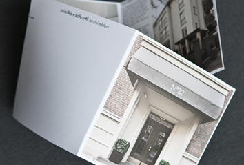
New York's hot new designer
Ellen Shapiro
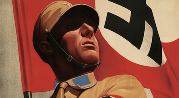
Revisiting the power of Nazi propaganda
Ellen Shapiro
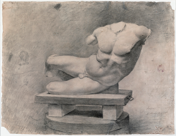
Picasso's fascinating early works
Ellen Shapiro
The silver age of photojournalism
Ellen Shapiro
How to spot a (graphic) knockoff
Ellen Shapiro
What makes people happy?
Ellen Shapiro
Where design and technology meet
Ellen Shapiro
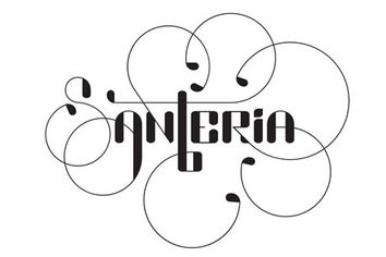
What makes a great logo
Ellen Shapiro
The man who makes your old newspapers into art
Ellen Shapiro
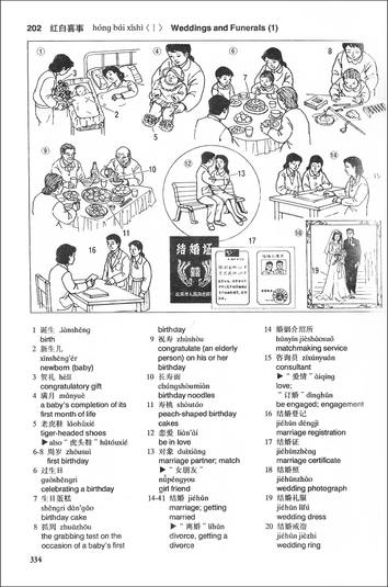
What I learned about China for my son's wedding
Ellen Shapiro
When art starts in a junkyard
Ellen Shapiro
Page: 1