Matt Singer
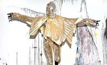
What would Superman wear
Matt Singer
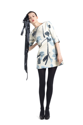
How a print becomes a dress
Matt Singer
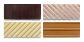
Can candy bars be pop art?
Matt Singer
Page: 1