Comic Books

“The Hulk”

Are comic books art? Maybe, but this leaden, pretentious flick about Marvel Comics' big green id, from the overrated Ang Lee, is just schlock art for the NPR set.

  • more
    • All Share Services

Will somebody please get Ang Lee away from popular culture — anybody’s popular culture? Lee’s “The Hulk” has less of a feel for comic books than his “Crouching Tiger, Hidden Dragon” had for the Asian martial-arts movies it was based on. Lee has developed a considerable reputation as an artist and a craftsman, and except for the slight pleasures of his “Sense and Sensibility” (most of them having to do with the cast) I’m damned if I can figure out why. At best, he’s a pedestrian storyteller with no feel for pacing or for the visceral, no discernible sense of humor and no sensibility for the enticements of pop entertainment. Worse, Lee has almost no instinct for the milieus he works in. Though he moved to the United States in 1978, his film of Rick Moody’s novel “The Ice Storm” had the weird, dislocated feel that often comes when foreign directors try to capture “America.”

What Lee does have, and what seems to earn him praise, is the type of good taste that deadens everything it touches. He combines the finger-sandwich finickiness of Merchant-Ivory with the cachet of “world cinema” (what, in another, more openly condescending age would be called “exoticism” by his admirers). That was most apparent in his most praised film, “Crouching Tiger, Hidden Dragon.” The movie was exquisite and dead. The best martial-arts movies, like the wonderful “A Chinese Ghost Story,” produced by Tsui Hark and directed by Ching Siu-Tung, are unself-conscious blends of storybook lyricism, violence and low comedy. One minute the heroes are flying through the air in a way that returns you to the wonder of seeing movies as you did when you were a kid, the next they’re indulging in the most shameless knockabout comedy.

Lee has no taste for the low, and he’s among the most self-conscious of filmmakers. So in “Crouching Tiger” he opted for refinement and the result was a placid formalism that was beautiful to look at and singularly unexciting. (It was particularly embarrassing, at last year’s New York Film Festival, to see the restored print of the 1965 Hong Kong movie “Come Drink With Me,” directed by King Hu and produced by the Shaw brothers, and to realize how much Lee had lifted from that film and yet how little he captured its spirit.) You could see what critics were responding to in “Crouching Tiger”; many had never seen anything like it. And that’s what bugged me. The movie won praise from critics who had never deigned to go near commercial Hong Kong movies that didn’t come with the imprimatur of art.

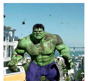
“The Hulk” isn’t exactly refined. It’s one thing for Chow Yun-Fat or Michelle Yeoh to soar through the air, another for an angry green monster to go on a rampage of destruction. But like “Crouching Tiger, Hidden Dragon,” this movie takes itself very seriously. For “The Hulk’s” visual busyness and its allusions to the configuration of the pages of comic books, Lee seems to be under the impression that he’s working from myth instead of a good pulpy premise. “The Hulk” goes on for two hours and 20 minutes and there’s not a stirring or exciting moment in it.

Universal Pictures seems determined to deflect the inevitable disappointment audiences will feel by emphasizing quotes (some from feature writers and not critics) that claim Lee is taking blockbuster filmmaking into daring new technical and emotional terrain. But the Hulk, who, despite his bulk, can leap across landscapes and zoom through the desert faster than the Roadrunner, is far more fleet than this lumbering mess of a movie. Lee and his screenwriters, John Turman, Michael France and James Schamus, have conceived of the story as — no fooling — an Oedipal tragedy. It’s all about the conflict between fathers and their children, and at particularly tragic moments Danny Elfman’s score includes the sounds of Eastern-sounding voices wailing lamentations. “The Hulk” might turn out to be particularly beloved by those who subscribe to the theory of recovered memory. It’s a behemoth abused-child tale, whose angry green monster emerges from experiments conducted by the father of scientist Bruce Banner.

Banner (played by Eric Bana), who works in genetic testing in Berkeley, Calif., alongside his colleague and girlfriend Betty (Jennifer Connelly), has repressed all memories of his childhood, believing his parents dead. In movie terms, that means they’re just dying to get out. Betty has parental troubles of her own, not having spoken to her father (Sam Elliott), an Army general, in years. Since it turns out that Betty’s dad imprisoned Banner’s dad (who was a military scientist), the movie is set up for a tale of two young lovers caught up in old rivalries.

It shouldn’t be hard to come up with a workable scenario for a movie about a hero whose rage turns him into a monster. Ideally, the movie would get us cheering along with him the way we cheer when King Kong faces down his enemies. The best comic-book movies — Tim Burton’s “Batman,” the Catwoman sections of “Batman Returns,” and Bryan Singer’s first “X-Men” — sprang from heroes who were working out their childhood traumas and the pain of being “different.” Burton and Singer were able to achieve moments of crazy, operatic grandeur. When Batman goes zooming in the Batmobile through the Wagnerian woods surrounding stately Wayne Manor, or Anna Paquin’s Rogue sucks the life force from Hugh Jackman’s Wolverine to heal the lethal wounds he has accidentally inflicted on her, those movies reach emotional peaks the composers of classical opera would be proud to call their own.

But “The Hulk” has no clear narrative or emotional arc. The movie seems populated with only villains — sometimes it’s the military, sometimes it’s the creepy industrialist who wants to use the Hulk for his own purposes, and sometimes it’s Banner’s crazy dad (Nick Nolte, looking as if he were auditioning for “Quest for Fire”), who has returned to finish the experiments he started when his son was a boy. We don’t even feel much for the Hulk. And that’s partly because Eric Bana, with his wide face and beady eyes (and his unfortunate resemblance to ’80s teen star Corey Feldman), seems to act primarily by furrowing his brow. There’s no heroism or passion in this guy — only the constipation of years of emotional torture.

Lee badly miscalculates by making the Hulk a big CGI creation. You feel no connection between the Hulk and Banner (the way you can feel the presence of the actor Andy Serkis in the CGI Gollum in the “Lord of the Rings” movies). He’s just Lee’s destructo machine. Perhaps Lee had to convince himself that he was doing something grand and mythic here to get through the action set pieces. But when the Hulk is flinging tanks around the desert or when battling three genetically engineered killer-mutant dogs (one of them, a standard poodle, is the drag-bar Cujo), you’re watching the stiffest, most removed blammo scenes imaginable.

“The Hulk” isn’t simply thrown together. It’s achieved, slaved-over junk. Lee has done everything he could to bring the visual experience of reading a comic book to the screen. He bisects the screen with horizontal and vertical splits. He uses triple, quadruple and quintuple frames to re-create the look of a comic. He layers frames on top of each other with something going on in each. There are all sorts of tricky dissolves and cuts. Images seem to deliquesce into each other. Traumatic memories are presented in flash cuts and have the texture of melting Silly Sand. Two- and three-stage zooms take us from, for instance, a close-up of a frog’s eye to an overview of the laboratory where the poor creature is the subject of an experiment. (Even exploding frogs are tasteful in this movie.)

Lee does so much in making this movie that nothing sticks. It’s exhausting. The cinematographer, Frederick Elmes, shot “Blue Velvet” for David Lynch. Yet there are only two memorable images: Crazy Nolte watching his son’s apartment in the dead of night, surrounded by his evil pooches, and a slow fade as Banner is shot with a tranquilizer dart and we see his white face floating in darkness before the screen goes black.

Mostly, “The Hulk” reminds you of other, better movies you wish you were watching: David Cronenberg’s moving “The Fly,” “Frankenstein” with Boris Karloff (the actor who makes CGI seem forever a paltry thing), and John Guillermin’s lovely remake of “King Kong.” (When Betty and Banner go for a walk with a team of military sharpshooters for an escort, I flashed on the scene in “The Godfather” where a gaggle of old Italian mamas serve as chaperones for Al Pacino and his Sicilian fiancée.)

You get the feeling that Lee and his team were so fixated on the visuals that they forgot to come up with a script. The dialogue is atrocious, running to lines like, “Look at you. Soon to be a great scientist,” or, “Your friend is up to something. And I’m going to get to the bottom of it.” The cast is stranded. Sam Elliott looks as strapping as usual, but his peppery laid-back appeal is straitjacketed into one of those stiff military-man roles: He’s a hard-on with a brush cut. As she was in the fraudulent “A Beautiful Mind,” Jennifer Connelly is stuck playing the long-suffering love interest to the tormented male lead. She’s as focused and serious as always, but unlike in that movie, she doesn’t get to give a performance.

Nick Nolte has perhaps the movie’s one truly good moment: Beholding the monster that is his son, he reaches up a fatherly hand to stroke the creature’s cheek. At other times, you can’t decide whether he’s the most committed actor in the movie or he should simply be committed. He seems torn between parodying the stereotypical mad-doctor role and digging to find some emotional nugget in it.

I can’t imagine, beyond the inevitable opening-weekend boom, that “The Hulk” will have the emotional pull or narrative strength to satisfy audiences. (At the preview I attended, the scattered applause at the end went head-to-head with the boos.) But I did have an awful thought watching it. Like “Blade Runner” or “The Cable Guy,” two bad, mucked-up movies that refused audiences the pleasure of a clear story or decipherable emotion, “The Hulk” could, in a few months’ time, start to attract a coterie who will lament that it was too dark and daring for mainstream audiences. Maybe the perceived worthiness of Ang Lee’s reputation will win out. The movie even figures out a noble function for the Hulk: He becomes the protector of the Latin American oppressed. At last, a comic-book movie that National Public Radio listeners can be proud to take their kids to see.

Charles Taylor is a columnist for the Newark Star-Ledger.

That’s not the original Hulk!

Even in books dedicated to his work, famed comic artist Jack Kirby's drawings never appear on the cover

  • more
    • All Share Services

That's not the original Hulk! (Credit: Dean White)
This article originally appeared on Imprint.

ImprintJack Kirby is widely recognized as one of the most important comic creators of the 20th century. Co-creator of Captain America, the Fantastic Four, the Hulk, the X-Men, and creator of Darkseid, The Demon, OMAC and myriad others, he still can’t get no respect.

Early in 1992 my phone rang. At the time I was an art director at a book publisher in Manhattan, and it was some time before I learned the art of being taken to lunch. On the other end was a book agent. “Do you want to go to lunch?” “No thanks,” I replied. “Then I guess you don’t want to meet Jack Kirby?” Less then an hour later I walked into the lobby of the hotel where the Kirbys were staying. I was the first to arrive, and walked over and introduced myself to Jack and Roz. The raison d’être for the meeting was that Jack and Ray Wyman were shopping around “The Art of Jack Kirby.” I will save the details of that meeting for another time, but suffice it to say Jack regaled me with war stories over lunch, and I met one of the greatest influences on my early life. Unfortunately I could not convince my publisher how important I believed the book to be. Sadly, almost exactly two years later I learned Jack had passed.

Jack Kirby characters

The Art of Jack Kirby, by Ray Wyman, (The Blue Rose Press, 1992). The cover is signed “Kirby/Eastman” but there’s little evidence of Kirby. Kevin Eastman is the co-creator of the Teenage Mutant Ninja Turtles and also wrote the foreword.

A short time afterward I took a trip with my family to San Francisco and we visited the Cartoon Art Museum there. Truth be told, I only had a cursory interest in comics at that time. Although a friend tried to keep me abreast of current “good” comics (“Dark Knight Returns” and “Watchmen”), my interest had waned after Kirby left DC in the mid-1970s and I had lost track of him and the comic book industry in general. Much to my surprise “The Art of Jack Kirby” sat on a shelf for sale. But something was wrong. The cover didn’t look like Kirby, and although it was signed “Jack Kirby / Kevin Eastman” I could discern very little Kirby at all. In a decision I’ve regretted every since I passed up the chance to buy a copy based on the cover, and have yet to find an affordable copy.

Cut to present day and it was with great expectations to see that a university press would be publishing Charles Hatfield’s “Hand of Fire: The Comics Art of Jack Kirby.” Hatfield, after all, is a college professor of English at California State University, Northridge, and the author of “Alternative Comics: An Emerging Literature,” as well as many articles over the years for “The Jack Kirby Collector.” However, when I finally saw the cover I had that same sinking feeling I had years earlier: “That doesn’t look like Kirby.” Sure enough, as Hatfield explained on his blog: “Re: the cover, I love Geoff Grogan’s image, and I’m proud to have it! I commissioned it. The Press and I discussed many options for the cover. There were legal constraints, of course. The decision to go with a new, original illustration rather than a photo of Kirby was my call. I’m digging the results!”

Kirby, hand of fire

Hand of Fire: The Comics Art of Jack Kirby by Charles Hatfield (University Press of Mississippi, 2011), illustration by Geoff Grogan.

As I designer I know there were infinite possibilities, regardless of the rights issue, beyond a choice of a photo or Kirby art. With all due respect to Geoff Grogan I am hard-pressed to understand why someone would opt for an imitation of the artist the book is about. Can you imagine a book on Matisse, Picasso or Pollock, or pretty much any “fine” artist, with faux art on the cover? For me it represents that a serious take on comic artists and Kirby in particular still has a long way to go.

Published almost simultaneously this year was “Lee and Kirby: The Wonder Years,” an oversize trade paperback edition of “The Jack Kirby Collector,” written by the late Mark Alexander, with a cover (and interior) designed by publisher John Morrow. Unfortunately, once again, for a book about Lee and Kirby’s “Fantastic Four” years, Kirby is nowhere to be seen on the cover.

Wonder years

Lee & Kirby: The Wonder Years by Mark Alexander, (TwoMorrows Publishing, 2011) design by John Morrow.

Actually both these tomes represent a long-standing tradition of packaging books about and containing art by Kirby with someone else’s art on the covers. Kirby drew hundreds or more covers in his lifetime, yet apparently isn’t qualified to grace his own books.

An early example of this is the “Silver Surfer Novel,” published by Marvel/Fireside Books in 1978. Hailed as the first new (and final) collaboration in many years between Stan Lee and Jack Kirby, “All New…The Ultimate Cosmic Experience!” Lee and Kirby shared equal billing on the cover over a painting by Earl Norem.  Perhaps the conventional wisdom was that “painted covers look like paperback covers,” yet when Marvel signed a deal with Lancer books in the mid 1960s to reprint their comics for the first time in mass-market paperback format, it was recycled (and pastiched) Kirby art that they utilized.

Silver surfer novel

The Silver Surfer by Stan Lee and Jack Kirby (Fireside/Marvel 1978), cover painting by Earl Norem. In contrast to the Lancer paperback from 1966, which featured Kirby art.

Lancer paperback

Marvel continued this practice going forward. The cover of “Fantastic Four” Number One, November 1961, is one of Kirby’s most iconic covers. For Marvel’s “Fantastic Four Omnibus” Volume One (2005), which contains only Kirby’s art within, they featured an Alex Ross painting based on the cover, although they did issue a variant cover as well as one with Kirby’s original cover. Covering the same material with Kirby’s name once again featured prominently, the “Fantastic Four Masterworks” Volumes One through Six, issued in 2009, displayed covers by Dean White. For the “Fantastic Four Omnibus” Volume Two they issued an alternate with a painting by Mexican artist Ladronn. “The Hulk Omnibus” and “Masterworks” volumes sport competing “interpretations” by Ross and White, respectively. “The Avengers Masterworks” Volumes One and Two again featured cover art by White while prominently flaunting the Kirby moniker; likewise “Captain America Masterworks,” “The Avengers Omnibus,” and “Thor Omnibus” series. According to Marvel, “Thor” contains: “The painstakingly restored classic tales that gave birth to the greatest saga of myth and adventure to ever grace the comic book page!” Similarly, despite touting Kirby, the “Tales From Asgard Omnibus” selling copy boasts “Read these stories as never before with all-new, modern coloring and six extraordinary interlocking covers by current THOR artist Olivier Coipel. For the record, Marvel, unlike DC and many other publishers in these days of high-res scans, has continued the practice of hiring artists to trace and recolor the original pages, so one can make the argument that you aren’t getting Kirby art in the interiors as well.

Dueling Fantastic Four Number Ones: Kirby’s original...

... Alex Ross ...

... and Dean White reinventions. The White covers are signed Kirby/White although the art is only based on Kirby’s.

In 2008 Abrams published the Eisner Award winning “Kirby: King of Comics” by Kirby biographer and former assistant Mark Evanier. While not his long awaited biography, this coffee table book featured beautifully reproduced artwork plus a succinct biography. The cover, by designer Paul Sahre, solved the rights issue, as well as which Kirby art does one display from what comic book company, by creating a dynamic wraparound collage featuring tightly cropped images of various elements and characters: a gray Hulk, a hint of Captain America’s shield, a rocketship, etc. Unfortunately, Sahre left mid-project due to creative differences, so the interior does not display the same level of creativity he was able to put on view earlier with “Maximum Fantastic Four,” with its inventive folded poster cover and panel-by-panel enlargements, a tribute to “FF” #1, ironically published by Marvel in 2005. The Abrams cover was a toned-down version of Sahre’s original design and oddly, they chose to devote a gatefold to an Alex Ross “interpretation” of a Kirby splash, quite a bit of real estate to give away for a work of art not by the subject at hand.

Paul Sahre’s original Kirby: King of Comics cover (Abrams, 2008). The published version removed Sahre’s wrap around white lettering.

Likewise three versions of The Incredible Hulk by the same trio of artists

The Incredible Hulk, art by Alex Ross

The Incredible Hulk, art by Dean White

Kirby's iconic world eating godlike Galactus reinterpreted by Ladronn andWhite.

Sahre’s inventive poster cover for Maximum Fantastic Four (Marvel, 2005) that folds out to reveal Kirby art for the cover of Fantastic Four number one.

One can only hope that when Evanier finally gets around to publishing his biographic opus on Kirby that the cover will feature art by the subject, or a design that pays tribute without resorting to simulation or trying blatantly to appeal to a contemporary audience. Sometimes imitation is not the highest form of flattery.

Copyright F+W Media Inc. 2012.

Salon is proud to feature content from Imprint, the fastest-growing design community on the web. Brought to you by Print magazine, America’s oldest and most trusted design voice, Imprint features some of the biggest names in the industry covering visual culture from every angle. Imprint advances and expands the design conversation, providing fresh daily content to the community (and now to salon.com!), sparking conversation, competition, criticism, and passion among its members.

Continue Reading Close

Steven Brower is a graphic designer, writer and educator and the former Creative Director/ Art Director of Print. He is the author/designer of books on Louis Armstrong, Mort Meskin, Woody Guthrie and the history of mass-market paperbacks. He is Director of the “Get Your Masters with the Masters” low residency MFA program for educators and working professionals at Marywood University in Scranton, Pa. @stevenianbrower

Comic books’ undercover hero: Tibet

An exhibition at New York's Rubin Museum showcases the Asian country's surprising prominence in comic culture SLIDE SHOW

  • more
    • All Share Services

Comic books' undercover hero: TibetFrom the cover of "Green Lama."(Credit: Rubin Museum of Art)

View the slide show

Which Himalayan country has had guest-starring gigs in some of the century’s most popular comics? If you guessed Tibet — a safe choice based on this interview’s headline — you’re spot on.

A new exhibition at New York City’s Rubin Museum (an institution wholly dedicated to the art of the Himalayas) will show you “the most complete collection of comics related to Tibet ever assembled.” A number of them may already be familiar to you; as curator Martin Brauen explained to me this week, popular comic figures like Donald Duck, Lara Croft and Tintin all make appearances. All the comics — from the obscure and frivolous to the overtly political — capture Tibet as it has been perceived by artists and readers at different points over the course of past several decades.

Click through the following slideshow for some truly remarkable images from the exhibition.

Why did you decide to do this exhibition now?

Well, soon the movie of “Tintin” is coming out, so it’s perfect timing … But that was not known to me when I planned this exhibition about two years ago. I had actually done a similar exhibition a long time ago [at the Ethnographic Museum of the University of Zurich]; it was a larger one, called “Dreamworld Tibet,” made up of all these strange, funny unknown pictures or imaginations regarding Tibet, from novels, Hollywood movies — and, among other things, also comics. When I came to the Rubin about three years ago, I [decided] to do an exhibition here only about the comics, which makes sense because, as you know, comics are considered nowadays more and more as “art.” And since I’ve chosen about 50 comics related specifically to Tibet, it fits into the Rubin’s general subject of Himalayan art.

I like to explore new subjects; I also think very often things like comics are considered as something that should not be represented in a museum. I remember when I applied for a grant for my studies regarding the “Dreamworld Tibet” exhibition, I applied for money from a well-known institution called the Goethe Institute. They wrote me back and said something like: “We are not financing research about trivial culture because the result would also be trivial.” That reflects the opinion of quite a number of people. With this, I wanted to show that actually, it’s really interesting to go deeper into this subject of comics — and we can learn a lot.

How did you originally notice that Tibet was such a powerful theme in comic-book literature? Do you think this is something that people who read lots of comics will already be familiar with? Or will it be surprising, even to comic fans?

I think for most people it will be quite a surprise to see so many comics related to Tibet. Most of the visitors might know “Tintin in Tibet” or might know that Lara Croft once went to Tibet to find a so-called “Black Mandala.” Some might also know that Dr. Strange was in touch with a guy who stayed in Tibet, and he got a lot of teachings from him. But [the sheer number of] characters from the comic world who have been in Tibet is really quite surprising; there’s Mickey Mouse, Donald Duck, Uncle Scrooge, Lara Croft, Dr. Strange, Bugs Bunny — and even other, less well-known ones … In the earliest comics we are showing, from 1944 and 1945, the star is the so-called “Green Lama,” who seemed to be quite popular in his time. He’s now almost forgotten.

Are there any specific stereotypes or generalizations about Tibet we find repeated in these comics?

Since this is an exhibition related to Tibet, of course the stereotypes relate to Tibet. But if you study comics related to somewhere else — Africa, maybe — I’m sure you’ll find similar stereotypes related to that country. For Africa, “Tintin in Congo” is a good example; it’s often criticized [for being] racist. Whereas “Tintin in Tibet” doesn’t contain any racism. But you do find some sorts of stereotypes: For instance, the “levitating monk” appears in “Tintin” as well as many other comics, and also of course this creation of the Yeti, the abominable snowman.

I realized when I went deeper into these comics that certain personalities have influenced our view of Tibet quite strongly, although most of us are not aware of it. For example, early missionaries were fascinated with all the pomp and grandeur of Tibetan Buddhism; they compared it with Christianity, with Catholicism, and they felt that there must be some relationship between the religions. Because of that, I think — although I can’t prove it — that the missionaries were quite in favor of Tibetan Buddhism … They were fascinated by the Dalai Lama, whom they compared with the pope; they were fascinated by the Potala, the winter residence of the Dalai Lamas — and all this you can find in comics and in novels and in Hollywood movies about Tibet. What appears again and again is this hierarchy, with the Dalai Lamas on top, and then below, some monks and other normal people.

Another person who influenced our notion of Tibet very much was a half-Russian lady called Helena Blavatsky. She was the founder of the Theosophical Society, and she had quite weird ideas about Tibet (for instance, she claimed she had been in Tibet, which is quite clearly not true). She said she had telepathic relationships with two so-called Mahatmas — sages living in Tibet — and and that they would tell her what to do. Interestingly, these two Mahatmas were not Tibetans, but were Indians of Aryan origin. This is a subject that comes up in many comics again: a superhero or a “lama” who is very powerful, but in most cases — actually in all cases — is not Tibetan but white.

For example there’s a novel by James Hilton called “Lost Horizon”; it was a bestseller that sold many many millions of copies in the 1930s, ’40s and ’50s. Hilton invented the idea of Shangri-La, this place somewhere in Tibet where a sort of brotherhood resides. This idea is taken up in some of the comics. But this brotherhood is again full of white people — no Tibetans.

In general, as long as you don’t think “This is actually Tibet,” it’s fun! These are fairy tales; they’re entertaining, but a lot of things which are depicted are, of course, wrong.

For Westerners, what is the connection between the supernatural and the East?

It’s a good question, because Westerners have a way of seeing Tibetan events as somehow special or magical. For example, these “levitating monks,” or monks who can appear and disappear. Now, this is not only a Western notion; that’s the interesting part of the whole thing — because if you go to Tibet and if you read the stories, you very often read lot of these things there, too … I would compare quite a number of these comics to fairy tales — I mean, in fairy tales you find similar things: miraculous activities, miraculous events, etc. But in this case, sometimes they are taken from Tibetan stories.

The exhibition also contains some biographical comics; one particular one is about a Tibetan saint called Milarepa. Milarepa, for Tibetans, is known as a very magical person, who can do things normal people can’t do; this is depicted in the two comics we are showing in the exhibition. In the show, we juxtapose traditional Tibetan paintings of Milarepa … with examples of how Dutch comic art has depicted the same scenes, so you can compare the Tibetan way — the traditional way of depicting the saint’s life — and with the ways Dutch comic art has depicted the saint.

“Hero, Villain, Yeti: Tibet in Comics” is on display at the Rubin Museum of Art in New York City through June 11, 2012.

View the slide show

Continue Reading Close

Emma Mustich is a Salon contributor. Follow her on Twitter: @emustich.

Tales from the other Comic Con

Unlike its San Diego cousin, the Long Beach version is still all about cartoons and graphic novels

  • more
    • All Share Services

Tales from the other Comic Con
This article originally appeared on Imprint.

Kevin Eastman

These days, the so-called San Diego “Comic” Con’s main attraction is sugary TV and movie confectionery. But if you enjoy graphic novels and cartoons – and, well, scary stuff – you may have attended the recent Comic & Horror Con at Long Beach, Calif.’s Convention Center.

While SDCC has been around for over 40 years, the relatively pint-sized LBHCC just started in 2009. But it certainly doesn’t seem new. In fact, it feels downright retro. Sure, it had its panel sessions about “Robot Chicken” and Web comics and “Transmedia.” But the longest lines of autograph seekers were for Kevin “Teenage Mutant Ninja Turtles” Eastman and, well, John “Halloween” Carpenter… 1980s, anyone? Hell, there was even a stage for group readings of “The Tell-Tale Heart” and other such classic radio drama performances.

John Carpenter

Elsewhere on the main floor, you could find plenty of dealer and publisher booths stacked with all sorts of comics literature, some dating back a half-century or more. And in Artist Alley you could meet 1970s “Swamp Thing” legend Bernie Wrightson and hot contemporary talents like writer/artist/animator Darwyn Cooke, as well as discover up-and-coming creators. And all in a relaxed, human-scale environment. San Diego can keep their crowded halls and obnoxious fanboys.

As a first-timer, the LBCHC experience was all new to me. So here’s a fresh, designer eye’s view of my top favorites.

Photos by M. Dooley.

.

― #1 ―

Most “Self Sufficient” Artist:
Kenny Keil, with Tales to Suffice

L.A. graphic designer Kenny Keil loves to parody superhero comics. And horror, crime and romance comics. And just about every other comics genre and trope from the 1940s onward. His primary conceit is to turn the medium’s typical hyperbolic bombast on its head. For instance, he promotes “Tales to Suffice,” a trade paperback collection of his self-published comic book series of “mind-blowing adequacy,” as “Quite possibly too much comic!”

Inside the book you’ll find an array of absurdities such as a “Professor Wormhole and the Time Posse” story, “Vaguely Unsettling Anecdotes” strips, and a “vintage” ad for making $$$ by “selling soup door to door: it’s easy!” I first thought the variety of visual styleswere by a number of different artists. And with Giant-Sized Modesty, Kenny hides his true identity behind a Stan Lee cartoon caricature he calls Morty Finkelman. But it’s totally Keil. And totally hilarious. No hype.

.

― #2 ―

Most Promising Publisher:
Tinius Brothers

Can anyone save us from monopolistic, corporate greed and help restore balance to New York?

Well, certainly not now. But maybe in another forty years. In ”Holli Hoxxx’s” world it’s 2051, and the laws of gravity have been suspended, literally in midair. And Tycho Industries has exclusive control of the devices that keep people grounded. But the more things change, as our heroine Holli notes, the more they float away.

Adam Tinius, half of Tinius Brothers publishing, was at LBCHC to promote their debut comic, the first of a six issue series. Adam wrote the script, 48 pages of fast paced plot progression. And the art, by Italy’s Stefano Cardoselli, is stunning. It recalls the early comic book stylings of Frank Miller and Ted McKeever.

With this kind of product and any kind of luck, Tinius could some day turn itself into a big, greedy corporation.

.

― #3 ―

Most Generous Giveaways Booth:
Long Beach Public Library


Libraries usually loan books, but at this convention Long Beach Public Library’s Youth Services Officer Francisco Vargas and Manager Darla Wegner were giving away shelves of them for free. Attendees could help themselves to everything from a David Sedaris paperback to a “Pirates of the Caribbean” pop-up. My kind of neighborhood outreach!

Francisco explained that reading by teens and tweens is trending upward, and that “most public libraries in the US and abroad are turning to graphic novel formats more and more.” Their booth was stacked with Japanese manga-style books like “Croquis Pop.” And these were just a few samples of the hundreds of series that have become available for pick up – and return – at LBPL.

.

― #4 ―

Most Midcentury Modern Artist:
Tina Schmidt

Put on your André Kostelanetz platters and pour yourself a highball. Tina Schmidt paints the “Mad Men” era, only without the… madness. She calls her idyllic, iconic, and non-ironic images RetroFusion. It’s Shag, only without the stylistic wink.

Tina’s canvases and prints depict a swanky, glamorous 1950s and early ’60s lifestyle that could only have existed in one’s imagination. Not surprisingly, she’s Hollywood based. Tina’s worked for Warner Bros. and Disney, and was the lead artist and supervisor for Klasky Csupo’s “Rocket Power” and “Rugrats.”

.

― #5 ―

Most Progressively Proud Publisher:
Prism Comics

Prism Comics is an organization with a mission: to support LGBT comics, and to link their creators with appreciative readers. Its booth was selling a rainbow assortment of gay and lesbian comics literature authored by a spectrum of creators, from 1960s underground comix stalwarts such as Howard Cruse and Trina Robbins to Megan Rose Gedris, whose surreal romance Web comic, “Yu+Me,” is now available in paperback.

A steady stream of artists dropped by to lend their support to Prism and to chat with visitors. That’s where I met Eric Orner, L.A.-based illustrator and creator of the weekly strip, “The Mostly Unfabulous Social Life of Ethan Green.”

Eric was excited to hear I was from

Eric introduced me to his latest GN project, “Pini and Jihad.” The book will be subtitled “a graphic misadventure in the Holy Land, based on an all-too-true story.”

.

― #6 ―

Most Readily Recognizable Rockwell “Ripoff” Artist:
Mark dos Santos

By day, Mark dos Santos is a staffer at Pasadena’s Comics Factory, the coolest shop of its kind on the east side of L.A.; Jaime Hernandez and Kazu Kibuishi are regular customers. But at night, and sometimes stretching into the wee hours, Mark pursues his other love: drawing, for a variety of comics publishers.

Mark’s been a LBCHC Artist Alley regular since it began three years ago. And as usual, he was doing a brisk business with his posters, mostly lighthearted interpolations of super hero characters into Norman Rockwell and Alphonse Mucha objets d’pastiche.


.

― #7 ―

Most “Erotic Euro Books” at a Booth:
Pacific Comics

Erotica, yes: because “porn ‘toons” sounds so déclassé. Whatever you call it, Tony Raiola’s got it. Tony launched his Pacific Comics Club, a publishing and distribution venture, in the mid-1960s in France and Italy. But his current home turf is Long Beach.

Pacific deals in two types of comics: vintage strips, of the Rip Kirby and Prince Valiant variety, and imports, both tame and risqué. And at his booth Tony’s positioned yellow Post-its® over any naughty bits that might unsettle the eyes of innocent passers-by. But he welcomes over-18 browsers, who are free to rummage through a wealth of innovative, imaginative European narrative illustration, gathered together in one tight spot. His huge stockpile dates back over 40 years: on this visit I unearthed a copy of Linus magazine I’d bought back in 1968.

Below are some comics pages by Milo Manara, Alfred, Anne Baltus, Fernando deFelipe, Vittorio Giardino, Francis Masse, and Guido Crepax. If you’re unfamiliar with the languages, feel free to create your own story line.

Copyright F+W Media Inc. 2011.

Salon is proud to feature content from Imprint, the fastest-growing design community on the web. Brought to you by Print magazine, America’s oldest and most trusted design voice, Imprint features some of the biggest names in the industry covering visual culture from every angle. Imprint advances and expands the design conversation, providing fresh daily content to the community (and now to salon.com!), sparking conversation, competition, criticism, and passion among its members.

Continue Reading Close

Assassinating Russia’s ultimate archvillain

A compelling new graphic novel reimagines the killing of the mysterious Grigori Rasputin

  • more
    • All Share Services

Assassinating Russia's ultimate archvillain
This article appears courtesy of The Barnes & Noble Review.

“Murder is the emperor of political action,” says an eager conspirator in the graphic novel “Petrograd.” In this case the murder is the notorious assassination of Grigori Rasputin, and the political action is a conspiracy orchestrated by agents of the British Secret Service at the height of World War I. Author Philip Gelatt and artist Tyler Crook demythologize the killing of Rasputin — a figure so buried in legend that this task borders on the herculean — largely by substituting a not wholly implausible counter-historical fiction.

Barnes & Noble ReviewBeginning in the trenches of the Eastern Front and ending with the February Revolution, “Petrograd” is based on enough known facts and real people to credibly capture a sense of time and place, but it also employs just enough fiction to create a compelling (if conventional) spy thriller. It mines a fair amount of tension out of material that’s already, in a sense, a matter of history.

There are no real revelations here for anyone with a passing familiarity with history or the spy genre. As a novel it is good, satisfying, but as a comic it is beautiful. Crook’s gorgeous sepia-toned artwork creates a palpable atmosphere of a people and a city on the edge while crisply moving the action through carefully constructed panels.

Whether archvillain, debauched madman, or clever charlatan, Rasputin remains largely a mystery in this novel, as he has in real life. He is a cryptic center around which wind the various strands of the Russian aristocracy, the tsar’s secret police, and British intelligence. Wary, perhaps, of coming at the enigma of Rasputin too directly, the narrative follows Agent Cleary, an Irish-born agent of the British Crown stationed in St. Petersburg. Cleary’s personal and political ambivalence make him a reluctant but effective spy who uses his contacts — including nobles at the top of Russian society and Bolshevik revolutionaries at the bottom — to “facilitate communication between war efforts.” As Cleary says, spying on the Russians sometimes means spying for them.

It is to the novel’s credit that the conspiracy it invents is not needlessly complicated or baroque. The British fear the Russians will make a separate peace with Germany, and rumors of secret negotiations at the behest of the Russian royal family’s “mystic advisor” are seen as the decisive factor. Thus, a comment made as a hypothetical jest by the right person is reported up the chain of command, and Cleary finds himself pressed into making sure that one nobleman’s fantasy becomes a reality.

Despite the inherently grandiose and seductive nature of conspiracy theory as a basis for fiction, “Petrograd” never indulges the assumption that the machinations of empire are by definition omnipotent or all-encompassing. Neither the men who orchestrate events from afar nor those who carry out their plans are ever truly in control of their own actions or their outcomes. This is best captured in the depiction of the killing of Rasputin. As written by Gelatt and vividly illustrated by Crook, the infamously excessive assault that unfolded — the victim was shot, stabbed, poisoned, and thrown into an icy river — was due not to any supernatural hardiness of Rasputin, nor extraordinary malevolence on the part of his killers, but rather the assassins’ naiveté and inexperience. The romantic notion of changing history by means of some brilliant scheme is quickly replaced by the sordid work of actually killing someone. In the end, the murder accomplishes nothing, as the tide of revolution sweeps away the Romanov dynasty and ends the Russian involvement in the war. In a pattern often repeated throughout history, the only political action that really matters manages to take all the relevant “intelligence” completely by surprise.

Continue Reading Close

Inside “Maus”

25 years later, Art Spiegelman gives us a behind-the-scenes look at his seminal Holocaust graphic novel

  • more
    • All Share Services

Inside
This article appears courtesy of the Barnes & Noble Review.

Among those of a certain age, is there a soul who doesn’t remember how brilliantly “Maus” lit up the night when it burst upon the scene in 1986? A deeply serious comic strip of the Holocaust before the category of graphic novel was common coin, with Jews depicted as timorous mice and Nazis as bestial cats, “Maus” was scandalous in concept, jaw-dropping in execution, and, beneath its transgressive exterior, humbling in its rigorous yet gentle understanding of the victims of one of the seismic events of the 20th century.

Barnes & Noble Review
Lest you’ve forgotten any part of this, “Maus” mastermind Art Spiegelman is publishing “MetaMaus” to mark the 25th anniversary of the original. And after a quarter of a century, the work still provokes spellbound fascination and anguish in equal measure.

As a fellow member of the so-called Second Generation, or children of survivors, who’ve written books on the subject so central to our lives, let me attest to how handily the original “Maus” beat us all to the punch. Spiegelman’s first version was actually published 14 years earlier as a three-page underground strip in 1972. To put it in the proper time frame, this was during an era when the word “Holocaust” was scarcely spoken in polite society. The general public was locked in ignorance. Survivors were choked by a sort of guilt-by-association shamefulness. The Eichmann trial was only 11 years in the past; the taboo-breaking Holocaust TV miniseries six years in the future. As a measure of how traumatic the events of World War II were, the American Jewish community as a whole remained so shell-shocked that they had barely begun the supernatural task of processing it. Along came Spiegelman’s distinctly un-Disney-like hordes of mice to jolt us from our complacence, its first volume (“My Father Bleeds History”) in 1986 and its second (“And Here My Troubles Began”) five years later.

Like a director’s commentary track, the new “MetaMaus” provides a kind of behind-the-scenes “Inside ‘Maus’” that rewards us with insights this reviewer, for one, was too blown away to perceive the first time around. It’s built on a very distilled and definitive four-year-long interview with “associate editor” Hilary Chute, who deserves more credit than she receives (she’s not even listed on the front or back covers) for posing exactly the right questions, such as this one: “Were there times when you felt that perhaps comics wasn’t the best medium for your father’s story?”

Answer: “I came up against things in ‘Maus’ that involved imparting general information, and those were the moments when I would despair and think: Well, maybe I should just do something that’s a combination of prose and comics, use comics when it’s appropriate, and just typeset pages of prose when that seemed appropriate. But that would have been a real cop-out.”

And this: “Aside from Expressionism, what aspects of visual or literary modernism have you found productive?”

Answer: “I was interested in the fact that us low artists [i.e.. cartoonists] were the only artists still interested in drawing the human figure when all of modernism was moving away from that.”

The book is filled with similar revelations, such as the eccentric nature of Spiegelman’s influences. These embrace not only the German-born American artist Josef Albers (his “concern with retinal information rather than drawing per se”), but also “Little Orphan Annie” (which “offered me a more direct validation that comics could actually carry emotional resonance despite, or probably because of, the abstraction of the language and visuals”), as well as Mad magazine pioneer Harvey Kurtzman, whose sensibility Spiegelman credits with radicalizing “what we now think of as humor.”

Along the way, Spiegelman provides a glimpse into his years of apprenticeship, as well as a graduate-level course in comics semiotics: not only how eye movement works on the page, frame by frame, but how the graphic architecture serves in specific cases to deliver the narrative. As such, it is nothing less than a treatise on the rhythm and grammar of comics storytelling. The visual vocabulary he utilizes turns out to be more ingenious than you (or I, at least) ever suspected. Who knew, for instance, that on one page the smoke from the narrator’s cigarette was meant to be subconsciously seen as smoke from the crematorium in the panel below? (Another throwaway revelation: “I do believe that the self-destructiveness of my smoking is not totally unrelated to the secondhand memories of secondhand smoke” his parents breathed from the crematoria.)

In fact, Spiegelman doesn’t so much rapid-fire his replies as he chain-smokes them, one after the other, torching one eye-opener from the spark of the previous. On how he managed to condense such encyclopedic information into two volumes: “‘Maus’ could have been ten times longer if I’d just not tried to pack it as tightly.” On why he chose this most daunting of topics to begin with: “My work life has mostly consisted of finding the hardest thing I’m capable of doing to placate the Hanging Judge within. I wanted a challenge worth meeting as I turned thirty, and ‘Maus’ qualified.”

(More about that Hanging Judge: “Drawing doesn’t come easily to me — maybe I’m lazy like my father always told me I was.”)

Most important, he manages to explore the fluidity of the fiction/nonfiction divide that inevitably plagues historic narrative, and to confirm that they are not as easily segregated as naive commentators would have us believe. Acknowledging that “memory is a very fugitive thing,” he cobbles a workable reply to those who insist on its rigidity. “I still puzzle over what fiction and nonfiction really are. Reality is too complex to be threaded out into the narrow channels and confines of narrative and ‘Maus,’ like all other narrative work including memoir, biography, and history presented in narrative form, is streamlined and, at least on that level, a fiction.” To flesh out his point he shares the delicious anecdote of how, before the New York Times Book Review saw the light and acceded to putting the book on the nonfiction side of the bestseller ledger, one benighted editor argued, “Well look, let’s go out to Spiegelman’s house and if a giant mouse answers the door, we’ll move it to the nonfiction side of the list!”

Fortunately, more enlightened minds prevailed. The result has forever helped redefine our attitudes toward history and the art that attends it.

Continue Reading Close

Daniel Asa Rose is the author, most recently, of "Larry's Kidney: Being the True Story of How I Found Myself in China With My Black-Sheep Cousin and His Mail-Order Bride, Skirting the Law to Get Him a Transplant ... and Save His Life" – named one of the top books of the year by Publishers Weekly.

Page 1 of 19 in Comic Books