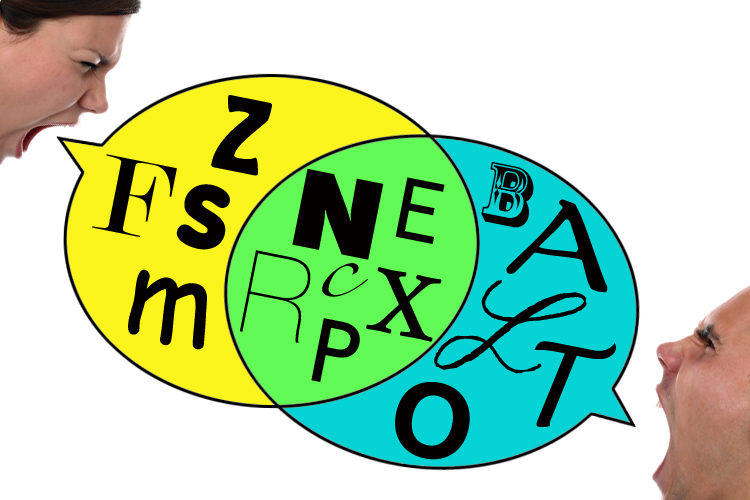
On the subject of fonts (or, typefaces, to use the more technically accurate term), feelings often run high. People have their favorites, for reasons both practical and sentimental. The story of how Helvetica became the preeminent typeface of our times has inspired a documentary film, while loathing of Comic Sans has prompted what can only be called a typographical jihad. A surprising number of older authors name Courier as the font they prefer to write in because it resembles the characters of a typewriter and therefore kindly suggests that the current draft is still available for improvement. But surely everyone can agree that a good typeface is easy to read, right?
Not so. A recent study out of Princeton, and brought to wider attention by Jonah Lehrer at Wired.com, suggests that ugly, irregular fonts can boost the amount of information readers retain from a text, while easy-to-read type is more likely to just sort of slide out of their minds. The study, titled “Fortune Favors the Bold (and the Italicized): Effects of Disfluency on Educational Outcomes,” found that people remembered more from worksheets and PowerPoint presentations when they were composed in a hot mess of hated fonts like Monotype Corsiva, Haettenshweiler and the dreaded Comic Sans Italic.
The hypothesis is that the added difficulty in reading these texts forces more cognitive engagement, which leads to greater comprehension. While we naturally think that we learn better from texts that are pleasant and easy to read, the opposite may be the case. For Lehrer, who admits to loving his Kindle but also to worrying that it makes “the act of reading a little bit too easy,” this is an ominous sign.
For type buffs it’s even worse. E-readers have already obliterated the careful choices designers make when deciding to set a novel in Minion or a history book in Caslon Old Face. As with Henry Ford’s Model T (available in any color you want, as long as it’s black), Kindle books are invariably set in PMN Caecilia. The Nook and iBook apps on my iPad offer a choice of five and six fonts, respectively, but on the off-chance that the designer of the print edition chooses one of these, the text will still be “flowed” onto its digital pages in an ad hoc fashion and sized according to my personal preferences.
Even for a typography ignoramus such as myself (a friend recently asked about the typeface my own book was set in and I had to admit I’ve forgotten what it’s called), this seems a sad state of affairs. Only one of the dozen fonts available in the three major e-book formats makes the list of the top 10 typefaces used by award-winning book designers (that would be New Baskerville), so how good can they be? On the other hand, the critic and author Lev Grossman might rejoice to learn this, since prize-winning designers seem to be partial to Garamond, a font he has reviled at length for its “empty, self-indulgent quirkiness.” He could make the digital switch and never have to read Garamond again!
It’s safe to say that once computers made a variety of fonts available to the average user, many, many more people were encouraged to take an interest in — and positions on — typography. The result seems to have encouraged more hatred that adoration. Does anyone love, say, Palatino as much as they despise Comic Sans? Does anyone go on as long in praise of Georgia as they will rant against Papyrus or Bradley Hand?
The utilitarian nature of fonts means that the good ones get used a lot and as a result seem commonplace rather than wondrous. How clever the Edwardian bookbinder Thomas Cobden-Sanderson was when, in order to prevent his beloved Doves Type (designed by Emery Walker and used to set the exquisite Doves Press Bible in 1902) from being squandered on lesser books after his death, he threw all of the hand-cut type off the Hammersmith Bridge into the Thames River. Now the fabled Doves Type seems not just beautiful, but also precious because of its rarity.
Well, if the Princeton researchers are correct, perhaps all beautiful type will soon become rare, as readers buckle up for bumpy rides through texts set in Arial or Brush Script (or both!), to optimize them for maximum information retention. In time, hideous fonts could become so familiar that we start to find them easy to read, and lines set in elegant New Century Schoolbook will come to seem jarring. Let’s hope that, in the meantime, all the typographers don’t throw themselves off the Hammersmith Bridge.
Further reading
“Fortune Favors the Bold (and the Italicized): Effects of Disfluency on Educational Outcomes” by Connor Diemand-Yauman, Daniel M. Oppenheimer and Erikka B. Vaughan: The original Princeton study of the effects of ugly typesetting on comprehension
Jonah Lehrer in Wired.com on the Princeton study and the perils of too-easy reading
Top Ten Typefaces Used by Book Design Winners from the FontFeed
Authors tell Slate.com about their favorite typefaces
Five fonts we never want to read again, from Flavorwire
The first page of the Doves Press Bible
ban comic sans A website devoted to eradicating the world’s most hated font
Type Matters: A page of delightful short videos about book designers, authors and fonts, from Penguin
Font Fight: A video in which personifications of common fonts duke it out in a warehouse, from CollegeHumor
