Imprint

A fond farewell to the hard-wired phone

From "Superman" to "I Love Lucy," we look back at the role this outdated played in television and film

  • more
    • All Share Services

A fond farewell to the hard-wired phone

Our all pervasive and everyday friend, the telephone -- on TV and film.

ImprintWhen it comes to using a telephone these days, most people spend more time on a cellular phone than a hard-wired device. Even the phone sets we use that are tethered to an outlet tend to be wireless. Folks are canceling their traditional telephone service in exchange for their cellphone plans. And you can forget pay phones or phone booths — good luck even trying to find one of those! Makes sense, but it’s caused me to reflect on a century of the telephone’s history in our culture, and there’s no better barometer of our popular culture than film and TV. I spent a lot of time in front of our television set when I was a kid — I’d often turn it on and watch it as well. TV shows, reruns of programs that aired before I was born, cartoons … This self-imposed saturation also has a lot to do with why I love animation so much. There was even a program that aired on WGN/Ch9 in Chicago every Sunday night called “When Movies Were Movies” that specialized in showing the classic films of the Depression/World War II era. By the time I reached high school I’d become entranced by the 1930s-1940s time period. But while watching TV and especially old movies, I formed an affinity to a regular player beyond the actors — the humble and ever present telephone.

Posters for "Sorry, Wrong Number" 1948, "Dial M For Murder" 1954, and "Butterfield 8" 1960. All depicting Western Electric equipment. Interestingly, Hitchcock's film takes place in London but this re-release poster has replaced the British telephone actually used in the film with Henry Dreyfuss' (American) Western Electric 302 model for U.S. familiarity. . .

It was around this time (early 1970s) that I noticed that a lot of the antique stores and junk shops in the Chicago area had old telephones for sale. This was pre-Bell System divestiture, so I don’t really know what to attribute this glut of available vintage equipment to, but it seemed to me to be the ideal time to gobble up these old telephones that I’d come to know so well from the stuff I’d watched on television. As I began to collect these wonderfully simple and gorgeously designed contraptions, I also began to notice differences in the design details. After a while, I could plainly see the chronological transition that the design of any particular phone model followed. I’ve come to realize that this was the foundation for my interest in basic design evolution as well — future posts will show further evidence of this. When lined up and displayed next to each other, it’s easy to see the evolution of the design and distillation of details – especially by the time industrial designer Henry Dreyfuss (1904-1972) became involved as a Bell Telephone consultant in 1930 and an actual designer for them by the mid-1930s.

Henry Dreyfuss (Bob Landry photo) with select examples of his firm's work

Dreyfuss’ work with the Bell System/Western Electric stretched from the debut of his classic 302 desk set in 1937 to the timeless model 500 phone still in production in 1982. In the end, there had been over 161 million Dreyfuss-designed telephone sets produced. What’s also interesting to me is how the Western Electric/Bell System/AT&T telephone could exist as both a generic icon and a “product”. Because of the monopoly the Bell Telephone Company had over the market, we’ve got approximately 70 years of documentation in various realms (print, TV, motion pictures, etc.) of a corporation’s service. Yes, there were companies like Stromberg-Carlson, Kellogg, GTE, etc., but I think it’s hard to argue that Western Electric reigned as anything other than supreme. As a result, even when the use of the telephone wasn’t in itself an advertisement, it ended up being one anyway. A very unique set of circumstances indeed…

Here’s a visual timeline of the basic Bell System desk set equipment produced by Western Electric and American Telephone & Telegraph (AT&T). All the telephones photographed against a white sweep (except for the 1980s pay phone ad and the 1932 Model 302 prototype) are a part of my personal collection. It’s safe to say that having all these telephones creates an environment that makes it appear as though a regional production of “The Front Page” could break out at any moment…

1904 -- 1020-B nickel plated desk stand, including hard rubber bi-polar "Pony" receiver with exposed terminals, and glass (to prevent the spread of disease) "Whispering Mouthpiece".

1915 – 1020-AL non-reflective "Parkerized" painted brass desk stand and hard rubber receiver now with enclosed terminals.

1920 – 51-AL painted desk stand with off-center shaft to accommodate a surface-mounted dial.

1925 – A1/AA1 painted deskset with brass base and aluminum cradle holding combined Bakelite transmitter/receiver. This is a transition phone that incorporates elements from both the “Candlestick” and the “Cradle” designs. This is essentially a Candlestick base with a short shaft for the handset holding cradle. In production for a very short time and as a result, a very rare model.

1927 – 102 painted round aluminum based desk set and continues the surface-mounted dial design.

1930 – 202 painted aluminum OVAL base and new recessed dial design that fits flush to the base.

1937 – 302 H1 is also a transition model and a first of (several) sorts. It’s the first Dreyfuss-designed set to go into production and the first model to incorporate the ringer within the desk set. Prior to this, a separate ringer box had to be installed on a nearby wall. This intro model is made with a metal shell and very heavy. It also utilizes the same basic handset as the previous cradle models – but some introduced the Dreyfuss F1 plastic handset. The ears and contact buttons are smaller than the basic 302 of 1938 and there were air vents inside the handgrip.

1938 – The classic 302 is the basic shape that has become known as the “Lucy Phone” because of its use on the “I Love Lucy” TV show. By now it always came with the F1 handset.

1941 – 302 shell manufactured and molded out of Thermoplastic, saving metal for the war effort and approximately 2 lbs in weight. The use of plastic also offered up wide color options.

1955 – 5302 transition telephone that allowed the use of 302 guts with a modern “500” look. They sometimes came with older F1 handsets as well.

1949 – The Model 500 is the first post-war designed phone and became the icon of American telephones. It served as the foundation for Bell Systems phone design through the 1980s. Also designed by Dreyfuss, it was produced in a rainbow of different colors and would later (1953) incorporate a clear plastic dial, as well as options like a lighted dial and volume controlled handset.

1950s Model 500 now offered with a clear plastic dial.

1963 – 1500 was the “Touch Tone” version of the 500 and could be considered a remuddled version of the classic Dreyfuss design. Initially TT/pushbutton phones came with 10 buttons, and were later changed to 12 including the * and # options.

A Model 1500 with two button blanks ready to receive the * & # buttons to come.

The Classic 12 button Model 2500

Click Here to see an “animated” Phone Timeline.
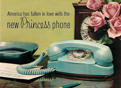
 

1963 – 701 “Princess” phone. Designed by Robert Hose of Henry Dreyfuss Associates. When introduced (with multiple color options) they had no ringer and needed a wall mounted ringer box. They later included internal ringer, lighted dial, and Touchtone (2702) versions.

Princess Ad from the '60s

1965 – “Trimline” phone. Designed by Donald Genaro of Henry Dreyfuss Associates, it was the last of the standard telephone designs created before the Bell System break-up. Features included streamlined/ergonomic design, multiple colors and lighted dials/pushbuttons.

Bill Blass Trimline Ad from the 70s

1920s 533a/1930-40s 1653/ 1950s mixup

1940s Model 354/1950s Model 554/1970s Model 2554

1930-40-50s Spacesaver telephones.

1940-50-60s 3oo type exterior use telephones.

1940s 522 Model telephone for use in elevators.

1960s 660 Model Card Dialing Telephone (originally made for the military)

1970-80s "Telstar" dial and pushbutton models

Two 320 Model Mine Telephones -- these were provided with insulation that would prevent sparks from igniting natural gas found in mines.

Left: 1950s Motorola H13-2AL TYPE TA116 Radio "Handie-Talkie" Telephone used by the Utah State Police. Right: Early 1960s Motorola/Bell System MJ IMTS Radio Telephone -- The 1966 "Green Hornet" TV show had one of these in the Bruce Lee chauffeured Black Beauty. It would be Motorola that would pioneer cellphone technology with its DynaTAC (see below).

The 1983 Motorola DynaTAC "Brick" Cellular Phone -- The beginning of the end of traditional hard-wired service.

1920s and 1950s Western Electric coin telephones.

1980s Pay Phone Ad

Mid-20th century telephone booth.

Seven multi-colored glass inserts for use in booths.

A 1932 prototype (never produced for public use) version of the 302 Model.

On the left, a 1947 prototype pushbutton phone which recently sold on eBay for $17,999.99. On the right, a clear plastic version of the 302 model. From this model on, Western Electric manufactured limited editions of most of their models in clear plastic.

Western Electric started offering models of the their telephones in versions other than black almost from the beginning, but the introduction of plastics after World War II opened all sorts of polychromatic vistas.

Some select telephone related ephemera…

On the left: Illustrator George Petty carved out a career depicting beautifully glamorous pin-up women often holding a red-lined drawing of a telephone. Middle: Clark "Superman" Kent and his relationship with the now almost non-existent telephone booth, is legend. Right: A cover presenting the Bell System/Western Electric's dedication to the World War II effort. (Looks like a Douglas Fraser illustration/design!)

Two marvelously designed and illustrated wrap-around covers from 1930s AT&T booklets.

A May 1950 Bell Telephone System instruction booklet for grade schoolers. They were still handing these out in the 1960s.

A 1930s pinback commemorating 50 years of telephone service and executed with a deliciously simple graphic.

Finally, here are some funky examples from the endless library of  instructional films produced for Western Electric/Bell Telephone System/AT&T:

1. Using a Dial Telephone

2. How to Dial a Telephone

3. Bakelite Telephone

4. How to Dial your Phone by Bell System

5. 1963 Push Button Phone

I’ve found the sites below helpful in answering questions and obtaining parts.

http://www.phonecoinc.com/

http://www.oldphoneman.com/

http://www.telephonecollector.info/

Henry Dreyfuss’ 1955 autobiography, “Designing For People” and Russell Flinchum’s 1997 Dreyfuss biography are both terrific and great sources for the design enthusiast.

BTW — I’m fully aware that the picture of Maxwell Smart and Alfred Hitchcock posing with the giant-sized UK telephone prop depict pieces of non-Western Electric equipment. Regardless, it still seemed to fit into the scheme.

Thanks go to the illustrious Corrie Lebens for her help in scanning and organizing all this with me.

Copyright F+W Media Inc. 2011.

Salon is proud to feature content from Imprint, the fastest-growing design community on the web. Brought to you by Print magazine, America’s oldest and most trusted design voice, Imprint features some of the biggest names in the industry covering visual culture from every angle. Imprint advances and expands the design conversation, providing fresh daily content to the community (and now to salon.com!), sparking conversation, competition, criticism, and passion among its members.

Our bodies, our products

A look back at the long tradition of creating memorable trade characters from the objects they sell

  • more
    • All Share Services

Our bodies, our products
This article originally appeared on Imprint.

ImprintI bet many of you don’t know what the Michelin Man, also known as the Bibendum, is made of. Take a wild guess! French cartoonist Marius Rossillon, also known as O’Galop, created the prototype for a Munich brewery (he was holding a glass of beer and quoting Horace’s phrase “Nunc est bibendum” — now’s the time to drink). It was rejected. But the Michelin brothers saw the image and suggested replacing O’Galop’s man with a figure made — yes indeed — from tires. Voila! The Bibendum is now one of the world’s most recognized and collected trademarks in the world.

Concocting trade characters from the products or the things they represent derives from a long tradition — dating back to medieval trade markings and up through the golden age in the early 20th century (and beyond).

French designers were indeed quite fond of playful mnemonic manipulation, as the examples here for steel wool cleaners, pots and pans, teas and coffees from the 1920s and ’30s attest. The characters are quite surreal yet none so abstract that the message is lost. Made from the packages or from the products themselves, these characters are not as cuddly as Speedy Alka Seltzer or the Mt. Olive Pickle man, but they do have an artful presence and charm.

Continue Reading Close

When nuclear terror reigned

Old handbooks about atomic annihilation allow a fascinating glimpse into some of our greatest fears

  • more
    • All Share Services

When nuclear terror reigned
This article originally appeared on Imprint.

ImprintEngland has a long tradition of dystopian prophecy in literature and cinema. The likes of H.G. Wells, George Orwell, J.G. Ballard, and Ridley Scott all seem to revel in presenting doomsday scenarios. Films such as 1961′s “The Day the Earth Caught Fire,” and the 1965 BBC docudrama “The War Game,” depicting a Soviet nuclear strike on England, as well as books like Raymond Briggs’ “When the Wind Blows,” a deceivingly innocent tale of untold horror, are among the works that underscore the British fascination with and fixation on nuclear devastation.

Fascination? More like well-earned trepidation. After all, during World War II, London was blitzed nightly by German bombs and rockets, its citizenry enduring what most civilized beings could barely imagine. If Hitler had developed the atomic bomb, England would have suffered the same fate as Hiroshima and Nagasaki.

England was forced to develop a sophisticated civil-defense apparatus, which included publishing cautionary guides like this handbook “Advising The Householder on Protection Against Nuclear Attack.” With the same kind of low-key narrative that a “householder” might read on how to survive a bug or rodent infestation, this “training publication for the civil defense, the police and fire services” addresses protective measures, needed equipment, what to do after an attack, and how to “manage” life “under fall-out conditions.” The text is reservedly quaint, underplaying the tragic impact of nuclear war, and the illustrations lack the slightest hint of horror. Indeed, by Jove, it is actually kind of comforting.

Similar handbooks in the United States were shrill by comparison. While they suggested that survival was possible, the magnitude of a nuclear attack was never minimized.

This handbook was republished by the V&A in 2008—for what purpose, other than nostalgia, is unclear. I reproduce it here as a curio from a time when our biggest enemy was the Soviet Union. With all the natural and man-made potential catastrophes at our doorstep, one almost longs for those days.

Continue Reading Close

Illustrating the ’60s music revolution

How one book captured the spirit and art of the cultural transformation -- as it was happening

  • more
    • All Share Services

Illustrating the '60s music revolution
This article originally appeared on Imprint.

Imprint“When did music become so important?” That’s Don Draper from last week’s “Mad Men,” set in 1966. Later in the episode he turns off “Tomorrow Never Knows,” from the Beatles album “Revolver,” and walks out of the room.

art: Rick Griffin

There’s something happening here, but you don’t know what it is — do you, Mr. Draper? One year later, Rolling Stone magazine will make its debut, followed soon by “Rock and Other Four Letter Words.”

“Rock,” a 250-plus-page Bantam paperback, was published in January 1968 and subtitled “Music of the Electric Generation.” It was one of the first books of its kind, chronicling a cultural revolution that was still in the midst of its own creation. Crammed with black-and-white portraits of bands and musicians, it’s part oral history, part visual LSD trip. One of its fold-out spreads has an intricate, circuitlike diagram that connects over a hundred names, from the Butterfield Blues Band, the Beach Boys, and the Byrds to Busby Berkeley, Brubeck and Bach.

The editor-designer was a writer named J Marks. The photographer for most of the images was Linda Eastman, who went on to work for Rolling Stone and — oh, yes — marry Paul McCartney.

By the sheer force of its graphic presentation, ”Rock and Other Four Letter Words” conveys the mid-1960s music scene’s spirit, vitality and relevance.


Continue Reading Close

How to resurrect a comic book

Should revived comics be made to look new or faded? Two releases explore both approaches

  • more
    • All Share Services

How to resurrect a comic book
This article originally appeared on Imprint.

ImprintMemory is evanescent. I can’t recall where I made the purchase; perhaps it was during an elementary-school or Cub Scout trip. Nor do I remember my exact age; it was anywhere between 8 and 10. What I do remember vividly is the visceral experience: the feel and smell of the paper as I unfurled it. The sense that I was both witnessing and experiencing history, which I then held tangibly in my hands. In the morning of that day, my mother had given me some small change for the day’s trip, and I spent it on a reproduction of the Declaration of Independence. It was printed on a rough-hewn, yellow paper stock with stains on both sides, and it had a rigidity that made it hard to open (it was folded in quarters). The reproduction possessed a distinct smell, and the texture was coarse, as if it was once damp and left to dry. “Onion paper,” my mother explained when I got home. It sounded exotic. Sadly, I’ve forgotten the whereabouts of that formative piece of paper, but the power of the experience has remained.

As I remember it. Every defect was a hidden treasure.

Around that same time my father came home with a present for me. It was a ream of blank newsprint paper. He was a transit worker, and he explained that someone had left it behind on the subway. For me it became a treasured gift, as the paper looked exactly like the paper of the comic books I so fervently read. With the paper as my narrative canvases, I began producing my own comics by the score: Dr. Sol, The Crusaders, The Saturator, Gas-Man! et al.

Page from The Saturator, created when I was 11. At long last, I could produce comic books that looked like comic books.

Cut forward to 2001 when I first began to go through the Woody Guthrie Archives, located in Manhattan, to explore whether it was possible to make a book of his artwork. (It was.) Peering through his drawings and journals, I had the same experience I had as a child, although this time the documents had authentically aged: The years had added a yellow patina to many of these pieces, despite the fact that they were stored in a climate-controlled environment. This was the first time I was confronted with the question of how best to reproduce this work. Does one attempt to imagine it as it was when originally created, with pristine white backgrounds and colors that have not yet faded? Or reveal it as it exists today, less vivid but with the stains of time present? Since the former was impossible to know, I came to the conclusion that only the latter made sense.

I experienced this again a few years later with Louis Armstrong’s collages, which he “laminated” with Scotch tape. With these collages there was no question about heading back in time—the dried tape was as much a part of the collages as every photo was.

Woody Guthrie’s journals gain gravitas with the patina of passing years.


In Armstrong’s collages, yellowing tape adds to the experience.

Which brings me back to comics. One of the first collections I ever purchased, in the 1980s, was Bill Blackbeard’s oversize “Smithsonian Collection of Newspaper Comics,” first published in 1977. Within the anthology, “Hogan’s Alley,” “Little Nemo in Slumberland,” “Gasoline Alley,” “Buster Brown,” and myriad others were lovingly and photographically reproduced with great detail on a paper stock closely akin to newsprint.

Imagine my surprise when I began to explore hardcover anthologies of comic books from DC and Marvel, released in the same era. “DC Archives” and “Marvel Masterworks” could not have been more different from Blackbeard’s groundbreaking accomplishment. They were garishly colored on high-gloss white stock; I had the sensation that I would need sunglasses to read them. I soon learned that since the original comics were unavailable—as were photostats—and the original artwork had been lost, destroyed, or scattered, the reproduction involved hiring present-day artists to trace and recolor the comics. The final effect was not so much of a black-and-white MGM classic colorized by Turner but rather like Gus Van Sant’s frame-by-frame remake of “Psycho,” starring Vince Vaughn as Norman Bates.

A page from Bill Blackbeard’s seminal work on newspaper comic strips, beautifully photographed in the pre-scanning days.


A side-by-side comparison of the original Fantastic Four #4 comic and a Marvel Masterworks “recreation.” Not only are the tracings inaccurate, the coloring does not adhere to the original.

The first time I became aware that change was in the air was when DC released “Jack Kirby’s Fourth World Omnibus, Vol. 1. “Here, an off-white paper replicated the look and feel (although happily not the fragility) of newsprint, and the line art was reproduced from the original stats. Fortunately, DC has employed this technique for other releases, although Marvel has opted for the strategy of tracing and reproducing on bright paper.

Smaller publishers like Fantagraphics followed Blackbeard’s lead, and since the advent of digital scanning, many others have chosen similar tacks: Abrams, IDW, Dark Horse, Titan, and Yoe Books all beautifully reproduce from the source. Still, two schools of thought have emerged about how best to achieve an optimum reading experience, both utilizing matte paper. One approach keeps the yellowing borders intact, while the other involves removing the borders and enhancing the colors, as if the comics had originally been printed on white, higher quality stock.

The DC release Jack Kirby’s Fourth World Omnibus, Vol. 1, successfully replicates the look and feel of the original comics.

In the next month, two books of comics reprints I’ve edited will be released, showcasing both techniques. “Golden Age Western Comics,” published by powerHouse Books, reproduces the original pages whole cloth, although the blacks and colors have been enhanced to replicate how they would have appeared before fading. In addition, we made minor touch-ups. Up until this point, this generally would have been my preference, as I prefer the viewing experience to be as close to reading a 60-year-old comic as possible; these comics were never printed on white paper to begin with. However, Fantagraphics has removed the borders and all signs of aging on our Mort Meskin book of reprint stories, “Out of the Shadows.” Comparing the two releases, I’ve come to appreciate the advantages of both approaches. As a genre, Westerns are mired in nostalgia, having long since been replaced by other action tropes in modern-day entertainment. With that in mind, a book as object set in a distant time and place seems appropriate. For the Mort Meskin collection, we hoped that a contemporary audience would rediscover him; Fantagraphic’s fresh, newly minted approach goes a long way toward achieving that.

A page from Golden Age Western Comics, published by powerHouse.

A page from Out of the Shadows, released by Fantagraphics.

Continue Reading Close

Steven Brower is a graphic designer, writer and educator and the former Creative Director/ Art Director of Print. He is the author/designer of books on Louis Armstrong, Mort Meskin, Woody Guthrie and the history of mass-market paperbacks. He is Director of the “Get Your Masters with the Masters” low residency MFA program for educators and working professionals at Marywood University in Scranton, Pa. @stevenianbrower

Donny Osmond: Design icon

In the1970s, teen magazines were my obsession -- and inspired my love of design

  • more
    • All Share Services

Donny Osmond: Design icon
This article originally appeared on Imprint.

Before there was a Justin Bieber — before there was even a Justin Timberlake — there was Donny Osmond. One summer night in the 1970s, my poor older brother, Mike, was forced to take his preteen sisters to see Donny and those other Osmonds, as well as the Jackson 5, at New York’s Madison Square Garden.

ImprintImagine the stress of worrying about two adolescent girls and their obligatory mutual friend dancing their way down from the cheap seats to the slightly better view one section below. Mike was in college, and my sister and I weren’t even in high school yet. I guess that’s why our brother sat ducked down in his seat, hiding behind a newspaper.

16 was my first magazine subscription, though I never got to send away for any of the groovy posters or luv kits. 16 and Spec were essentially the same publication, but the idea of reading a magazine called 16 made me feel older—you know, more mature.

Gloria Stavers was 16 magazine in the early 1970s. She met its owner, Jacques Chambrun, in 1958 and signed on as office staff for the nascent publication. She checked reader mail and fulfilled subscriptions, all the while studying young readers’ needs. She soon made a name for herself in the entertainment industry with her list of questions compiled from the typical queries the magazine received — “40 Intimate Questions.” By late 1958, Chambrun named Stavers editor in chief of 16. The writer Dave Marsh calls her the “first real pop journalist.”

Stavers published teen idols’ loves ’n’ hates, baby pix, and wonderfully whitewashed life stories. There was no sex to speak of, though there was an implied — and completely benign — sexiness in some of the feature titles (“What I Do After Dark!”). The stories were upbeat, and the stars didn’t have things like drug or alcohol problems. There were lots of exclamation marks and no sordid scandals. And ohhhh, the pinups that were carefully removed from the center of the book and taped to my bedroom walls …

The 16 mag (always mag, never magazine) of my childhood asked squealing preteens to choose between Donny, David, and Michael. Though I did like David Cassidy and his groovy hair, and enjoyed a little Donny from time to time, my heart ultimately belonged to Michael Jackson. He seemed like a shy guy, which was intriguing, and Michael didn’t get quite as much magazine real estate as Donny. I always rooted for the underdog, even back in 1973.

I was past my teen-mag expiration date by the time Andy and David Williams and Shaun Cassidy became fave raves. And I never quite understood the appeal of Randy Mantooth or Rick Springfield, though I always had a huge crush on Scott Jacoby.

1970s-era Spec and 16 inspired my love of publication design. Looking back, of course, they’re both pretty cheesy but also charming and unself-conscious with their rub-down type and Chartpak rules. The colors! The illustrations!

These are my teen mags, by the way, not eBay purchases—though admittedly, I’ve been seriously tempted…

Number one fan:


Continue Reading Close

Page 1 of 47 in Imprint