 Cooper Union and the Type Directors Club teamed up in the fall of 2010 to sponsor Type@Cooper (known informally as CooperType), the first postgraduate certificate program in type design offered in the United States. The extended program*, coordinated by Cara Di Edwardo and led by Jesse Ragan and Alexander Tochilovsky, covers a wide range of topics: techniques, technology, aesthetics and personal expression, history, and theory. It includes workshops, taught by industry professionals, on broad pen calligraphy (Karen Charatan), drawn lettering (Ken Barber and Richard Lipton), Python programming (Ben Kiel), experimental letter design (Mark Jamra), font development tools (Andy Clymer) and more. They are supplemented by a series of guest lectures. Among the lecturers in the past year have been Matthew Carter, Christian Schwartz, John Downer, Roger Black and Mike Daines. The goal of the program is to enable students to have the skills to create a professional-quality digital typeface. Naturally, the final project, the result of 162 course hours over three terms, is an original typeface. The work of the first class to complete the Type@Cooper program was exhibited this fall at the Type Directors Club.
*Type@Cooper also includes a five-week long Condensed Program in the summers. The first Condensed Program actually finished before the first Extended Program. The work of those students was not included in the exhibition at the Type Directors Club and is not part of this article.
Although eighteen students were admitted into the Type@Cooper program, only eleven completed it. They come from a wide range of backgrounds. Several are in the midst of career changes. The students (and the names of their typefaces) are Aaron Carámbula (Marais), CJ Dunn (Range), Cristóbal Henestrosa (Vanitas Serif), Thomas Jockin (Garcon), Becky Johnson (Dagmar), Annica Lydenberg (Barker), Mark McCormick (Alfonso), Liz Meyer (Harper), Juan Carlos Pagan (Mica), Nick Sherman (Ozwig) and Jesse Vega (Ariia). (A sampling of the typefaces can be found on Facebook here. The faces are the direct result of two courses taught by Jesse Ragan: Designing an Original Typeface and Advanced Typeface Design, the latter focused on multiple-style families, interpolation, language support, kerning and workflow automation. All of the typefaces show remarkable professionalism. They are not grunge fonts or “experimental” designs in the early Emigre vein but full-fledged typefaces of the kind designers expect from established foundries. As a requirement for the certificate all of the typefaces have multiple weights, though none have fully developed families yet. (According to the students, all of the fonts still have various hiccups that need to be―and will be―ironed out before any are made available to the public.)
Three of the typefaces on display at the Type Directors Club especially caught my attention. They were Marais, Dagmar and Alfonso. Here is a closer look at each of them, examining their strengths and shortcomings. (Reminder: These are works in progress and inevitably they are imperfect.)
Carambula, a graphic designer at Objective Subject, a branding and interactive studio, began Marais as a sketch in a Type@Cooper workshop conducted by Hannes Famira. It is a faceted slab serif that is at its best the heavier it gets. Not surprisingly, Carambula says that the font began with “a single ultra black ‘k’ so heavy that the thin strokes collapsed under the weight of the thicks and the slab serifs swelled from the overstuffing.” The resulting design has many of the key features that distinguish Marais: a chunky overall appearance, as if the letter was roughly hewn from a quarry; a chiseled slab foot serif which is single-sided to open up the letter’s lower counter; and a rhomboid slab head serif that gives the letter a dimensional look. It is this dimensional aspect of the ascending lowercase letters that originally captivated me when I first saw Marais. The letters are like optical illusions: flat one minute and then three-dimensional the next. Carambula says that the rhomboid head serifs came from an attempt to inject some blackletter DNA into a roman typeface.

Essentially Marais Ultra can be viewed as a contemporary Cooper Black. (In terms of color, Marais Ultra and Marais Black seem to bracket Cooper Black.) Despite beginning with an ultra k Carambula did not design Marais Ultra first. Instead, he began with the medium weight as a means of developing control characters that would allow him to realistically determine the limits of the weight and proportions of his typeface. From there he went back to the ultra weight and eventually to the regular and black weights. The italics―but only medium and ultra so far―came later.
Marais Regular, the lightest member of the family, is rugged and has the color of a Venetian Oldstyle face. The features that made the ultra k so wonderful have been carried over, but the single foot serif does not seem necessary at this weight given the openness of the counters. In the medium italic―which, despite its name, seems to be the same weight as the regular (a glitch common to fonts in progress)―the dimensional head serifs of the ascenders have given way to simple bent stems that follow the m, n, p and r of the regular roman. The result is a livelier appearance than that of Marais Ultra Italic. But I prefer the latter’s sparkling solidity. It is reminiscent of Hermann Zapf’s often-overlooked Kompakt, a heavy, sloping companion to Palatino.

Like a number of typefaces over the past twenty years, Marais reveals the influence of W.A. Dwiggins’ M-formula theory as developed in his experimental Newsface (aka Hingham). This is most evident in the asymmetrical counters of the round letters. This helps to tie letters that lack serifs such as c, e and o to the rest of the font. The exception is the s which remains curiously “flat.” It might benefit from some additional faceting. A similar situation occurs with some of the rounded numerals, though they are beautiful and very harmonious on their own. These are very minor criticisms. Marais, especially in the ultra weight, is a very assured and muscular face that should get out in the world. It would add some welcome crunch to advertising.

Becky Johnson trained as an herbalist before working as a jewelry deisgner and, more recently, shifting to a career in graphic design. Dagmar is her first typeface. It is the culmination of her decades-long love of letters. “I have had an intimate relationship with letter forms for as long as I can remember,” she says. “I would draw them over and over as a child and look at them formally, as objects. When I learned to read, I understood that type was a visual manifestation of language, but I continued to have an interest in the letter forms themselves.” Johnson’s obsession with letterforms was channeled into Dagmar, a simple, unassuming typeface. She was inspired, she says, by typefaces for signage and the early work of the Dutch type designer Gerard Unger.

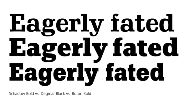
Dagmar can best be described as a humanist slab serif. Although she cites Unger as an influence, I see traces of the work of his compatriot Peter Matthias Noordzij, designer of PMN Caecilia. The humanist quality of Dagmar is obvious in the form of the key letters a and g, both of which are two-story in form but it is also present in the openness of the round letters a, c and e (but less so for s) and in the slight stroke contrast found throughout the font. The long shadow of Adrian Frutiger surely lies behind the open round letters. The subtle stroke contrast separates Dagmar from PMN Caecilia, Serifa, Boton, Calvert and most modern slab serifs. Instead, it links the font to contemporary text faces such as Scala and Whitman as well as the older Candida (Jakob Erbar, 1936) and Schadow (Georg Trump, 1938). Dagmar is quieter than these types, but not as retiring as PMN Caecilia. It has a contented appearance, even in the black weight.

So far Johnson has only completed the medium and black weights and an italic that matches the former. The italic shows growing pains. Johnson has tried to create a “true” italic, complete with cursive a, f, and g as well as exit strokes for many letters. It is not working yet. The a feels too plump, the f looks like a fish out of water, the g is struggling to fit in and the diagonal letters (k, v, w, x, y, and z) seem to be at odds with the arched letters (h, m, n). Dagmar might be better served with a more oblique companion rather than a true italic.
However, it is not the italic that makes Dagmar worthy of attention but the roman, especially the black weight. Dagmar Black manages to be severe yet friendly, powerful yet readable. The key to this balancing act is the careful application of curves that soften its demeanor without making it flabby. One instance is the use of bracketed serifs in C, G, S, c and s (and related numerals) but nowhere else. Introducing similar curves into the legs of K, R, and k might provide a good bridge between these round letters and the rest of the font. As it is they feel too stiff. Other than the absence at the moment of parentheses, brackets and braces (still to be designed), this tiny criticism is all that I can level at Dagmar Black.

Although it was the first weight designed, Dagmar Medium is not quite as successful as its heftier sibling. The stiffness of K, R, and k is more evident, the bracketed terminals of C et al are more obtrusive, and the round capitals feel a trifle too narrow. Nevertheless, it is a very good first effort. Johnson’s goal of creating a typeface “fit for information, lists, and editorial purposes” has nearly been achieved. She says she plans to fine-tune the design and release it commercially once all of the bugs have been worked out.
Mark McCormick, creative director at Crunch Fitness, began his career as an illustrator. Drawing letters “just for fun” in his spare time led him to enroll in the CooperType program. At the time McCormick was not yet obsessed with type. That has changed. “I probably couldn’t have picked Centaur out in a lineup,” he says, but now he has developed an appreciation for the classic text faces. This new-found appreciation is behind his typeface Alfonso.

McCormick’s intent was “to make a face that is technically sound enough to be read at small sizes (for the learned typophile), while retaining the illustrative quality that will keep it interesting when it’s huge (for the ignorant illustrator).” He wanted something sturdy but graceful or, as he phrased it, “a solid drumbeat with a couple guitar solos.” The one thing he did not want Alfonso to be was trendy. “I like the thought of a schooled viewer having no idea when it was created,” he remarks. I think that McCormick has largely achieved these goals.
Alfonso looks like a typeface from the beginning of the 20th century (or possibly from the 1970s when Edwardian designs were once again in fashion). There are hints of Windsor, Stanhope, Genzsch Antiqua and Plantin in the slightly splayed M, of Minister and Stanhope in the overlapping strokes at the apex of A), of ITC Isbell in the open counters of B and R, and of Genzsch Antiqua, DeVinne, Romana and Laureate (1901) in its sturdy bracketed serifs and general weight. But as familiar as Alfonso feels, in totality it looks like none of these other faces. It is absolutely original.

Alfonso is, at heart, at 19th century oldstyle face. Its lowercase has the structure of an oldstyle and its serifs are bracketed with beaks at the heads of lowercase stems. But its capitals have fairly uniform widths and the curved strokes on many letters end in ball terminals, features more commonly associated with “modern” style faces. The bracketed serifs are so sturdy they nearly resemble bell-bottoms. This, coupled with a low stroke contrast and tall x-height, gives Alfonso, even in its regular weight, an untrendy dark appearance. This is offset somewhat by its large counters. Those of B, P and R are open and those of X, h, m, and n are enhanced by single-sided foot serifs on some strokes. The M is splayed to the same effect. These letters are what distinguishes Alfonso visually. Two other notable letters are A with its overlapping apex and K with a gap between its stem, arm and leg. (Oddly enough, k does not follow K’s lead in this respect.)
The capitals are the most polished aspect of Alfonso. Only the A and J feel out of sync. The angled apex of A disrupts the tranquility of the cap line and the descending J too long, especially compared to the Q. The J is alone among the capitals in having a ball terminal, but it is widely echoed in the lowercase. The single-serif legs of h, m and n take away from the sturdy, tree-trunk aspect of the font established by the capitals. Although they were presumably created to open the counters, it is not clear―look at the m―that they are needed.
In Alfonso Black, the only other weight completed at the moment, the counters of B, P and R are closed as is the gap in K between its stem, leg and arm. The ball terminal on the J feels more at home at this weight. And the single-serif legs on h, m and n are clearly necessary―a similar feature has been applied to the x (following X) at this weight. This makes the black more homogenous overall.
Alfonso Italic reminds me of the ITC faces of the 1970s in its slickness. This is not a criticism. The letters have the well-crafted, almost voluptuous curves that defined many of ITC Bookman, ITC Cheltenham et al. The one letter that feels a bit pinchy in this respect is the g―but this is a notoriously difficult letter to design in the two-story form. The rest of the lowercase has a pleasing rolling rhythm.

Although I have focused attention on Marais, Dagmar and Alfonso, these are not necessarily the “best” faces produced by the Type@Cooper students. These are simply the ones that appealed to me the most, the fonts that I liked viscerally. Several others match or possibly surpass these three in terms of craftsmanship and all of the fonts are certainly worthy efforts. The Type@Cooper program has proven itself as a serious alternative to the more established type design programs at the University of Reading and the Koninklijke Academie van Beeldende Kunsten (KABK) in The Hague. Kudos to Jesse Ragan, Sasha Tochilovsky, Cara Di Edwardo and the roster of guest teachers and lecturers.
Copyright F+W Media Inc. 2011.
Salon is proud to feature content from Imprint, the fastest-growing design community on the web. Brought to you by Print magazine, America’s oldest and most trusted design voice, Imprint features some of the biggest names in the industry covering visual culture from every angle. Imprint advances and expands the design conversation, providing fresh daily content to the community (and now to www.salon.com!), sparking conversation, competition, criticism, and passion among its members.
