Imprint

Revisiting the power of Nazi propaganda

A new Holocaust Museum exhibit provides unique insight into one of the world's most devastating ad campaigns

  • more
    • All Share Services

Revisiting the power of Nazi propaganda (Credit: Kunstbibliothek Berlin/BPK, Berlin/Art Resource, New York)
This article originally appeared on Imprint.

The People Vote Slate 1, National Socialists -- 1932 -- Willi Engelhardt, artist. Credit: Library of Congress, Prints and Photographs Division, Washington, D.C.

What is the role of the printed word and image in collectively inciting societies to brand certain members and groups as evil, and to convince the citizenry to condone — if not incite — murder?

During a recent visit to the United States Holocaust Memorial Museum in Washington, D.C., I was reeducated in the power of branding — especially as applied to poster design — at the special exhibition, State of Deception: The Power of Nazi Propaganda, which demonstrates how the Nazi party used carefully crafted messages, advertising and design techniques, and then-new technologies (radio, television, film) to sway millions with its vision for a new Germany. As described in its press release, “The exhibition presents posters, photographs, artifacts, and film documenting the propaganda in the Nazi effort to achieve and consolidate power and drive the world into a war that cost some 55 million lives, including 6 million Jews, in the Holocaust. The legacy of this era continues today, influencing debates about hate speech and the dangers of propaganda in democratic societies, as well as efforts to prevent and punish the crime of genocide.”

I came away with one overriding question: Has any other organization of any kind, before or after, done a better job of using all the elements of branding and mass communication — symbol, headlines and slogans, color scheme, typography, imagery — to transmit its messages and mold public opinion?

Cover of "State of Deception: The Power of Nazi Propaganda," book by Steven Luckert and Susan Bachrach of the United States Holocaust Memorial Museum. The cover image is from a poster for the film “S.A. Mann Brand,” 1933. Credit: Kunstbibliothek Berlin/BPK, Berlin/Art Resource, New York. Book designed by Laura Lindgren.

To look into all of this more deeply, away from the crowds that clogged the passages of the maze-like exhibit, I bought the book. Like the exhibit, the book opens by defining propaganda as “the dissemination of information, whether truthful, partially truthful, or blatantly false, that aims to shape public opinion and behavior,” and is laid out in four main sections:

1919-1933: Propaganda for Votes and Power: A vision of national unity and promise of future prosperity for Germany glorified Hitler, recruited adherents, and helped transform the Nazi Party from an obscure extremist organization into Germany’s largest political party.

Workers, Awaken -- 1932. This election poster shows the German worker, enlightened through National Socialism, towering over his opponents. A Jew is portrayed whispering in the ear of a Marxist, symbolized by the red cap. Behind them, a communist youth with a bloody knife carries a banner that states “Beat the Fascists, Civil War, Class Struggle.” Credit: U.S. Holocaust Memorial Museum

Hitler über Deutschland (Hitler over Germany) -- 1932. Cover image from Nazi Party political pamphlet that detailed Hitler’s election campaign for president. Josef Berchtold, artist. Credit: U.S. Holocaust Memorial Museum/Randall Bytwerk

1933-1939: Propaganda and Persecution in the Racial State: Propaganda fueled the flames of hate by blaming the Jews and others for Germany’s economic woes and depicting them as a threat to racial purity and national health, making legislative measures against Jews (seizure of property and businesses, banishment from many professions, closure of schools, etc.) appear to be in the best interest of the public.

Poster for the film “Der ewige Jude” (The Eternal or Wandering Jew) -- 1940. As part of its wartime attack on Jews, the Ministry of Propaganda used motion pictures as a medium for antisemitic messages. This film was billed as a documentary on world Jewry aimed at unmasking the alleged pernicious influence of the “parasitic Jewish

1939-1945: Propaganda for War and Mass Murder: Posters, pamphlets, newspapers, radio broadcasts, films, school curricula, even toys and board games justified war by creating a potent image of the enemy and fostering a climate of acquiescence to the mass murder of Jews and others (including gypsies, homosexuals and people with disabilities) viewed as undesirable by the Nazi state.

“Behind the enemy powers: the Jew” -- 1942. Nazi propagandists frequently depicted the Jew as a conspirator plotting world domination by acting behind the scenes in nations at war with Germany. This caricature represents the Jewish financier manipulating the Allies: Great Britain, the United States, and the Soviet Union. Hanisch, artist. Credit: U.S. Holocaust Memorial Museum/Gift of Helmut Eschwege
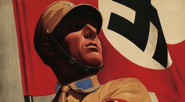
“]

“He is to blame for the war!” -- 1943. The Nazis sought to provoke hatred of Jews by transforming the perception of them from ordinary neighbor into enemy guilty of warmongering and betraying Germany from within. Mjölnir [Hans Schweitzer, artist. Credit: Library of Congress Prints and Photographs Division, Washington, D.C.

In all these materials, the integrity of the logo, the swastika, is never compromised, though it is depicted in a number of versions, including 3-D, as architecture and sculpture, in a pattern, as a symbol for a location on a map. The illustrations are powerful and compelling. The typography is nationalistic and bold, when related to Germany, with Fraktur and Kabel, often in hand-lettered versions, predominating. When related to Jews, scripts and fake Hebrew are used. The color scheme is strong and consistent: red, black, gold, tan.

Thankfully, after 1945, it was all dismantled*. As explained in part 4, “1945-Present: Propaganda on Trial,” after the Allied victory came the de-Nazification of Germany. Not only were war criminals brought to trial, statues of Hitler were removed, street names changed, information about the concentration camps documented and publicized, broadsides and films reinforced the concept of collective guilt on the part of the German public. And in the wake of the Holocaust international laws were passed criminalizing incitement to genocide, most notably in a 2003 verdict of the International Criminal Tribunal for Rwanda in which three Hutu Rwandans, a publisher and two talk-radio hosts, were convicted of “direct and public incitement for genocide” — the murder of half a million members of the Tutsi minority.

The exhibit and the book ask as many questions as they answer. For example, “What is the best way to expose and counter deceptive messages?” and “What limits should there be on speech and what are the costs of exposing them?”

According to the exhibit’s curator and author of the book, Steven Luckert, Ph.D., the public is seeking answers. “From the time of its opening on January 30, 2009 through the end of 2011 nearly 1.3 million people visited the State of Deception exhibition, making it our most popular special exhibition since the museum opened in 1993,” he stated via e-mail. “We are planning to launch a traveling version in 2013. The online version of the exhibition will continue to remain on the museum website, and we will probably increase the number of articles on Nazi propaganda currently available.”

Like other museums on the National Mall (Air and Space Museum, African Art Museum and Smithsonian Institution), the United States Holocaust Memorial Museum is free and open to the public almost every day of the year. The State of Deception exhibition will be on display through September 2012. See the Plan a Visit page for details.

* Note: The Nazi propaganda machine may have been dismantled after 1945, but the imagery keeps rearing its ugly head. In the last few months, swastikas were painted on libraries and synagogues in Brooklyn, Queens, New Jersey, Connecticut, California and Washington state.

Copyright F+W Media Inc. 2011.

Salon is proud to feature content from Imprint, the fastest-growing design community on the web. Brought to you by Print magazine, America’s oldest and most trusted design voice, Imprint features some of the biggest names in the industry covering visual culture from every angle. Imprint advances and expands the design conversation, providing fresh daily content to the community (and now to salon.com!), sparking conversation, competition, criticism, and passion among its members.

New visual artist: Brendan Griffiths

In the latest profile of an emerging design star, we look at an acerbic designer -- with an in-your-face aesthetic

  • more
    • All Share Services

New visual artist: Brendan Griffiths
This article originally appeared on Imprint. It's part of Print magazine's annual New Visual Artist series that profiles 20 of the most promising rising talents around the world in the fields of graphic design, advertising, illustration, digital media, photography and animation.


Illustration for Bloomberg View, 2011

The first thing you ought to know about Brendan Griffiths is this: Do not click on the exclamation mark.

ImprintThe objectionable glyph follows the name of the 29-year-old’s firm, Zut Alors!, on its website, zutalorsinc.com. Griffiths joined the company of the founding partner, Frank DeRose, last May, after picking up his M.F.A. in graphic design from Yale. While still in New Haven, he helped develop the site into a statement of the practice’s principles, a statement that has proved to be “very polarizing,” according to Griffiths. “People either love it or hate it.”

That’s just the kind of response the partners were looking for. Since coming aboard ZA!, Griffiths had been turning out bracing, acerbic graphic work for clients such as Bloomberg Businessweek, as well as iPad apps for Condé Nast titles. “Whenever we hire Zut, we always get really wild ideas,” says Gary Fogelson, whose firm, Other Means, has commissioned illustration from the office for Bloomberg’s editorial page, Bloomberg View. Appropriating familiar images and pairing them with bitingly sarcastic text, Griffiths and Zut Alors! have articulated a distinct visual language; what it says, Fogelson says, is “fuck you.” It’s an attitude that gets attention, and if it gives the client some in-your-face cred, so much the better for them.

Zut Alors! website ,2011

Yale Graphic Design M.F.A. 2011 website, with Juan Astasio Soriano and Brian Watterson, 2011


Paperweight for senior thesis, 2011

The message comes through in infographics, bookmaking, and typography, but perhaps nowhere more so than on the firm’s website, full of blind alleys and blinking icons. This iconoclastic approach matches Griffith’s own. At school, he and a group of colleagues created the Book Trust, a theory-minded but tangible design catalog in which other artists could purchase “shares”; they peddled it — in full corporate drag, name tags and all — around the New York Art Book Fair.

The Book Trust Prospectus, published by Investment Future Strategy, Ltd., with Benjamin Critton, Harry Gassel, Zak Klauck, and Mylinh Nguyen, 2012

“Almost all of graphic design is very commercial, including a lot of work I make,” Griffiths says. Alternating satire with confrontation, he is trying to work his way out of the design-world straitjacket, even as he’s piecing together how to operate a professional partnership. Griffiths says, “We’re just figuring it out as we go along.”

See the other 2012 New Visual Artists:


More Design Resources:

Continue Reading Close

Our bodies, our products

A look back at the long tradition of creating memorable trade characters from the objects they sell

  • more
    • All Share Services

Our bodies, our products
This article originally appeared on Imprint.

ImprintI bet many of you don’t know what the Michelin Man, also known as the Bibendum, is made of. Take a wild guess! French cartoonist Marius Rossillon, also known as O’Galop, created the prototype for a Munich brewery (he was holding a glass of beer and quoting Horace’s phrase “Nunc est bibendum” — now’s the time to drink). It was rejected. But the Michelin brothers saw the image and suggested replacing O’Galop’s man with a figure made — yes indeed — from tires. Voila! The Bibendum is now one of the world’s most recognized and collected trademarks in the world.

Concocting trade characters from the products or the things they represent derives from a long tradition — dating back to medieval trade markings and up through the golden age in the early 20th century (and beyond).

French designers were indeed quite fond of playful mnemonic manipulation, as the examples here for steel wool cleaners, pots and pans, teas and coffees from the 1920s and ’30s attest. The characters are quite surreal yet none so abstract that the message is lost. Made from the packages or from the products themselves, these characters are not as cuddly as Speedy Alka Seltzer or the Mt. Olive Pickle man, but they do have an artful presence and charm.

Continue Reading Close

When nuclear terror reigned

Old handbooks about atomic annihilation allow a fascinating glimpse into some of our greatest fears

  • more
    • All Share Services

When nuclear terror reigned
This article originally appeared on Imprint.

ImprintEngland has a long tradition of dystopian prophecy in literature and cinema. The likes of H.G. Wells, George Orwell, J.G. Ballard, and Ridley Scott all seem to revel in presenting doomsday scenarios. Films such as 1961′s “The Day the Earth Caught Fire,” and the 1965 BBC docudrama “The War Game,” depicting a Soviet nuclear strike on England, as well as books like Raymond Briggs’ “When the Wind Blows,” a deceivingly innocent tale of untold horror, are among the works that underscore the British fascination with and fixation on nuclear devastation.

Fascination? More like well-earned trepidation. After all, during World War II, London was blitzed nightly by German bombs and rockets, its citizenry enduring what most civilized beings could barely imagine. If Hitler had developed the atomic bomb, England would have suffered the same fate as Hiroshima and Nagasaki.

England was forced to develop a sophisticated civil-defense apparatus, which included publishing cautionary guides like this handbook “Advising The Householder on Protection Against Nuclear Attack.” With the same kind of low-key narrative that a “householder” might read on how to survive a bug or rodent infestation, this “training publication for the civil defense, the police and fire services” addresses protective measures, needed equipment, what to do after an attack, and how to “manage” life “under fall-out conditions.” The text is reservedly quaint, underplaying the tragic impact of nuclear war, and the illustrations lack the slightest hint of horror. Indeed, by Jove, it is actually kind of comforting.

Similar handbooks in the United States were shrill by comparison. While they suggested that survival was possible, the magnitude of a nuclear attack was never minimized.

This handbook was republished by the V&A in 2008—for what purpose, other than nostalgia, is unclear. I reproduce it here as a curio from a time when our biggest enemy was the Soviet Union. With all the natural and man-made potential catastrophes at our doorstep, one almost longs for those days.

Continue Reading Close

Illustrating the ’60s music revolution

How one book captured the spirit and art of the cultural transformation -- as it was happening

  • more
    • All Share Services

Illustrating the '60s music revolution
This article originally appeared on Imprint.

Imprint“When did music become so important?” That’s Don Draper from last week’s “Mad Men,” set in 1966. Later in the episode he turns off “Tomorrow Never Knows,” from the Beatles album “Revolver,” and walks out of the room.

art: Rick Griffin

There’s something happening here, but you don’t know what it is — do you, Mr. Draper? One year later, Rolling Stone magazine will make its debut, followed soon by “Rock and Other Four Letter Words.”

“Rock,” a 250-plus-page Bantam paperback, was published in January 1968 and subtitled “Music of the Electric Generation.” It was one of the first books of its kind, chronicling a cultural revolution that was still in the midst of its own creation. Crammed with black-and-white portraits of bands and musicians, it’s part oral history, part visual LSD trip. One of its fold-out spreads has an intricate, circuitlike diagram that connects over a hundred names, from the Butterfield Blues Band, the Beach Boys, and the Byrds to Busby Berkeley, Brubeck and Bach.

The editor-designer was a writer named J Marks. The photographer for most of the images was Linda Eastman, who went on to work for Rolling Stone and — oh, yes — marry Paul McCartney.

By the sheer force of its graphic presentation, ”Rock and Other Four Letter Words” conveys the mid-1960s music scene’s spirit, vitality and relevance.


Continue Reading Close

How to resurrect a comic book

Should revived comics be made to look new or faded? Two releases explore both approaches

  • more
    • All Share Services

How to resurrect a comic book
This article originally appeared on Imprint.

ImprintMemory is evanescent. I can’t recall where I made the purchase; perhaps it was during an elementary-school or Cub Scout trip. Nor do I remember my exact age; it was anywhere between 8 and 10. What I do remember vividly is the visceral experience: the feel and smell of the paper as I unfurled it. The sense that I was both witnessing and experiencing history, which I then held tangibly in my hands. In the morning of that day, my mother had given me some small change for the day’s trip, and I spent it on a reproduction of the Declaration of Independence. It was printed on a rough-hewn, yellow paper stock with stains on both sides, and it had a rigidity that made it hard to open (it was folded in quarters). The reproduction possessed a distinct smell, and the texture was coarse, as if it was once damp and left to dry. “Onion paper,” my mother explained when I got home. It sounded exotic. Sadly, I’ve forgotten the whereabouts of that formative piece of paper, but the power of the experience has remained.

As I remember it. Every defect was a hidden treasure.

Around that same time my father came home with a present for me. It was a ream of blank newsprint paper. He was a transit worker, and he explained that someone had left it behind on the subway. For me it became a treasured gift, as the paper looked exactly like the paper of the comic books I so fervently read. With the paper as my narrative canvases, I began producing my own comics by the score: Dr. Sol, The Crusaders, The Saturator, Gas-Man! et al.

Page from The Saturator, created when I was 11. At long last, I could produce comic books that looked like comic books.

Cut forward to 2001 when I first began to go through the Woody Guthrie Archives, located in Manhattan, to explore whether it was possible to make a book of his artwork. (It was.) Peering through his drawings and journals, I had the same experience I had as a child, although this time the documents had authentically aged: The years had added a yellow patina to many of these pieces, despite the fact that they were stored in a climate-controlled environment. This was the first time I was confronted with the question of how best to reproduce this work. Does one attempt to imagine it as it was when originally created, with pristine white backgrounds and colors that have not yet faded? Or reveal it as it exists today, less vivid but with the stains of time present? Since the former was impossible to know, I came to the conclusion that only the latter made sense.

I experienced this again a few years later with Louis Armstrong’s collages, which he “laminated” with Scotch tape. With these collages there was no question about heading back in time—the dried tape was as much a part of the collages as every photo was.

Woody Guthrie’s journals gain gravitas with the patina of passing years.


In Armstrong’s collages, yellowing tape adds to the experience.

Which brings me back to comics. One of the first collections I ever purchased, in the 1980s, was Bill Blackbeard’s oversize “Smithsonian Collection of Newspaper Comics,” first published in 1977. Within the anthology, “Hogan’s Alley,” “Little Nemo in Slumberland,” “Gasoline Alley,” “Buster Brown,” and myriad others were lovingly and photographically reproduced with great detail on a paper stock closely akin to newsprint.

Imagine my surprise when I began to explore hardcover anthologies of comic books from DC and Marvel, released in the same era. “DC Archives” and “Marvel Masterworks” could not have been more different from Blackbeard’s groundbreaking accomplishment. They were garishly colored on high-gloss white stock; I had the sensation that I would need sunglasses to read them. I soon learned that since the original comics were unavailable—as were photostats—and the original artwork had been lost, destroyed, or scattered, the reproduction involved hiring present-day artists to trace and recolor the comics. The final effect was not so much of a black-and-white MGM classic colorized by Turner but rather like Gus Van Sant’s frame-by-frame remake of “Psycho,” starring Vince Vaughn as Norman Bates.

A page from Bill Blackbeard’s seminal work on newspaper comic strips, beautifully photographed in the pre-scanning days.


A side-by-side comparison of the original Fantastic Four #4 comic and a Marvel Masterworks “recreation.” Not only are the tracings inaccurate, the coloring does not adhere to the original.

The first time I became aware that change was in the air was when DC released “Jack Kirby’s Fourth World Omnibus, Vol. 1. “Here, an off-white paper replicated the look and feel (although happily not the fragility) of newsprint, and the line art was reproduced from the original stats. Fortunately, DC has employed this technique for other releases, although Marvel has opted for the strategy of tracing and reproducing on bright paper.

Smaller publishers like Fantagraphics followed Blackbeard’s lead, and since the advent of digital scanning, many others have chosen similar tacks: Abrams, IDW, Dark Horse, Titan, and Yoe Books all beautifully reproduce from the source. Still, two schools of thought have emerged about how best to achieve an optimum reading experience, both utilizing matte paper. One approach keeps the yellowing borders intact, while the other involves removing the borders and enhancing the colors, as if the comics had originally been printed on white, higher quality stock.

The DC release Jack Kirby’s Fourth World Omnibus, Vol. 1, successfully replicates the look and feel of the original comics.

In the next month, two books of comics reprints I’ve edited will be released, showcasing both techniques. “Golden Age Western Comics,” published by powerHouse Books, reproduces the original pages whole cloth, although the blacks and colors have been enhanced to replicate how they would have appeared before fading. In addition, we made minor touch-ups. Up until this point, this generally would have been my preference, as I prefer the viewing experience to be as close to reading a 60-year-old comic as possible; these comics were never printed on white paper to begin with. However, Fantagraphics has removed the borders and all signs of aging on our Mort Meskin book of reprint stories, “Out of the Shadows.” Comparing the two releases, I’ve come to appreciate the advantages of both approaches. As a genre, Westerns are mired in nostalgia, having long since been replaced by other action tropes in modern-day entertainment. With that in mind, a book as object set in a distant time and place seems appropriate. For the Mort Meskin collection, we hoped that a contemporary audience would rediscover him; Fantagraphic’s fresh, newly minted approach goes a long way toward achieving that.

A page from Golden Age Western Comics, published by powerHouse.

A page from Out of the Shadows, released by Fantagraphics.

Continue Reading Close

Steven Brower is a graphic designer, writer and educator and the former Creative Director/ Art Director of Print. He is the author/designer of books on Louis Armstrong, Mort Meskin, Woody Guthrie and the history of mass-market paperbacks. He is Director of the “Get Your Masters with the Masters” low residency MFA program for educators and working professionals at Marywood University in Scranton, Pa. @stevenianbrower

Page 1 of 47 in Imprint