
T. Lux Feininger: Metalltanz, about 1928 - 1929. Gelatin silver print, 4 1/4 x 5 5/8 in. © estate of T. Lux Feininger. Credit: The J. Paul Getty Museum, Los Angeles.
 Those wild and crazy Bauhaus boys and girls, with their improv jazz band and beach antics and clownish poses. They weren’t just dedicated students at what was probably the most influential design school in the 20th century. They were also partying hearty in 1920s Germany… before Fascism put a brutal end to this hotbed of creative innovation.
Virginia Heckert, curator of photographs at the J. Paul Getty Museum, put together a selection of photos by Bauhaus masters and students as a companion to Lyonel Feininger: Photographs 1928 – 1939, on view at the Getty through March 11.
This is my second column on the Getty’s Feininger exhibition. You’ll find part one, my interview with Feininger: Photographs curator Laura Muir, here.

T. Lux Feininger: (Bauhaus Band performing), about 1928 - 1929. Gelatin silver print, 4 9/16 x 6 1/16 in. © estate of T. Lux Feininger. Credit: The J. Paul Getty Museum, Los Angeles.
What feedback have you gotten to the student photos?
People have been very pleased to see the student images. Although they may have been made with somewhat modest intentions – basically as snapshots of the student experience at art school – these photographs have, over time and because of the legacy of this particular art school, become important historical documents that convey so wonderfully the atmosphere of creativity, inventiveness and energy that permeated life at the Bauhaus.
 (Ben Hasty/MediaNews Group/Reading Eagle via Getty Images)
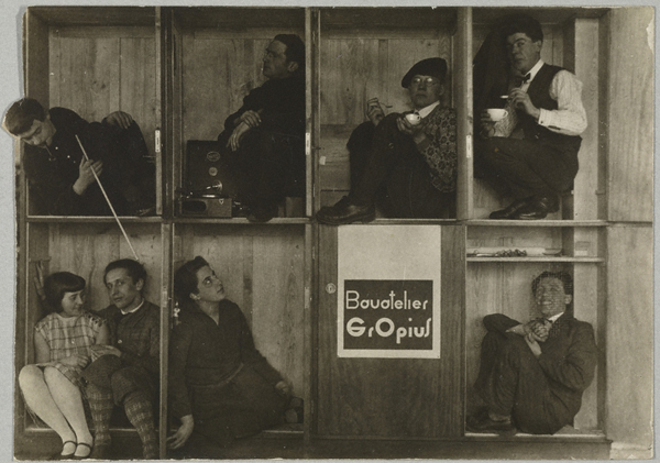
Edmund Collein: (Vorkurs Studierende Bauatelier Gropius, Winter Semester / Preliminary Course Students, Walter Gropius' Studio, Winter Semester), about 1927 - 1928. Gelatin silver print, 2 7/8 x 4 3/16 in. © Ursula Kirsten-Collein, Berlin. Credit: The J. Paul Getty Museum, Los Angeles.
What’s the background of these photos?
While the Getty Museum may not have found the appropriate opportunity in the past to exhibit these small treasures from our collection, since they were acquired primarily in 1984 and 1985, photographs of this kind are very well known. From the beginning, they’ve been used to convey the program of study and the atmosphere of daily life and leisure at the Bauhaus, and to exemplify Bauhaus master László Moholy-Nagy’s notion of the “new vision” made possible by the modern medium of photography. Virtually every publication on the Bauhaus uses photographs made by students and instructors to convey the uniqueness of life and study at the Bauhaus, particularly during the Dessau years, when the building that founding director Walter Gropius designed further shaped and embodied his notion of merging the fine and applied arts.
Among some of the exhibitions with accompanying catalogs that have incorporated student photographs into a recounting of the legacy of the Bauhaus are Bauhaus, 1919-1928, organized by Museum of Modern Art in 1938; Photography at the Bauhaus, organized by the Bauhaus-Archiv, Berlin, in 1990; and Bauhaus 1919-1933: Workshops for Modernity, organized by the Museum of Modern Art in 2009.
While the Getty Museum has often lent photographs from its collection to exhibitions dealing with European Modernism during the interwar years – most recently to The Mad Square: Modernity in German Art, 1910-1937, organized last year by the Art Gallery of New South Wales, Sydney – our decision to host the groundbreaking exhibition of Lyonel Feininger’s photographs organized by the Busch-Reisinger Museum provided the ideal opportunity to feature some 90 photographs from our collection to create a context to better understand why this important artist, who is otherwise known as a painter, printmaker and caricaturist, was drawn to photography as well.

Irene Bayer-Hecht: (Bauhaus Students at the Beach), about 1926. Gelatin silver print, 2 15/16 x 2 1/8 in. Credit: The J. Paul Getty Museum, Los Angeles.
In what ways have these works altered perceptions of campus life back then?
These photographs have come to define how we understand life on the Bauhaus campus, and how the atmosphere of creativity, innovation and spontaneity that permeated daily life also helped to inform similar attitudes in student projects and assignments.
 (AP)
(AP)Walter Peterhans: (Composition with Nine Glasses and Decanter), 1929 - 1933. Gelatin silver print, 9 1/16 x 6 5/16 in. © Estate Walter Peterhans, Museum Folkwang, Essen. Credit: The J. Paul Getty Museum, Los Angeles.
And what might today’s students learn from these photos?
To give one example, I find it fascinating to see that many of the male students dressed in three-piece suits and bow ties, a style of dress that is very different 90 years later, when students may prefer jeans and a T-shirt. This underscores the continued emphasis on personal style as an expression of individual identity.
Beyond an observation such as this, I find it most compelling to absorb the spirit of camaraderie and complete immersion that these young people exude as they embark upon a program of study in anticipation of life as creative professionals. That spirit permeates time spent in class and at leisure, suggesting a fluidity between work and play that is tremendously appealing.

Werner Zimmermann: In Der Werkstatt, about 1929. Gelatin silver print, 3 1/8 x 4 5/16 in. Credit: The J. Paul Getty Museum, Los Angeles.

Lucia Moholy: (Southern View of Newly Completed Bauhaus, Dessau), 1926. Gelatin silver print, 2 1/4 x 3 3/16 in. © 2011 Artists Rights Society, New York / VG Bild-Kunst, Bonn. Credit: The J. Paul Getty Museum, Los Angeles.
Copyright F+W Media Inc. 2012.
Salon is proud to feature content from Imprint, the fastest-growing design community on the web. Brought to you by Print magazine, America’s oldest and most trusted design voice, Imprint features some of the biggest names in the industry covering visual culture from every angle. Imprint advances and expands the design conversation, providing fresh daily content to the community (and now to www.salon.com!), sparking conversation, competition, criticism, and passion among its members.
