Imprint

Gidra takes on the American war machine

A forgotten newspaper adopted the name of a Godzilla monster as it fought imperialism and racism

(Credit: Alan Takemoto)
This article originally appeared on Imprint.

Remember those radical underground rags of the late 1960s? The East Village Other. The Berkeley Barb. The L.A. Free Press. Gidra. Wait … Gidra?

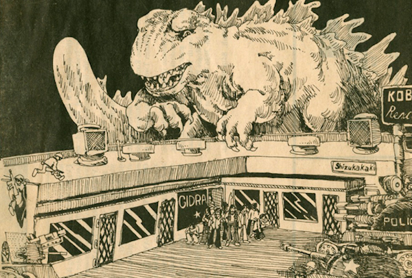
Wasn’t that a monster in those dumb Godzilla movies? Yes, but just because he tried to lay waste to Japan and the rest of civilization, Gidra wasn’t all bad. Which is how five UCLA students felt when they decided to name their newspaper after this three-headed winged dragon from outer space.

The ambitions of Gidra, which published monthly from 1969 to 1974, were more modest, and more noble. Its editors only wanted to destroy American imperialism in Southeast Asia and racism at home. As the “Voice of the Asian American Movement,” it promoted pride in Japanese culture, which had not fully recovered from the legacy of World War II incarceration. And was recently part of Drawing the Line, a Pacific Standard Time exhibition at L.A.’s Japanese American National Museum.

Its text spreads were unexceptional: simple, straightforward blocks of columns. But what made its pages come alive were the illustrations. It was the images that communicated to Gidra’s readers on a powerful, visceral level.

You can see a video about Gidra here, and read more about “Drawing the Line,” subtitled “Japanese American Art, Design, and Activism in Post-War Los Angeles,” here.

Unless otherwise indicated, all illustrations are by Alan Takemoto.

Illustration: Glen Iwasaki.

Illustrations: Glen Iwasaki and Mike Murase.

Illustration: Ken Minamiji.

Design: Naomi Uyeda.

Copyright F+W Media Inc. 2012.

Salon is proud to feature content from Imprint, the fastest-growing design community on the web. Brought to you by Print magazine, America’s oldest and most trusted design voice, Imprint features some of the biggest names in the industry covering visual culture from every angle. Imprint advances and expands the design conversation, providing fresh daily content to the community (and now to salon.com!), sparking conversation, competition, criticism, and passion among its members.

Rising design star: Naz Sahin

This Turkish creator's work has been showcased everywhere from "Saturday Night Live" to Good Magazine

This article originally appeared on Imprint. It's part of Print magazine's annual New Visual Artist series that profiles 20 of the most promising rising talents around the world in the fields of graphic design, advertising, illustration, digital media, photography and animation.


Infographic and layout design for Newsweek (designed with Emily Oberman and Bonnie Siegler at Number 17), 2009

Naz Sahin uses the word obsessed often, but with purpose. Obsessively, you might say. But not when she talks about design. Her work is humble, orderly, packed with detail but expertly crafted: not a mosaic—a perfect brick wall. “I think she’s more creative than me,” says her husband and sometime collaborator, Serifcan Ozcan. “But she wouldn’t say that.” In the kitchen, it’s a different story, Ozcan says: “She takes over.”

“I’m just very interested in cooking,” Sahin says. “Cookbooks, shopping for groceries, lists.” She likes organizing the fridge. She likes labels on Tupperware (“Nicknames for dishes, shortcuts for ingredients, bad spelling, ‘Pork Skin for Cracklings don’t touch 12/21’ ”). “I’m obsessed,” she admits. And so, in 2010, Sahin left a post-SVA stint at Number 17, where she worked on projects like VeryShortList and titles for HBO Family and “Saturday Night Live,” to go to the French Culinary Institute. Scott Stowell, with whom Sahin worked, briefly, at Open, is sure there’s a connection. “Naz works in two different areas, but her attention to detail applies to both,” he said. Take her Good magazine infographics of pragmatic, mise en place order, or her layouts for Diner Journal, which riff on those walk-in-fridge scrawls.

Opening titles for A Family Is a Family Is a Family and Saturday Night Live (designed with Emily Oberman and Bonnie Siegler at Number 17), 2009

Feasting Never Stops, personal blog, 2009-current

Feasting Never Stops, personal blog, 2009-current

Sahin—whose design education began in Turkey under “very European instructors from, like, the Czech Republic, who’d give us circles and rectangles to arrange all year”—is inclined to agree. While cooking, she says, “you’re constantly problem solving. You have some basic ingredients, and you have to combine them in the best and fastest way possible.” She likes planning elaborate meals, picking a theme and organizing dishes around it. One was a hybrid of traditional Muslim Turkish food with American sensibilities, called “What if We Ate Pork?” As for her own hybrid interests, Sahin wonders, “Am I a designer who loves to cook, or a cook who loves design?” What if she’s both?

|___ You postcard, (designed with Serifcan Ozcan), 2009

Roller Coasters, (designed with Serifcan Ozcan), 2009

Cover illustrations for Serifcan Ozcan's Homemade Mixes, 2008


See the other 2012 New Visual Artists:

Continue Reading Close

Selling Zionism in the 1920s

The Palestine Poster Project reveals attempts to entice settlers into what is now Israel

This article originally appeared on Imprint.

ImprintDan Walsh’s incredibly rich Palestine Poster Project Archives includes much in the way of protest, but it also contains a trove of rare Zionist/Israeli posters from the 1920s through the ’50s, largely before partition. The ones excerpted here are from the Mahmoud Darwish Memorial Gallery, which includes a collection of Zionist Worker agency posters calling for increased development of Palestine.

The affairs of the workers of Eretz Israel should be in the hands of the workers of Eretz Israel, 1935.

To experience the role of posters in the birth, growing pains, and ultimate conflict, this is perhaps the best online resource. Here’s what Walsh collects: 1) international artists and agencies; 2) Zionist and Israeli artists and agencies; 3) Palestinian nationalist artists and agencies; 4) Arab and Muslim artists and agencies. And here is what he says about his collection of over 6,700 posters:

I first began collecting Palestine posters when I was a Peace Corps volunteer in Morocco in the mid-1970s. By 1980 I had acquired about 300 Palestine posters. A small grant awarded with the support of the late Dr. Edward Said allowed me to organize them into an educational slideshow to further the “third goal” of the Peace Corps: to promote a better understanding of other peoples on the part of Americans. Over the ensuing years, while running my design company, Liberation Graphics, the number of internationally published Palestine posters I acquired steadily grew. Today the archives include some 3,000 Palestine posters from myriad sources making it what many library science specialists say is the largest such archives in the world.

To fortify our home - use Hebrew cement, 1937.

Come and See the Palestine Exhibition - Vienna, 1925.

Text in logo in upper left hand corner - The Worker, 1937.

Build Industries In Palestine!, 1927

Continue Reading Close

When text meets art

A new exhibition at the Museum of Modern Art highlights the meaning and mess of language

This article originally appeared on Imprint.

ImprintIn the exhibition “Ecstatic Alphabets/Heaps of Language,” which opened on Sunday at the Museum of Modern Art, words are treated as tools and as totems. Gathering text-based work by artists from Marcel Duchamp to Tauba Auerbach alongside contemporary designers like Paul Elliman and Dexter Sinister, the show offers varied takes on how to make meaning out of language, and also how to make a beautiful mess of it—sometimes at the same time.

A portion of Paul Elliman's Found Fount, at the Museum of Modern Art's "Ecstatic Alphabets/Heaps of Language"

The typographic theme runs through work by pillars of midcentury art (Lawrence Weiner, Robert Smithson) and contemporary design upstarts (like Experimental Jetset and Stuart Bailey and David Reinfurt, who collaborate as Dexter Sinister and produced the exhibition catalog—$5 in the MoMA gift shop and downloadable for free—as an issue of their magazine, Bulletins of the Serving Library). There’s also a bright thread of humor. Pick up one of three black telephones sitting on a shelf, and you’ll suddenly be on the line with Frank O’Hara or John Giorno or Robert Creeley, who generously recite a poem just for you (or in Allen Ginsberg’s case, chant incoherently in your ear).

Auerbach has some cheeky little ditties on display, including The Whole Alphabet (lowercase), a single piece of paper with all 26 letters typed one on top of the other in a formalist blur. Her other works are literal-minded jokes that use the expected physical form of the book as their punchlines: a 3,200-page RGB color test, for instance.

Cardboard scraps become letterforms in Elliman's Found Fount.

But the conceptual heart of the show, and the highlight, is Found Fount, by the London-based designer Paul Elliman. Elliman has long been experimenting with deconstructions of language and objects—creating alphabets from photobooth portraits, for example. Whereas some artists in the show disassemble language into its physical forms or turn it into sculptures drained of immediate linguistic meanings, Elliman conjures words from ordinary objects. “Dead Scissors,” for example, collects broken-off scissor handles that look like the letter P.

More of Found Fount's flotsam

Although Elliman has been gathering the pieces of Found Fount for 23 years, this is the first time the physical forms have been publicly on display. The show collects just a small sampling of the work, which still takes up a vast vitrine: cracked pieces of plastic, rusted metal U-rings, rhinestone-encrusted broaches, plastic beads, and cardboard cast-offs. The cardboard, mind you, has been not purposefully cut out into letterforms. Rather, they’re the random bits that are sometimes glued into folded boxes—the corners, wedges, and other pieces normally destined for the recycling bin. Here, however, they’re lovingly arranged and displayed on a black background under Plexiglas alongside Elliman’s other everyday wonders.

In Found Fount, silver hoop earrings become O's and lowercase g's

Tape dispensers and other plastic detritus in Found Fount

“Ecstatic Alphabets/Heaps of Language” runs through August 27. Paul Elliman will discuss his work on Wednesday, May 9, at 6 p.m.

Continue Reading Close

America’s road sign legends

Burma-Shave's rhyming ads turned highway billboards into poetry, and changed advertising -- and America

This article originally appeared on Imprint.

ImprintIn a simpler time, when automobiles went slower and the pre-Eisenhower highway system in the United States was less developed, there was a popular advertising campaign that ran from 1927 until 1963. It consisted of rhymed messages sequentially staked on the right side of the road, all ending with the advertiser’s name, “Burma-Shave.”

Examples of vintage Burma-Shave road signs, including a blue South Dakota version. (Ray Crockett photo)

These red ads (one state, South Dakota, insisted that they be dark blue to keep them from conflicting with the red reserved for warning notices) usually consisted of five signs. For example: “DON’T PASS CARS/ON CURVE OR HILL/IF THE COPS DON’T GET YOU/ MORTICIANS WILL/BURMA-SHAVE.”

Some slogans touted Burma-Shave as a pre-aerosol “brushless” shaving cream—a cream you could scoop out of a jar and lather onto your face without relying on an old-fashioned brush and moistened soap in a mug.


("Thoroly"? I guess if the word doesn't fit the composition, change the spelling. . .)

In 1925, Clinton Odell, a Minneapolis lawyer, took the liniment his father created and transformed it into a brushless shaving cream. He named his company Burma-Vita—Burma, because most of the essential oils in the liniment were from the Burmese portion of the Malay Peninsula, and Vita from the Latin for “life”: “Life from Burma.”

Some of Burma-Shave’s primary “brushless shaving cream” competitors were Barbasol and Noxema.

The company was sold to Philip Morris in 1963, and all the signs were removed soon thereafter. As a testament to the campaign’s cultural significance, a set of signs was donated to the Smithsonian, where it still resides. But the brand eventually petered out. After being sold yet again (this time to the American Safety Razor Company) and then reintroduced in 1997, it never regained a hold in the market.

A history of the Burma-Vita Company, written by Frank Rowsome Jr. and illustrated by Carl Rose, was published by the Stephen Greene Press in 1963.

By the early 1960's, the rising costs of road-sign maintenance (as well as new and more effective ways of advertising) sounded the death knell for the Burma-Shave signs.

The following pages from Frank Rowsome Jr.’s book list all the road-sign Burma-Shave phrases produced from 1927 to 1963.

Continue Reading Close

Secrets of the New Yorker cover

The venerable magazine's art editor talks about her choices -- and which cartoons were too provocative for print

This article originally appeared on Imprint.

ImprintFrançoise Mouly, the New Yorker’s art editor since 1993, doesn’t have normal relationships with the artists who draw the magazine’s covers. “Think of me as your priest,” she told one of them. Mouly, who co-founded the avant-garde comics anthology RAW with her husband, Art Spiegelman, asks the artists she works with—Barry Blitt, Christoph Niemann, Ana Juan, R. Crumb—not to hold back anything in their cover sketches. If that means the occasional pedophilia gag or Holocaust joke finds its way to her desk, she’s fine with that. Tasteless humor and failed setups are an essential part of the process. “Sometimes something is too provocative or too sexist or too racist,” Mouly says, “but it will inspire a line of thinking that will help develop an image that is publishable.”

Until recently, you would have had to visit Mouly’s office on the 20th floor of the Condé Nast building to see the rejected covers she keeps pinned to a wall. Now, some of those uninhibited outtakes have been collected in a new book, ”Blown Covers: New Yorker Covers You Were Never Meant to See” ($24.95, 128 pages), out now from Abrams. I talked to Mouly about the most incendiary sketches, the difficulty of publishing serious covers over Christmas, and why she heartily recommends listening to Rush Limbaugh.

Barry Blitt's illustration mocking terrorism fears was never used; the reference to Diet Coke and Mentos—a (very) low-level explosive combination—was deemed too obscure.

These early sketches of Blitt's idea, first with a pair of children and then with two businessmen (below), didn't work because they weren't specific enough.

What’s the process of deciding on a cover every week?

I’ve been the art editor for about 19 years, so I’ve been responsible for about 950 different published covers, and the process has been different for each one. But the general outline is that I set up a lineup every season of evergreen covers. So right now I’m talking to artists, soliciting ideas for Mother’s Day or spring or wedding or graduation.

And then there are timely political images or things that seem like the right idea at the right time—it can be a tsunami in Japan, but it can also simply be something that defines a time. Right now, one of the things I’m talking to artists about is the Republicans’ war on women. There’s not a specific moment for this, but it’s a subtext that’s in the air. Recently we did an image around the Republican primaries that involved a dog on top of a car, and that certainly was timely.

When we have something like that, then we are poised to upset the apple cart, and that can be turned around in as little as 24 hours. I’m in a constant conversation since I’m not commissioning or assigning any specific ideas. I’m not calling up artists and saying, “We need you to illustrate the war on women,” or whatever. We seldom have illustrations of cover stories on our covers. So we are dependent. What I’m really looking for are ideas that come from the artists on topics that will give us a sign of the era that we live in and, as a collection of images, will collect a picture of our time.

In the wake of the 1997 assault of Abner Louima, a Haitian immigrant, by white NYPD officers, Harry Bliss sketched then-Mayor Rudy Giuliani's paranoid psyche.

When I started, I didn’t know much about the New Yorker. I went to the library, and I looked at the storytelling images of the early days of the New Yorker—Peter Arno, Rea Irvin—and it did paint a portrait of the times, of what urban sophisticates chuckled at and attitudes, prejudices. That’s really not just the subtext but the text. That’s what we’re trying to capture—mannerisms as well as the way people dress and so on. I think you can get a very nuanced portrait of the society in images, because they talk about emotions beyond rationalization. So that’s what I try to orchestrate, but the artists have to come up with their own individual idea, like a little visual story, without being able to use words. And that’s a very specific task. There are not too many other venues for that. So I have to say, “Stop what you’re doing, and sit down at your drawing table, and come up with ideas.”

Christoph Niemann's 2003 sketch played on widespread anti-French sentiments in the U.S. in the run-up to the invasion of Iraq.

How many sketches do you receive from your regular contributors?

It depends. I don’t have any set way of doing it. Bob Mankoff, the cartoon editor, says that he wants to get a batch of 15 ideas. So he’s more systematic.

He also sets a specific day of the week for the cartoonists to come in person.

And he has minimum requirements. I search around, and I’m in a dialogue. Sometimes people send me one image. And what I say to the artists is, “Don’t edit for what you think will work.” If a sketch is on my wall, it’s not necessarily either accepted or rejected. It’s not like a line, and on the left is all the stuff that got rejected. It’s actually all the building blocks of having the right image at the right time. And many of the images that are published started out in sketches months and sometimes years before they were used—even the timely ones, because we are a weekly magazine, and we can only publish one cover a week. Sometimes something is too provocative or too sexist or too racist, but it will inspire a line of thinking that will help develop an image that is publishable.

In this rejected Barry Blitt sketch from 2002, Osama Bin Laden appraises proposed designs for the World Trade Center site.

What’s the most common reason why a piece may be great on its own but not work as the cover of the magazine?

Logistics. There have been some terrific images, and then we were out with a double issue that week and we couldn’t publish them. Or because the idea came in on a Friday and we had already published our cover. We are a weekly magazine, so the printing process finalizes something that is a constant flux. So I’d say logistics is usually the number one thing that narrows it down. And good taste would be the next one. Because everything needs to be approved by the editor of the magazine, David Remnick, who has final say on everything that gets published. But when I have the artists send stuff to me, I’m not necessarily going to show everything to David. I said to Anita Kunz, “Think of me as your priest. You can tell me all.”

Art Spiegelman reworked Norman Rockwell's painting "Freedom from Want" to highlight anti-Muslim violence in the fall of 2011.

What’s one thing that will never make it past David Remnick?

I don’t think that way. I encourage the artist to be uninhibited, because that is the sine qua non condition to try to make me laugh. And I mentioned in the book, Barry Blitt is really good at being uninhibited. He’s kind of a genius that way. My god, this guy thinks in doodling. There’s no editor in between the idea that he has and the idea that he commits to paper. But that’s a hard job to do—to not fear. It really is difficult to keep that spontaneity of thinking. But that’s because there’s no penalty. He’s not going to embarrass himself. He’s going to make me laugh, and it stays between us. This is similar to comedy writers who lock themselves up in a room. They’ll make a number of really bad-taste jokes, and the sexist and racist stuff is the least of it. They’ll really go off the deep end. And then that will actually unearth something that can be used.

An image like the terrorist fist bump, by Barry Blitt, which we published to such outcry, was talking about the unmentionables, the innuendos. There were a lot of allegations about candidate Obama being a Muslim, and that stuff was insidious because they were not saying it aloud, but they had no compunction. And all that the artist did here is visualize what people were insinuating, and sneaking in through the crack. Think of it as an inoculation, a way to actually use a drop of the poison in a controlled way. It’s very brave on the part of the artist to spend hours listening to Rush Limbaugh, for example—as Barry Blitt has done—because it’s a fascinating portrayal of America. It’s not useful to just say, “He’s a bad fat asshole,” and shield yourself from this, because you’ll only preach to the converted if you’re not listening to what’s being said.

Richard McGuire's waterboarding scene, painted after news came out of torture at Abu Ghraib, was inspired by Old Master paintings of Christ.

Is the fist-bump cover the one that has caused the greatest uproar?

We got a lot of flack in 1996 when we published a cover, also by Barry Blitt, of two sailors kissing in Times Square. And that was a parody of the Eisenstaedt photograph. This is pre-Internet, and people wrote letters to the editors. And in 1994 we broke a long tradition of Eustace Tilly by Rea Irvin being republished in February of every year, and we published an image by Robert Crumb. We got hundreds if not thousands of letters, but they were in the mail. What Barry said was, in 1996, if there had been the Internet, probably there would have been just as much of a reaction. The Internet amplifies the visceral reaction. And one of the ways we know that is, we are the New Yorker, but New York magazine got thousands of emails of people protesting the cover. Because New York, New Yorker—who knows? They just knew there was some cover they didn’t like. Some of them might not even have seen it. The Web allows for two things: for images to spread virally, and also for negative comments.

Anita Kunz’s drawing of Monica Lewinsky with a lollipop—why was that rejected?

We had already run an image on the topic, and we did not anticipate at the time how salacious the discourse was to become. It took us by surprise; we didn’t expect that the New York Times would have the word blow  job on the front page day after day after day after day. Often the artists know—because they actually are paying attention to stuff that’s in the air, they are so often ahead of their time.

Anita Kunz suggested that her sketch of Monica Lewinsky sucking a lollipop, made in 1998 during the White House sex scandal, "could be drawn in crayon, very child-like."

Your husband, Art Spiegelman, drew a picture of Santa Claus urinating in the shape of a Christmas tree. Why didn’t that pass editorial muster?

The editor at the time was Tina Brown, and she loved Art’s images. That’s really what started it all—the Hasidic man kissing a black woman, referencing Crown Heights. That’s the kind of image that she really liked. But Christmas is a difficult period for a magazine editor to do something provocative because somewhere in the back of people’s minds is “It’s a time to be jolly!” I know because around that time, I was actually preparing a cover story, one where we tied in the cover image to the article inside. This was a Mark Danner piece on the massacre in El Mozote, in El Salvador. And to do a cover image on the massacre—it’s like, “But not at Christmas time!” It still did run in December.

But to actually say to the whole wide world that Santa Claus doesn’t exist, that was getting a lot of editors unhappy—that we were willing to demystify Christmas. At the time, there were a lot of longtime New Yorker editors who were not necessarily that thrilled with the attention that the covers were getting. So in general there was a lot of opposition. And for that image, they were saying that it was provocation for the sake of provocation. Now, I actually don’t think so, and Art was very articulate about this and was explaining, “No, this is making a point. It’s not just a pee-pee joke for the sake of, like, ‘Ooh, ooh, isn’t pee-pee funny!’” It had to do with the obscenity of the merchandising around Christmas time. We’re talking about the early ’90s, when there are people homeless in the street—the inequality is contradicted by the over-merchandising Christmas. And then a suggestion was made to him: “Maybe it’s OK if it doesn’t mention the homeless.” And to him, that was really provocation for the sake of it. Later on we ended up publishing a crucified bunny rabbit, but that was Easter, not Christmas.

When The New Yorker passed on this Art Spiegelman sketch from 1993, he and Mouly used it as their Christmas card instead.

As you’ve been putting together the book over the last year or two, have you come across anything that you regretted rejecting?

There’s one of Sarah Palin brushing up on her books, preparing for her candidacy. I held that one for the last minute, because I was hoping and hoping and hoping that she would run. I really believed that we could publish it as a cover of the New Yorker. And when I realized that she prefers tweeting, I thought, well, I really would like to see that image in print. It’s wonderful, and it’s in the book.

Barry Blitt drew candidate Palin brushing up on her political reading.

Before the publication of the book, there was some back and forth with David Remnick about opening the door to that closed room and even discussing these things, because it’s not a very New Yorker-y thing to do. And there are issues with doing it. One could have to do with demystifying, making the process more predictable. But I actually think that it’s so rich and so interesting that it’s actually even more interesting if you have a sense of how the images are thought about, rather than less. It doesn’t explain anything because it still is genius when somebody gets the right idea.

And the other had to do with the fine line between what does get published and what doesn’t, because we publish so many provocative images. It seems to open itself up to second-guessing. But on that front, this will encourage more artists to take more chances, even the artists I’m already working with. I’m seeing it already. They are less afraid about wasting their effort on something that won’t get published. It’s encouraging more people to think more often about The New Yorker cover as a really vital form of communication to a great number of people, available to anybody who can handle a pen on a piece of paper. And that couldn’t make me happier.

Palin, drawn here by John Cuneo, has been a favorite subject of New Yorker artists.

Copyright F+W Media Inc. 2012.


Salon is proud to feature content from Imprint, the fastest-growing design community on the web. Brought to you by Print magazine, America’s oldest and most trusted design voice, Imprint features some of the biggest names in the industry covering visual culture from every angle. Imprint advances and expands the design conversation, providing fresh daily content to the community (and now to salon.com!), sparking conversation, competition, criticism, and passion among its members.

Continue Reading Close

Page 1 of 46 in Imprint