 Nadine Chahine is an award-winning type designer specializing in Arabic fonts. Since 2005 she has worked for Linotype combining design with sales and marketing, though as the company’s Arabic type design program has gathered momentum, her role has shifted toward a greater emphasis in font development. Born in Lebanon, she came to a career in type design initially via her graphic design studies at the American University of Beirut. This early awakening to the design possibilities for Arabic type was further explored in the M.A. Typeface Design program at the University of Reading, from which she graduated in 2003. The practicality of pushing the parameters of her vision for design is now the object of her day job, and the implications for such work the focus for the Ph.D. she is also currently undertaking at Leiden University (NL), in which she is investigating the study of legibility specifically in relation to the Arabic script.
 CD: So I have to confess to a very limited knowledge of Arabic letterforms, either as they are written or represented within typefaces. As I understand, there is a range of scripts for use as potential design departure points. Could you give just a broad overview of that range of scripts you are working with as an Arabic type designer and which of these you are especially drawn to and why?
NC: There are two distinct genres of Arabic calligraphic styles: squarish and rounded. The reasons for the split are complex and have to do with the writing medium as well as the intended function. The squarish styles are usually referred to as Kufi, though that’s not an accurate term. Of the rounded styles, and there are many, Naskh is the most commonly used source of reference.
The squarish styles are much as their name implies. They have very clear vertical and horizontal lines, and the overall look is often geometric and very much grounded in the baseline. Though initially used for text settings in the early manuscripts, the evolution of these styles made them appropriate for titling and large showings of monumental calligraphy.
The rounded styles are organic in construction, complex in formation, fluid in motion, and they feel as if they are floating elegantly along the baseline. These were either developed for large sizes (like the Thuluth) or text sizes (like Naskh). Naskh has been the de facto text style in manuscripts for more than eight centuries.
If one were to speak in very broad terms, Arabic typefaces today are based either on Naskh or on Kufi styles. The transition from calligraphic forms to typographic ones has been an unhappy affair, with Naskh typefaces losing the fluidity and elegance that can be found in their calligraphic origins.

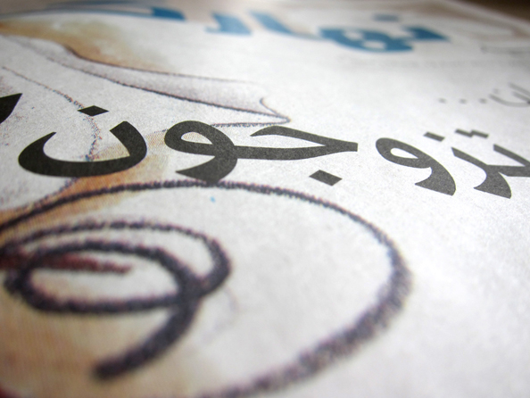
Detail from a page of a Quran set in a traditional Naskh script
My first contact with Arabic letterforms was during an Arabic typography course at the American University of Beirut. We studied with the master calligrapher and art critic Samir Sayegh. His work is almost solely done in the Kufi styles, and he has brought a breath of fresh air to Arabic calligraphy, which had barely evolved since Ottoman times.
His ability to inspire, and the drive toward modernity, is something that captured the attention of several of us. No other university had been teaching such a course at the time, and I see his vision as the lighting spark of many of the interesting developments in Arabic type design today.
This association between Arabic scripts and particular kinds of texts is an interesting one. It is not so dissimilar from the early years of printing with Latin types, when certain writing hands and then types were very strongly associated with particular contexts – a relationship between letterform and particular languages being especially strong. Such early associations though have been long since lost. Given that Arabic type design is in many ways still a nascent area of practice, what scope is there for such future flexibility in terms of the typographic interpretation of Arabic scripts?
The various styles of Arabic calligraphy have specific implications because of the usage that they were developed for (like Diwani for exclusive and official announcements), or the area they originated from (like Maghribi, which literally translates as “Moroccan”).
In terms of Arabic typography, the main distinction we have today is a functional one, and that is between headline and text. Kufi works best in headlines, and Naskh works best in text. What you do find, though, is a large play area in between the two extremes, and this is where I spend the majority of my time when designing. There are qualities in each that would benefit the other and bring possibilities for enhancing function. If you bring in some of the discipline and stability of a Kufi into Naskh, then you can come to a Naskh typeface that would work well in headlines. If you bring some of the fluidity of Naskh into Kufi, you can end up with a stable and sturdy typeface that could perform well in short runs of text.

(Examples of different calligraphic references) Afandem: Dynamic typeface inspired by classical Naskh calligraphy
While doing this though, one really needs to go back to the original calligraphic forms to understand why things look the way they do, and how to best translate these qualities.
The “companion” relationship of Arabic to Latin is obviously key in many of the typefaces you are designing. Could you talk through a little more about your range of strategies for designing across different scripts?
The No. 1 consideration when designing across various scripts is that each remains true to the visual aesthetics and structure of its script. This is a red line that should not be crossed. The next consideration is how the two typefaces relate to one another. Do they walk at the same pace? Do they have the same tone of voice? Do they work in the same way and are they really part of the same family? It is easier to address these issues when you work on both Latin and Arabic at the same time. This is how it went with Koufiya. I would make changes across both partners and would try to get them to speak well together without morphing one into the other. One has to accept that there are different dynamics in every script and that these need to be respected and accounted for. In the case of Koufiya (below), I wanted to give equal visual status to both scripts, as this was a problem common to designing in a bilingual setting. It was often the case that Arabic looked weaker and less refined than the Latin, and this was a situation that I was unhappy with.

(Examples of different calligraphic references) Univers Next Arabic: A modern Arabic design based on Kufi construction
With Frutiger Arabic (below), which was my next project, the Latin was pretty much set, so design decisions regarding size on the body, weight, contrast, stroke treatment, terminal treatment, overall design expression and tone had already been more or less decided. There are ways to handle these predetermined qualities to best bring them across into Arabic. With Frutiger Arabic, and with all my companions to other sans serifs, the dilemma was the question of structure and the choice to be made between text-friendly Naskh models or the less text-friendly Kufi models. The solution was my hybrid approach, where the structure is based on Kufi with some of the handwritten qualities of Naskh also introduced. This enabled it to work well in both headlines and short runs of text. One can argue that Frutiger can be used for more than short runs of text, and here I had to go back to its original intended use, which was signage.
 (Getty Images/Adene Sanchez)
Frutiger Arabic
There is, though, an underlying question that needs to be looked at when designing across different scripts and that is: Do you design to match the visual style, or the intended function? In Frutiger Arabic it was fortunate that I did not have to choose. The typeface was a match on both visual and functional levels. But with projects like Palatino Arabic it was a major decision that needed to be made, and I had to go with function. It was important that the Arabic companion functions well as a text face, and so if one were to look at the details of rhythm, stroke treatment, and overall texture, you’d find that the two typefaces are very different. They do however share a similar optical size, weight, contrast and of course, the Hermann Zapf touch.

Palatino Arabic
This emphasis on function in determining design approach is one you have had to strongly defend. Here I am thinking of your response to the mixed critical reception of Neue Helvetica Arabic, when you asserted: “It is not about how similar the curves are, but how similar[ly] the typefaces function. This is at the heart of multi-script type design.” Yet, if function truly is the most important thing in the creation of a new Arabic typeface, then why worry about, as John Hudson puts it, “capturing the idiom of a design in multiple scripts” at all? [Quotes from “Wishing on a typeface,” iLT, 4.12.2009, with JH comment 6.12.2009] The cynics have argued that the matchmaking marketing opportunities afforded by trading on some of the great names in type design, and with Helvetica arguably the most famous name of all, are just too great to ignore. Why shackle an emergent area of creative practice in type design to established idioms within Latin type design?

Neue Helvetica Arabic
For the first part of the question, it happens every once in a while that people question how two typefaces are matched. It is almost as if they expect to see a one-to-one adaptation of body parts, that you would take one curve and simply use it on another letterform. This might work within the same script system, but is often quite wrong to do so across different scripts. The Arabic and Latin scripts are different and especially so in their structure, the angle of the cut of the pen, and the way characters are put together to form words. So what one applies is not the actual curve, but the logic behind how it is drawn (open versus closed, organic or not, contrast, etc). It is these stroke characteristics that are affected by the intended function, hence my statement that we look at the intended function of a curve rather than the actual existing outline.
As to reasons for why we need Arabic companions to existing Latin typefaces, there are four. First, there is a significant market demand for the expansion of the classic Latin typefaces into various other scripts like Greek, Cyrillic, Arabic, Thai, Devanagari, and CJK. This is due to the nature of our globalized market where leading brands are being communicated across the globe and the wish is to maintain the same voice and identity across the various regions. This is the reality today, and is a legitimate design endeavor. It is quite challenging to do, so it’s not like we are taking the easy way out.
Second, when we extend a typeface into another script, we are taking over an idea. Typefaces are like people. There is the body and the soul. Every typeface is of two parts: an idea and its visual implementation. There is a great sense of joy when you are able to bring over a concept that you appreciate into a script that so far had no equivalent. When we look at Neue Helvetica and what it stands for (neutrality, authority, etc.), it is simply too hard to resist trying to bring those qualities into Arabic. Great ideas are meant to grow, and this is true in type design too.
Third, it is often the wish of the designer to extend a design concept across different scripts. This is even more the case with the new generation of type designers. If you look at the type design program at Reading, you’ll find that designing a non-Latin is an actual requirement now.
And fourth, the nature of communication in the Middle East today requires bilingual adaptations. Whether we have matching typefaces or not, Latin and Arabic are sitting side by side in any case.
I do have to add a quick note here: Designing a companion is not the only way to push forward Arabic type design. There are loads of possibilities when one is looking at Arabic on its own. A significant portion of my time is spent on designing stand-alone Arabic typefaces. The freedom there is very rewarding, but I would not want to choose one over the other.
Subsequent to the release of Neue Helevtica Arabic came Univers Next Arabic, about which you said, “[It] is everything that I’ve wanted to design … It also makes me want to redesign my earlier typefaces, but that would be cheating, no?” [7.12.2010] Not necessarily. What have you learned along the way? What would you now do differently?
It’s two things really… Univers Next Arabic has more Kufi in it, and that makes it closer to my heart. And its outlines have a certain strength and tension in a way that I had not managed to achieve before. That was why I wanted to redraw the earlier typefaces.
Type design is all about the relationship of black and white. There are complex dynamics involved and many hidden facets that only reveal themselves over time. Spacing Arabic characters, for example, is an area where I have learned a lot along the way. Because Arabic is partially connected, you are spacing both real and phantom letters. The spaces in between characters are then both black and white and this is a complexity that one has to learn how to deal with.
The most valuable lesson that I have learned is to give myself the time that a typeface needs. It is good to be able to step away from the project, come back to it later, and be able to see it with fresh eyes. I have also been lucky in that I have had the chance to address the same question (the relationship of Latin and Arabic) with many different answers. I’ve also developed a liking for Naskh ever since I started working on Palatino Arabic in 2005. I’m drawn to the Kufi styles as I see more freedom there, and I had erroneously looked at Naskh as a style which is rather outdated and not so flexible. This turned out to be quite wrong, and I suspect that this view stemmed from the abundance of badly designed Naskh typefaces out there. Palatino Sans Arabic completely banished any remaining doubts, and my work for An-Nahar (below) has actually inspired me to explore further the possibilities that a modern Naskh can offer. Of the 18 published typeface families that I have designed to date, only five are in the pure Naskh style, and I feel like there’s a lot more to explore…
The results of font development work for the Lebanese newpaper An-Nahar in print:


 (Jakub Porzycki/NurPhoto via Getty Images)
In terms of your achievements, you have talked with great pride about the opportunity to work at Linotype, a company with a great legacy in terms of non-Latin type design. Your work there has also afforded you the opportunity to collaborate with two great names in type design, Adrian Frutiger and Hermann Zapf. How did working with these two legends compare?
With Adrian Frutiger it was simply a nod of approval. He loved my Frutiger Arabic and had no corrections to implement. He thought that “this work has a touch of genius,” and that was the best thing ever said about my work. I was at the time living in Dubai, and so we did not get the opportunity to work side by side. With Hermann Zapf it was more personal. He would tell me stories of how he learned about Arabic, and the travels that he had been on. We would spend hours together drawing outlines and making corrections. It was almost like he lent me his eyes, and so I learned so much from observing how he looks at letterforms and the details that he looks at.

Adrian Frutiger checking on the progress of Frutiger Arabic
I was very surprised by something you said in particular about working with Hermann Zapf: “The hours and days spent working alongside Herman Zapf on Palatino Arabic had managed to somehow teach me, a non-calligrapher, the beauty of drawing calligraphic forms” [2.06.2010] I was surprised because as someone from an Arabic background you would have grown up in a culture where the practice of khatt is revered, and so I wondered what it was about this experience with Zapf that really unlocked for you a new idea about the relationship of formal writing and drawing type.
I have to start here with a confession. My handwriting is not so great. I’m quite lousy at lettering and drawing in general. So while Arabic calligraphy is a revered art in the Middle East, and though I know how each shape is supposed to look, my hand is simply not trained to do it. Working with Hermann Zapf somehow trained me to be able to virtually create elegant calligraphic curves. When we would come across a difficult character, he would draw it in pencil on paper, and then I would mark the extremes with a red dot so that I know how to place the points in FontLab. With time, I managed to do it on my own so I could continue with the work and would only check with him every once in a while. It was really all down to how to understand and re-create the relationship of the two edges of a modulated stroke.
 (Khin Maung Win)
Nadine at work on Palatino Arabic with Hermann Zapf
You have described your approach to design as “holistic” in that the only way to make sense of the development of letterforms is within a wider cultural context. And I have to say that reading your blog www.arabictype.com, it is almost impossible to separate you from your own cultural context, so wholeheartedly do you speak about your homeland of Lebanon and its ongoing inspiration for you as a designer! Yet, while your own role in consolidating the future of your country is clearly envisioned in terms of the contribution you are making to the possibilities for improved typographic expression, I wondered if there isn’t the potential for a conflict of interests here, between the personal and the corporate. The competitive pricing strategy for many of the new Linotype Arabic fonts is surely prohibitive to many smaller design agencies with perhaps the creative imagination necessary to encourage regeneration in design. How do you resolve this tension between facilitating the accessibility to quality fonts that will potentially enhance Arabic typographic design and the hard line business of sales?
We have had the occasional feedback that the pricing is on the high end, but we have still seen an acceptance from the local designers to invest in good typography. The reality on the ground is not very helpful: Costs of production in Germany are high and the economic reality is that this cost is split across the users so the smaller the potential market, the higher the cost. The challenge to a wider market for Arabic typefaces is the fact that font piracy is rampant in the Middle East. This applies to fonts of any cost. The overriding perception of fonts is that they come for free with the Mac and so the problem is more about convincing them that they need to license and less about the actual cost.
We do sponsor occasional projects, especially if they are for nonprofit organizations and offer educational discounts, too. I also spend a lot of time giving advice to students and interviews for papers and dissertations so that I can help with design development as much as possible.
You always talk with great enthusiasm and hope for the future of Arabic type design. What is most exciting for you in terms of what is happening in this field right now? Are there any new foundries emerging? Who is out there to watch?
The most exciting thing about Arabic type design today is that we have reached the tipping point: There are enough designers around to make this into a very interesting field. It’s not about one individual designer or foundry but rather the growing perception within the global design community that designing Arabic is very exciting and a requisite for a foundry’s international portfolio. It is all about supply and demand. You can have amazing designers doing work that no one is interested in. This is not the case here. There are clients asking for more Arabic typefaces, and a design community inspired enough to make them.
And I’m sorry, but as a final question I have to ask you, what is it with numerals – the gift of the Arab world to the Latin alphabet and you don’t like drawing them?
Yes… It’s no secret! I don’t like drawing numerals. It’s bearable if it’s a pure Naskh design but a Kufi one is torture. The forms of the Hindi numerals that we often use in the Middle East don’t translate well into the Kufi style. It gets worse if they are tabular. You get miles of white space in between… But I guess you need something to keep it real. Type design is way too enjoyable otherwise!
Below: A dynamic typeface system developed by Nadine as part of her Ph.D. studies into the legibility of Arabic typesetting.
 (Getty Images/Photos by R A Kearton)

The images show the same words with the letters combining in different ways. The outline forms are Simplified Arabic: The letters sit side by side (as in Latin but aligned right to left). The shapes of the letters are static, not reacting to what comes before or after.

The purple forms are in the new Dynamic Arabic. This attempts to replicate some of the features of Arabic calligraphy as drawn by hand. The letters react to those that precede and follow them. The end result is more complex though the design is more elegant.

Copyright F+W Media Inc. 2012.
Salon is proud to feature content from Imprint, the fastest-growing design community on the Web. Brought to you by Print magazine, America’s oldest and most trusted design voice, Imprint features some of the biggest names in the industry covering visual culture from every angle. Imprint advances and expands the design conversation, providing fresh daily content to the community (and now to Salon.com!), sparking conversation, competition, criticism, and passion among its members.
