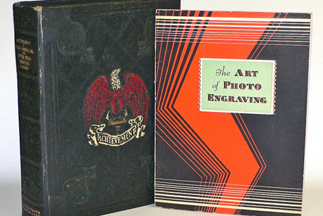

Anyone following the posts I’ve done for Imprint should be left with the impression that I get off on tasty examples of graphic art. Regardless of how well and even superior the reproduction of images is now, thanks to new technology like the iPad, there’s nothing like leafing through some of the publications that presented the art of lithography and photoengraving in their original form. Two publications in the library here that have become my favorites are Achievement in Photo-Engraving and Letter Press Printing (1927) and the separate softcover addenda,The Art of Photo Engraving (1929). Both were published through the American Photo Engravers Association, and are the result of editing and compiling by Louis Flader.
 (AP)
(AP)
The earlier of the two volumes consists of 488 pages explaining the craft of photoengraving, and it reproduces every conceivable example of the technique offered by the technology then available. There were no more than 7,260 copies printed, each pre-ordered by subscription and sold for $10 a copy. The second mini-volume was a softcover publication re-presenting the section describing the art and process of photoengraving, personally compiled, revised, and arranged (again) by Louis Flader.

Here’s a bio of Flader using information from/by Paul Moxon:
German-born American Louis Flader (1877-1963) was a technician, labor leader, executive and author. Flader rose to prominence in 1901 when he was elected president of the International Photo-Engravers Union of North America, which had just broken away from the then-powerful International Typographical Union. After a distinguished tenure, he resigned in 1906. During these years he had been repeatedly promoted by his employers from foreman to various executive positions and finally general manager. In 1911 he was persuaded to become executive secretary of the American Photo-Engravers Association, a manufacturers trade group, where he immediately launched the Bulletin and later the short lived, but well regarded, journal More Business “The voice of letter press printing and photoengraving” (1936-42).
Flader was known as a polished public speaker and he possessed a tireless, inventive mind. In 1938, he was issued a U.S Patent for a “combined half-tone screen and negative,” and with Joseph S. Myrtle, he co-authored the textbook Modern Photoengraving (1948). But Flader’s legacy is having edited the comprehensive Achievements in Photo-Engraving and Letter Press Printing (1927), a massive volume featuring step-by-step explanations of engraving processes and hundreds of full-color illustrations and photographs by over 350 photoengravers.

Achievement In Photo Engraving and Letter Press Printing (1927)
The large 1927 book looks like something used at the beginning of a vintage Walt Disney feature-length fairy-tale cartoon. Measuring 12.5 inches tall, 9.5 inches wide, and a full 3 inches thick, the gilt-edged tome is monstrous!
The cover is an embossed treat done in black leatherette material with a red-and-white eagle heralding the word “Achievement” below its talons. This was obviously intended to say, “This is the Bible of the industry.”
 (AP)
(AP)A close-up of the book's cover
The front and back tan-and-gray endpaper design by John Koehl consists of four American Photo Engravers Association logos surrounding a cameo saying, “Your Story in Picture Leaves Nothing Untold.”
 (AP)
(AP)Front and back endpaper design by John Koehl
There are examples of advertisements and designs reproduced on tissue, newsprint, glossy stock, and numerous tipped-in images. There’s even a two-page spread of Bit-O-Honey and Oh Henry! candy wrappers printed on the same waxtreated paper used in the original packaging. Flader not only filled the book with an endless variety of printing examples and techniques, but he also chose smartly designed artwork that stands on its own as wonderful examples of graphic design.
 (AP)
(AP)The book's first illustration is a watercolor by Rowena Meeks Abdy reproduced on tissue and set in a cutout frame.


 (Wikimedia Commons/Daniel Mayer)
Left: a handcolored photograph. Right: assorted letterheads
 (AP)
(AP)Check out that typography treatment on the right!


 (AP)
(AP)Greeting-card treatments designed and printed by the Gibson Art Co., Cincinnati, Ohio


 (AP)
(AP)The ad on the right would make a marvelous poster. It's for the Marmon Motor Car Co., by Homer McKee Advertising Agency.

Two printing techniques broken down into their respective screening and color stages
 (AP)
(AP)Left: a bread wrapper design. Right: a college-annual illustration by R. Francis Richey
 (AP)
(AP)Left: M. Jeanjean cartoon advertisement. Right: illustration by T.M. Cleland for Westvaco

 (AP)
(AP)A painting by Maurice Logan for the Southern Pacific Railroad
 (AP)
(AP)Left: a direct mailing card illustrated with a painting by C.K. Van Nortwck. Right: a golden anniversary announcement printed on gold textured stock


 (AP)
(AP)The illustration/design on the right is by Walter Rosenthal.


The second volume consists of a reproduction of the chapter from Flader’s earlier edition explaining the art and technique of photoengraving. This link reproduces much of The Art of Photo Engraving shown above.
If you can’t track down copies of these books (especially the 1927 edition) for sale, try an interlibrary loan. The experience of sitting with these books and spending time savoring the attention to detail and quality is unparalleled!.
If you relish a tactile design experience, you might also enjoy the DesignCast “Freaks of Fancy, or Everything You Wanted to Know About Wild, 19th-Century Printing Techniques (But Were Afraid to Ask).”
