 Viewers of HBO’s new series Girls can be forgiven for not paying much attention to its title sequence. Buzz about the show, which follows the complicated, passionate, and often narcissistic doings of four young women in New York City, quickly grew into a divisive debate over its feminist intentions. And that was just the pilot. With the first season now complete, it’s finally safe to shift our gaze to the striking sans serif that opens every episode.

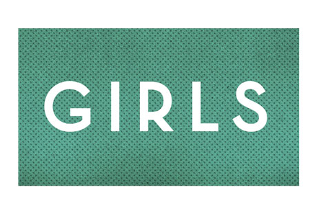
The custom typeface is the work of the Los Angeles–based production company Grand Jeté. “Truth be told, there were countless hours spent on the pitch, because I believed in the project,” says Howard Nourmand, the firm’s creative director. After landing the job, he worked closely with Girls’ creator, Lena Dunham—who also wrote, directed, and stars in the series—to strike a balance between something bold and something beautiful.
“Lena specifically expressed to me that she was a fan of art deco typography,” says Nourmand, adding that his instructions included thinking about weird and intimate spaces, and off-beat visuals atypical for a show about young women.
Deco-inspired letterforms are an apt fit for both the 25-year-old Dunham and her series. Introduced nearly a century ago at the Paris Exposition, art deco was a stark departure from the ornate Art Nouveau style that was the norm. “The Exposition marks the coming of age of a new décor . . . it is a setting up of new standards, not a perfecting or adapting of the old. It is a definite break with the past,” wrote the critic Helen Appleton Read in 1925. The same is being said for Dunham’s 21st-century Girls, with its unique and arresting point of view.
Each episode opens with a static shot of the show’s title filling the screen, in place of a more complex sequence. No animation, no video—just text on a solid background. The colors change from week to week; Nourmand calls this “a playful touch,” but it also creates a palette that builds in sophistication with the series. The stripped-down simplicity perfectly matches Dunham’s vision. There are no tutus or glamour shots of the Chrysler Building, just a direct and elegant typeface inviting us in.
Nourmand is tight-lipped on whether his minimal opener will return for season two. For now, we’ll have to settle for a behind-the-scenes look at Grand Jeté’s process, and hope that Girls remains anything but ordinary.


 (AP).
(AP).
.
For more type inspiration, check out our typography webcasts, including Ilene Strizver on everything you need to know about fonts and Christian Schwartz on using type on the web. And don’t miss the numerous typography design books available at MyDesignShop.com.
