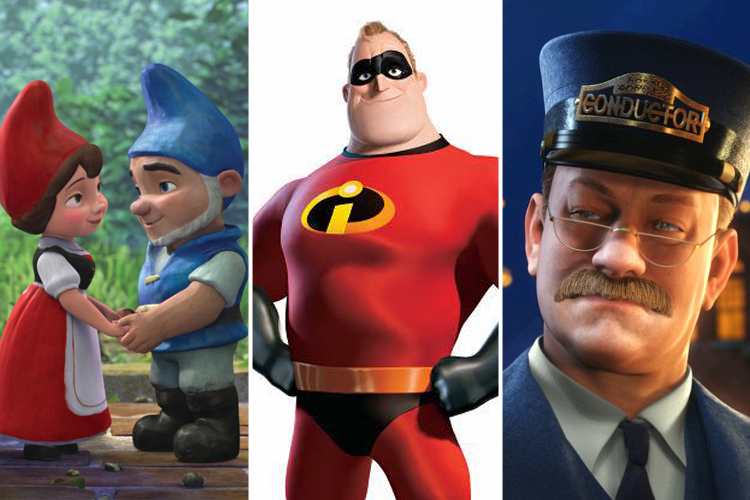
Having spent several weeks staring at the subway posters for “Gnomeo and Juliet,” a computer-animated retelling of Shakespeare’s classic in which the star-crossed lovers are lawn ornaments, I can offer one clear takeaway from the film’s ambitious ad campaign: These garden gnomes are hideous. Gnomeo and Juliet look remarkably like real-life garden gnomes — down to their plasticky texturing — and yet, there’s something off-putting about their appearance. Their faces look disconcertingly human, but their body shapes are blocky and unappealing. There’s something dead-looking about their eyes.
Over the past few years, we’ve been deluged with unforgettable animated characters that have somehow managed to transcend their digital origins and feel like living, breathing beings — Carl, the cranky widower in “Up,” the animals of “Madagascar,” the heroes of “Toy Story.” A large part of their appeal lies in their elegant and beautiful designs; Wall-E, probably the most distinctive animated character of the past few years, was a masterwork of simplicity. But why do those characters, Pixar’s in particular, look so delightful, while others — like Gnomeo — feel awkward and repellent? How do you design a CGI character that people actually want to look at?
To find out, we called up Shannon Tindle, an Emmy-winning character designer who’s worked on “Coraline,” “How to Train Your Dragon” and numerous Dreamworks-animated projects. We asked him about hideous gnomes, the misguided idea behind “The Polar Express” and why animators are unfairly being pushed to the side.
The main characters in “Gnomeo and Juliet” are, I’m sad to say, pretty unappealing.
You know it’s a garden gnome. To sell that movie, the characters should look like garden gnomes that people will recognize. If they went away from what a garden gnome looks like, it would probably be kind of creepy.
But they also just seem ugly — not terribly interesting to look at, and a little bit too human. What do you think distinguishes good character design from bad character design?
For me, it should be something that’s believable but not necessarily realistic. Those are two things that people interchange quite a bit on productions — and I’ve been involved in a lot of them. From my point of view, it’s been proven that realism is not really appealing to an audience. Two good examples of successful design that audiences embraced — “Kung Fu Panda” and “Up” — are films that certainly were not realistic but had believable characters. A lot of people are actually afraid of stylizing characters in animated films, period. They tend to want to push it to be more realistic, but the first thing people see in an animated film is the characters, and if it’s a character that doesn’t have an appealing, believable design, they’re not going to feel any connection to it.
There were a number of films — “Polar Express” and “Final Fantasy,” for example — that used motion capture to re-create very realistic human characters. It was an intriguing idea, but there was also something really unsettling about those films.
All I know is that the studio that Disney formed to produce those films, Image Movers, doesn’t exist anymore. “Christmas Carol” is one of my favorite stories of all time. But with those films, it doesn’t look exactly like a real person and so it becomes something in between. In any animated film — stop-motion, CGI and 2-D, and I’ve worked in all of those mediums — you need to make a clear statement. Any time you waffle, if you’re somewhere in between reality and stylization, a straight line and a curve, people feel it and they tend to have a bad reaction to it.
Those films mostly seemed like technical showboating more than anything else, like people just wanted to play around with this new motion-capture technology they were really excited about — but without any clear artistic purpose.
I think the animators have gotten the short end of the stick. I read an interview where Gore Verbinski was talking about his new film, “Rango,” and how he got all these actors in there and really relied on their performances. Well, animators are actors, plain and simple. They are a lot of scenes. I had friends who worked on “The Lord of the Rings: The Two Towers,” and Andy Serkis got a lot of credit, but that first shot where you see them climbing down the mountain, that’s all animation. There’s a magic that comes from a team of animators, while motion capture can, sometimes, look more like a tracing, or like you’ve drawn a photograph. You see the technological marvel of it, but it doesn’t really grab you in any way because it seems to only be a technical exercise. I think the reason that worked in “Avatar” is, first of all, they had a team of incredible animators who did work over the motion capture and massaged it, but those characters were also stylized enough that you don’t think, “Oh, that looks like the guy I saw walking down the street.”
So you think all this emphasis on motion capture is hurting CGI animation?
I think there exists a happy medium that people haven’t really explored or people aren’t admitting when it’s successful. The best of motion capture that I’ve seen occurred when an animator translated a really strong performance from an actor. “Sleeping Beauty” and “Snow White” used live actors, but the animators didn’t just trace over the frame. The best animators can use a performance by one guy in a room to animate a female and a male character and an animal character. There are some things that an actor really isn’t physically capable of.
What’s the process actually like when you design a character for a CGI movie?
You sit down with the director and he gives you a pitch about what the film and main characters are all about. It’s driven by story and we need to design characters for the story, whether it’s dramatic or comedic — you want the style to match the tone so there’s no disparity. You wouldn’t want “Coraline” to look like ’30s screwball Warner Bros. rubber hose animation. Then you start breaking it down by character. You pretty much always start with a lead character, then it has to go through the different levels of the studio for approval. When everyone’s comfortable, you model the character in the computer, sculpt in the computer with a modeler. The time could take six months, or it could take a year.
I remember when I was watching the first “Toy Story” being very drawn to the toy characters and very turned off by the human characters. I feel like Pixar and other places really struggled, at first, to create CGI human characters that weren’t, in some way, off-putting to look at. Do you think human characters are more difficult to design? Do you think they’ve improved?
I think it’s absolutely more difficult because you have a point of reference for it. We see humans every day, and we know what they look like and the closer you try and get to it, the more the average guy can spot the differences. A lot of people feel like “The Incredibles” was some of the best human design animation ever done and I think it still holds up really well. The further you go away from realism and the more the humans look like toys or, in the case of “The Incredibles,” like Greek sculptures, the better it gets. Both Carl and Russell, in “Up,” look like toys. Andy in “Toy Story” (even though he gets better in “Toy Story 3”) was stylized but there were also some strange surfacing things going on — liver spots, and veins and things that made your brain automatically go, “Those things don’t really belong there.”
There seems to be a kind of consistency to Pixar characters — they look rounder and less square than Dreamworks characters, like “Shrek.”
The mandate at Dreamworks is not to have a house style. We don’t want everyone to walk into the movie and go, “This is a Dreamworks movie.” If you compare “Madagascar” to “Shrek,” for example, those are two different styles. I can definitely look at the Pixar movies and break them down and the difference between the two, but I think it’s kind of comparing apples and oranges.
You mentioned the panda in “Kung Fu Panda” as an example of successful, memorable character design. What other character designs stand out?
I love the main family in “The Incredibles” and the fashion designer, Edna Mode, is just beautifully designed. They did an incredible job designing those characters. You want to have a lot of contrast in your lineup, and “Kung Fu Panda,” “How to Train Your Dragon” and “The Incredibles” all have a lot of different, broadly different silhouettes and shapes of characters. Looking at very different shapes is automatically more interesting than characters with the same height and same shape — just contrast Bob Incredible and his boss — it’s automatically interesting. Same with “How to Train Your Dragon” — if you look at Gobber and his peg legs and put him next to Hiccup the main boy, there’s big contrast there, and then the dragons. Chicken Little had a really nice lineup and pushed its design. “Up,” “Finding Nemo,” and whatever anyone thought about “Robots,” man, that lineup was really interesting to look at.
What characters have stood out as being unsuccessful?
I don’t personally respond to the design in “Beowulf,” “Polar Express,” “Christmas Carol,” “Final Fantasy” or anything that skews toward realism. There’s an eye-contact issue with those characters. It never seems like they’re making eye contact with each other — they kind of have dead eyes. It’s an eye-tracking issue. There’s always this blank stare look.
And if you look at “Polar Express,” for example, they tried to make the main characters that Tom Hanks played look kinda like Tom Hanks and in some instance really trying to look like Tom Hanks. That’s going beyond making your character look real — you’re trying to make him look like one of the most well-known personalities in the world. I would much rather see Tom Hanks in a movie than I would want to see a facsimile of Tom Hanks.
