
Photo courtesy the John D. & Catherine T. MacArthur Foundation
 Last fall the John D. and Catherine T. MacArthur Foundation named Matthew Carter a foundation fellow. The so-called genius grant simply confirmed what those of us in the small design world already knew: that Carter is one of the most important type designers of the past half century. He was born into the world of type design in 1937 as the son of Harry Carter, the type historian. And through his father he entered the business of type design rather than going to university. At the age of 17 Carter studied punchcutting with P.H. Rädisch at Joh. Enschedé en Zonen in Haarlem, the Netherlands. One year later he returned to London and set up shop as a lettering artist and typographic advisor to Crosfield Electronics, English distributors of the Photon phototypesetting machine. In 1965 Carter joined Mergenthaler Linotype in Brooklyn, where he worked closely with Mike Parker on adapting the Linotype library to the then-new world of phototype. The two men, plus Cherie Cone and Rob Friedman, left Linotype in 1981 to establish Bitstream, one of the first digital type foundries. Ten years later Carter and Cone went out on their own as Carter & Cone Type, and ever since Carter has worked as a freelance type designer — though often in collaboration with Font Bureau — for a wide range of clients, including the Hamilton Wood Type Museum.
Thus, Carter is unique in having designed type in every medium that has existed since the era of Gutenberg: metal, wood, film and digital. His career has also spanned a surprising revolution in the profession of type design. When he was learning punchcutting, there were few professional type designers.
Most of the famous type designers of the first half of the 20th century were first and foremost either letterers or book designers. There were only a handful of individuals who made their living exclusively from designing type and, with the notable exception of Frederic W. Goudy, they all worked for type foundries. Even in the era of phototype this situation remained largely unchanged. But with the advent of digital type and nonproprietary type design software, it became possible for individuals without the backing of a large company to succeed as full-time type designers. Although the number of such individuals is still quite small, the number of those who have designed at least one font is enormous. Type design has become a democratic art.
Carter has not only survived these tumultuous changes but has also managed to remain at the forefront of the profession, both prolific in his output and continually surprising in his inspirations. He has always managed to find lettering styles from the past that are out of favor or overlooked yet not eccentric or extreme. Thus, he has resurrected the work of Charles Snell, Robert Granjon, Andrea Mantegna, Richard Austin and Vincent Figgins. Carter is both a man of the present, at home with the latest type technology, and a man of the past, fully aware of the long and fascinating history of the Roman alphabet.
This interview, conducted via email, was sparked by the awarding of the MacArthur prize and the announcement of Carter Sans, the first typeface to bear Carter’s name.

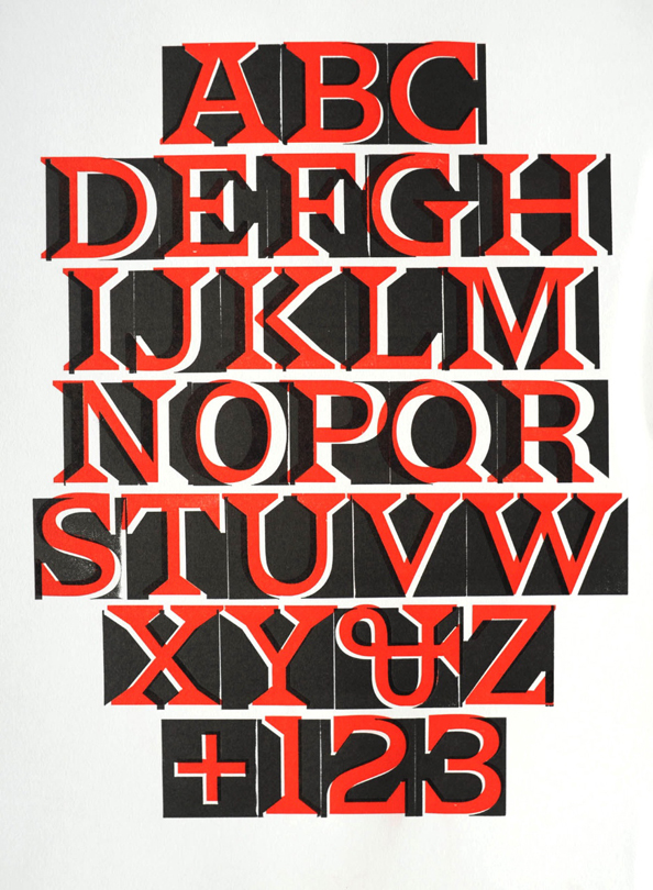
Carter Sans Pro Medium
– – – – – – – – – – –
PAUL: First, let me begin by congratulating you on being named a John D. and Catherine T. MacArthur foundation fellow in 2010. Has this changed your life and, if so, in which ways?
MATTHEW: It has brought me many very kind messages, some from fellow designers who have reacted to the fact that the MacArthur Foundation has seldom acknowledged design by saying, in effect: “Good for you, and good for us.” In practical terms I hope it will allow me to start more projects on my own initiative rather than responding to commissions — although I’m tremendously grateful for custom work over the past few years that has kept my company going through tough economic times. My temperament will never allow me to turn down work, particularly from long-established clients.
Miller and Wrigley are two examples of faces that began speculatively but found good clients and generated good business. I would like to find similar projects over the next few years.
Your newest typeface, Carter Sans Pro, officially released by Monotype Imaging at the beginning of February, is the first to bear your name. Was this your idea or Monotype’s?
It was Monotype’s idea. I had failed to come up with a better name. Allan Haley had invited suggestions from interested parties, but nothing more appropriate materialized.
Unlike your previous sans serif designs — Bell Centennial, Verdana, Tahoma and Walker — this new font is not a grotesque but something harder to pin down. How would you describe it?
Here is what I said about Carter Sans for Monotype’s website:
I have always been intrigued by inscriptional lettering with flared terminals to the strokes that falls somewhere between the monoline sanserif of ancient Greece and the fully-seriffed letter of Imperial Rome, and perhaps shows the influence of cuneiform writing from a different culture. Lettering like this in mid-evolution seems to have an experimental vigor that is sometimes lost by the time it reaches its maturity. Similar letters occur in early Christian inscriptions, Florentine lettering of the Renaissance and on Pisanello’s medals.
A separate but important thread was the wonderfully expressive lettering of Berthold Wolpe, both in his early work in Germany as a pupil of Rudolf Koch and later in England as the designer of Albertus and hundreds of hand-lettered book jackets and covers for Faber & Faber. I knew Berthold and have warm memories of working with him on a new version of his Pegasus typeface in 1980. Sanserifs with swelling strokes make up rather a small category of type design. Albertus, Optima, Pascal, Amerigo and Friz Quadrata are the best-known examples. I thought there might be room for one more.

Carter Sans Pro Regular

Carter Sans Pro Italic

The Carter Sans Pro family
The typefaces I mentioned above would have been classified as “Flareserifs” by Bitstream, but I think this is a misnomer because they don’t really have serifs as such. I rather like the term “flare serif.” But there is always the sticky question as to where the dividing line lies between a sans serif such as Optima with flared strokes and a flare serif such as Icone or your new Carter Sans Pro. Some people get around this slippery slope by declaring that any deviation from a straight stem or stroke disqualifies a letter as a true sans serif. Do such classification quibbles bother you, or do they provide you with an opportunity for a new design? Are there specific examples of inscriptional lettering that sparked Carter Sans Pro in the same way that the lettering on the reliquary of Justin II provided the basis for Sophia?
No. I don’t really think of Carter Sans as a historical revival or as being historically based in particular. As I mentioned, there are of course historical precedents for sanserif letters with flared strokes, just as there are contemporary ones (you are right to add Icone to the list), and I’m aware of these at some level of consciousness, but I didn’t refer to them specifically in working on this design. I started from the idea that I had not previously done a flared-stroke face, and I thought it would be an interesting exploration. The closest I had come in the past is Skia, which has a slight concavity to its strokes, but it’s fairly muted and not really visible at small sizes.

A comparison of Carter Sans Pro with other flare serif or modulated sans serif typefaces.
I am glad you brought up Albertus earlier, since I was immediately reminded of it upon seeing Carter Sans Pro. Your N, U and J are very much like his, but that is where the similarities seem to end. Did you get the idea for what I call the “German” J — with that horizontal top stroke — from Albertus? Did any other “flare serif” typefaces influence features of Carter Sans Pro?
I was very familiar with Albertus while I was growing up. As a British Monotype face, it was much more popular in the U.K. than here. My fondness for it was increased as I got to know Berthold himself and the wider range of his work to which I was introduced by Rowley Atterbury of the Westerham Press, a friend of Berthold’s and an enthusiastic user of his types. Any influence of Albertus on Carter Sans is probably the result of absorption over time rather than specific reference on a letter-by-letter basis. At about the time I was starting on the design I rediscovered my copy of “Das ABC-Büchlein” and enjoyed looking at the lettered alphabets by Koch and Wolpe again (although there is no actual example of a flared-serif sanserif as such). The “German” J may have come more immediately from Verdana, which has the horizontal top stroke on both the capital and lowercase letter.
One thing that seems to distinguish Carter Sans Pro from nearly all other typefaces with flared terminals is that it has industrial rather than classical widths. It also has square dots on i and j instead of round ones or broad pen-inflected diamonds. They feel out of place. Were you deliberately trying to avoid a “calligraphic” sans serif?
A friend who saw Carter Sans in use on the wall of the Art Directors Club said the rhythm of the lowercase reminded her of Verdana. Since Verdana is certainly more industrial than classical, I think she was seeing the same thing that you noticed in the widths. Carter Sans had none of the spacing constraints that Verdana had to conform to as a screen font, so I guess any similarity between the two designs is unconscious on my part. I wouldn’t be surprised if all the development work that went into Verdana conditioned me to approach sanserifs in a certain way, even at this distance of time, and even if the same functional imperatives no longer apply. I did a lot of work with the capitals of Carter Sans at an earlier stage than I would normally do. I wanted them to have an inscriptional quality, and I’m sure this influenced their set widths and fitting. I usually consider capitals primarily as initials to words in lowercase but while doing the type for campus signs at Yale a few years ago, I had to design the capitals to work as much for all-cap settings as for use as initials. I found this exercise very interesting. Although Carter Sans could hardly be more different from the Aldine-derived seriffed face I did for Yale, I got fascinated again with all-cap typography.
So I don’t think I was trying to avoid a “calligraphic” sanserif as such; I was looking more for a “lapidary” effect, and to the extent that these two qualities are different, the resulting design has more chisel than pen in its makeup. I was very delighted that Michael Bierut picked up on the inscriptional aspect of Carter Sans in the work he did for the Art Directors Club, which was set predominantly in the capitals.
The inscriptional origins of Carter Sans Pro are evident in its faceting, yet this faceting is “softer” than that of either Albertus or Amerigo. Were you trying to tone down the font’s “historical” aspect and make it more contemporary?
I tried to design the amount of flare so that it was not ambiguous or eroded too quickly as the point size decreased, but was neither so prominent as to overwhelm the design at display sizes. I don’t think I arrived at the result by looking at any similar face but by experiment. If the effect is more contemporary than historical, I’m glad. I think that’s in keeping with my rather pragmatic approach to the design.
– – – – – – – – – –
A few months ago, Scott Kosofsky told me that you were working on a digital version of a Hebrew originally cut by Guillaume Le Bé I for Christopher Plantin. I assume Scott is referring to Le Bé I’s Two-Line Great Primer Hebrew. Can you talk about how this assignment came about and what it is for? Is this the first time that you have designed a Hebrew typeface?
When Barry Moser was working on his Pennyroyal Caxton Bible, he asked me to do a Hebrew alphabet. This was not needed for text setting but for Psalm 119, whose verses are traditionally numbered with the Hebrew letters, and for a few words on the title pages of the different sections of the Old Testament. Because Barry set the Bible in Galliard, I used the types of Guillaume Le Bé I as a model since he was a contemporary of Robert Granjon, the source of Galliard. I got interested in the Hebrew type that resulted and did some more work on it for my own education (and without any knowledge of the language). I eventually did two versions of the Le Bé, one for text, the other for display.
I showed these to Scott, who, not surprisingly, pointed out various problems but was not completely dismissive and filed the fonts away with the idea of returning to them at a later time. Recently, having done a lot of work on pointed Hebrews of his own design, Scott took up Le Bé again, thinking it might be useful for a certain kind of work. He seems to be encouraged by the results. You should really ask him about this, because I have had no further part in the development, other than looking at proofs of what Scott has produced.
– – – – – – – – – – – –
[Scott Kosofsky, principal of the Philidor Company, is a writer, book designer and book packager. He frequently creates his own typefaces for exclusive use in the books he designs.]
SCOTT: In early February, Nextbook (and Random House and the online Tablet Magazine, which is run by Nextbook) are rolling out a major debut of the Le Bé, in an e-book of 35 poems of Yehuda Halevi, with excellent new translations by Hillel Halkin. Matthew’s work on the Gros Double Canon Hebrew began with Barry Moser’s Bible, where it was used only for the numbering of the Psalms (in the King James tradition). Matthew had known these types since he was a teenager, helping his father with the organization of the Plantin materials. Matthew doesn’t read Hebrew (neither does Barry), so the character set was put up into a Latin font: aleph=A, beth=B, etc. Matthew gave the material to me, hoping I might be able to do something with them. Last summer, after Mahzor Lev Shalem appeared, for which I had worked out a new programming scheme for the positioning of the multiple diacriticals of Hebrew in OpenType, I finally got to work on Matthew’s character set. The principal issue that had kept me from them for a long time was that he had drawn only the largest Hebrew, and I knew I needed to add the “Texte” size to make it useful for biblical or liturgical work. That font I made myself.
Both originals were cut by Guillaume Le Bé I. The only significant change I made to the alphabetic glyph set was to the gimel, which I took from the earlier Hebrew Texte that Le Bé I had cut. I made yet further versions of the lamed — Le Bé I had already made three — to allow closer leading when necessary. The diacriticals were another matter, as modern expectations are different and one no longer has to make the compromises that were inevitable in metal. Nevertheless, I kept the diacriticals in the spirit of Le Bé, especially in regard to weight.

The Le Bé Large Hebrew. Created by Matthew Carter and Scott-Martin Kosofsky after Guillaume Le Bé (I), 1559-1560. Courtesy of Scott-Martin Kosofsky, The Philidor Company
 (Image courtesy of the Minnesota Senate photographer's office)
Le Bé Hebrew Text. Created by Matthew Carter and Scott-Martin Kosofsky after Guillaume Le Bé (I), 1559-1560. Courtesy of Scott-Martin Kosofsky, The Philidor Company.

Le Bé Hebrew Text set 20/23.5 pt., with extended letters for justification. Courtesy of Scott-Martin Kosofsky, The Philidor Company.
– – – – – – – – – – –
Two years ago the Hamilton Wood Type Museum in Two Rivers, Wis., released Carter Latin (now called Van Lanen), your first-ever wood type. Can you explain who initiated the design?
MATTHEW: This project began in 2002, thanks to Richard Zauft, who was teaching in Milwaukee at the time and advising the Hamilton Museum. He suggested to Hamilton that they should revive a few of their old wood types and commission a new one as a way of earning revenue. On a visit to Boston he invited me to take on the new design, and I jumped at the opportunity, mainly out of curiosity about a kind of type that I had never dealt with before.

Van Lanen deliberately printed off-register in two colors to show the possibilities inherent in the design. Courtesy of Matthew Carter.

Detail from the grave of Amos White (d.1733) showing the inspiration for the ampersand in Van Lanen, Carter’s wood type. Photograph courtesy of Matthew Carter.
Why did you choose to do a Latin for the design? Did you have any design from the past in mind as a starting point?
I was given a completely free hand in proposing a design. At about the same time that this job came to me, I visited Glenn Goluska in Montreal and was shown his collection of types, among them a drawer of wood type in a Latin style. I don’t know the origin of the face, and I never saw it printed, but it looked interesting in the wood. A pleasant impression of it stuck in my memory, perhaps because in contrast to many wood types, the letterforms were rather plain and unornamented.
The Hamilton Museum website mentions “optical effects” you were trying to achieve with the typeface. Can you explain a bit further?
The positive/negative aspect of type is always in a type designer’s mind. This may be particularly true for a designer who was trained, as I was, in punchcutting, a technique that works on the space — the letter is what is left over at the end. When I spent time at the Deberny & Peignot foundry in the early 1960s, Adrian Frutiger showed me that he sometimes began a design not by drawing with black ink on white paper but by drawing with white paint on black paper; drawing the space, in other words, not the letter. I followed Adrian’s example — always a good idea — and enjoyed the obvious affinity with punchcutting. From those days I also remember buying Willem Sandberg’s “experimenta typographica” 11 and loving the page of “the inner LIFE principle,” in which the word LIFE is turned inside out to show its inner forms. “Glyph space,” as Cyrus Highsmith has recently called the integration of a contour with its spacing, is not a concept unique to type design but, as Cyrus says, “It is the mechanism that makes movable type possible.”
I’m not a printer, least of all a letterpress printer, but I tried to think like one and imagine a typeface that allowed me to print something in a way that I could not otherwise do. I’m not sure what caused the positive/negative view of type to move from the back of my mind to the front of it, but once there I could imagine that the interaction of dual forms could provide interesting effects at the poster sizes typical of wood type. I explained my positive/negative idea to Richard Zauft (a letterpress printer par excellence) and was encouraged by his reaction. I made a titling font of Latin capitals and figures (no lowercase) in PostScript format, then duplicated it and reversed all the characters to make a pair of fonts, positive and negative, night and day, sun and moon, yin and yang. The set widths are exactly the same in both fonts.
Where did you get the idea for the whimsical ampersand?
There were no specific models for my Latin letters, except for the ampersand, which occurs on gravestones in and around Boston.
Why did it take seven years for the typeface to come to fruition?
I sent my digital fonts and proofs to the Hamilton Museum, where a few trial characters were cut in wood in time for Richard and me to show them at the TypeCon conference in Minneapolis in the summer of 2003. The trial letters were produced by the traditional method: enlarged pattern letters were cut from plywood with a fretsaw; the patterns guided a pantographic router that cut the face in type-high maplewood blanks. Hand-finishing with a knife was needed to sharpen corners left rounded by the router bit. The job was done by Norb Brylski, who had worked at the Hamilton factory and continues part time at the museum.
In spite of its promising beginning, the project languished for various reasons until the arrival at the Hamilton Museum in the spring of 2009 of Jim Moran and his brother Bill.
[Mark Simonson says that the project was stalled for years because registration of the positive and negative forms needed to be more precise than could be done on the traditional pantographic cutter. The CNC router made this possible — and it was faster than cutting from patterns.]
They abandoned the previous method of cutting from patterns and found a local sign manufacturer with a CNC router that could work directly from my digital data. The results were excellent and were improved still further by ingenious software that raised the conical router bit as it approached acute internal angles in order to cut very sharp crotches. In November 2009, Jim and Bill Moran organized a weekend “Wayzgoose” at the Hamilton Museum. I made my way to Two Rivers, Wis., for the first time. Fonts of both the positive and negative versions of the type had been successfully cut in wood at 12-line (that is, 2-inch) size by then, still under its working name of Carter Latin. Alphabets of both versions were set up on Vandercook presses, the positive letters inked in red, the negative in black. Participants were invited to print from these as one of the weekend’s activities. I had hoped from the beginning of the project that printers would find ways to experiment with this two-faced type but I was quite unprepared for the inventiveness of the first results. Without any prompting from me or the Museum’s staff — and to our great delight — all manner of pages emerged from the presses, one color, two colors, two impressions, multiple impressions, in register, out of register, right way up, upside down, sideways.
On the day I arrived at Hamilton I picked up a piece of maplewood Carter Latin type and realized that it was exactly 50 years since a type of my design had been in a physical form that I could hold in my hand. At a dinner on the last evening of the Wayzgoose Bill Moran made the happy announcement that the new typeface would be named in honor of Jim Van Lanen, the local entrepreneur who had long been the driving force behind the Hamilton Museum.
[The above text was written for Eye magazine to explain the story of the wood type. An edited version appeared in Eye number 76 (Summer 2010), pages 4-7.]
What size is the face?
It is 144-point or, in wood-type terms, 12 lines high.
– – – – – – – – – – –
Earlier you mentioned that the first time you ever focused on capitals rather than lowercase letters occurred when you designed a typeface for Yale University. Why was that?
The Yale type was planned from the outset to have two versions, one for print, the other for signs. The one for signs (called Street) was the more urgent because the development of signs for the campus had already started. I knew that the lettering would be in white reversed out of dark blue, and that the main element of the sign, the name of the building, would be in capitals. The signs, whether free-standing or attached to walls, reminded me of inscriptions, and this led me to think about the inscriptional origins of Roman caps and the everlasting problem of reconciling capitals with lowercase. For me, the moment when the first true synthesis occurred was in the type of De Aetna. This led me in turn to the Beinecke Library to pore over their copy of the book and its type — the archetype of Roman type for me.

Signage for Hall of Graduate Studies, Yale University, showing the Yale Street typeface in use. Photograph courtesy of Matthew Carter.
So, the decision to base the Yale type on a face by Francesco Griffo was your decision rather than Yale’s?
John Gambell, the Yale University printer who initiated and ran the project, also liked the idea of an Aldine face. For one thing, Monotype Bembo had been used for university printing at an earlier time, so there was a useful precedent. I proceeded with a Griffo-inspired design with particular attention in the Street version to all-cap setting.
Your version of Griffo’s design has a taller x-height and more open counters. Was this due to a specific usage you had in mind for the font, or your own general preference for what a contemporary typeface should look like, proportion-wise?
The proportions of the Print face are different from those of the prototype, partly to suit contemporary taste, partly because the face will often be set at sizes smaller than the prototype. The differences are even more exaggerated in the Street version, which is heavier, more widely spaced and bigger in the x-height than the Print face. This was the result of tests we did on the readability of the signs. It’s a paradox that the Street face, which is for use at large sizes, has the characteristics of type for very small sizes when compared to the “normal” Print version. [Griffo’s type in De Aetna was ca. 16-point.] The reason, I suppose, is that both sign types and tiny types have to work in difficult typographic environments. You never see an outdoor sign for the first time straight in front of your nose; you see it at a distance, at an angle, at night, coming round a corner, through the window of a bus, or driving past at 70 mph.
You mentioned that making the signage version of Yale made you think about type in new ways (for example, all caps as opposed to caps with lowercase). Was this the first time you designed a typeface for signage or display purposes?
Yes, unless you include the sanserif I did for Colin Forbes and his Heathrow signs — long ago in the early 1960s.
Which of your typefaces is your favorite design? Is there a least-loved one — that is, one that might have been difficult to do for some reason?
I honestly don’t have favorites (or regrets) in an absolute sense. So much depends on the use to which the type is being put. However, I must admit that I’m often gratified by the way Verdana and Georgia stand up to the rough and tumble of the Web after 15 years of hard use. The Walker type project was a source of great pleasure, mostly because of the particular conjunction of people who were involved at the time.
The final question: Do you consider type design to be about achieving a specific aesthetic, or about solving a technical problem? Or some combination of both?
I think it can be either, or a combination of both. In my case, I would say that Mantinia, for example, was in search of a specific aesthetic, while Bell Centennial and Verdana had to grapple with technical concerns. As a combination I could cite Fenway, which was done originally for Sports Illustrated, who gave me rigorous copy-fitting constraints but a free hand in the appearance of the face. Miller is an example of a type that began with my fondness for the look of Scotch Roman, but has been adapted to more technical needs such as newspaper text and display.
Copyright F+W Media Inc., 2011.
Salon is proud to feature content from Imprint, the fastest-growing design community on the Web. Brought to you by Print magazine, America’s oldest and most trusted design voice, Imprint features some of the biggest names in the industry covering visual culture from every angle. Imprint advances and expands the design conversation, providing fresh daily content to the community (and now to www.salon.com!), sparking conversation, competition, criticism, and passion among its members.
