August Heffner
Embracing '90s typography
August Heffner
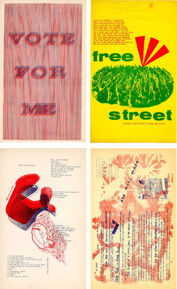
Design for the people!
August Heffner
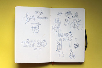
Hand lettering hits the Web
August Heffner
Why I still work with my hands
August Heffner
The intersection of food, design and politics
August Heffner
The case against vacation photos
August Heffner
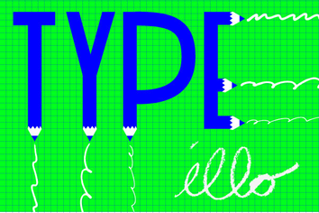
What is typographic illustration?
August Heffner
Page: 1