On Monday, Southwest Airlines said it will acquire AirTran Airways for $1.4 billion in cash and stock. This latest round of industry consolidation follows the mega-mergers between Delta and Northwest, and United and Continental.
Together the two discount carriers will form the world’s second-largest airline measured by passengers carried — pretty astonishing for an airline that won’t have a single wide-body aircraft in its fleet. Southwest will also gain access to 37 new cities, including AirTran’s large hub in Atlanta, where it competes head-to-head with Delta on busy domestic routes. And by inheriting AirTran’s network into Mexico and the Caribbean, Southwest takes on its first-ever international routes.
This will also mark the first time in many years that Southwest has flown an aircraft type other than the Boeing 737. In addition to its own fleet of 50-plus 737s, AirTran operates 86 Boeing 717 twin-jets (the 717 is a derivative of the McDonnell Douglas DC-9).
What this all means for consumers remains to be seen. Nothing measurable, in all likelihood, though the buzz on the business page, as happens whenever carriers join forces, will be all about market share and the impact on ticket prices.
AirTran, currently the nation’s third-largest low-cost carrier has been around in one form or another since 1994. The present incarnation was formed from the ashes, quite literally, of the much beleaguered ValuJet Airlines in 1997. Following the infamous 1996 Everglades crash, ValuJet took over the much smaller, Orlando-based AirTran Airways, keeping the latter’s identity in an effort to rebrand.
And speaking of rebranding, there is also a certain, entirely inconsequential aesthetic aspect to the merger, which I’m sure nobody on the planet aside from yours truly has bothered to consider. If you’ll allow me:
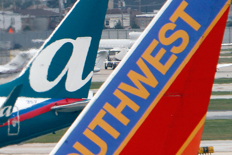
For starters, good riddance to AirTran’s nonsensical name. People often think it’s a contraction or an acronym of some kind. It’s not. It’s just “AirTran.”
And when it disappears, so too will one of the industry’s most overwrought paint schemes. I reckon there isn’t an artist alive who could take white, teal green, royal blue and candy-apple red, and make them look good together, but that didn’t stop AirTran from trying. In case it wasn’t ugly enough, they threw in some gratuitous curves and swooshes. And while I confess to liking the big italicized “A” on the tail, somebody needs to rein in the tacky practice of painting website addresses — airtran.com in this case — on engine cowls and winglets.
(Note: The more flattering critique that appears in my book is based on AirTran’s previous livery, not the current one. Yet another reason why that book needs to be revised or taken out of print.)
Not that Southwest’s uniform isn’t itself overwrought. The old Southwest featured lengthwise fillets of red, mustard and sienna. If it wasn’t imaginative, at least the hues were desert-esque and geographically correct. Having expanded far afield, the airline’s look, if not its name, was assumed too parochial, and so it has been, um, refreshed. Refreshed to the point that a Southwest jet looks like a bad peyote dream, or an overly rich dessert concocted by a starving child. The roof of every plane is a syrupy blue, delineated from a neon-red underside by a nose-to-tail ribbon of burnt yellow. Even the cowls and wheel hubs have been splashed with molten, tooth-rotting confection.
Still, though, one unsightly plane is better than two unsightly planes. And at least they aren’t planning to do as United and Continental have done, and hammer out some grotesque hybrid.
Shortly after United and Continental announced their intent to merge, forming what will soon become the world’s largest airline, a combination paint scheme was unveiled marrying the Continental tail with United’s typeface and bare white fuselage. “Continented,” let’s call it. I understand the sentiment, but they managed to get it backward. This awkward fusion preserves the worst aspects of each carrier’s identity as it jettisons the best. The best being United’s current tail design — a truncated, feathery version of its familiar “U” emblem. Continental’s tail, on the other hand, bland and ultra-corporate, looks like a PowerPoint slide. Continental’s two-tone flanks and thin gold cheat-line, meanwhile, are considerably more handsome than United’s anemic blue and white.
If there’s comfort in any of this, it’s that no U.S. carrier’s identity is anywhere near as awful as some of those found overseas. It’s hard to pick an overall loser, but EgyptAir’s latest uniform, which could double for that of an amateur hockey team, is perhaps the most repellent. Poor Horus, he looks like a giant eye sprouting false lashes.
Of course, the only thing worse than an ugly livery is seeing that ugly livery splashed across the fuselage and tail of an ugly plane. Let us hope that EgyptAir does not decide to order any Airbus A380s. The idea of that scheme plastered across history’s most inelegant jetliner is almost too terrible to imagine. (Photoshoppers, get to it and I’ll give the winner — er, loser — a free hat or T-shirt.)
These are not good times, maybe, for design in general — graphic, industrial, whatever.
As I pointed out a few weeks ago, the airline business is hardly the only industry to be suffering through a plague of destructive identity makeovers. One more for the ruined logo club: Pepsi. If you haven’t seen it, the soft drink giant recently took its classic, ying-yangy globe of red, white and blue, and gave it an asymmetric scrunch. It looks like a sad, partially deflated beach ball.
Meanwhile, it is interesting to compare the evolution, or devolution, of large aircraft with that of oceangoing vessels — a realm that has similarly lost its aesthetic way. Comparing the A380 with the Boeing 747 is a lot like comparing the newest passenger ships to classic ocean liners like the Queen Elizabeth II. The ocean liners were beautiful in much the way the 747 is beautiful; their successors are ugly in much the same way the A380 is ugly. Today’s big boats are ostentatious, unbalanced, out-of-scale with themselves. We don’t have ocean liners any more, we have “cruise ships,” and they look like ready-to-topple wedding cakes. And those names, all cheap and meaningless. The largest cruise ship in the world is something called, in a strange fit of redundancy, Oasis of the Seas.
Almost as bad as “AirTran.”
– – – – – – – – – – – –
Do you have questions for Salon’s aviation expert? Contact Patrick Smith through his website and look for answers in a future column.
