Loud, complicated, sprawling: The New York City subway is a national landmark as much as it is a transit system. From its 1904 inception, the New York City subway has grown into the largest unified transportation system in the Western Hemisphere — one that includes more than 423 stations and 660 miles of track. But its breathtaking, and frequently overlooked, collection of signage — from colorful mosaics to colored circles — also offers fascinating insight into the popular conception of public transportation and the world in which we live.
Today, the modern subway is dominated by the Helvetica typeface: A clean, simple, unfussy font became a favorite of municipal planners and corporations in the postwar period. Prior to this redesign, however, the New York subway was a chaotic collection of signs and placards in various typefaces that more closely resembled the world of Dr. Seuss than the modern system we know today. In his new book, “Helvetica and the New York City Subway System,” New School adjunct professor Paul Shaw explains how the efforts of designers — including iconic graphic designers (and co-founders of the influential Unimark design firm) Massimo Vignelli and Bob Noorda — as well as politicians and the public helped engineer that change, and what that overhaul says about urban infrastructure and ourselves.
Salon spoke with Shaw over the phone to find out Helvetica’s revolutionary message, its effect on public transportation and what it tells us about New York City.
Where did Helvetica come from and why was it developed?
The typeface was created in a small town outside of Basel by one of the oldest typeface companies, Haas, which went back centuries. They were not happy that one of the most popular typefaces among Swiss designers was a German typeface, Akzidenz Grotesk. They wanted a typeface that was going to compete with it. They took Akzidenz Grotesk, studied it, and changed tiny aspects of it, which, when you add it up, created a new design. They didn’t have much imagination when it came to the name. They called it Neue Haas Grotesk, which means the “new sans serif from the Haas company.” It wasn’t exactly a barn burner in convincing people to get it — it didn’t really catch on among the Swiss designers.
So how did a relatively unpopular typeface become the iconic “Helvetica” that we know today?
The Haas company was partially owned by a German company. They said, “We like this new design; we want to sell it in Germany and elsewhere.” The German company was brilliant and realized that Neue Haas Grotesk was not a good name. They wanted to call it “Helvetia,” which is the Latin name for Switzerland, but the people at Haas balked at this on the grounds that you can’t name a typeface after a country; that somehow it was insulting to Switzerland. Someone had the brain to think, “Let’s just add a ‘c.'” Helvetica is easier to say. It was a brilliant solution.
How did Helvetica become so dominant?
It’s weird; it was almost an accident. Helvetica became dominant for basically two quirks. It coincided with an interest in Swiss design, worldwide, in the 1960s. It happened to get picked up by the right companies — by the right technology.
Why the 1960s?
The ’60s was the heyday of the idea that corporations would want an identity that would cut across all their products, all their materials and all their offices. That was part of the postwar international spread of corporations — especially American ones. They wanted to have a unified appearance.
What was it about “sans serif” typefaces, those without the loops at tails at the end of strokes, that was so attractive?
The designers were looking for typefaces with objectivity or neutrality; that it wouldn’t suggest the historic past or even cultural things. There were a number of typefaces that could fit this bill, but Helvetica was the one that was available in a wide variety of ways. It was part of the Swiss zeitgeist. And so companies, as soon as it was available, began to make it the default. People used to joke that you couldn’t tell one corporation from another because they all had Helvetica.
A lot of people are familiar with the New York City subway system of today. What did the subway look like 50 or 60 years ago?
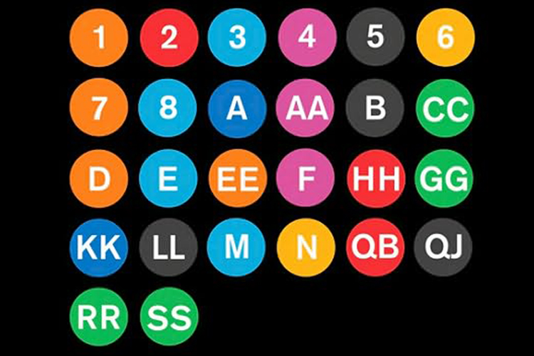
It wasn’t a unified system of signs. You’ve got ceiling signs, you’ve got institution signs, you’ve got mosaic signs, you’ve got column signs, and then, of course, you’ve got billions of other things: no smoking, no spitting. So, accumulation: That’s what there was in Don Draper’s day.
What happened in the postwar period that inspired reform?
People began to realize that if New York was going to become this world-class city, the heart of finance, art, publishing, you had [to do something about] this embarrassing transportation system. Which, as we all know, is incredibility effective, but not very pleasant. The system is far better today than when I arrived in the late ’70s, and yet there are days when I go down into it and I just start cringing. All of a sudden you just realize it does stink or it’s dirty — even if it’s cleaner than it used to be. It’s an old system, and it’s a cobbled together system, which is really the one thing that separates it from every other system in the world that I know of.
Helvetica was developed in 1957 and was first available in New York in 1963. When did it make its way into the subway system?
It didn’t take over until decades after everybody thought it did. It doesn’t become the official typeface until December 1989. Given that the first attempt is 1966, and the first manual is 1970, that’s a long time, but it crept in. It showed up before it officially “showed up.” You can tell that they still don’t know what they’re doing. Just last December they renamed “Jay Street — Borough Hall” “JayStreet — MetroTech.” I finally went over to see what everything looked like. I was stunned. They’ve got the wrong Helvetica. It’s Helvetica, but it’s not the right one. It’s the same mistake that they made in the ’80s. They got confused. I can’t believe for the entire new station they’ve done that, because they’ve taken great pride in Helvetica as the identity of the system.
How did Helvetica reflect the ideology of its day?
Sans serif as a dominant typeface really goes back to the ’20s: to the Bauhaus and other modernist designers that were contemporaries, but not members of, the Bauhaus. Sans serif was seen by all of these designers as a typeface that didn’t have historical roots. It seemed to be free of the past; to be a typeface that was contemporary. To them, it was something that seemed to be free of any associations, and therefore was perfect for what they thought was a new world happening.
A lot of these designers were left leaning if not all-out communist, and they thought there was going to be revolutions in other countries. They saw designers as the new visual people. I use the phrase “visual engineers.” They wanted type that seemed modern; that fit in with cars, skyscrapers and things like cinema and photography. And sans serifs became part of modernism. They also saw sans serifs as free of decoration. We want letters that are as simple as possible. They were stripped down, it was part of the machine aesthetic at the time. The letters aren’t obscured by unnecessary parts. They’ve been associated with modernism ever since. There’s still a sense that if you want to indicate that you are modern, you use a sans serif letter form. Tech companies love them. Architects love them.
How does that manifest itself in the New York subway system?
If this is the typeface of the modern world, especially modern corporations, then it’s also the typeface of modern transportation. It’s amazing how the same subway station with a Helvetica sign looks newer than the same station with just mosaics. If you doctor photographs, you could quickly modernize the New York system just by changing the signs.
What does the story of this typeface tell us about New York City?
What was most surprising about this whole thing was that I thought I was just writing about “Is it Helvetica or is it Standard and why?” and instead I’m writing about “What happened and why?” and “Why did things go downhill but somehow they’re still working?” “How have things changed and they haven’t changed?” And that’s what began to fascinate me: how what Massimo Vignelli and Bob Noorda did in ‘66 is still with us today, even though they haven’t been involved since 1970. What we have today is not what they did. We have a different typeface, we have different colors, we have a different system of signs. We have all of these things that are different, and yet, when you look at it, there is an essence that is there that they established. It’s survived how many mayors, how many heads of the subway, budget crises, graffiti. If you’re asking what symbolizes New York, it’s not Helvetica. It’s how what Vignelli and Noorda did has survived. That’s very New York. It doesn’t matter that everything around them has fallen apart; it’s still there.
