 Color-fans: Today we try something new. Eager to invite folks into the color conversation, I asked Tom Biederbeck, editor of the excellent blog on print design Felt and Wire, to share some views.
Tom suggested we put the question to past master of the gloriously colorful: Sean Adams of AdamsMorioka. Sean and I both wrote columns for Tom when he was editor-in-chief of STEP Inside Design, and I’ve always wanted to meet Sean in person. (Sean, when we get that chance: The first beer’s on me.)
Sean and Tom now spar in friendly Spy vs. Spy style in an occasional series for Felt and Wire called 3Q’s. Below, Tom’s and Sean’s collectively smart take on color, inspiration, and what irresistibly draws the eye.
When I think about designers who are masterful in using color, I think of AdamsMorioka, the Beverly Hills studio of Noreen Morioka and Sean Adams, who’ve done vivid and memorable work for Nickelodeon, Sundance, Disney and so many others. Whether he’s doing environmental design or editorial work, identity or motion design, Sean Adams’ color sense is distinctive without lapsing into simple style. And while his work has mid-century modern antecedents, Sean has done more to evolve that canon and make it fresh and relevant in the 21st century than anyone today that I can think of.

His color sense is rooted in the same way. There’s more than zest to his palette. He freely admits to a Left Coast bias: “My color sense is a product of what I see. Living in Los Angeles, I’m bombarded with a clash of cultures. I see more palettes that come from Mexico, South America and Asia than European. Add some Middle Eastern and Hawaiian, and you’ve got a bright mess.”
It appears that his only dogma is eclecticism. “I don’t understand when people say they can’t work with color,” he says. “I’ve never met a color that didn’t like the one next to it. Being brave and slamming things together always works.”


Inspiration is all location. “I work in a space with 12-foot floor-to-ceiling windows that blast light all day, so there is no such thing as too intense. My inspiration comes from my environment,” Adams says, and there’s no doubt that includes Disney, specifically the Disney artist Mary Blair, whose work from 1940-70 includes iconic imagery we all recognize: concept art for “Alice in Wonderland,” “Cinderella” and the attraction “It’s a Small World.” Walt Disney himself is said to have admired Blair’s color styling. “She combined colors in ways I would never have considered. Lime green and yellow with rust, violet and pink, avocado green and burnt orange. If you ever need a crash course in color theory, ride ‘It’s a Small World’ repeatedly. If the song doesn’t drive you mad, you will emerge a color master.”


I had to spoil Sean’s fun at this point and jump in with a cliché: How does he get ahead of trends so he knows not to offer a color solution that’s played out? Adams is of course way ahead of me. “I am the last person to ask about trends. I am so tragically unaware of any trend that people pity me. I’ve worn the same style of clothes since I was five. I’ve used the same palettes my entire career.
“I can talk about colors I like at one time as opposed to another. For example, we just repainted the office, changing from pastels to odd colors: watermelon, avocado, ochre, butter yellow. But I have no idea what is groovy today. My advice is to avoid trends. Stick with what you like. You’ll be out of style for 18 years, then in style for two, then out again, in cycles.”

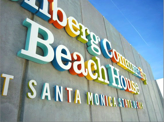
Works by Sean Adams and Mary Blair at Disneyland; all photographs by Sean Adams.
Copyright F+W Media Inc. 2011.
Salon is proud to feature content from Imprint, the fastest-growing design community on the web. Brought to you by Print magazine, America’s oldest and most trusted design voice, Imprint features some of the biggest names in the industry covering visual culture from every angle. Imprint advances and expands the design conversation, providing fresh daily content to the community (and now to www.salon.com!), sparking conversation, competition, criticism, and passion among its members.
