
 Beginning in the early 1890s artistic conventions — indeed academic art everywhere — were under attack by a kindred group of young artists who marched throughout Europe under the youthful banner of Art Nouveau. Although it was called by different names in the various nations in which it took hold — Stile Liberty in Italy, Secession in Austria, Jugenstil in Germany, etc. — the movement was linked by the fact that its practitioners viewed “the total work of art” as not merely canvas but as a functional product that influenced all aspects of life. Art touched everybody and everything from advertising to architecture. This idea was underscored by a common visual mannerism, the Art Nouveau style, based on curvilinear forms drawn from nature. Noted for its sinuous, organic designs, the term “Floreated Madness” has been used to describe Art Nouveau’s underlying eccentricity.
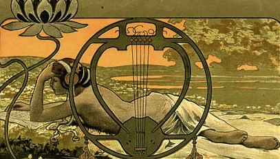
This is a beautiful example of Stile Liberty in its heyday. Scena Illustrata (rivista quindicinale di letteratura, arte e sport) was a Florence based journal of popular culture that began in 1865. This is an issue from 1902, near the end of the style.
Art Nouveau ceased shortly after the turn of the century, and whatever remnants remained were terminated with the onset of World War I. But between 1890 and 1906 countless artworks were produced first in France, then Germany, Austria, Italy, Eastern Europe, England, Russia and the United States. Type is among the most emblematic. For over 15 years after its inception artists, graphic designers and typographers developed a huge number of stylish and distinctive hand-drawn and cut-metal typefaces that complimented architectural and interior motifs. These were delightfully eccentric typefaces, which, curiously, were rooted in the fundamental rules of type design — balance, harmony, color. A few of the faces have survived the test of time and are still used, but most were so inextricably tied to the era in which they were designed that they have been lost.
 (Bobbi Lin / Food52)


 (Lai Seng Sin)
Copyright F+W Media Inc. 2011.
Salon is proud to feature content from Imprint, the fastest-growing design community on the web. Brought to you by Print magazine, America’s oldest and most trusted design voice, Imprint features some of the biggest names in the industry covering visual culture from every angle. Imprint advances and expands the design conversation, providing fresh daily content to the community (and now to www.salon.com!), sparking conversation, competition, criticism, and passion among its members.
