I’ve ogled the Veer font library for quite some time now. And I am currently in mourning over what appears to be the end of the company’s active type-collecting days, as Veer restructures to increase emphasis on user-generated imagery (“micro-stock”).
The many tasty typefaces former “Head of Type” Joe Newton curated over the last three years will remain intact; but the collection will be frozen in time — at least for now — with no new additions on the (near) horizon.
New typefaces would come across my desk almost daily,” Joe recalls. “What a wonderful thing to have the opportunity to play with them all! I think we are in a golden age of type design — such variety — everything from ‘spaghetti western film poster’ to serious and meticulous revivals. From craft project to fine craftsmanship.”
Alejandro Paul‘s fonts are among my favorites,” Joe continues. “They’re beautifully designed, endlessly intricate and ornate. Ale Paul has really helped redefine what a script font can be.”
Users occasionally contacted Joe to see how they could make their type look as customized as Ale Paul’s elaborate specimens — and he’d delicately counsel them to perhaps try software other than Word.
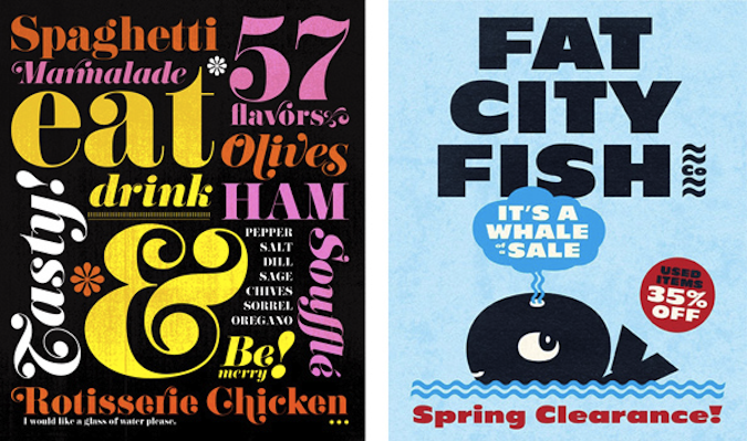
I love all the refinement of the high-end typefaces, but I also have a real soft spot for vernacular lettering,” says Joe. “Dharma Type is a good example — their fonts have a wonderful sense of playfulness. They embrace the idiosyncrasies of their sources, and I’m drawn to them because they play to my own graphic, cartoony side.”
 (Christophe Ena)
HT Gelateria with Killernuts (Dharma Type) and Crescendo (Canada Type)
While I realize there are still lots of good places to poke around when I’m in need of a type fix, the taste level at Veer always seemed high (or at least in keeping with my own, which is probably debatable, now that I think about it). And Veer sent out those great little promo mailers.
I think I’ll miss Joe’s often tongue-in-cheek font specimens as much as the Veer merchandise, which now also lives in the past tense. I regret that I never ordered the KERN jacket that sat in my shopping cart for so long, though I did buy pillows, jewelry and a few T-shirts for my former co-workers at SpotCo over the years (on my personal account, not the company one — if you’re reading this, gift recipients!).
When you search the Veer site for merch these days, you’ll come to a page that says, “The store is closed.” *Sniff*
 (Lucasfilm)
P22 Slogan (IHOF) and Dharma Gothic, Dharma Slab, Rama Gothic, Rama Slab (Dharma Type)
 (AP/Eric Charbonneau)
Idler (Manfred Gensicke, Dirk Heider) and Zierfische (Mark Butchko)

Satura Pro (Fountain) and Replay (MacRhino)

Brilliant (FaceType) and Ambroise (Porchez Typofonderie)

Graham Cracker (Jukebox) and Horst (PintassilgoPrints)
Copyright F+W Media Inc. 2011.
Salon is proud to feature content from Imprint, the fastest-growing design community on the web. Brought to you by Print magazine, America’s oldest and most trusted design voice, Imprint features some of the biggest names in the industry covering visual culture from every angle. Imprint advances and expands the design conversation, providing fresh daily content to the community (and now to www.salon.com!), sparking conversation, competition, criticism, and passion among its members.
