

“Mad Men” Season 5 … about time! But that new outdoor ad of the guy suspended in white space … what’s the big idea? It’s certainly eye-catching. And it’s already become controversial. In those respects it may be meant to announce “Don Draper: The George Lois years.”
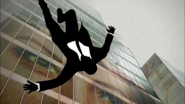
 People are offended by the obvious 9/11 association. It’s undeniably deliberate, and most dramatic when seen on Manhattan’s bus shelters, where the plexiglass superimposes the city’s surrounding buildings over the falling mad man. But of course, he’s been falling ever since the show’s very first episode.
The opening sequence first aired in 2007, and I’ve been showing it to my design history classes ever since. It’s even earned a spot in the new “Meggs’ History of Graphic Design”… but more about that book in a future column.
Students’ discussions about the clip have always been lively. We’d begin by considering various interpretations. Then we’d talk about other visual references. Here, the responses have been numerous and varied. There’s Saul Bass, from his early days through to “Casino,” and, of course, the many and ever-ongoing Bass homages. There’s the “Twilight Zone” intro. There’s Robert Longo. And from our earlier Constructivism lesson, there’s the Stenberg brothers’ 1927 “Daddy’s Boy” movie poster, with its hapless protagonist frozen in mid-plummet, surrounded by walls of blank, uniform, Modernist skyscrapers.
Eventually I’d push my students to think beyond the art and design box, to consider how and why these credits – and the show itself – have such resonance in our 21st century culture. And then I’d watch the shock of recall and recognition start to sweep through the classroom. But those days are over.
This 9/11 connection hasn’t been a big secret. On the other hand, it hasn’t really been very widely acknowledged … until now. Imaginary Forces’ rich, subtle and iconic motion graphic had left much to our imaginations. But the poster leaves us with practically nothing, both literally and figuratively. Layers of subtext are lost, and less is… less.
Without knowing what to expect beyond the indication of Don’s increasing isolation from, apparently, everything, it’s impossible to speculate about other, better design options. But it’s a shame that AMC’s marketing creatives couldn’t have come up with anything more groundbreaking and impactful … and now I’m just speaking figuratively. After our longer-than-usual wait, all intrigue and excitement that could have been generated has instead been diluted, and, yes, diverted. And finally we’re left with a poster that seems to ask, just what are we falling for here? More of the same? And perhaps more obviously than in the past?
I certainly hope not. Creator Matthew Weiner recently said that he tries to “shake it up and dump out the milkshake and rinse out the glass and start over … You like chocolate ice cream? I can’t make richer chocolate ice cream. I’m going to make orange sherbet this year. And if you don’t like it, you don’t like chocolate ice cream. It’s still ice cream.”
Food for thought.
.


 (Gilbert Carrasquillo/GC Images/Getty Images)
 (AP/Mark Lennihan/Salon)
Copyright F+W Media Inc. 2011.
Salon is proud to feature content from Imprint, the fastest-growing design community on the web. Brought to you by Print magazine, America’s oldest and most trusted design voice, Imprint features some of the biggest names in the industry covering visual culture from every angle. Imprint advances and expands the design conversation, providing fresh daily content to the community (and now to www.salon.com!), sparking conversation, competition, criticism, and passion among its members.
