
Soon after we started our White Plains, N.Y., animation/design studio in 1990, a neighborhood church opened a special volunteer bookstore three doors down the block on Main Street. People would donate books to the store’s inventory and the church would accept financial donations in exchange for whatever volumes you wished to leave with – you gave whatever you felt was fair and exited with your book(s). At a certain point, it became so popular as the place you could give your old books a good home, that people would back trucks up to the front of the store in the middle of the night and literally dump libraries of tomes at the store’s threshold. If you arrived early enough, you had your pick of the tasty, choice ones and could come to the store after it opened to contribute your donation. Without a doubt, I was able to acquire some very unusual and esoteric books this way. This is also how I came to own two editions (acquired at different times) of a Russian book titled “A Book About Tasty And Healthy Food”.

These books appear to have been published as a profile of popular Soviet Russian foods, food products and recipes. There are plenty of heavily retouched monochromatic and full-color photographic illustrations. A brief journey through the books to evaluate the graphic technique used to present the foodstuffs leaves you with the impression that these were perhaps published in the 1930-40s. The retouching is so heavy-handed and the majority of the design is so unsophisticated that my instincts were telling me that they had to be pre-Cold War. Hardly. When I eventually referred back to the title page and saw the 1961/1965 publishing dates, I gasped. I’d never seen such a blatant example of stunted graphic design development – if it were produced intentionally it would be brilliant parody!

Of all the images, this is the nicest - could easily make an awesome poster !

. . .and the chapter headings had a decent style to them.
 (Andres Kudacki)
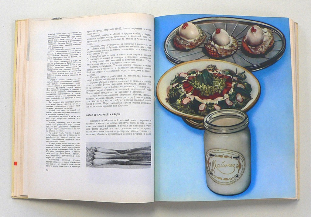
Enough to make anyone swear off mayonnaise. . .
 (Win McNamee/Getty Images)
Impressive and bold treatment of a typical kitchen of the time. . . (?)

End papers. . .

Green cover rear end papers. . .
 (Gordon Chibroski/Portland Press Herald via Getty Images)
Looks like something done between the wars. . .

What's in the red bowl - yogurt ? Spit. . . ?

Maybe you injest these and the illustrations look better. . .
 (Reuters)
Olive this. . .
 (Reuters)
. . .but I don't love this so much.


Copyright F+W Media Inc. 2012.
Salon is proud to feature content from Imprint, the fastest-growing design community on the web. Brought to you by Print magazine, America’s oldest and most trusted design voice, Imprint features some of the biggest names in the industry covering visual culture from every angle. Imprint advances and expands the design conversation, providing fresh daily content to the community (and now to www.salon.com!), sparking conversation, competition, criticism, and passion among its members.
