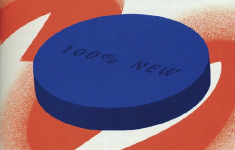

Illustration for Bloomberg View, 2011
The first thing you ought to know about Brendan Griffiths is this: Do not click on the exclamation mark.
 The objectionable glyph follows the name of the 29-year-old’s firm, Zut Alors!, on its website, zutalorsinc.com. Griffiths joined the company of the founding partner, Frank DeRose, last May, after picking up his M.F.A. in graphic design from Yale. While still in New Haven, he helped develop the site into a statement of the practice’s principles, a statement that has proved to be “very polarizing,” according to Griffiths. “People either love it or hate it.”
That’s just the kind of response the partners were looking for. Since coming aboard ZA!, Griffiths had been turning out bracing, acerbic graphic work for clients such as Bloomberg Businessweek, as well as iPad apps for Condé Nast titles. “Whenever we hire Zut, we always get really wild ideas,” says Gary Fogelson, whose firm, Other Means, has commissioned illustration from the office for Bloomberg’s editorial page, Bloomberg View. Appropriating familiar images and pairing them with bitingly sarcastic text, Griffiths and Zut Alors! have articulated a distinct visual language; what it says, Fogelson says, is “fuck you.” It’s an attitude that gets attention, and if it gives the client some in-your-face cred, so much the better for them.

Zut Alors! website ,2011

Yale Graphic Design M.F.A. 2011 website, with Juan Astasio Soriano and Brian Watterson, 2011
 (Vincent Yu)
Paperweight for senior thesis, 2011
The message comes through in infographics, bookmaking, and typography, but perhaps nowhere more so than on the firm’s website, full of blind alleys and blinking icons. This iconoclastic approach matches Griffith’s own. At school, he and a group of colleagues created the Book Trust, a theory-minded but tangible design catalog in which other artists could purchase “shares”; they peddled it — in full corporate drag, name tags and all — around the New York Art Book Fair.

The Book Trust Prospectus, published by Investment Future Strategy, Ltd., with Benjamin Critton, Harry Gassel, Zak Klauck, and Mylinh Nguyen, 2012
“Almost all of graphic design is very commercial, including a lot of work I make,” Griffiths says. Alternating satire with confrontation, he is trying to work his way out of the design-world straitjacket, even as he’s piecing together how to operate a professional partnership. Griffiths says, “We’re just figuring it out as we go along.”
See the other 2012 New Visual Artists:
- Sang Mun
- Erin Schell
- Berton Hasebe
- Drea Zlanabitnig
- Casper Heijkenskjöld
- Kelsey Dake
- Jerome Corgier
- Tracy Ma
- Olimpia Zagnoli
- Ryan Thacker
- John Passafiume
- Lisa Hedge
- Jungyeon Roh
- Dafi Kühne
- Jing Wei
- Caleb Bennett
- Naz Sahin
- Serifcan Ozcan
- Brendan Griffiths
- George Michael Brower
More Design Resources:
- Learn about the next generation of app design from one of the industry’s leaders!
- Available now: Print Magazine’s Guest Art Director Digital Collection
- Get an inside look at logo design from Chermayeff & Geismar
