 Roy Kuhlman (1923–2007) is not forgotten—his work has been written about here and here, his book covers have been collected here and here, he was inducted into the Art Directors Hall of Fame, my 2007 obituary is here, and there is even a spare website waiting for an infusion of content, launched by his daughter, Arden Riordan. For Imprint, Steven Brower recently wrote about Evergreen Review, where Kuhlman was once art director.
 (AP)
(AP)Simple typography + startling image = allure
 (AP)
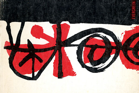
(AP)What defines an apple?
I was briefly an art director at Evergreen too. I did not meet Kuhlman at the time, but I was very inspired by his improvisational abstract book covers designed for Evergreen‘s publisher, Grove Press. There was a transcendent modernist aesthetic that gave and continue to give them a timeless quality. I noted in his obituary:
Mr. Kuhlman’s minimalist graphic vocabulary was entirely his own. He avoided literal representation, because he said he couldn’t really draw well. Instead his random color patterns and amorphous shapes seemed totally independent from the texts they were illustrating. In fact, rarely did he actually read the manuscripts before designing the covers, and yet every image was as provocative, eye catching and poster-like as book covers and jackets had to be draw attention on the shelves.
I have long been disappointed that Kuhlman has not received more attention. In the 90s, at the SVA “Modernism & Eclecticism: History of American Graphic Design” symposia that I codirected with Richard Wilde, we invited Rick Poynor to talk about and interview Kuhlman. I think it was his only late-in-life public appearance before the design community.
Just recently, I was looking through two vintage Evergreen/Grove Press books with Kuhlman’s covers: The Apple (1961) and The Maids and Deathwatch (1962). Both suggest the time when Late Modernism ruled the roost, and paperbacks were dressed in conceptual, abstract, and minimalist covers by Paul Rand, George Guisti, Chermayeff & Geismar, Leo Lionni, Rudy de Harak, and more (see Baseline #43). But as stated above, “Mr. Kuhlman’s minimalist graphic vocabulary was entirely his own.”
What set his work apart from others working in this manner was the free-form aesthetic, the painterly swirl and carefree splotches that gave personality to an otherwise abstract (perhaps obtuse) visual idea. Whenever I see these and his other covers, I smile, sigh, and wish I could do that.
.
Read more on Chermayeff & Geismar in Identify: Basic Principles of Identity Design in the Iconic Trademarks of Chermayeff & Geismar.
