 My last post concerned the photoengraving industry of the pre-Depression period. This week it’s pre-WWII lithography!
“Litho Media: A Demonstration of the Selling Power of Lithography,” published in 1939 by Roger Stephens and edited by H. Homer Buckelmueller and Colin Campbell, is a 206-page, 12-by-15-inch slipcased bible produced to help publicize the successful and effective results of using the lithography process for marketing purposes. It doesn’t pretend to be anything other than a “Toot Your Own Horn” compilation of uses (employing tipped-in examples of the produced work discussed), accompanied by testimonial letters from the various people responsible for utilizing the craft for their products. There are no technical descriptions or images that explain the process.
 (AP)
(AP)The 12-by-15-inch Litho Media with its slipcase
 (Associated Press)
The hardcover edition with its dust jacket
The major difference I find between this publication from 1939 and the subject of my prior post (“Achievement in Photo-Engraving and Letter-Press Printing,” 1927) is the more aggressive approach to presenting the cause for using the technique. The 1927 catalog felt more like a “Gentleman’s Game” of marketing. This newer reference edition uses a more modern/familiar approach to promoting the craft — a bit more brash and direct.
(When it comes to the images, remember to click on the picture to enlarge and click again to go in even further …)
 (AP)
(AP)Opening acknowledgements

Title page


 (AP)
(AP)The fold-out approach was a reflection of the book's dust jacket, which also opened to show a chronological art-history timeline


The book with its dust jacket
 (AP)
(AP)The dust jacket in its opened configuration
Back to our feature presentation …


 (AP)
(AP)Lithographed postcards from the 1939 Golden Gate International Exposition
 (AP)
(AP)The Hotel Pennsylvania's map for use by visitors to the 1939 NY World's Fair
 (AP)
(AP)The Hotel's Statler Company's folder in opened form
 (Isaac Billy UNMISS via AP)
A brochure announcing the offerings of the new Alwyn Court apartments at 58th Street and Seventh Avenue
 (AP)
(AP)The letter from Tison Page of Tison Page Advertising discusses, among other things, the use of halftone screening to give the impression of three colors using only one
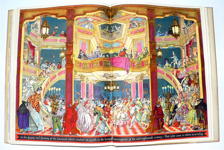
 (Joel Ryan/invision/ap)
Illustration by Henry Stahlhut with accompanying letter from fair president Grover Whalen
 (AP)
(AP)General Electric Air Conditioning sales presentation example

 (AP)
(AP)PanAm brochure illustrated by Kenneth W. Thompson
 (Reuters/Lucas Jackson/Dey Street Books/Salon)
Foldout with more illustrations by Thompson

Remember blotters?
 (AP)
(AP)A Currier & Ives–inspired calendar


A dust jacket cover illustrated by Gregor Duncan


 (AP)
(AP)P.O.P. examples (having nothing to do with breakfast cereal ...)


 (AP)
(AP)A small Sealtest cookbooklet tipped into the page

 (AP)
(AP)Actual tipped-in labels lithographed for various products
 (AP)
(AP)A label (front and reverse) for canned salad sprouts
 (AP)
(AP)Example of a White Owl cigar band and a Robt. Burns holiday cigar-box wrapping
 (AP)
(AP)A Boraxo label printed on metal and Griffin Allwite shoe polish packaging
 (AP)
(AP)Paas Easter Egg coloring package
 (AP)
(AP)A chapter on logos and trademarks


 (AP)
(AP)A billboard foldout designed by . . .
 (AP)
(AP)... Dean Cornwall

A pre-Speedy advertisement for Alka-Seltzer
 (AP)
(AP)A reproduction of a Sir Samuel Luke Fildes (1844–1927) painting used by the Lever Brothers Company for in-store promotion
 (AP)
(AP)Menu cover produced by Schenley Distillers Corporation
 (AP)
(AP)Esso automobile roadmap
 (AP)
(AP)Esso map, partially folded out

Sheet music produced by the State of New York to promote safety to children

 (AP)
(AP)Package insert for Murine eye drops


Office and factory forms

 (AP)
(AP)... illustrated by T.M Cleland ...

 (AP)
(AP)... and printed on a Harris Offset Press
The remaining eight spreads are actual ads at the end of the book.
 (<a href='http://www.istockphoto.com/portfolio/Poike'>Poike</a> via <a href='http://www.istockphoto.com/'>iStock</a>)
Three spreads promoting the products of International Printing Ink


 (AP)
(AP)Gloss finishes ...

... weatherproofed printing, and photoreproduction
 (AP)
(AP)The gold-and-blue image is an actual printed-on-metal example, tipped into the page


.
If you relish a tactile design experience, you might also enjoy the DesignCast “Freaks of Fancy, or Everything You Wanted to Know About Wild, 19th-Century Printing Techniques (But Were Afraid to Ask).”
