 Earlier this year, the Internet Corporation for Assigned Names and Numbers, or ICANN—the nonprofit organization that controls the Internet’s domain-name system—announced that it was accepting applications for new domain-name extensions. For a mere $185,000 a pop, anyone could suggest alternatives to .org, .com, .biz, and the other URL standbys. Out of the 1,409 applications ICANN received, there were a few amusing ideas (.ketchup, .gripe, .wtf) and plenty of reasonable if slightly depressing commerce-oriented suggestions from corporations (.pfizer), brands (.calvinklein), e-business niches (.spreadbetting), and tourist-hungry cities and regions (.barcelona, .quebec).
 (AP)
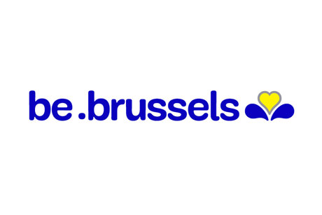
(AP)Base Design's new logo for the Brussels Capital Region
Among the latter was .brussels, a domain extension for the Belgian capital, which has now been spun off into a new brand and logo for the Brussels Capital Region. This identity reboot was by Base Design, an international firm with offices in five cities (including Brussels) whose clients have included Adidas, Camper, Chanel, the Museum of Modern Art and Kanye West. In a press release, Base describes the thinking behind its Brussels rebranding:
To ensure instant recognition and continuity the Brussels Capital Region required the new logo to incorporate the traditional blue and yellow Iris, the symbol of the Brussels Capital Region. Taking these constraints into consideration, BASE DESIGN has developed an accessible brand that serves not just as a logo but also as a system or platform that can be used by all the Brussels stakeholders.
Indeed, the new identity works across all sorts of applications, from T-shirts to garbage trucks. Base uses a custom rounded sans serif, which plays off the iris icon and its heart-shaped center petal. The logo is highly versatile and can be combined with additional “be blank” slogans as appropriate. As one of Base Design’s partners said in the press release, “Logos, however pretty, are no longer sufficient to build a brand.”
 (AP)
(AP)
 (AP)
(AP)

(AP)
 (AP)
(AP)
What do you think—be-autiful or ba-loney? Let us know using the comments form below.
.
For more on logo design, check out The Logo Brainstorm Book, now on sale at MyDesignShop.com.
