Robert Rauschenberg and Jasper Johns — friends and lovers — succeeded in the task they had set themselves in their New York studio during the 1950s. They had determined to free American modern art from the chilly grip of Abstract Expressionism, and that they had done. Their images of, and appropriations from, popular culture stopped being seen as a joke and started to be taken seriously. Influential curators from MoMA would make their way to Manhattan’s leading art galleries — such as Betty Parsons and Leo Castelli — to see firsthand the latest work by these two young Americans. There they would quietly peruse and identify pieces to purchase and add to their impressive collection of modern art. Many others would also go and browse: the Manhattan intelligentsia, collectors and other artists. Among the regular visitors was a fey man in his early thirties who had already made a name for himself as a fashion illustration but who now desperately wanted to break into the art world.
Andy Warhol (1928-87) would stand and look at the work of Rauschenberg and Johns and despair. What could he — a mere commercial artist working in advertising — do to match the impact being made by those two bold artists? He had found a degree of fame as a designer of pen-and-ink drawings of shoes, and he had made good money creating alluring shop window displays. But that was as far as it went. For years he had experimented with pop motifs. He had produced a very basic drawing of a dead James Dean (1955) with his overturned car in the background and a line drawing of the author Truman Capote (1954), as well as a Surrealist-inspired picture of a chess player — a reference to the importance of Marcel Duchamp to the emerging artist. And yet, by the end of the 1950s, Warhol still hadn’t discovered his own subject or style on which to build his fine art career. He only had his illustrations or poor pastiches of other artists’ works: He remained an outsider looking in.
In 1960, he followed in the wake of Paolozzi, Hamilton and Rauschenberg and made an artwork featuring a Coca-Cola bottle, although his approach was different. While the other artists had used the brand and bottle as a part of their artwork, Warhol made it his sole motif, just as Johns had done with his subjects.
In “Coca-Cola” (1960), Warhol simplified the bottle into a graphic representation and placed beside it a disc of the brand’s famous logo, as if he had cut both out of a magazine and magnified the image. The effect was stark and detached, and it was more powerful as a painting than it would have been as a piece within a collage. But it wasn’t quite right. It was too subjective. Warhol couldn’t resist adding some painterly brushstrokes to his design, marks that were in keeping with the emotional dramatics of Abstract Expressionism but that undermined the potency of his otherwise coolly disconnected image. The problem was that there was too much Andy Warhol in the painting to make it a distinctly Andy Warhol painting. He was, though, very near to finding a signature style. He came closer still with some black and white paintings of small ads that he had removed from the back of a newspaper. “Water Heater” (1961) studiously mimics the advertisement for a water heater, but Warhol yet again over-embellished the image by incorporating into the picture drips of paint running down from some of the lettering. And then, in 1962, he cracked it.
Having asked anyone who would listen to him for an opinion of what he should paint, he struck gold when one person suggested that he plump for the most pervasive piece of pop culture he could identify, like money in the form of a dollar bill or a stick of chewing gum. Now, that was a great idea. While Johns mainly chose objects so familiar that they were overlooked, Warhol would take images so popular that they already had mass appeal — he would be as bold and brash as the advertisements and products surrounding him in Manhattan. He figured that one could interpret the icons and artifacts of the consumer boom in two ways. The idealized images of perfect people and faultless products could be seen as either clichés or classicism; they could either be viewed as a crass and exploitative picture of a woman in lipstick, or they could be read as celebrating the ideal of perfection, just as the Greeks had done with their revered artworks. It was a psychological tension that was rife with possibilities. Warhol went back to his mother’s place for lunch to think about a suitably “low” motif. When he arrived there he sat down and consumed the same meal he had been eating for the past twenty years: a slice of bread and a can of Campbell’s soup.
He still couldn’t find a New York gallery to show his work, but he did in Los Angeles. In July 1962, at Irving Blum’s Ferus Gallery in LA, 32 paintings by Andy Warhol of “Campbell’s Soup Cans” (1962) were exhibited. They were presented on 32 separate canvases, each depicting a different flavor in the Campbell’s range. Irving Blum had wittily hung them in a single horizontal line supported by a shallow white shelf, as if they were still in a food store. The intention was to sell each canvas individually for $100, but by the end of the show, there were only five takers, one of whom was the movie star Dennis Hopper. By this time, Blum had developed a taste for Warhol’s “Campbell’s Soup Cans.” He liked seeing them en masse, and he started to think that they worked better as an overall piece rather than as single units: The sum, he thought, was greater than the parts.
He put it to Warhol that the work should be reconceived as one entity featuring 32 canvases, and the artist agreed, making Blum a co-creator of one of the twentieth century’s most famous artworks and a member of a fast-expanding club of Andy advisers, a motley band of which he was happy to be a part. A willingness to listen to other people and, when appropriate, to take advice was among Warhol’s greatest gifts. He would often solicit ideas, politely ignoring the suggestions he thought to be off-beam but quickly acting on any that he considered had merit.
Irving Blum’s recommendation was such an instance. With Warhol’s agreement, the art dealer went about buying back the five previously sold “Campbell’s Soup Cans” canvases — all of which remained in the gallery awaiting collection once the exhibition had finished. Reportedly he had varying degrees of difficulty — Hopper is said to have been the most intransigent — in persuading his clients to take back their money and to allow him to keep the canvases. It was worth the effort. As a unified work, “Campbell’s Soup Cans” would not only define Warhol as an artist but would also define Pop Art and the movement’s overriding obsession with mass production and consumer culture.
Warhol had succeeded in removing almost all evidence of his presence from the paintings; there are no stylistic ticks and no look-at-me flourishes in any one of the 32 canvases. The power of the work was in its dispassionate coldness, communicated by the apparent absence of the artist’s hand. Its repetitive nature parodies the methods of modern advertising, which aims to infiltrate the public’s consciousness in order to indoctrinate and persuade by bombarding us with multiple exposures of the same image. Warhol is also challenging the convention that art should be original with his studied uniformity of his “Campbell’s Soup Cans.” Their sameness goes against the traditions of the art market, which places value — financial and artistic — on perceived rarity and uniqueness. Warhol’s decision not to create his own graphic style but to mimic that of the Campbell’s soup cans has a political and social dimension. It is a Duchampian rebuke to the art world for elevating artists to the role of all-seeing geniuses and a comment on the diminished status of individual workers in the homogenized world of mass production (a concern that had been raised by John Ruskin and William Morris in the nineteenth century).
Warhol presses that particular point with his method of production. Although the 32 “Campbell’s Soup Cans” appear identical, they are, in fact, all different. Go up close and you will see that the brushwork is not quite the same on any one of the canvases. Look even closer and you’ll notice that at times the label’s design has been changed. Behind the apparent soullessness of the repeated motif is the hand of the artist, an individual whose take it was to make the work, just as the efforts of individuals unknown and uncredited are behind the creation of a can of Campbell’s soup.
The Chinese artist Ai Weiwei was making a similar point at Tate Modern in 2010 when he filled the institution’s cavernous Turbine Hall with 100 million porcelain sunflower seeds. As a unit, they formed a dull gray landscape, but pick up a few in your hand and you could see that each and every one had been hand-painted and was markedly different to any of the others. The artist was referencing the vast Chinese population and reminding the world that his fellow countrymen are not one singular mass that can be thoughtlessly trampled upon but rather a collection of single people with their own hopes and needs.
Warhol was intrigued by the workings of big business and the mass media and our response to their messages. He was fascinated by the paradox that an image of a soup can, dollar bill or Coke bottle could become so familiar as to be desirable; a visual shorthand saying “come and get me” when shopping in a crowded store. And yet an image of something horrific like a plane crash or an electric chair would lose much of its power through being seen repeatedly in newspapers or on television. No artist understood or captured the contradictory nature of consumerism better than Andy Warhol.
And few have harbored the dual fascinations of celebrity and morbidity with such passion. A combination he brought together with his “Marilyn Diptych.” Warhol produced it is in 1962 — the year that his career took off and the movie star’s came to an end with her death. It is a very early example of a Warhol silkscreen, a much-used commercial printing technique that he introduced to the world of fine art. It was the last triumphant step on the road to Warhol finding his artistic style. He had already established that his art would be based on mimicking the visual language of American consumerism — so to borrow from that world once more made all sorts of sense. His aim was to remove his hand altogether from the making of an artwork, to find a more “assembly line” effect that would close the gap between his images, their production, and those they were imitating. Silkscreen printing did this and more. It allowed Warhol to employ the garishly bright artificial colors used in the commercial sphere. He didn’t wish to do so in order to express his inner feelings for a subject, as had been the case with the Fauves and their vivid colors, but so that he could ape the palette of pop culture.
The “Marilyn Diptych” began life as a publicity photograph of the actress taken while she was filming the movie “Niagara” (1953). Warhol acquired the image and then followed his silkscreen procedure of transferring the photograph in glue and onto silk, after which he said he would “roll ink across it so the ink goes through the silk but not the glue.” He enjoyed the process, saying it was “all so simple and chancy. I was thrilled with it.” It was an act of spontaneity and chance dating back to the ideas of Duchamp, Dada and Surrealism, with his penchant for repetition and celebrity added to the mix.
The work is made up of two panels, each consisting of a silkscreen version of the original image that Warhol had repeated 25 times and arranged in rows of five across like a sheet of postage stamps. The left-hand panel has an orange background against which the yellow-haired, fuchsia-faced Marilyn Monroes smile at the viewer with teeth showing through parted red lips. It is the very essence of the celebrity illusion packaged by movie moguls and glossy magazine editors: a world apart, where perfect beauty and carefree happiness coexist. It is in stark contrast to the right-hand panel, which Warhol has painted in black and white.
The 25 Marilyns on this side, although taken from the same image, are as grimly haunted as the ones on the left are brightly cheerful. These Marilyns are smudged and blurred: faded and barely visible. The panel alludes to her death just a few weeks before, as well as being a comment on the price of fame, a dangerous game in which you end up losing your identity, your sense of self, and — in Monroe’s case — your lust for life. There is something reminiscent of Oscar Wilde’s story of “The Picture of Dorian Gray” in the “Marilyn Diptych.” On one side, the image of Marilyn never ages — she is so young and gorgeous, sensual and vivacious. Meanwhile, on the other side — in the attic, so to speak — is a picture of her deterioration from a (silk) screen beauty to a ghostly lady who has lost her looks.
It is one of Warhol’s most iconic artworks, and, once again, one not entirely the product of his own brilliant mind. An art collector called Burton Tremaine had gone along to Warhol’s New York studio with his wife to take a look at what the artist was up to. Warhol showed them his work, among which were two separate Mariln Monroe silkscreens: one in color, and one in black and white. Mrs. Tremaine suggested to the artist that he should put the two together as a “diptych,” to which she says Warhol replied, “Gee whiz yes.” Such was the alacrity with which he responded that the Tremaines felt they had little alternative but to buy them both — which they duly did.
The word “diptych” was a clever thought, as it is so strongly associated with altarpieces in churches, thereby memorializing the adored film goddess as a figure now worthy of true God-like worship. On the other hand, the picture represents a parasitical piece of opportunism by Warhol. He was trading on the reputation of the recently deceased film star and the warm feelings the public had toward her, at a time when emotions were running particularly high because of her fatal overdose. The artist had turned Marilyn Monroe into a piece of merchandise. Which, for Warhol, was a desirable outcome. It fit with his goal to reflect the machinations of the commercial mass market right down to the last detail. Sure he had turned the actress into a product, but then so had the purveyors and consumers of pop culture. Warhol was fascinated by money and by his country’s attitude to it. He once infamously said that “good business is the best art.” It is clearly a comment designed to arouse and provoke, but it makes perfect sense in the context of his work.
Andy Warhol was a remarkable artist who chose consumer society as a theme, which he then exploited using the methods of consumer society. He even went to the extreme of turning himself into a brand. He became the personification of everything that he was trying to say about the avaricious, celebrity-obsessed world in which he was living. He must have been amused when he heard people talking about “buying a Warhol.” Not this or that painting but Andy Warhol — “a Warhol.” Implying that the work of art, the object they had acquired, was irrelevant in intellectual or aesthetic terms; the only thing that mattered was that it was a branded product that had social cachet and made financial sense: it was a good buy. The fact that Warhol probably hadn’t made the piece matterered not, as long he had authenticated the work on the way out of his studio, which he bluntly and cheerfully called “The Factory”: a direct reference to his commercial methods of production.
Before settling on using images made ubiquitous by the media for his subject matter, Warhol had experimented with making paintings of characters from comics. Pictures such as “Superman” (1961) were large-scale copies of scenes that he had taken from comic strips and reproduced, mimicking their graphic style. There was little difference between the approach he took in making his comic-book painting and the one that led him to fame and fortune soon afterward. In fact, it is possible that he would have found success earlier via his comic-book pictures had there not been another artist doing the same thing, in the same city, at the same time … but better.
Roy Lichtenstein (1923-97) had been involved in art for a while. He had studied fine art, taught fine art and produced fine art of varying types and quality for many years. But, like Warhol, he had not found a style with which he was comfortable or that was recognizably his — until he happened upon cartoon comic strips in 1961. His approach was to find a dramatic scene in a comic, cut it out, make an exact colored drawing of it, enlarge it by projecting it onto a canvas, draw it again in the bigger format, make some compositional adjustments, and then color it in. The result was a large-scale painting that looked almost identical to the original small panel he’d cut from the cartoon strip.
Comics were obvious territory for the artists of the fast-emerging Pop Art movement to explore, which explains why he and Warhol (and another painter called James Rosenquist) arrived at the same idea almost simultaneously. The difference between them, though, was Lichtenstein’s technical approach. Yes, he mimicked the graphic style, lettering and speech bubbles of comic strips, but he also copied the printing process by which they were made.
In the 1960s, color comics used a printing technique called Ben-Day Dots. It is based on the same principles as George Seurat’s Pointillism wherein dots of colors are applied to a white surface with space left around them. The human eye detects a color “glow” surrounding each dot and takes on the task of mixing it with the other colored dots in the vicinity. This was beneficial to printers and their comic clients. If the printer wasn’t covering all the paper in ink, but just dotting it with color, there was decent financial saving to be had.
Lichtenstein copied the system and in doing so happened upon a style that made his paintings instantly recognizable. In the autumn of 1961, he went to show his new work to Leo Castelli, the influential New York gallery owner. The astute Castelli liked what he saw. He knew Warhol was pursing a similar path, and he mentioned to Warhol that he had just seen Lichtenstein’s dot painting. Warhol immediately went to look at Lichtenstein’s canvases, studied them for a while, and decided to move away from the comic-strip art for good.
You generally only need one really good idea to succeed — Facebook, Google, James Bond — and Lichtenstein had arrived at his. He either destroyed or forgot about all his previous work and concentrated on producing his distinctive Ben-Day-style comic-book reenactments. A few weeks after his meeting with Leo Castelli, he delivered his first consignment of comic-strip-inspired paintings to the art dealer.
Lichtenstein was as instantly successfully as the heroes of the popular art he was portraying. Castelli sold the first consignment quickly. He followed that up next year by selling all of the paintings displayed in Lichtenstein’s first show at the gallery before the exhibition had opened.
Were people buying his work because of its deep philosophical undercurrents? Did the wealthy collectors of Manhattan ponder on how the artist was commenting on their world by exaggerating the modern ideal of perfection? Would they still have bought the pictures if they knew that they were a critical comment on their thoughtless, blasé way of life; that Lichtenstein’s pictures always portrayed the drama and the heroics, but never the consequences? Were they struck by the irony that they had paid a lot of money for a copy of an object that is worthless and mass produced? Or did they flock to acquire Lichtenstein’s paintings because they were fun and brightened up a room?
Lichtenstein’s paintings were a very long way from Abstract Expressionism. Where the art of Pollock and Rothko had been all about existential feelings, Lichtenstein and Warhol focused purely on the material subject, removing all trace of themselves in the process. Lichtenstein even made a painting called “Brushstroke” (1965) that parodied Abstract Expressionism by turning the symbol of their personal expression, a big gestural brushstroke, into an impersonal, detached object of mass production. Americans were their subject, as it had been largely for Paolozzi and Hamilton, and would be for the next generation of British Pop Artists.
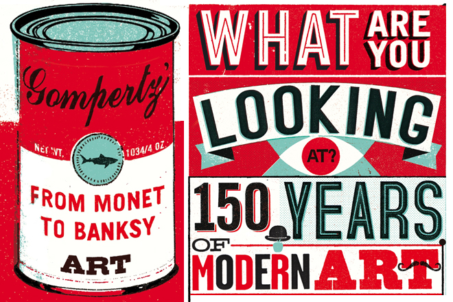
From “What Are You Looking At? The Surprising, Shocking, and Sometimes Strange Story of 150 Years of Modern Art” by Will Gompertz. Published by arrangement with Dutton, a member of Penguin Group (USA), Inc. Copyright (c) 2012 by Will Gompertz.
