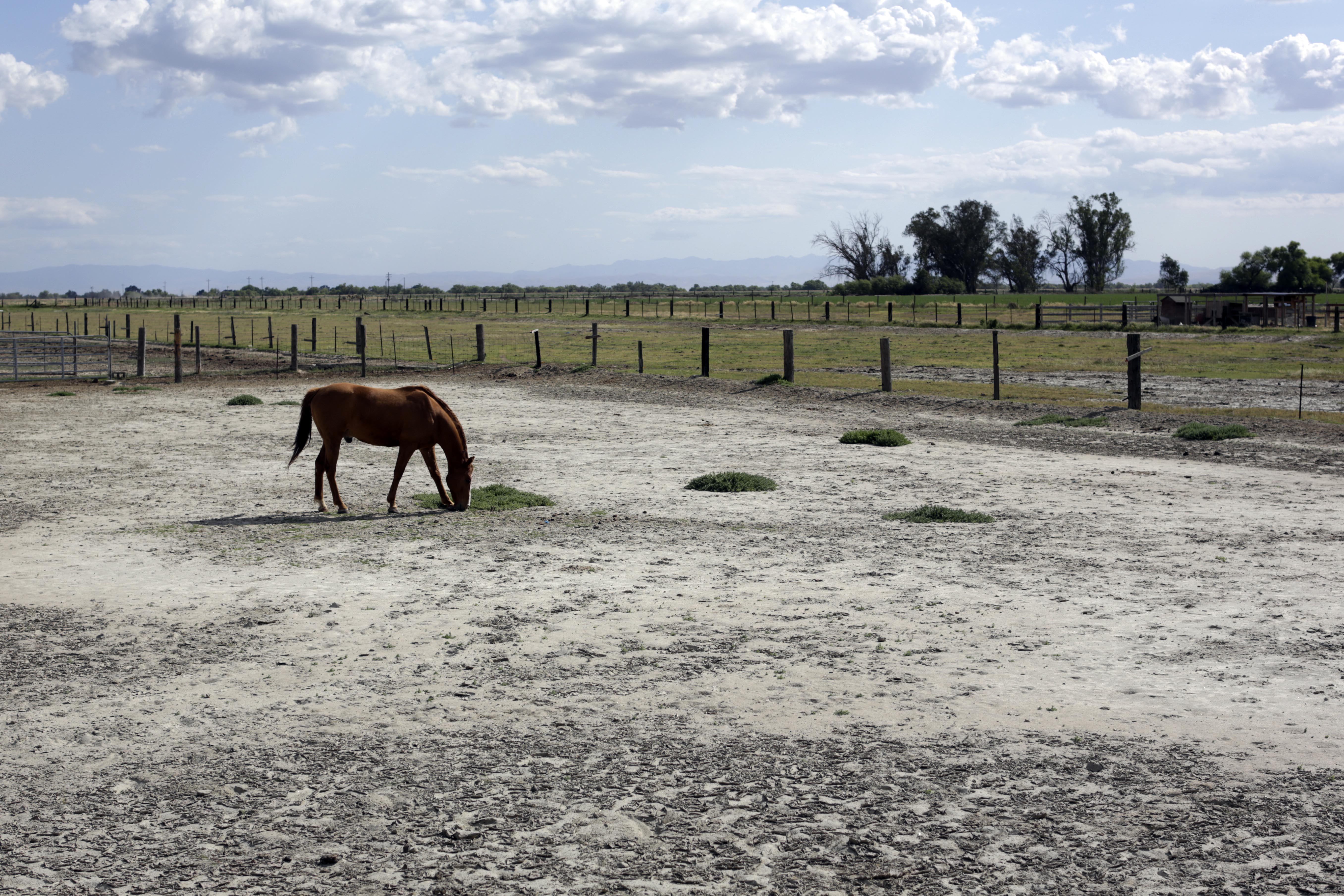
XKCD’s Randall Munroe, an expert at making science easy to understand (not to mention cool), has taken advantage of California’s long, skinny shape to come up with this nifty visualization for its catastrophic drought. As you can see, in as long as the U.S. Drought Monitor has been collecting data, what’s happening now is truly unprecedented:

While the records only goes back as far as 2000, there’s no denying that the drought is exceptional (or, to use Munroe’s phrasing, “ludicrous”). Over half of the state is experiencing the most extreme category of drought, which was unheard of before 2014. We know less about the previous century, but a climatologist at the National Drought Mitigation Center in Nebraska told Mashable’s Andrew Freedman that this current drought is worse, in ways, than one that hit the state in the late 1970s, and comparable to ones experienced since recordings began in the mid-1800s.
“I think we’re looking at a once in a generation type of event,” he said.
