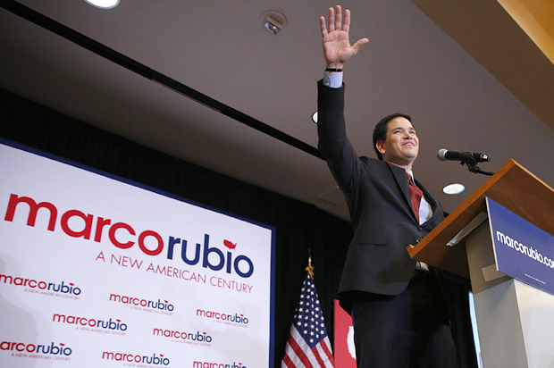
He didn’t win the Iowa caucus. He didn’t even come in second. But Marco Rubio not only surprised people in Iowa, he won an award that only the subconscious can grant: Most striking logo font. It’s youthful. It’s sleekly modern. It’s got a map of the United States on it that looks, from a distance, like the tilde that sits over the “n” in some Spanish words. If GOP metrosexuals and Latino Republicans could decide this race, he’d clearly have the election sewn up.
But graphics, including fonts, are open signifiers – they hint at things, they don’t come down hard the way language does. They’re ambiguous. This one both plays up Rubio’s freshness and also gets at how he could be destroyed by GOP rivals. It’s like an abstract painting you need to view from 20 feet away and then close up to really understand: The “Marco Rubio: A New American Century” backdrop – with the candidate’s name in all lower case – captures some of his appeal and exposes him to attacks.
Unlike his main competitors Ted Cruz and Donald Trump, Rubio tries to reach widely rather than to demonize or polarize single demographic groups like New Yorkers or immigrants. “There are persuaders and there are crusaders, and I think Rubio is a persuader,” Republican strategist Peter Wehner told the New Yorker. “When you’re losing Presidential elections on a consistent basis, you’ve got to nominate somebody who is a persuader.” The New Yorker article, by the way, calls Rubio “The Opportunist.” Compared to his front-running rivals, he’s friendly, flexible. You see it in his font.
Rubio’s flexibility also makes him vulnerable. By offering something fresh and new he opens himself up to attacks from several directions. He’s already been assaulted for wearing boots that his opponents hint make him look feminine or childish. He’s been pegged as a flip-flopper, which, given his back-and-forth on issues like immigration, seems fair.
And that’s the problem with the font: It’s handsome, but it may not be macho enough. The United States is there, but it’s tiny. Can anyone imagine Ted Cruz running a map of the U.S. that small? Can we imagine Trump allowing his name to be in lower case on a poster? And the U.S. dotting the “I” – does it remind you a little bit of the way girls in junior high dotted theirs with a heart? Just wait until trolls on Twitter run with that one.
The GOP establishment is now lining up behind Rubio, which may be the first time a party has regrouped around a third-place finisher. Even Rand Paul, who was once considered an anti-establishment candidate, has nodded in his direction. The Week says that despite Rubio’s 21st century rhetoric, his leadership allows the Republicans to run in place:
Nominating Rubio is a statement that the party does not need a course correction. It doesn’t need to stand even more firmly with social conservatives or fight with greater zeal and brinksmanship, as Cruz has argued. Nominating Rubio is a statement that the party does not need to find a less aggressive or less interventionist foreign policy, as Trump, Rand Paul, and (to a lesser degree) Cruz have argued. Nominating Rubio is a statement that the party does not need to offer any policy changes to attract working-class whites, as the candidacies of Trump, Mike Huckabee, and Rick Santorum have, to varying degrees, suggested. Instead, they just have to offer Rubio’s story of gumption and rising from under his working-class parents’ knees.
So the GOP may be in denial despite all its excitement about a possible new front-runner. If you’re hoping for a Republic bloodbath, wait ‘til FontGate starts rolling. Rubio has kept the boots. He’ll keep the font too: This could be fun to watch.


