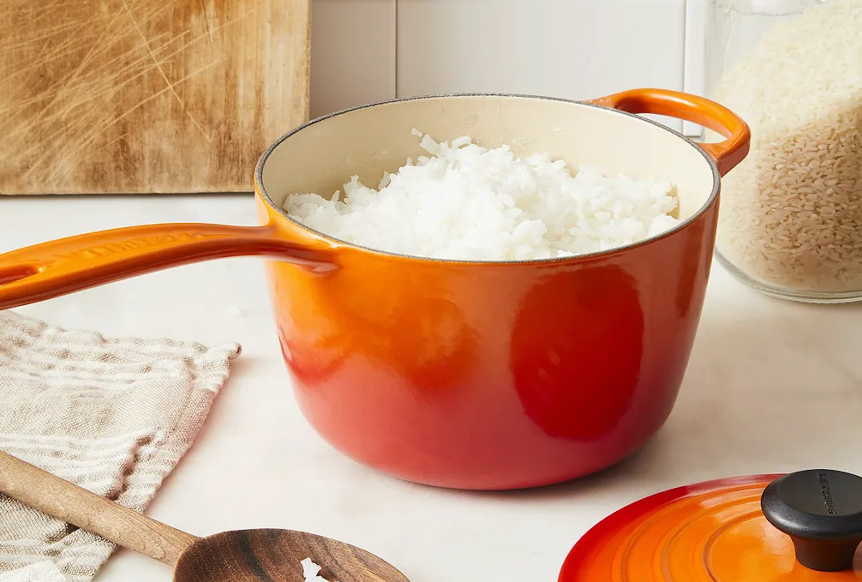
There’s a scene in the movie “Julie & Julia” in which Meryl Streep, playing the inimitable Julia Child, is bustling around her Paris kitchen. She dips a spoon into a fiery red-orange casserole dish for a quick taste, decides to add a dash of salt, and moves on to tend to a boiling pot of cannelloni. Cut to another scene where Amy Adams, playing food blogger Julie Powell, is laboring over a pot of beef bourguignon in her New York City apartment. Set decades apart, the two scenes share one unmistakable visual detail — a vibrantly colored Le Creuset on the stove.
For the better part of the last century, Le Creuset’s Dutch ovens have been both a cookware luxury and kitchen staple for home cooks and professional chefs alike. The brand changed the way many approached cooking by reinventing a utilitarian item in a way that combined form and function with flair. Equipped with a double-coated enamel engineered to resist dulling, staining, and even chipping, Le Creuset’s Dutch ovens were always durable, yes, but their colors lent them something even more distinctive — personality.
It all started with the color Volcanique (or Flame, as we now know it), which was inspired by the intense orange glow of molten cast iron — and the tonal variation as it cooled and hardened. While Flame remains a best-seller, the French cookware company has since introduced more than 200 colorways in both matte and metallic finishes. You’ll find colors like Artichaut, an “opulent green that is born of the garden,” and Oyster, a gray-brown sheen with a hint of iridescence. Then there’s the personalization offered by colorful knobs that can be swapped in to accentuate certain tones: think of a light blue pot with a gold-finished topper.
The process of color production at Le Creuset is as complex as it is unique. It begins with a fair amount of trend forecasting with the help of partners around the world who track global events, cultural movements, and design trends and help distill them into micro trends. These trends are then translated into visual and design cues, and undergo an internal process of development and experimentation, which eventually turns them into fresh color launches.
From there, the Le Creuset’s color lab and foundry, located in in Fresnoy-le-Grand in the North of France, take over — and regardless of the target hue, the end result is always at the mercy of science. “At the highest level, you’re trying to create colors from materials that inherently don’t like each other — and you want to get them to bond,” says Le Creuset’s vice president of marketing, Christopher Scinto.
That bonding process of cast iron and glass — the components that make up the cookware — produces a chemical reaction. The compounds, which are then used to create the colors, will change that initial reaction, and it doesn’t always go as planned. The next step is to get each layer of color to chemically bond with one another. The enamel may bond with the cast iron, but that doesn’t mean that the secondary colors are going to bond with the base color. For that reason, it’s virtually impossible to ever match a Le Creuset shade to a Pantone chip.
And while there have been the occasional off-base results (softer neutrals are particularly tricky to achieve through the chemical process), the brand has also found itself with hues that exceeded all expectations. An example is the recently launched Agave, which features a cross-color gradient — a first for the Le Creuset. It begins as a lush green that fades into a striking blue, creating a beautiful ombré effect.
“The brand is continually researching ways to create lively, unexpected color combinations,” says Scinto. And while Le Creuset releases at least one new colorway every year, they are always intentional with each new tone they introduce.
To date, Cerise is their most popular color across the globe. Described as a luscious cherry red, exuding passion with a timeless attitude, it joins a host of new warm colorways like Nectar and Cayenne — a golden yellow and a zesty red-orange, respectively. On the cooler end of the spectrum, blues reign supreme, like the ever-popular Marseille, which emulates the hues of the southern French coast. When it comes to neutrals, Meringue, which is inspired by towers of meringues at a Parisian patisserie, is a crowd favorite.
Generationally, it’s been found that those who are investing in their first Le Creuset tend to shy away from the over-saturated primary colors in favor of neutrals like Oyster, Meringue, and Licorice (a sophisticated matte black). This contemporary palette of colors is relatively new for the brand. “We researched kitchen design trends, and of the 4 million new kitchens produced per year, they all largely end up being neutral-toned, which makes for a great base for people to build off of,” says Scinto.
At a time when so many of our buying decisions relating to home are motivated by design, cookware can be an easy way to usher in a fresh dose of color into the kitchen, without having to resort to a more drastic change. “We like to think of it as jewelry for the kitchen,” says Le Creuset’s territory manager, Dena Engelhardt. “Human beings are visually motivated, so why wouldn’t we want to surround ourselves with beautiful items that can engage us?”
