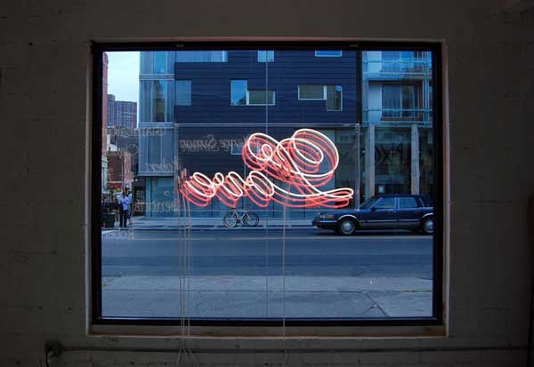
You walk into the showroom. Here is the salesman: affable, dressed the part. Here is the promotional literature, detailing the features, benefits, and provenance of the product. In the center of the room, you are invited to see yourself with it, your image imposed upon the design. Finally, you look up to find the centerpiece. It glows and spells out its virtues, and you are moved by its luminance.
 No, you are not shopping for the latest VW Bug. Your salesman is no slick-talking charmer (although he is quite charming). Rather, he is the type designer Christian Schwartz, and this is a week-long pop-up shop advertising the release of Marian, a new font in nine weights from Commercial Type. Called “Thieves Like Us,” the show is a collaboration between Commercial Type and Dino Sanchez, an industrial designer and artist, and it offers a new and ambitious way to present specimens of type to designers.
Few digital type foundries release fonts at this scale. (One example that comes to mind is House Industries’ event at the Eames Office, in Santa Monica, to celebrate the release of Eames Century Modern.) What makes “Thieves Like Us” unique is that Commercial Type commissioned new work for the font release.
Initially, there was a more traditional plan for Marian. But Schwartz says, “As it got closer to release, Paul” — Barnes, co-founder of Commercial Type — “and I realized that designing print ads for the typeface was going to be difficult. It’s so light that it will have a hard time standing out among the other ads. We also realized that since the typeface is a single stroke, it gave us a unique opportunity to make things.”
The result is an enjoyable display of the typeface’s virtues and not just its formal characteristics. Indeed, one doesn’t often see a specimen set in neon, or backlit mirror boxes lined up along the floor that present the story of a type. And neither of those are as perversely cool and fun as Marian’s name painstakingly nailed into the wall (observe the dot of the i for a swoon-inducing moment).
The only downside of the show is its brevity—this exhibition is more “pop-up” than “shop.” It opened one Thursday in October, and it closed 10 days later with a party at Jo’s catered by Tessa Liebman. The $100 ticket includes a nine-course dinner of modernized European dishes and a limited-edition poster — everything but the type.
Nails as lettering from “Thieves Like Us”
Neon lettering from “Thieves Like Us”
Type specimen from “Thieves Like Us”
<
Vinyl lettering from “Thieves Like Us”
Lightboxes from “Thieves Like Us”
Nails as lettering from “Thieves Like Us”
Nails as lettering from “Thieves Like Us”
Lightboxes from “Thieves Like Us”
Copyright F+W Media Inc. 2011.
Salon is proud to feature content from Imprint, the fastest-growing design community on the web. Brought to you by Print magazine, America’s oldest and most trusted design voice, Imprint features some of the biggest names in the industry covering visual culture from every angle. Imprint advances and expands the design conversation, providing fresh daily content to the community (and now to salon.com!), sparking conversation, competition, criticism, and passion among its members.


