Fashion

The fashion of team passion

Columnist Paul Lukas scrutinizes the trends and minutiae of sports aesthetics, from square-neck jerseys in hockey to the impact of frills in Olympic figure skating.

  • more
    • All Share Services

The fashion of team passion

A certain writer for a certain online magazine who often yammers on about teams’ outfits in his sportswriting had an idea for a column about uniforms. He thought he’d follow trends and changes, critique the fashion. He figured it’d be interesting.

And he was right. It’s fascinating. Problem for this poor hack was that someone was already writing such a column for the Village Voice, and doing a far better job of it than our hero had been planning to do.

Paul Lukas, 37, has been writing Uni Watch monthly for the Voice since 1999. He also writes about product and brand design, mostly for business magazines, pens a travel column for Money magazine and writes about food and music.

On his Web site, Inconspicuous Consumption, Lukas examines the details of product design that most of us ignore. The site currently features a consideration of Heinz EZ Squirt Blastin’ Green Ketchup. “One thing you might not realize, because it doesn’t appear to have gotten much attention,” he writes, “is that the new ketchup’s official color, as listed on the package, is not green — it’s Blastin’ Green.” His musings were collected in a book, “Inconspicuous Consumption: An Obsessive Look at the Stuff We Take for Granted, From the Everyday to the Obscure,” in 1997.

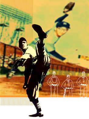
Lukas, a Long Island native who graduated from SUNY-Binghampton with a political science degree that he says has had “approximately zero impact on my life,” calls himself “an all-purpose minutiae fetishist,” concerned with “the details that other people overlook.” Recent Uni Watch columns have dealt with the history of stirrup socks and facial hair in baseball, changes in boxing glove color and the use of American flags on uniforms.

The day he talked to Salon by telephone from Brooklyn, where he lives, he was working on an article about a vintage Scotch tape dispenser.

Where did you get the idea for the column?

I’ve written a lot in the nonsports realm about brands and brand histories and product design. Writing about uniform design is a lot like writing about brand design, except the brand is a team.

Team loyalty is a very special and specific kind of brand loyalty. In fact, in a lot of ways, it’s the most passionate kind you can find. If you’re loyal to a particular brand of cereal or adhesive tape, you have a loyalty to the brand image and maybe the logo, but you also believe that the product has a certain level of quality. If the quality went downhill, you’d say, “OK, well, I had an affection for this brand but they’ve blown it.”

With teams, the quality changes all the time — players retire, players change teams, they get traded, whatever — so the quality of the brand, the content of the brand, is always changing, but we stay loyal to it anyway. We are totally loyal to that logo, that design, and that uniform, regardless of who’s wearing it. I’m sort of fascinated by that kind of relationship and that kind of bond that sports fans have.

Also, what kid doesn’t grow up dreaming of wearing a major league baseball uniform or a hockey uniform or the uniform of whatever sport you dream of being a part of? When I was in Little League, I would make sure that my baseball stirrups were just so and all that kind of stuff. It appeals to the detail-oriented nature that I have. I do a lot of detail-oriented writing, and applying that to sports meant coming up with the concept for a uniform column. I could have done it for a design magazine and treated it as a design column that just happens to be about sports, but I felt really strongly that I wanted it to be taken seriously as a legitimate sports beat, legitimate sports journalism.

A lot of people were surprised that I could sustain it, that I could do a monthly column about uniform design. Frankly, I could do a weekly if they’d give me the space.

Yeah, I was going to say, there’s plenty to write about.

Like just a few days ago, the Indians announced a new alternate uniform and cap for the upcoming season, and their new cap is not going to have Chief Wahoo on it. And it happens that next football season the Redskins are using a new helmet that isn’t going to have the Indian on the helmet. So there’s a trend right there: Finally, after all the people saying you shouldn’t use Native American symbolism and blah, blah, blah, it’s interesting that these are both happening in the same year. There’s no shortage of developments to write about.

Who are you picturing in your head when you’re writing? Who’s your reader?

Just another sports geek like myself. But, more to the point, I guess I’m writing for somebody who sees these things without really noticing them, which I guess is somebody not like myself. A lot of my work, not just in sports but in the other areas I write about, is about the inconspicuous details that people see without actually noticing they’re seeing. The idea is to make a light bulb go on over people’s heads, for them to say, “Oh, yeah. I sort of noticed that but I didn’t really think about it.”

I bring up uniforms a lot, just talking to friends or whatever, and it’s one of those things that everybody has an opinion on. When the home team changes its uniforms, everybody either loves it or hates it.

Sure, that’s your brand. I’m a big Mets fan, and in the last few years, as the Mets have gone away from blue and gone more toward black, they’re not just messing with merchandising. I feel like I’ve had a fairly intimate relationship with the Mets’ brand and the Mets’ identity system, for most of my life. And when they change, when they tinker with the brand, it feels like they’re tinkering with part of me.

It speaks to that intense brand loyalty that sports affiliations comprise. The content is really irrelevant. I’ve been a Mets fan when they won the World Series, I’ve been a Mets fan when they’ve been a last-place team, and my passion hasn’t wavered one little bit. I prefer it when they win the World Series, obviously, but they’re still my team no matter how crappy they are. No matter how low the quality of the brand goes, it’s still my brand, and when they mess with it, I don’t like it.

There’s also a cynical side to it. You know they’re just messing with it because everybody has the blue gear, so if they throw a bunch of black gear out there, people will go buy it.

And also because they know that people like me, I may piss and moan about it, but I’m such an intense fan, I’m not just going to storm away and say the hell with it, I’m not a Mets fan anymore. I’m going to grit my teeth and stick with it, but they can go trolling for the more casual fan with the “hipper” color scheme. So yeah, it’s a little cynical, but that’s just the reality of how brands are marketed these days.

I do sort of wonder, though, about teams that change more often. You look at a team like the Texas Rangers, who have changed a lot over the years — their logo, their colors. The Brewers also. I don’t understand how you build up a heritage or a sense of history when you change so frequently.

I grew up in Los Angeles, rooting for the Dodgers, who had the same uniforms since God was a boy, and then the Rams and the Lakers were both pretty constant, too. I notice that the teams that changed uniforms a lot — the San Diego Padres, or like you said, the Rangers — tend to be crappy teams. There seems to be a correlation between crappiness and new uniforms, or constant change. It’s almost a measure of a good, solid organization that they don’t change their uniforms.

Yeah, that’s certainly the instinctive feel. I think that’s changed a little bit. The Rams changed their uniforms after they won their first Super Bowl, and that’s not how it used to work.

Didn’t the Denver Broncos do that too? Didn’t they get those weird new uniforms after they finally won a Super Bowl?

No, actually, the weird new uniforms finally broke their Super Bowl jinx. But yeah, it used to be that only a franchise that was really in trouble would change. They’d be thinking, “If we can just put some bells and whistles on the uniform, nobody’ll pay attention to how lousy our record is.”

You bring your opinions into the column and critique the uniforms.

Like any cultural criticism or design critique, you need to have a point of view. I try not to get too persnickety about it. What I try to avoid, and probably don’t avoid, is coming off like a grumpy old man who hates any change.

You’re definitely a traditionalist.

I’m a traditionalist. I’m a classicist. But it’s not like every change is a bad change.

What are some good innovations?

For just nice designs? The Astros a couple of years ago went to that sort of terra cotta color pallette that I really like, when they moved into Enron Field — if it’s still going to be called Enron Field. Coming up this year, the Angels, after wearing those ridiculous pinstripes with the wing coming off the A and the fake vest look, and color sleeve, they’ve gone back to a much more traditional style this year, so good for them. They’ve got a really nice look.

What else? In baseball, I’m totally down on the pants coming down to the ankles thing, but I do think that the reaction to it — the players bringing the pants [hem] all the way up to the knee — while it’s not my favorite look, it’s a nice look. All sock is better than no sock. And if more [players] do it, I think it may actually lead to more teams coming up with something designy for their stockings. Instead of just a solid color, put some stripes in there or something like that.

I was watching a game from the ’87 Series on ESPN Classics the other day, and they still had the stirrup socks.

Right, everybody had the white showing through.

And I was saying to my wife, “Don’t they look much more like ballplayers than the guys with the pajamas coming down to the shoes?”

Right. That’s the thing, they look like footy pajamas. Whatever style you favor for that kind of thing, what’s interesting to me, and should be interesting to anybody involved in these sports, is that the whole notion of a uniform is that it’s uniform. And here’s an element that is completely nonuniform. It’s an element where players are allowed to impose their own style on it.

You know, it’s interesting that the National Football League has its uniform police making sure that players have their pant legs pulled down and their socks pulled up, but baseball doesn’t seem to mind. As I noted in one piece, the Yankees infield last year had four players with four different pant and socks styles. If you looked at them from the knees down, you would never guess they were on the same team. It’s interesting to me that there’s this one little area of self-expression that’s allowed.

What about some other sports? Something I’ve noticed about hockey lately is the logos on the front of the sweater, the newer ones, like the Columbus Blue Jackets and the Minnesota Wild and the Los Angeles Kings’ redesign, are really busy, so that if you get 10 feet away it just looks like a smudge.

Yeah, they’re not just simple graphic symbols. I think that just speaks to the possibilities of logos that are all designed on computers nowadays instead of on the drafting table or something like that. Also, it’s all part of that information overload thing. People like busy, I think. Certainly, throughout the design realm, not just in sports, you see a lot more examples of overdesign than underdesign.

A lot of times when I cover these sports, there’s a lot of stuff that I hadn’t noticed because I hadn’t thought about it before. In hockey, one thing I’ve been noticing a lot lately is the jersey neckline. Way, way back, most teams had the lace-up collar, which a few teams have now gone back to. Most teams now have a V-neck collar. A few have introduced this sort of extreme V-neck — it almost looks more like a Y than a V. A couple of teams, I think the Nashville Predators were one of the first to do it this year with one of their alternate jerseys, have got a square collar.

You can see that the design of the collar has affected the actual physical construction of the entire jersey. The yoke had to be done differently, and that affects how the sleeves had to be sewn in. They made a big fuss over the fact that they have the first square-collar jersey in the National Hockey League. And it’s like, all right, good for you guys.

I think what the NHL is doing is actually pretty interesting because usually, change has to do with logo design, but in this case, with the Predators, it’s also about construction and physical design of the shirt. They’re using the alternate jerseys, or the third jerseys, as they call them, as a sort of testing ground for new logos, which they then sort of subsume more fully a year or two down the road, into their identity system.

In the case of the Ottawa Senators, their alternate jersey became their road jersey. A few other teams have done that, too. It gives teams a chance to sort of test-drive a new look for a team, so instead of abruptly changing their graphics they can sort of ease into it. I think that’s pretty smart. I’m interested to see if other sports try that. What baseball has done with their alternate jerseys is use the existing design, but in a different color.

What do you think of the basketball trend with the big wide sleeves, instead of the old tank-top style sleeves?

I don’t personally like that look. I think that basketball uniforms are not as interesting as any of the other sports’ uniforms. There’s only two pieces, shorts and the jersey. I guess there’s the sock issue to consider, the black sock or the white sock, high sock or the low sock — but to me, the basketball uniform isn’t as interesting.

Also, the whole baggy pants thing — everything looking very baggy. I’m not too fond of where basketball has gone in the last decade or so. But I’ve got to give the NBA and, I guess, [commissioner] David Stern, some credit because they’re the only league of the four major sports to have successfully resisted manufacturers’ logos on the uniforms. You can have the team logo on your butt, or all these other crazy things, but there’s no Nike swoosh or Russell Athletic R or Champion C or any of that on the uniforms that the players wear. They’re on the merchandise, but they’re not on the uniforms, and I have to give a kind of tip of the cap for that.

I think what’s going on right now that’s interesting is the Olympics.

I was just going to bring that up.

The Olympics are essentially individual, not team, sports. If you look at the individual professional sports, like auto racing or tennis or boxing, you have a whole different set of aesthetics going on. You don’t have the team as brand, and often because of sponsorship, you have all sorts of commercial brands cluttering up your uniform. In auto racing it’s right on the car; tennis players wear sportswear of their affiliated sponsor or sportswear manufacturer; boxers sell space on their trunks and stuff like that …

Or the bottom of their shoes.

The bottom of their shoes, yeah, or their backs, on their skin, in Bernard Hopkins’ case! What interests me most about the Winter Olympics is the figure skaters. You hear a lot about their outfits. You don’t really hear much about the outfits of the skiers or the lugers or anything like that except to say, “Oh, he looks sleek in that get-up” or “Picabo Street’s got that spider-web getup,” but there’s not a whole lot of chatter about it because basically they’re just wearing some kind of skin-tight outfit and a number.

And that’s the thing about the Olympics: Everybody has a number — except the figure skaters. And I never understand that. Why can’t they just wear a unitard and a number like all the other athletes? And you always hear the debate about whether figure skating is a true sport.

And whether they get judged on their outfits.

In fact, they clearly do. There was an article in today’s Newsday — hang on, I’m going to go grab it because I tore it out. Newsday’s headquartered on Long Island, and one of the U.S. figure skaters, Sarah Hughes, is from Long Island, so it’s like a big local story, and this headline says, “Dressing for Success: Hughes’ Moves on Ice Are Tailor-made and So Are Her Costumes.” And it’s all about how some of her previous outfits got a less than warm reception by the skating establishment, whatever that means.

You know, the notion that you can be judged on what you wear, that it can affect whether or not you get a medal, is why people don’t take figure skating seriously, or why some people don’t. As someone who covers sports aesthetics professionally, I get into the notion that they’re taking their aesthetics very seriously, but I think in a way that detracts from the sport’s legitimacy.

Are there any other trends going on that have caught your eye lately?

In baseball, aside from the stirrups thing, there’s been something of a return to basics. We talked about the Angels going back to a basic look this year. The Royals, I believe, have added a vest this year. The Indians are adding an alternate vest this year. The vest trend is slowly gathering steam. I’m kinda digging that.

I hate the vest look.

You don’t like the vests?

I’m kind of a traditionalist too, but I don’t like the vests. I like that whole sort of early ’60s aesthetic in other areas — for a couch, say — but I just don’t like the vest look.

Oh, well, sorry, man. It’s slowly becoming the thing.

It seems like the back-to-basics thing kind of hit about 10 years ago.

In ’93 or so, everyone went back to the belted pants instead of the elastic waistband. Everyone went to the button-front jersey instead of the pullover, so the last decade or so has been a slow return to basics …

Well, there’s been some slippage.

… except everyone has the colored jerseys.

There was that gray hat period.

The gray — ohhhhh, the dreaded gray hats, the Pirates and the Royals with the gray hats. [Moans.] Well, those didn’t last.

People need to understand that, once upon a time, teams were coming up with their logos and their uniform designs, and different factors were influencing them. A century ago, what a team wore largely had to do with what kind of textiles and fabrics were available from the sporting goods manufacturer in their city, because that’s who supplied the uniforms. So if they had pinstripe fabrics available at a decent price, well, maybe the team would wear pinstripes. And if they had this kind of felt available at a decent price, or maybe if the owner wanted to splurge a little, well, this is how they’re going to look. But it was totally an individual thing.

Eventually the suppliers went national, so Spalding would be supplying the team, or Wilson or whatever, but the decisions on how my team was going to look, if I owned the team, were made by me and the people in my office. Nowadays, teams make these decisions, not in isolation, but with consultation from brand advisors and brand design consultants and the league office, and especially the merchandising arm of the various league offices.

When the Indians announced this new uniform that they’re going to this year, which is a vest uniform that they’re going to wear at home on Sundays and holidays, one of the things they talked about at the press conference was that they had actually been looking to go to a vest as early as 1993, but the league office said, “Well, a bunch of other teams are doing that too, and you don’t want to look like all the other teams. Why don’t you wait a few years before you go to the vest.” So a lot of this is coordinated with a sort of grand plan in mind.

Back in the ’50s, ’60s, even into the ’70s, merchandising was nothing like it is today. It wasn’t as coordinated and it wasn’t as large-scale. Now it’s such a big revenue stream in sports that it’s really the tail wagging the dog. It used to be what you wore on the field would determine how you merchandise. Now, how you want to merchandise determines what you wear on the field.

And it even starts farther back in the process because now new teams are named by the marketing department, as opposed to a century ago when maybe a local sprortswriter would slap a nickname on a team and it would stick.

Right. Exactly. So all this goes into these brands that we end up having this incredibly emotional attachment to. And whether you think one way is better or another way is better, it’s certainly different now than it was a long time ago. I think it’s safe to say that the “Mets” would not have been developed if it was an expansion team today. It’s the New York Metropolitans Baseball Club, that’s what that stands for, and it’s really, it’s a nonsense word.

Not to mention the Knickerbockers.

Exactly, exactly. But that’s what makes the history and the heritage of these teams interesting.

Last question. I almost never ask this to people on the phone, but what are you wearing right now?

What I almost always wear every day, which is jeans, sneakers and a T-shirt.

So you’re not a fashion plate yourself?

Well, it’s a good pair of jeans and a good T-shirt. I do have a lot of old uniforms that I sometimes wear. I’ll take them from any sport but I especially like old baseball, old flannel jerseys, and pants if I can get them. I’ve got a few beautiful uniforms from the ’30s. I’m not a big guy, I’m like 5-8, 150, and most athletes are bigger than that, so it’s hard for me to find stuff that’s small enough to fit me, but if I find anything that fits, I buy it.

I did a reading recently in New York of Uni Watch material, and I wore this beautiful 1930s, pinstriped, flannel baseball uniform, complete with the stockings and everything, for a company team, like a factory team, and it said on the jersey “Aluminum Products,” because it was from an aluminum manufacturing plant, and it was their company team. I’m always looking for stuff like that. I don’t, like, walk around the neighborhood in baseball pants, but I might walk around in the jersey. So yes, in some ways the sports uniform obsession has infested my closet.

King Kaufman is a senior writer for Salon. You can e-mail him at king at salon dot com. Facebook / Twitter / Tumblr

Kenneth Cole gets schooled

Updated: The fashion mogul has backed off his assault on schoolteachers after a public outcry

  • more
    • All Share Services

Kenneth Cole gets schooled

[UPDATE BELOW]

It was always bound to go there, but few likely expected it would be so blatant. I’m talking about the ongoing campaign against organized labor; for decades deeply rooted in American political culture, the crusade has been periodically amplified in popular culture as well, from 1954′s “On the Waterfront” all the way to the Sopranos’ depiction of mob-controlled unions (and sometimes pop culture and political culture have even fused). So it was only a matter of time before vilifying rank-and-file union members would be commodified into a consumer brand by a company looking for an edge in the high-end retail market.

That’s where Kenneth Cole now comes in. The clothing designer has just launched a new crusade to tie his expensive clothing and shoes line to the elite’s movement du jour: the fight to demonize public schoolteachers and their unions. In a billboard and Web-based campaign, Cole’s foundation portrays the national debate over education as one that supposedly pits “Teachers’ Rights vs. Students’ Rights.”

“Should underperforming teachers be protected?” asks the foundation’s website.

When asked about the campaign, one of Cole’s spokeswomen insisted the company isn’t trying to insult teachers or unions, saying, “It’s something in the news and being debated, and we wanted to provide a forum where people could discuss it as well.” But with the company using the same loaded language as the conservative political activists trying to undermine public education and teachers’ unions, the corporate P.R.-speak is, to say the least, unconvincing.

No, Cole’s campaign is thinly veiled ideological propaganda, and it comes with myriad problems, not the least of which is the simple fact that almost nobody believes “underperforming teachers” should be protected. That includes the nation’s biggest teachers’ unions, which have been outspoken in backing “accountability” reforms for teacher tenure. So right off the bat, Cole is constructing a straw man, one that has served over the years to pretend that public employee unions in general and teachers’ unions specifically are about nothing more than making sure bad employees get to keep their jobs.

Of course, there is a legitimate debate among state lawmakers and school boards about how to determine what an “underperforming teacher” is. Should a teacher be considered subpar if her students perform poorly on standardized tests? Should any teacher-to-teacher peer review be included in performance evaluations? And should any factors other than tests and grades — say, student poverty levels — be considered when using student achievement to judge a particular teacher?

As evidenced by the language of his new campaign, Cole, like the anti-union activists in the larger corporate-sponsored education “reform” movement, doesn’t want those questions asked, much less answered, for pondering them raises the very queries about power and wealth that Cole’s fellow 1 percenters don’t want to discuss.

For instance, actually taking an honest look at America’s education system brings up queries about why other less economically stratified nations have unionized teachers and far better academic results than here in America. It also forces us to ask why it just so happens that wealthy unionized districts in America do so well — but poorer districts have such problems. All of that consequently compels us to consider issues like poverty and funding disparities between rich and poor districts — issues that inherently threaten the status quo, and thus the interests of the super-wealthy. And so under the veneer of the term “reform” and with the backing of seemingly altruistic philanthropy via foundations like Cole’s, the super-wealthy work to avoid substance and instead define the education policy discourse on reductionist slogans like “underperforming teachers.”

Perhaps the biggest problem with Cole’s campaign, though, is how it forwards the “us-versus-them” notion that teachers’ rights to due process in the workplace are automatically at odds with their students’ interests. This so fundamentally misunderstands how education works that it perfectly underscores why a clothing corporation doesn’t have much credibility on education issues.

Think about it: We need our best teachers to work in the public schools that educate the most at-risk populations. Why? Because with decades of social science research proving that achievement is driven mostly by out-of-classroom factors (poverty, family dysfunction, etc.), those are the schools that need the most skilled pedagogues to overcome comparatively difficult odds for success. But why would a good teacher opt to work in such a school without basic protections — protections designed to make sure the at-risk population’s achievement-suppressing disadvantages aren’t used as a rationale to fire her? She probably wouldn’t.

In this way, “Teachers’ Rights vs. Students’ Rights” is the mirror opposite of how things actually work. Without extending teachers’ rights to, say, be evaluated fairly or to challenge a termination, it would be difficult — if not impossible — for public schools to recruit the best teachers to the specific at-risk schools that need them the most.

Most likely, these inconvenient truths are of little concern to someone like Kenneth Cole. According to Gotham Schools, he sends his kids to private school, making him part of the larger trend of elites who are trying to foist radical policies onto public schools, knowing their own kin won’t be hurt by those policies.

But, you ask, wouldn’t a clothing mogul with no kids in public school be averse to a divisive crusade against teachers, if only to circumvent a controversy? Even if he is a political activist, wouldn’t he refrain from such a campaign for fear of losing customers?

These are fair questions, and they highlight how Cole’s campaign may say something hugely important — and troubling — about the long-term future of education politics in America.

Recall that Cole is in a zeitgeist industry that is all about lashing branded chic to the popular fad of the moment. That means his move probably reflects what he believes to be an ascendant cause célèbre — one that he thinks he isn’t joining in spite of his company, but in support of its profit-making objectives. Put another way, he probably believes he will gain customers if he ties his company to anti-teacher, anti-union themes.

Sure, that gamble could be wrong — and I hope it is. I hope America sees just how wrongheaded and ideologically extreme the crusade against public schools, teachers and unions is.

But as a successful mogul, Cole’s clearly got skill as a cultural seer; and if someone like him sees mass profit potential in not-so-subtly bashing teachers and unions, it’s a scary sign that such unhinged anti-teacher sentiment could be going more mainstream than ever.

Update: After a mass outcry from teachers, Kenneth Cole announced on Twitter Monday that it is removing the billboard. In its statement, the company said “We misrepresented the issue – one too complex for a billboard – and are taking it down.” It has also taken down the campaign on the accompanying website.

Continue Reading Close
David Sirota

David Sirota is a best-selling author of the new book "Back to Our Future: How the 1980s Explain the World We Live In Now." He hosts the morning show on AM760 in Colorado. E-mail him at ds@davidsirota.com, follow him on Twitter @davidsirota or visit his website at www.davidsirota.com.

The true meaning of prep

Whit Stillman's "Damsels in Distress" celebrates preppy life. Too bad it leaves out its complex cultural baggage

  • more
    • All Share Services

The true meaning of prepGreta Gerwig and Adam Brody in "Damsels in Distress"

You may have heard that the director Whit Stillman, whose fourth movie, “Damsels in Distress,” opens Friday, is a chronicler of preppy culture. It’s not true. Stillman makes delightful movies, featuring light, witty scripts spoken by perfectly cast actors. But to consider Stillman an ethnographer of prep is to misunderstand both prep and Stillman movies.

It’s true that Stillman’s characters often wear stereotypically preppy clothing. They can be found in madras plaids, blue blazers, Lacoste shirts and other clothes historically associated with our country’s most selective colleges and the private schools that prepare — hence “prep” — students for them. They mention Brooks Brothers and Sag Harbor in casual conversation. But prepdom, as I understand it, and as I learned it in my own prep school and college, is only partly about clothing. It is more properly understood as an orientation toward power.

Preppies are most basically those people who don’t mind being associated with elite schools and the professions those schools feed into: banking, teaching, government (and one might add sailing instruction and magazine fact-checking). By virtue of the clothes they wear, they express their comfort being associated with a certain kind of cultural prerogative — one that is particularly suspect right now, in the era of foreclosures and Occupy Wall Street.

Stillman’s movies, from “Metropolitan” to “Damsels,” illustrate bigger ideas about the way preppiness is understood and misunderstood by Americans.

Like members of other subcultures, including Deadheads or Goths or English soccer hooligans, real preppies are at least willing to proclaim allegiances. Some of those allegiances are parochial, and might be represented by, say, a college scarf, while others are broader. But Stillman’s characters exist out of time and out of context. They may talk about politics (a bit), and may worry about how the lower classes perceive them, but they ultimately have almost nothing to say about, or even to do with, the institutions that form preppies: the universities, the banks, the government, even the yachting club. They’re all dressed up with no place to go.

Of course, thinking of Stillman as a preppy filmmaker is an understandable mistake. He is heavily responsible for his own inclusion in the pantheon of prep chroniclers, from J.D. Salinger to Louis Auchincloss, and Lisa Birnbach. His 1990 debut, “Metropolitan,” was the first movie to treat prep culture with a discerning eye after a decade that, despite the rise of Polo and other preppy brands, saw movie preps only as douffi (the plural of “doofus,” according to “Damsels in Distress”). I am thinking here of the Robert Prescott characters in “Real Genius” and “Bachelor Party,” or the golf-club villains in “Caddyshack.”

But “Metropolitan” was a shrewd movie about New York City private-school alumni on winter break from preppy colleges. It’s a movie whose plot hinges on a character’s decision to purchase at A.T. Harris the tuxedo he had been renting — after admitting to himself that if he’s to attend more debutante balls, he realizes he needs better threads — but that same character can have a thoughtful, if pretentious, discussion about Fourier. And Stillman, like F. Scott Fitzgerald, has the wit to give his characters names just a rep stripe away from caricature: “Tom Townsend,” “Serena Slocum,” “Rick von Sloneker.”

As if to further identify himself with prepdom, Stillman has always carried himself as a possible model for his characters. To this day, he meets reporters at the Harvard Club, and even when he is some miles away he still looks “like a wayward preppy trying to get into the Harvard Club” — a look, the New York Times Magazine recently noted, that involves “khakis, a white shirt and a blue blazer.” Stillman did, in fact, attend Harvard, which means that he could get into the Harvard Club, and if he had not attended Harvard he ought to have, being named John Whitney Stillman and all.

That willingness to dress a certain way — even when it might get you attacked by punks, as in “Last Days of Disco,” or called a fascist, as in 1994’s “Barcelona” — is a meaningful tenet of prepdom. But the clothes are not just an aesthetic choice. After all, it’s the rare preppy who does not know that she is wearing a uniform that, if not actually identical with an elite — anyone with a little money can buy the clothes — signals an aspiration toward elite society. To wear clothes made popular by the Ivy League is to announce an affirming attitude toward the Ivy League. That may not be a popular stance to take right now. For good reason, our country’s financial elite is under attack, and the schools that breed that elite deserve some of the opprobrium.

But preppy clothes have been the uniform of other products of the university, too, not just the bankers. Who loves a tweed jacket more than a humanities professor? And who loved a sack suit more than the elegant political radicals of the early 1960s? Take Malcolm X: For him, conservative attire was not ironic but proprietary. His clothes announced that he, and the Negro more generally, was entitled to the uniform and the prerogatives of power. Preppiness, in other words, is not inherently reactionary, and it is not inherently exclusionary; indeed, in a sense it is very democratic, precisely because one only needs the clothes, not a family crest. But it is not demotic; it is elitist. It is concerned with access to hierarchies, not the abolition of them. There have been left-wing preppies, but there have rarely been populist preppies.

In Stillman’s movies, however, preppiness almost never carries this complicated, interesting philosophical baggage. There are movies far less accomplished that nevertheless have more to say about the contradictions of prepdom. “School Ties” examines the anti-Semitism that used to pervade prep schools; “Igby Goes Down,” the nihilism and dysfunction of Manhattan private-school culture; “Dead Poets Society,” intellectual conformity; “Love Story,” the class chasm on Ivy League campuses. “The Rector of Justin,” the 1964 book by the dean of preppy novelists, Louis Auchincloss, depicts a rotten ethical core at the heart of a Groton-like boarding school. These works vary in quality, but they at least treat prepdom as the site of interesting, and often timely, dilemmas. They feature preppy clothes aplenty, for authenticity and because the clothes are beautiful to look at. But the clothes are just the superficial signifier of preppiness; the movies are about much more.

Stillman uses preppy clothes for an entirely different purpose.The clothes round out his characters, give the audience shorthand for what kind of families the characters come from, but above all take them out of time. For Stillman, preppy clothing is not a way to evoke, say, a Kennedy-era boarding school, but rather a way to defeat dating altogether. In short, if you wanted to make a fantasy movie set in some unidentifiable period of postwar America, you could use certain articles from Brooks Brothers and J. Press. And, indeed, that is what Stillman, who is not a realist or ethnographer but a fairy-tale fantasist, has done.

Consider “Metropolitan.” A screen card at the beginning says that it is set “not so long ago.” The characters seem to have late-20th-century diction — they don’t have the quasi-Brahmin speech patterns that persisted in the Ivy League into the 1960s (see the young John Kerry here) — but the yellow cabs are of an earlier vintage. The lapels on the men’s jackets are neither early-1960s narrow nor late-1970s wide. But the cut and the shoulders are not from the 1980s. Like the women’s gowns, the men’s dinner jackets are, in fact, designed to straddle all eras while beholden to none. It turns out that there are few styles harder to date accurately than the clothing appropriate for a debutante ball, or the preppy casual clothes one relaxes in afterward. The mystification of time continues in “The Last Days of Disco,” which according to the screen in the beginning occurs “in the very early 1980s,” but shows footage of the Disco Demolition Night held at Comiskey Park in July 1979.

In all Stillman’s movies, there is no racial or religious tension, no class envy, no religious bigotry. Stillman’s world even lacks many of the interlopers who have kept prep schools and elite colleges vital and meritocratic (and fashion-conscious): There are no obviously Jewish characters in Stillman’s movies, no Asian Americans, only one black character who so much as gets a name, and no gay men or lesbians.

There is nothing wrong with Stillman’s World, this alternate reality in which conversation is snappy, the young men and women are all attractive, and their clothes are tailored awfully well. There are times when I would not mind living there. But that’s because it’s a Utopia, literally a nowhere — it does not exist, it cannot exist. That the resident characters wear certain clothes we associate with certain schools, certain professions, certain vacation spots and certain stores does not mean that these characters are like the real-world people found in those schools, work professions, vacation spots or stores. Whit Stillman characters are not preppies; they just dress like them.

But more than ever, what is true of Stillman’s characters may be true of anyone wearing preppy clothing in America today: He is not exactly a preppy. It’s not that he lacks money or schooling — after all, the majority of preppies were always aspirational, rather than bred. It’s that the statement he is making has nothing to do with elite institutions or power. In fact, preppiness today is a way to avoid those conversations.

To wear such timeless clothing in 2012 is a bit like wearing very preppy clothing in 1970, when Whit Stillman was in college. Outside the haberdasher’s doors, there is warfare, recession and class anger; but on one’s back there are the clothes of another era, indeed clothes that transcend all eras. In a time of tumult, preppy clothing is escapist. It does not imply that its wearer is a conservative or a 1-percenter or opposes birth control for women. But it does suggest that, at least for the moment, he would rather talk about something else — as if it were a few years ago, or a few years from now. As if talking about something else were ever really possible.

Continue Reading Close

Mark Oppenheimer writes the Beliefs column for The New York Times. He can be followed on Twitter @markopp1. His website is www.MarkOppenheimer.com

Before Trayvon Martin’s hoodie: A history of controversial fashion

Don't tell Geraldo, but hooded sweatshirts are just the latest in a long line of ridiculously "suspicious" clothes SLIDE SHOW

  • more
    • All Share Services

Before Trayvon Martin's hoodie: A history of controversial fashion

View the slide show

Thanks to an acidic mix of harebrained punditry, blame-the-victim ethos and our national talent for self-distraction, America has been suckered into a debate about hooded sweatshirts in the wake of the Trayvon Martin tragedy.

Why the hoodie and why now? Do some clothes really suggest stronger criminal tendencies than others? The hoodie allows its wearer to hide under a little mobile shadow and enjoy a measure of anonymity. But if Martin had been shot in a pea coat with the collar popped, we wouldn’t be debating the sinister implications of wide lapels.

The hoodie is not the most vilified garment in American history — that can be gauged by the fact that no member of Congress has shown up to work in a burqa, along the lines of U.S. Rep. Bobby Rush’s hoodie stunt last Wednesday. In the past century, the lineup of suspicious clothing has included trench coats, jeans and stiletto heels. And they are all presumed innocent until proven guilty.

View the slide show

Continue Reading Close

Andrew Marcus is a journalist and playwright living in Los Angeles.

The prettiest boy in the world

A Bosnian male model is now appearing in bra ads -- and challenging how we think about beauty

  • more
    • All Share Services

The prettiest boy in the world
This article originally appeared on Imprint.

ImprintRecently in Holland there appeared a series of ads designed by Doom&Dickson for a HEMA’s push-up bra, using this tag line:

A push-up bra that gives you 2 cup sizes extra. Modeled by Andrej Pejic. A man. So imagine what it can do for a woman.

Andrej Pejic, a male model from Bosnia, is from my neck of the woods and is also known as “the prettiest boy in the world.” In the fashion industry, where a small percentage of female models succeed, Andrej is widely accepted as one of the top supermodels by fashion and mainstream media (See covers below).

When you find out he is a man, does he become less beautiful? If so, does that challenge your thinking about beauty?

Copyright F+W Media Inc. 2012.

Salon is proud to feature content from Imprint, the fastest-growing design community on the web. Brought to you by Print magazine, America’s oldest and most trusted design voice, Imprint features some of the biggest names in the industry covering visual culture from every angle. Imprint advances and expands the design conversation, providing fresh daily content to the community (and now to salon.com!), sparking conversation, competition, criticism, and passion among its members.

Continue Reading Close

How the vultures took Jason Wu for Target

Target's new line by the beloved designer brought out bloody instincts in consumers. And I was there to witness it

  • more
    • All Share Services

How the vultures took Jason Wu for Target

If you thought the End of Days was going to resemble a Chevy ad, you must not have been near a Target on Sunday. September’s Missonigeddon might have been intense, but it turned out to be small taters compared to the Jason Wupocalypse. This is how civilization ends. Not with a nuclear missile strike but with a run on kitty cat-festooned tote bags.

Jason Wu is the young, impeccably elegant designer whose career went into the stratosphere when high-profile Michelle Obama chose his dreamy, one-shouldered creation for her husband’s inaugural ball in 2009. His preppy-with-an-edge ready-to-wear designs retail at high-end stores like Neiman Marcus and Nordstrom for upward of a thousand bucks a pop. So from the moment Target – which has in the past done wildly successful collaborations with the likes of Alexander McQueen, Jean Paul Gaultier and Rodarte — announced that it was teaming up with Wu for a February launch, the slavering began. And when Target released a preview teaser of zippy little navy and cream ensembles, we all pretty much knew: There would be blood.

Sure enough, there was. Across the land, you could hear the cries of disappointment as the entire collection was snapped up before most of America had brewed its Sunday morning coffee. In some quarters, it got downright ugly. In Miami, a couple cleaned out the entire line “in two minutes.” Store security was called to intervene, the mob turned angry, and one of the Wu vultures allegedly taunted the other shoppers by saying they could “buy it off him outside.”

I’m a fan of Wu’s cool, ladylike and eminently wearable designs, and, as it happens, live near a Target. And because I usually swing by the superstore after my Sunday morning run anyway, I figured this weekend would afford an opportunity to at least check out the Wu wares. I assumed it wouldn’t be crazy there, because believe me when I say that the Bronx Target, conveniently located near the Applebee’s and that guy selling incense on a card table, is not exactly the fashionista Mecca of Miami.

It was not yet 10 in the morning on the line’s launch day when I entered the store. What I found was a scene of devastation unlike anything I’d since, oh, Filene’s Going Out of Business sale in December. The entire accessory line of cute purses and scarves was nowhere to be found. And the handful of racks that had held the promise of cap-sleeved blouses and pleated skirts was picked as clean as a cow carcass in piranha-infested waters. The real pros had likely cleared off moments after the store opened at 8. But around the racks, there still hovered a group of what appeared to be three teams of shoppers, who, by the random assortment of wares in their carts, were not there to beef up their own wardrobes. What was left? One XL trench coat. One XL gold peplum top. One L short-sleeved tee. Over in the children’s department, I noticed that someone had squirreled away a cream-colored shirt in a medium. I felt a momentary impulse to snatch it up like a gold nugget in a stream before remembering that it wasn’t really my style.

It was a scene being replayed in Targets all over the country, where the line swiftly disappeared — only to reappear soon after on eBay. There are currently well over 11,000 Jason Wu for Target items up for auction – most promising “NWT” (new with tags) — and selling at considerable markup. A $39 poplin dress is going for $180. A purse that was $49 is selling for $280. Free enterprise in action.

Designer collaborations with low-priced chain stores – and the frenzies that accompany them — are nothing new, as those of us who still wake up screaming from the flashbacks of the Lagerfeld for H&M stampede back in 2004 will attest. And they will no doubt continue — though Target imposed limits on how many items customers could order online, it set no such restrictions on what went down in the stores. Company spokesman Joshua Thomas told the Wall Street Journal this week “the company was ‘disappointed’ there was so much hoarding.” EBay put it in more calculating terms, noting that “this week the marketplace … reflected the public’s enthusiasm.

It may be “disappointing” that a handful of eBay-savvy pros can change how an entire line of clothing is distributed to the masses. But just because a designer goes down-market at the same place you buy your economy-size bags of cat litter, it doesn’t make the world of fashion any more inherently fair or democratic. If it were, designers wouldn’t be creating clothes with size 0 teenagers in mind. It’s just how it is. And so I left Target Sunday morning with dishwashing liquid but no new dresses. I didn’t mind. I’ve got my sights on spring’s new Marni for H&M line anyway.

Continue Reading Close
Mary Elizabeth Williams

Mary Elizabeth Williams is a staff writer for Salon and the author of "Gimme Shelter: My Three Years Searching for the American Dream." Follow her on Twitter: @embeedub.

Page 1 of 33 in Fashion